
Color is one of the most powerful elements in web design. We use it to set the mood, capture attention, and elicit reactions from our visitors.
In this tutorial, we’ll demonstrate how to take a template like the Suits Product Showcase Slider and quickly switch up the entire vibe of the design with some simple color and style changes. In the end, we’ll create an eye-catching slider built for an entirely different industry and audience.
Table of Contents:
- Step 1: Modify slide count
- Step 2: Upload the model photos
- Step 3: Customize the slide background colors
- Step 4: Customize the sidebar colors
- Step 5: Add a shadow overlay to all the slides
- Step 6: Update the text layers
- Step 7: Customize the button layers
- Step 8: Edit the global layers
How to quickly create an eye-catching slider using a template
It’s common to worry about the copycat effect when using templates to design your website. The last thing you want is for your ecommerce site to look like everyone else’s.
But using a template doesn’t mean you have to stick to the same style or layout as the original. It’s just there to save you time building your design from-scratch.
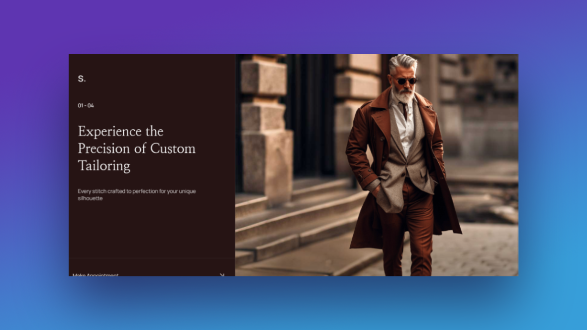
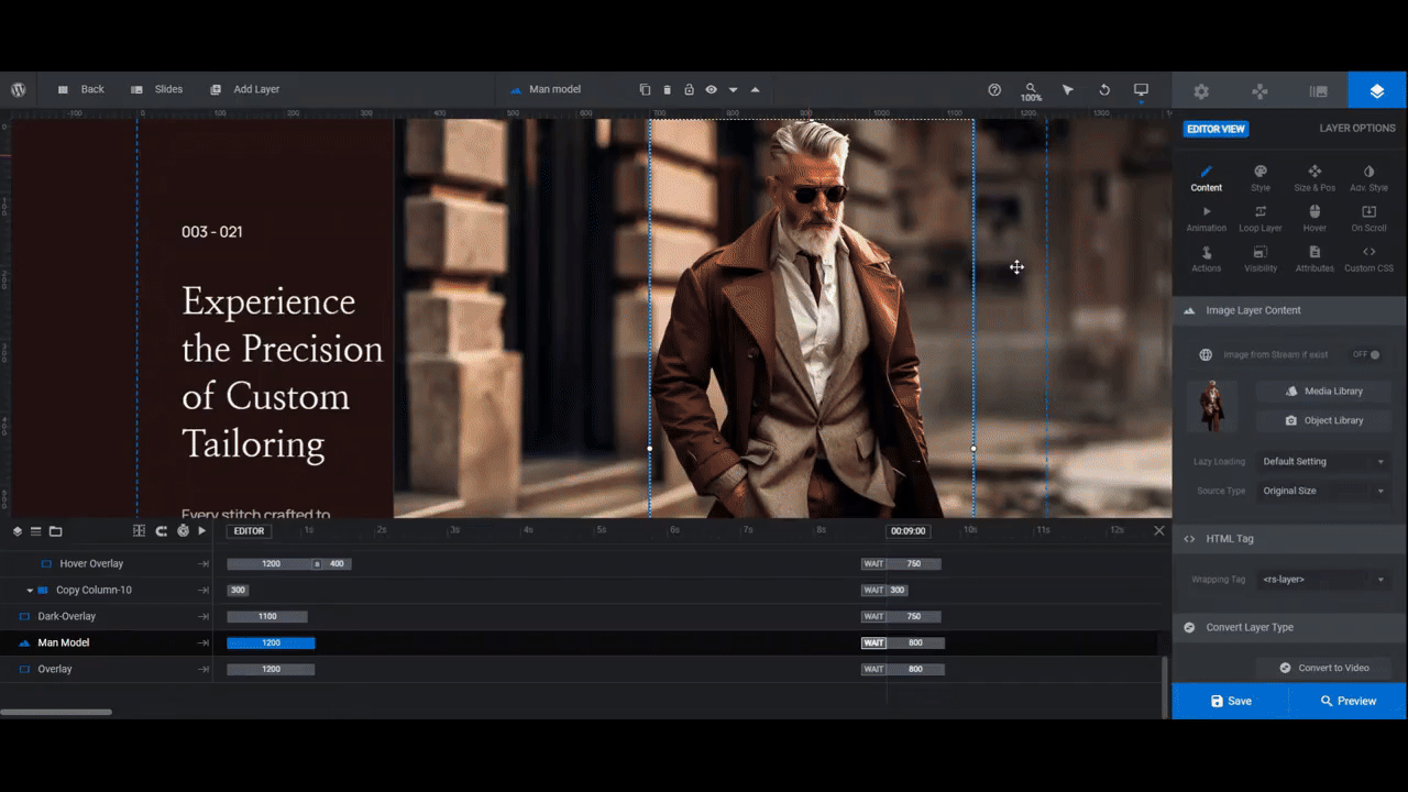
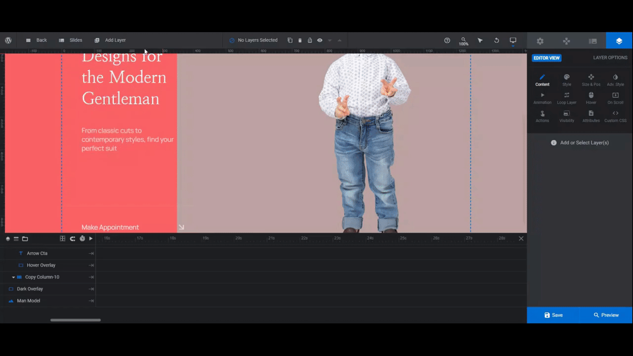
Take, for instance, the template above. This men’s fashion template is dark and stylish. With some simple changes, however, you can turn it into a colorful and eye-catching slider for a kids’ brand.
First time using Slider Revolution? Check out the manual for tips on how to get started with modifying a template.
Step 1: Modify slide count
There are four slides within this template. If you want to delete some slides or add more, there’s an easy way to fix this.
Go to “Slides” in the top toolbar.
To delete, hover over any of the slides (since they’re all designed the same way) and click the trash can icon that appears to the right of it.
To add, hover over any of the slides and click the duplicate icon that appears to the right. This way you won’t have to build a new slide from-scratch.
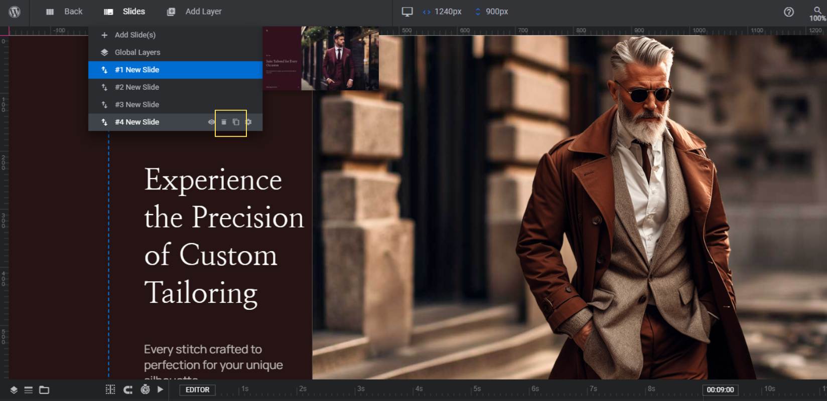
Save your changes when you’re done.
Learn more:
Step 2: Upload the model photos
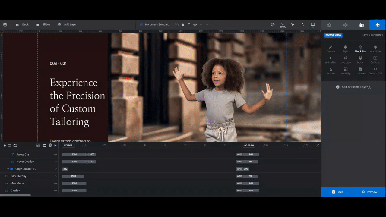
In the template, the Man Model image layer is placed in front of the blurred landscape background. In this step, we’re going to replace the male model photos with those of our child models.
Select the Man Model layer in either the canvas or timeline editor. Then go to “Content” to upload your new photo to the Media Library.
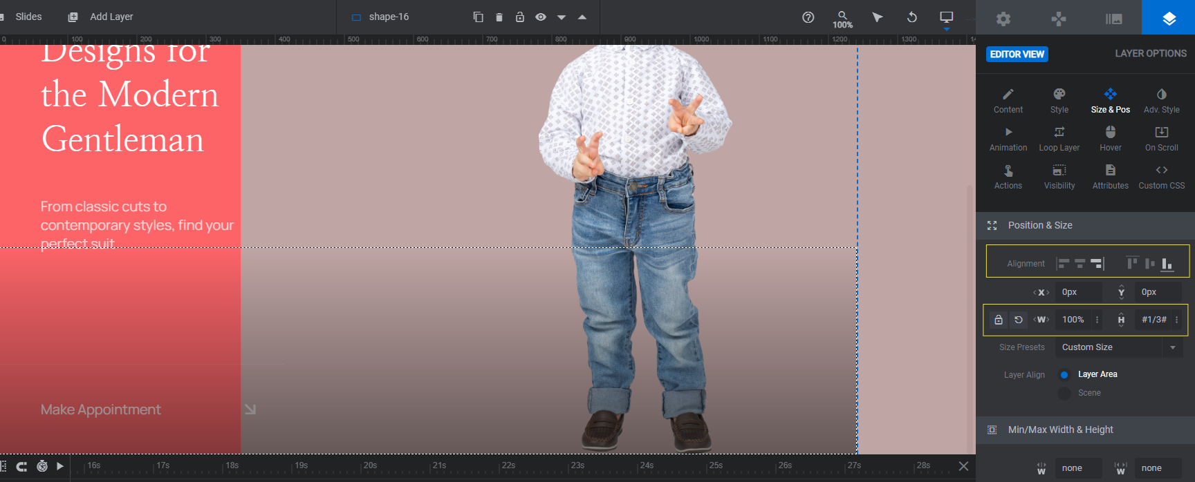
Not all of the model images in the slides are the same size or dimensions. So even if you export all of your images at the same sizes, you’ll probably need to do some resizing in this step.
Go to “Size & Pos”. Use W (for width) to adjust the size of your photos, aiming to make each of them roughly the same size throughout the slider. Somewhere between 500px and 600px should work.
Then use the responsive variant dropdown in the top toolbar to make sure that any resized images look okay on smaller screens.
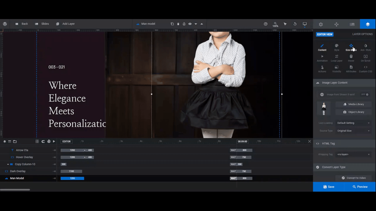
Repeat this process for each slide until the models are all about the same size and in the same position in the slider.
Learn more:
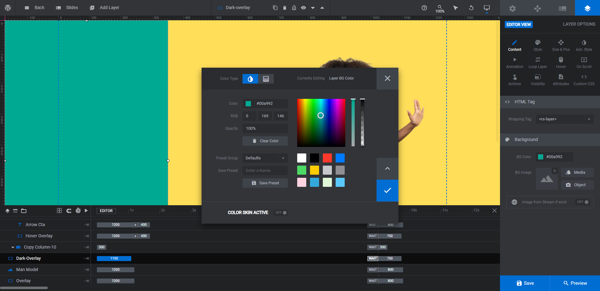
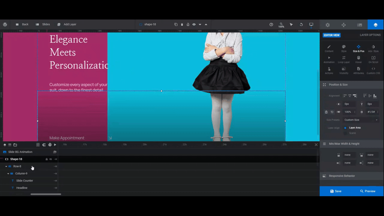
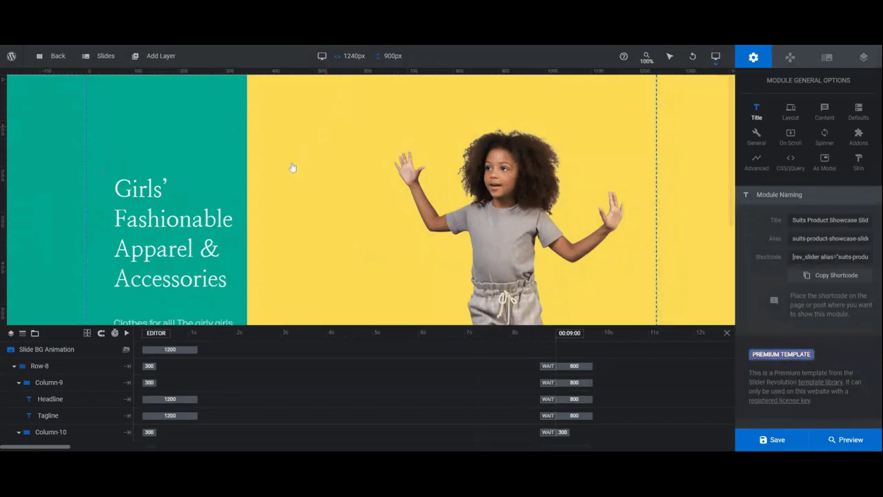
Step 3: Customize the slide background colors
The current background in each of the slides is a blurred but realistic backdrop, like a cobblestone street or a room in a house. We’re going to replace this image background with a solid color instead.
To do the same, go to “Slide Options” and “Background”. Change the Type to Colored. Then click the color block to open the color selection module.
You can do a few things here:
- Select a preset from one of the colors in the bottom-right corner.
- Enter a custom HEX code under Color.
- Switch the toggle at the top in order to create a gradient background.
Go through and do the same thing for each slide.
Learn more:
Step 4: Customize the sidebar colors
To adjust the color block that sits behind the text and button on the left, select the shape layer called Dark-Overlay. You can edit the color under “Content” or “Style” the same way you did the background color.
Before moving onto the next step, head over to “Module Options” and “Layout”. Now that all your colors are in place, you should update the module background color (the one that appears as the slide loads).
Scroll down to “Module Background” and set the color to match the color of the Dark-Overlay in the first slide so that visitors barely notice the transition.
Learn more:
Step 5: Add a shadow overlay to all the slides
Right now, Slide 1 is the only one that has a layer in it called Overlay. This adds a shadowy overlay to the bottom of the slide, which works well for our colorful slide designs.
We want to add the same overlay shape to the other slides.
To do this, go to “Add Layer” in the top toolbar and select Shape. This adds a new rectangular shape layer to the slide.
Next, go to “Content” or “Style” to open the color selection module. Switch the toggle at the top to gradient. The default settings should be good to go. But just to confirm, this is what they should be:
- Color (left and right): #0c0c0c
- Opacity (left): 0%
- Opacity (right): 50%
- Direction: Vertical
- Angle: 180 degrees
Then go to “Size & Pos”. Configure the following settings:
- Horizontal alignment: Right
- Vertical alignment: Bottom
- W(idth): 100%
- H(eight): #1/3#
- Layer Align: Scene
The last thing to do with this layer is to move it behind all of the other layers. To do this, go to the timeline editor. Select the shape layer. Then drag it to the very bottom of the list.
The order of the layers in the timeline dictates how far forward (top) or backward (bottom) they appear in the canvas.
Learn more:
Step 6: Update the text layers
There are three text layers in each slide. We’re going to delete the one called Slide Counter as it’s not needed when there’s only three slides.
Note: To delete a layer, select it in the canvas or timeline. Then hit Backspace or delete on your keyboard.
The remaining text layers are the Headline and Tagline. To edit what the layers say, go to “Content” and replace the existing text in the box.
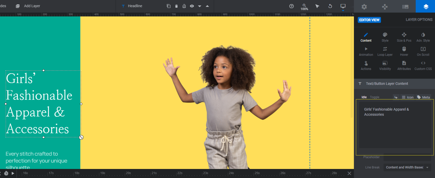
Next, use the “Style” settings panel to change the font as well as the size, spacing, and other styles for each text layer.
Go through each slide and apply the same changes. Save your work between each slide.
Learn more:
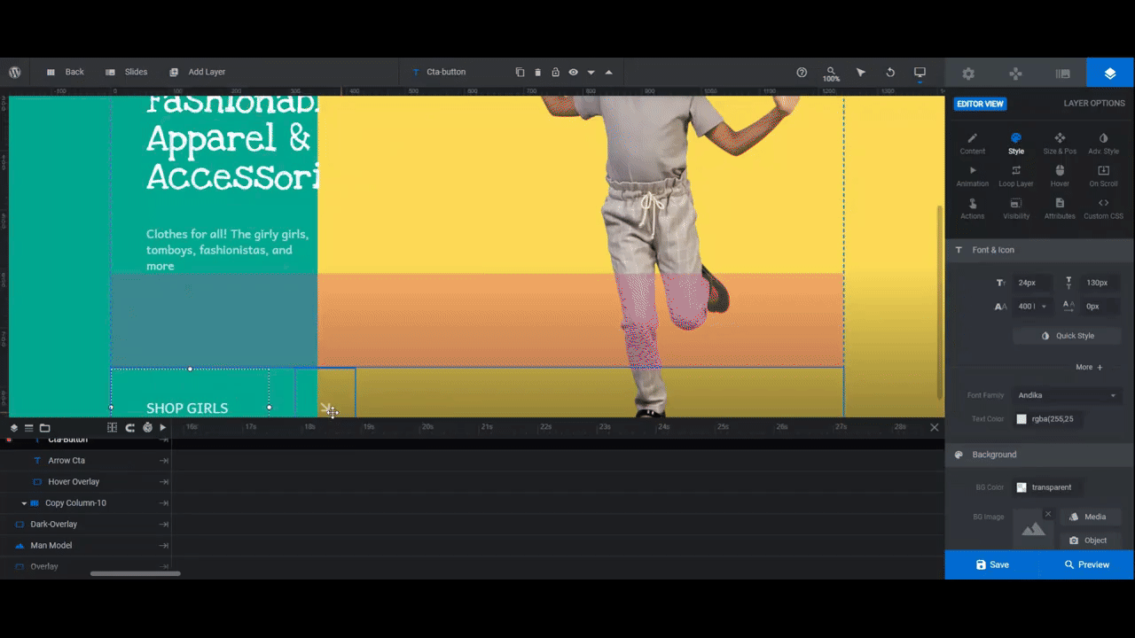
Step 7: Customize the button layers
There are three layers we’re going to lump together as the button:
- Cta-Button is the text layer that serves as our button and link.
- Arrow Cta which lets shoppers know this text area is a link.
- Line which separates the button from the other text.
- Hover Overlay which gives our button a hover-triggered sliding reveal effect.
Editing the CTA button
To customize the Cta-Button layer, use the same settings as you did to edit the text layers in the step above. Use “Content” to modify what the text says and “Style” to change the font and styles.
If you want to change the look of the text when someone hovers over it, go to the “Hover” panel and scroll down to “Style”.
Note: You’ll need to modify the Hover Overlay layer if you want to change the color of the button. Edit the color (as well as the opacity of the color) under “Content” or “Style”.
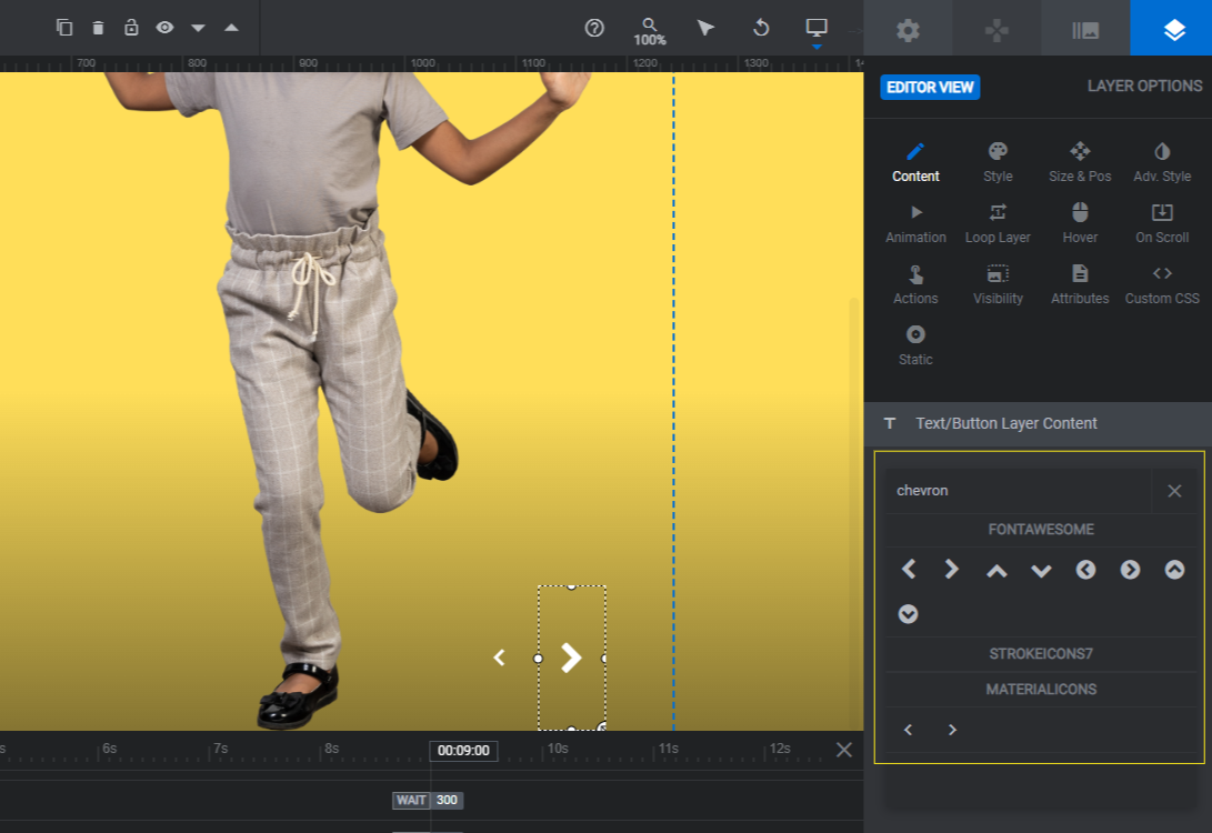
Editing the arrow icon
Next, let’s edit the Arrow Cta icon. This is a text layer, so you’ll go to “Content” to modify it.
To change the arrow to another icon or arrowhead style, click the Icon tab above the text box. Then search for a new one.
Once you’ve found your new icon, remove the code for the old icon in the text box so only yours remains.
Now, the icon is set to point diagonally downwards until someone hovers over it. If you want to change this effect, go to “Animation”.
The IN > Anim To setting has the arrow set to a 45-degree rotation. It also has a 60% (0.6) opacity setting applied.
The hover keyframe returns the arrow to a 0-degree rotation so that it points right. And the opacity setting goes back to 100% (1.0)
You can keep this rotational effect as it is, you can customize it, or you can remove it entirely. There are other settings you can use in this panel to animate your arrow. For instance, you can change its size and slant. You can even move it left, right, up, and down.
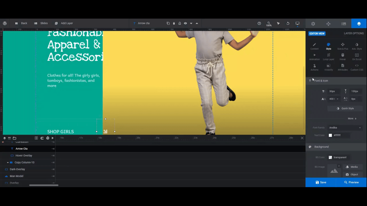
Make the same modifications to the icon in the other slides, saving your changes between each.
Editing the line
There’s a faint line that separates the button from the text above. We’re going to make ours more prominent.
To make modifications to the Line layer, go to “Style” and edit the BG Color. Right now, it’s white with a 10% opacity.
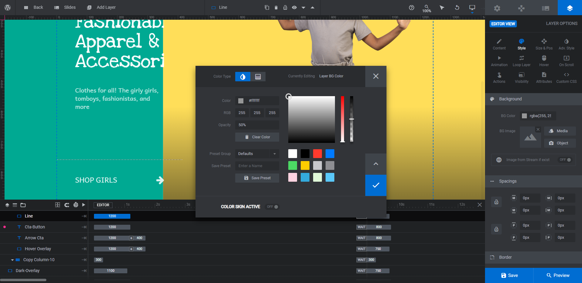
You can also use the H setting under “Size & Pos” to increase the thickness of the line.
Editing the link
To edit the button link, select the Cta-Button layer. Go to “Actions”. You’ll find five pre-configured actions already there.
The only one that needs editing is the Simple Link. Click on it and then enter the product, category, or sale page URL you want the slide to link to.
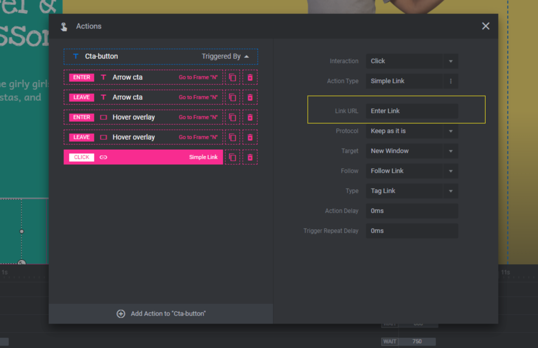
Close the panel to save your changes.
Learn more:
Step 8: Edit the global layers
Finally, we need to update the Global Layers. To access them, go to the top toolbar and select Global Layers.
There are two rows of layers here. Row-23 contains the Logo and Contact link. If you don’t need these header layers, select Row-23 and delete it.
Copy-Row-23 contains the left and right navigation arrows in the bottom-right corner of the slider.
We need to keep these here so our users can control the pace of the slider. However, we want to update the style of the chevron arrowheads so they match the chunkier and bolder redesign of this slider.
To modify the Prev and Next layers, use the Icon setting under “Content” (the same you used to modify the button arrow) and search for “chevron”.
You can use the other settings panels as well to change things like the color and size of the navigation arrows.
When you’re done, open the Preview and test out your new ecommerce slider. If it’s good to go, you can embed it into your home page using either the shortcode under “Module Options” or with the Slider Revolution widget found inside your page builder plugin.
Learn more:
Capture shoppers’ attention with a colorful ecommerce slider
Although the Suits Product Showcase Slider template started out with a dark and stylish vibe for our menswear brand, it was easy to update the style and create an eye-catching slider for kids’ clothes from it. The basic layout and transitions remain. However, a totally new color palette and font style transformed this slider into one that’s colorful, youthful, and friendly.

