
Want to take the design of your slider hero section up a notch? While well-chosen photos and videos work great, that’s probably what your target users are going to find on other websites. To make your home page really stand out, you need to give it a little something extra.
In this tutorial, we’re going to demonstrate how to do just that using the Starry Night Parallax Zoom Effect Slider template.
Table of Contents:
- Step 1: Modify the slides
- Step 2: Update background images
- Step 3: Add foreground images
- Step 4: Edit text layers
- Step 5: Customize the buttons
- Step 6: Update the global layers
- Step 7: Adjust the progress bar navigation
How to use the parallax zoom effect in your slider design
Life coaching websites often have to rely on their words (and usually too many of them) to get people feeling inspired enough to take the plunge. That’s because stock graphics alone can be so uninspired and cheesy for life coaches.
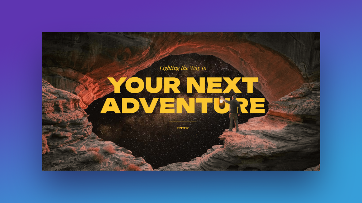
In this tutorial, we’ll use this template as our starting point:
Then we’ll show you how to keep all the good stuff like the parallax zoom effect and layered images and use them to create an inspiring slider design for our life coaching business:
If you’re looking for a Slider Revolution refresher before you read the tutorial, start here:
Step 1: Modify the slider
There are four slides in this template. Before you begin editing, decide how many of those slides you need. We’ll be turning ours into a three-screen slider, so we’ll need to delete one of them.
Something else to consider is how you’re going to lay out your slides. Each slide has a background image as well as one or two images layered in front of it.
To speed up the time it takes to customize this template, try to find slides that have a similar layout and layering structure. For example:
- Slide #1 has a bottom and top layer that nearly touch.
- Slide #2 has a left and right layer that are far apart.
- Slide #3 has a bottom and top layer with a big gap in between.
- Slide #4 has one layer that sits in the bottom-left corner.
If you’re going to delete any slides, remove ones with layouts you aren’t going to need. Also, if you find a layout or two you like, delete the rest and then duplicate the remaining slides as needed.
To manage your slides, go to “Slides” in the top toolbar.
When you hover over each slide, different options appear on the right. Click the trash can icon to delete a slide. Click the copy icon to duplicate. You can also drag-and-drop the slides to reorder them.
Note: The layers don’t have to perfectly match what you plan for yours. You’ll be able to resize and reposition them so that they work for your custom design.
Learn more:
Step 2: Update background images
To swap out the background images in each slide, go to the “Slide Options” panel. Click the Media Library button to upload your new imagery.
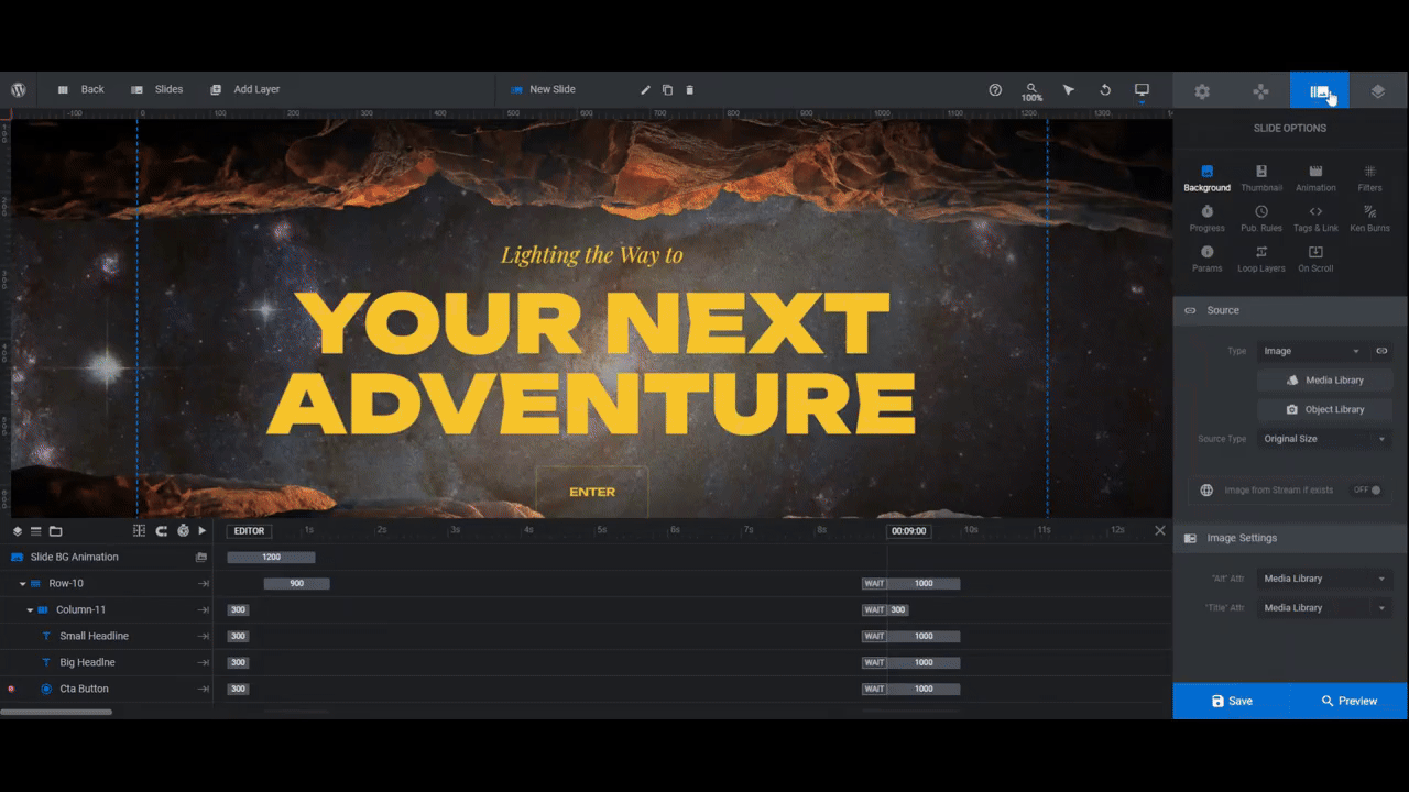
When you’re done, save your changes.
Note: If you want to alter the zooming effect applied to the background images, go to the “Ken Burns” settings panel. You can adjust the position, duration, movement, blurring, and more.
Learn more:
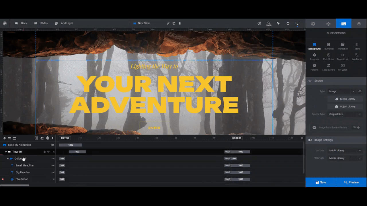
Step 3: Add foreground images
If you look at the timeline editor at the bottom, you’ll find your foreground image layers. Each is named [position]-Image.
To quickly swap out yours for the ones that are in there, export them with as close to the original size as possible. Here are the sizes in pixels for each image in this slider:
Slide #1
- Bottom-Image: 1920×654
- Top-Image: 1920×610
Slide #2
- Left-Image: 1920×1080
- Right-Image: 1920×1080
Slide #3:
- Bottom-Image: 1920×459
- Top-Image: 1920×380
Slide #4:
- Left-Image: 1215×1024
Note: Because many of these are full-width images, you’ll need to be mindful of where you place the graphical element so that it shows up in the right place once it’s uploaded to the slide.
To replace these images, select the layers in the timeline editor or canvas. Then go to “Content” to upload your new images to the Media Library.
You can also delete layers you don’t need by selecting them and then hitting Backspace or delete on your keyboard.
It’s important to open the Preview and check your work at this point. Because of the Ken Burns zoom effect applied to the background and the On Scroll parallax effect applied to the foreground, the canvas isn’t a perfect representation of what it’ll look like on your website.
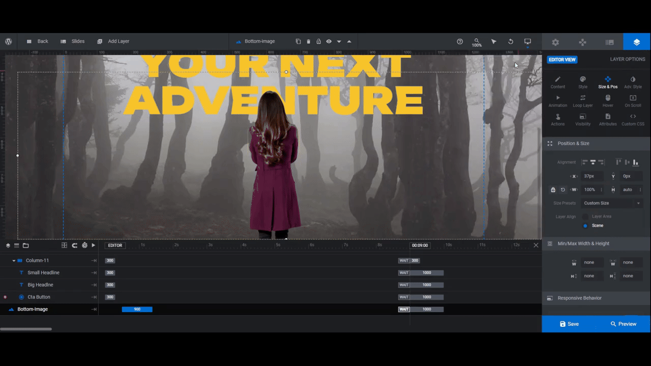
If you need to adjust the size or positioning of the foreground image layers, go to the “Size & Pos” panel to do so:
- Use X to move the image left or right.
- Use Y to move it up or down.
- Use W to edit the width.
- Use H to edit the height.
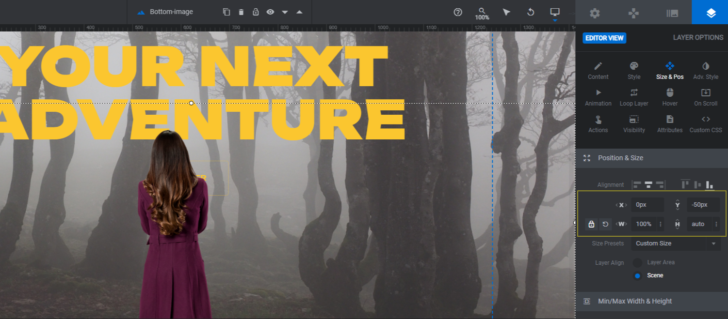
You can also use the positioning tools at the top to instantly align the image to one of the margins or to the center of the canvas.
Before you wrap up with this step, a responsive check is needed. Unless your images are nearly identical in shape and size as the originals, you’ll probably need to tweak how they look on smaller screens.
To change the canvas view and editor to a smaller device, use the responsive toggle in the toolbar. Then make your edits in each responsive variant’s view. Changes made here will not affect the work you did in the Desktop version.
When you’re done, preview your work once more. Use the responsive toggle at the top of the preview screen to be sure the responsive edits came out as you wanted them to.
Learn more:
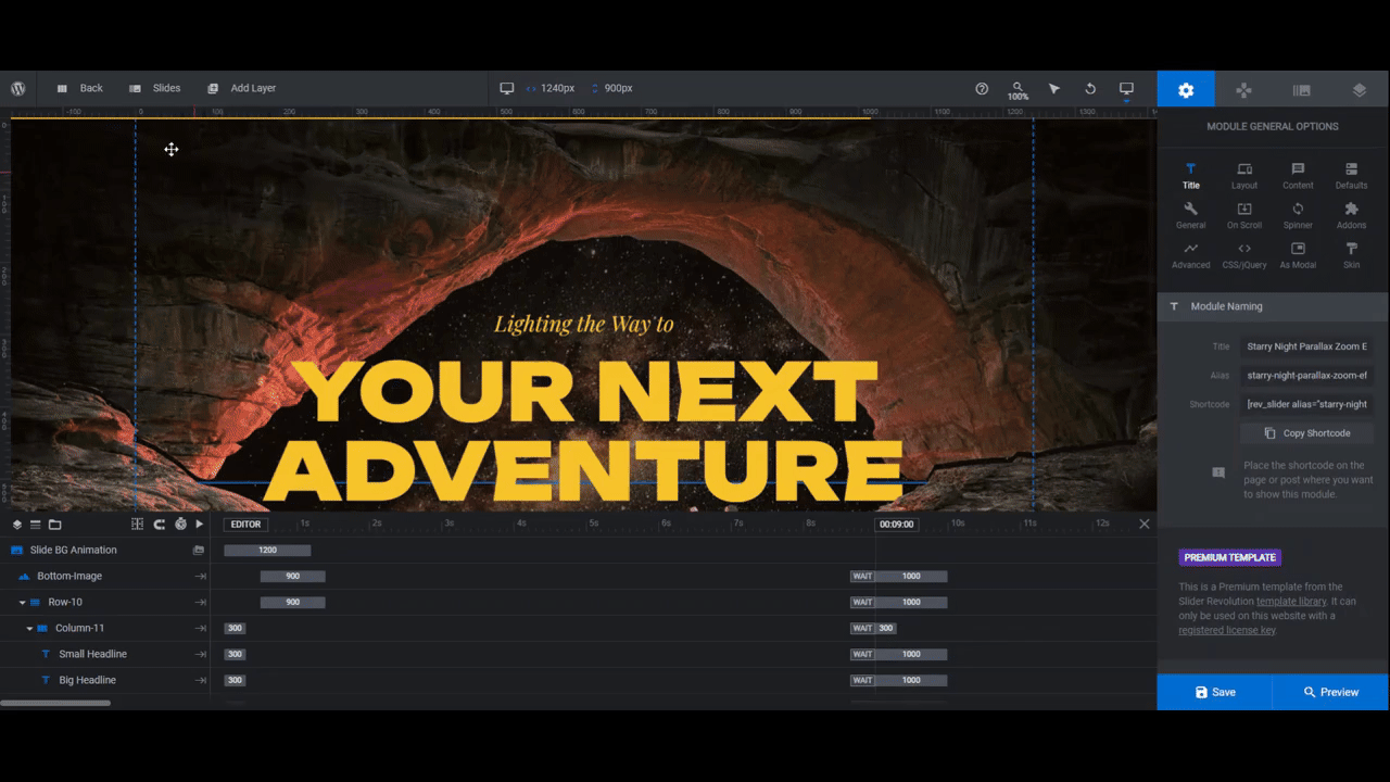
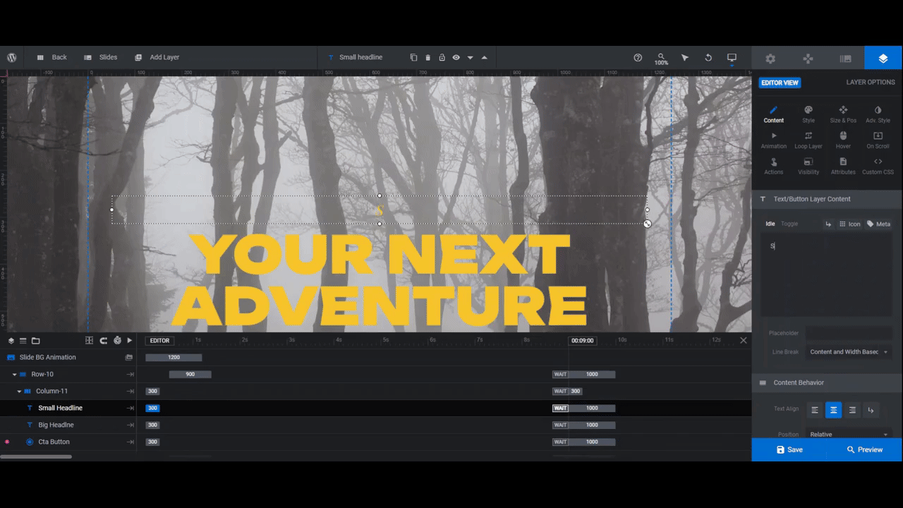
Step 4: Edit text layers
There are two text layers in each slide: Small Headline and Big Headline.
Use “Content” to edit what the text says in each layer. Then go to “Style” to adjust the font, color, size, and other settings.
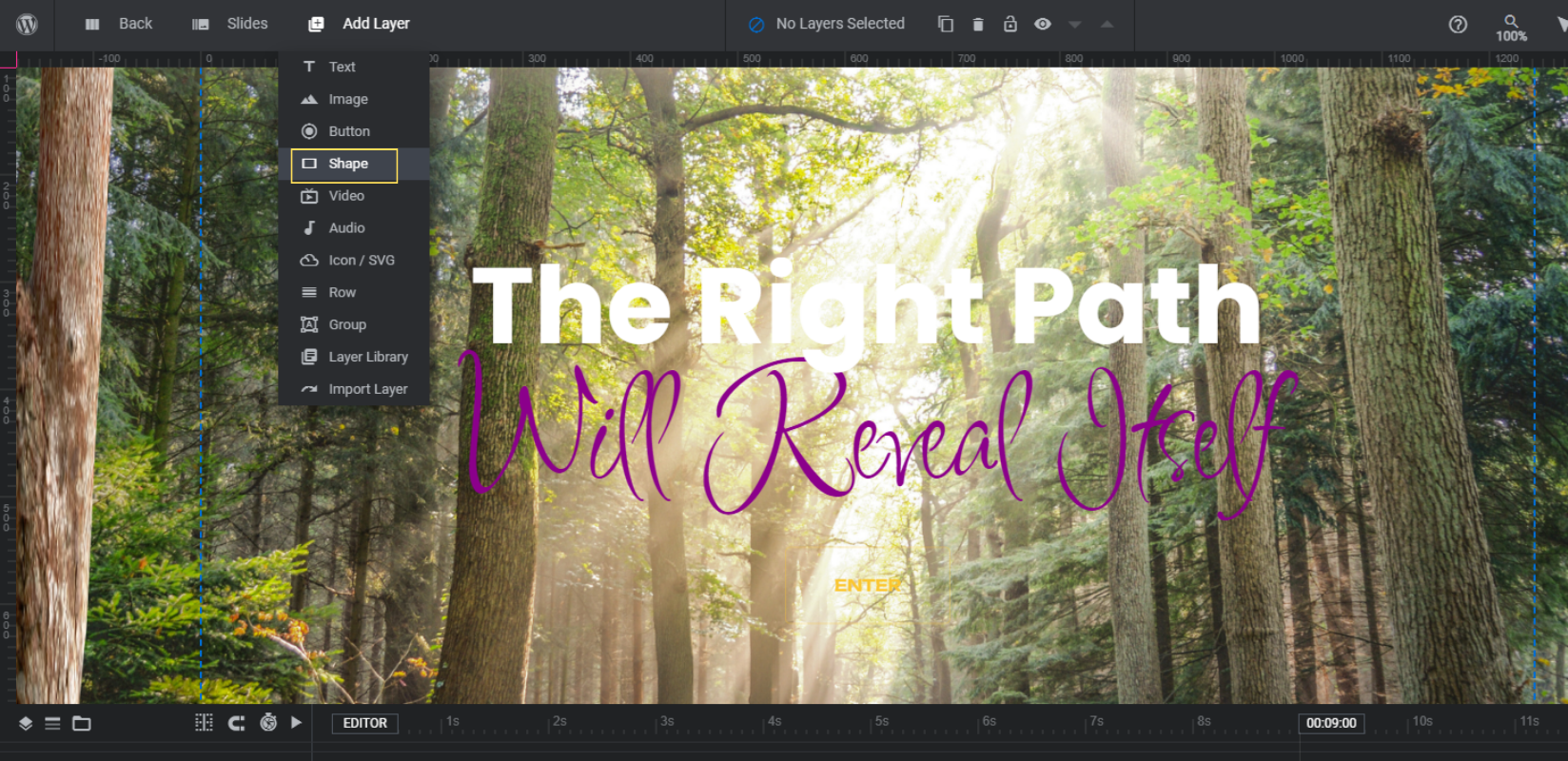
Pro tip: If your font or colors don’t show up clearly against a too-light background, you can do one of a few things. You can find a different image. You can darken the image. Or you can add a gradient behind your text layers so you can keep your image more or less intact.
To add this gradient background, go to “Add Layer” in the top toolbar and select Shape.
Here’s what you’ll do next:
Go to “Size & Pos”:
- Set the Position to center-align and top-align.
- Set the W value to 1920px.
- Set the H value to 600px.
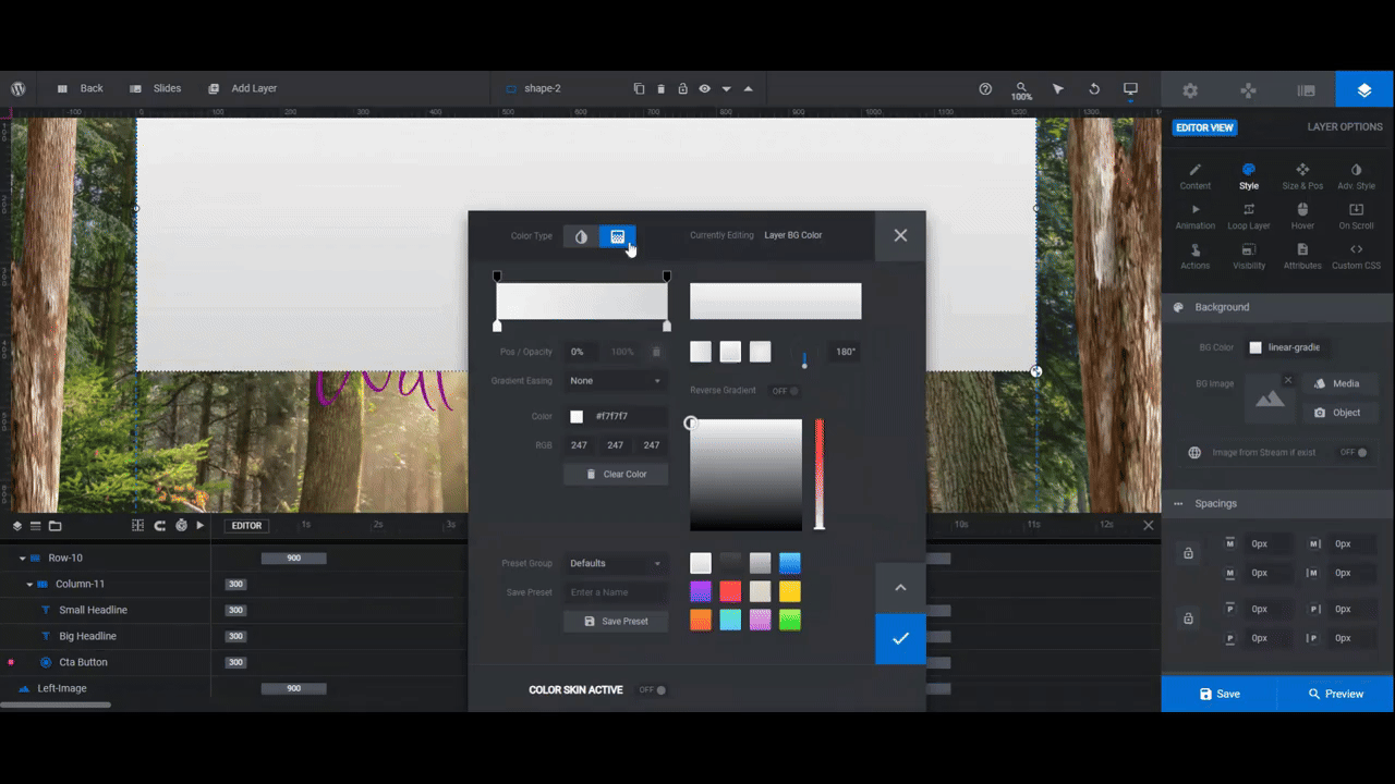
Go to “Style” next. Click the color block next to BG Color. Select the gradient option in the top-left. Then do the following:
- Set the Color (the bottom of the bar) on both the left and right ends to #050505.
- Set the Transparency setting (the top of the bar) for the left color to 50%.
- Set the Transparency setting for the right color to 0%. Also move the Pos(ition) setting to 50%.
Then on the right side of the color selection dialogue, select the radial gradient option.
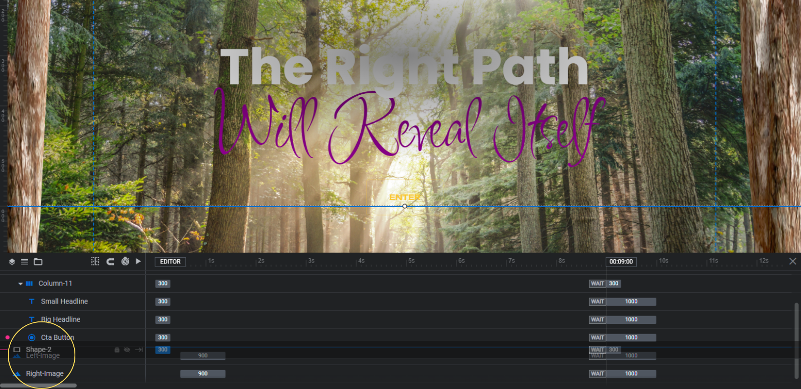
The last thing to do is to move this shape layer behind the text layers. To do this, go to the timeline editor at the bottom.
Drag and drop the Shape layer so that it’s lower in the list of layers than your headline text layers. This will move it behind them.
Preview your work once more to make sure the text in each layer looks good. Also do one more responsive check to ensure it looks good on smaller screens.
Then save your changes.
Learn more:
Step 5: Customize the buttons
The Cta Button layers are a lot like text layers. Start by editing the text and fonts as you did in the previous step.
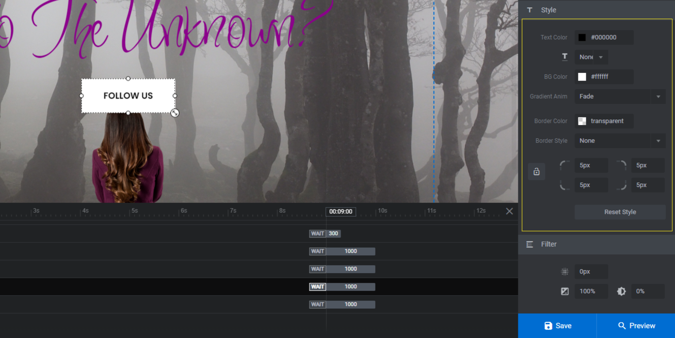
Next, you can modify the colors of the button’s outline or fill from the “Style” panel. The fill color is under “Background” and the outline color is under “Border”.
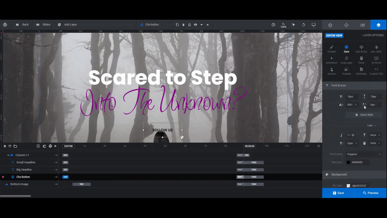
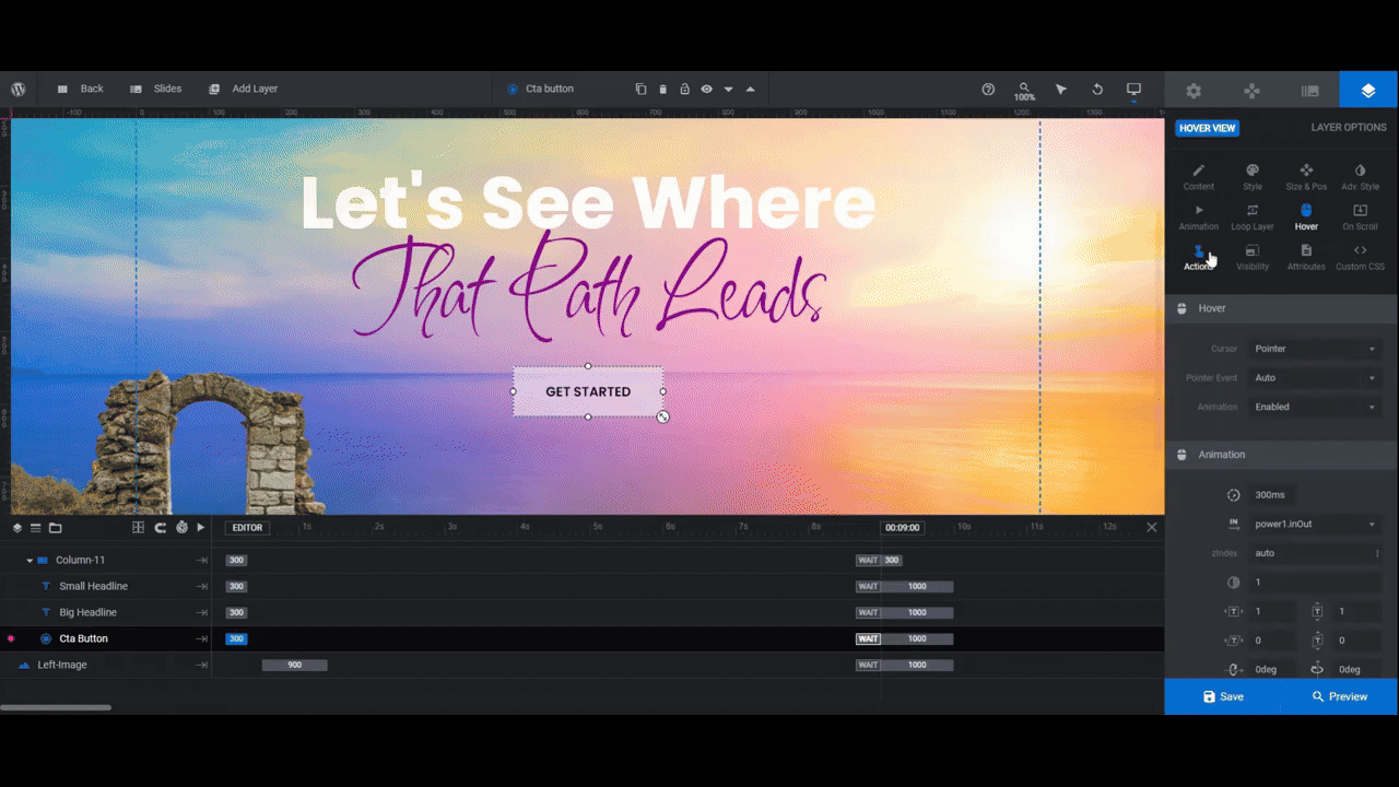
You’ll also want to adjust the colors and general appearance of the buttons when someone hovers or clicks on them.
Go to the “Hover” panel and the “Style” section to do this.
The last thing you may need to edit is the button link. Currently, each button is programmed to move to the next slide.
For a storytelling slider such as the one in the template and the one we’ve just created, the sequential sliding works for each screen except the last. We want the final slide to take visitors to the next step. That could be the section below-the-fold on the home page, a landing page, or a contact form.
Open the last slide in your slider. Then click “Actions” to open the link settings panel.
Click the trash can icon to the right of the existing action to delete it. Then click Add Action to “Cta Button” at the bottom to create a replacement link.
Use Simple Link to add a custom hyperlink. Use Scroll Below Slider to drop visitors to the below-the-fold section. Use Scroll to ID to take them to a different section on the home page.
Learn more:
Step 6: Update the global layers
To access the global layers, go back to “Slides” in the toolbar and select Global Layers.
There are two rows of layers here.
Column-13 contains a logo and header links. If you’re using your theme to create a header for your site, then you don’t need this row. To delete it, select Column-13 and hit the Backspace or delete key.
Note: You can also edit the layers the same way you did the text and button layers in the slides.
Copy Column-13 contains a slide counter along with navigation arrows. If you have five or more slides, these tools are useful. However, if you have fewer, you might decide that you don’t need them. In that case, delete them the same way you deleted the top row.
Learn more:
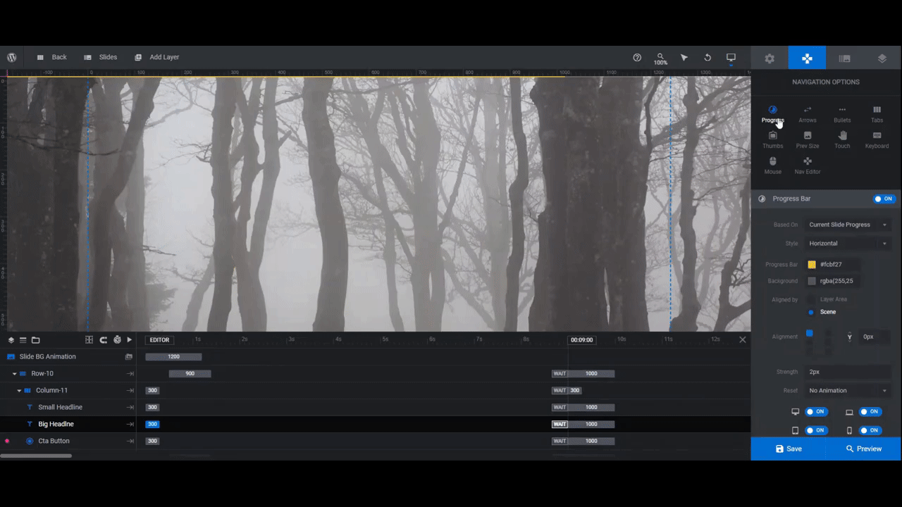
Step 7: Adjust the progress bar navigation
Since the call-to-action buttons act as our navigation, we’re not going to add any arrows or bullets. What we are going to do, though, is to edit the progress bar that sits at the top of the slider since it still has the old template colors.
Open up any of your slides to exit out of Global Layers. Then go to “Navigation Options” and “Progress”.
In addition to adjusting the colors, you can also change the position and width of the progress bar from this panel.
Preview your changes one final time. When you’re satisfied with how the slider and parallax zoom effects turned out, save your changes.
You can now add this slider hero section to your home page. You can use the shortcode found under “Module Options” or you can embed it directly in your page builder with the Slider Revolution widget.
Learn more:
Parallax zoom effects and eye-catching graphics: a killer pair
The great thing about using a template like the Starry Night Parallax Zoom Effect is that the special effects are already taken care of for you. This will give you more time to spend on creating awesome graphics, customizing the content, and telling a great story.

