

Meta description:
Geometry is an inherent part of design. We use it to create structure, balance, and stability. We can also use geometric shapes and lines to add pops up color to our designs while conveying a little something extra to visitors about what our website and brand do.
In this tutorial, we’ll show you how to edit the Geometric Slider Design Template and turn it into a creative geometric design for your hero section.
Table of Contents:
- Step 1: Delete two of the slides
- Step 2: Adjust the background colors
- Step 3: Edit the text
- Step 4: Customize the shapes
- Step 5: Update the background particle wave
- Step 6: Remove global layers
- Step 7: Customize the CTA button
How to create a stunning geometric design for the hero section
In this template, you’ll find three geometric designs and layouts. Before you begin the tutorial, figure out which of the three layouts (if you don’t plan on creating a slider) you want to use.
You’ll be able to customize every part of the template’s design, including the shapes. Below we’ll show you how to turn Slide #1 from the template into the following hero image for an interior design agency:
Note: Our video editor is making divider lines appear between some of the shapes. The lines aren’t visible normally, it’s just something that the editor is picking up during recording.
If this is your first time using Slider Revolution, start by reading through this brief reference material:
Step 1: Delete two of the slides
To convert this geometric slider into a single screen hero section, start by deleting two of the three slides.
Go to “Slides” in the top toolbar. Locate the two slide layouts you don’t need. Then click the trash can icon beside each to delete them.
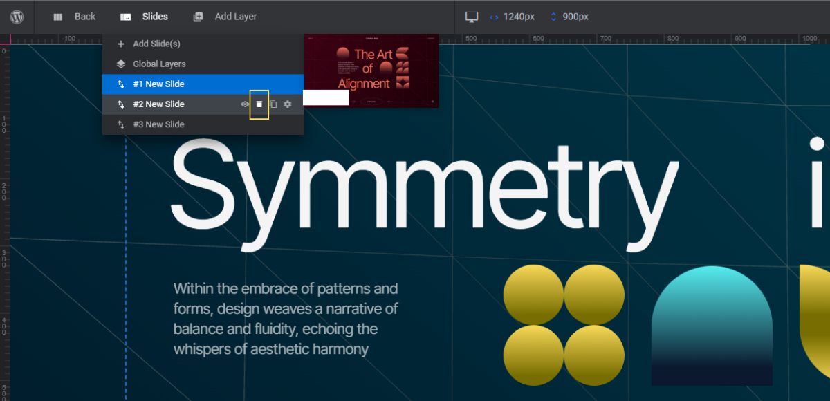
Note: To choose a slide layout, factor in how much headline text you have. Also think about how you want to lay out the shapes around the text layers. It’s okay if you don’t find a slide layout that perfectly matches what you have planned. Just find one that will require the fewest amount of edits and customization.
Learn more:
Step 2: Adjust the background colors
The background in each slide uses a subtle gradient. To replace this gradient with your own, go to “Slide Options” and “Background”.
Use the color bar at the top as well as the settings below it to customize the colors in the gradient. You can also use the settings on the right to change the style of gradient as well as the direction the colors move in.
Before moving on, go to “Module Options” and “Layout”. Currently, the color that appears in the loading screen matches the dark blue of Slide #1.
Go down to “Module Background” and change this to a solid color that matches your new gradient.
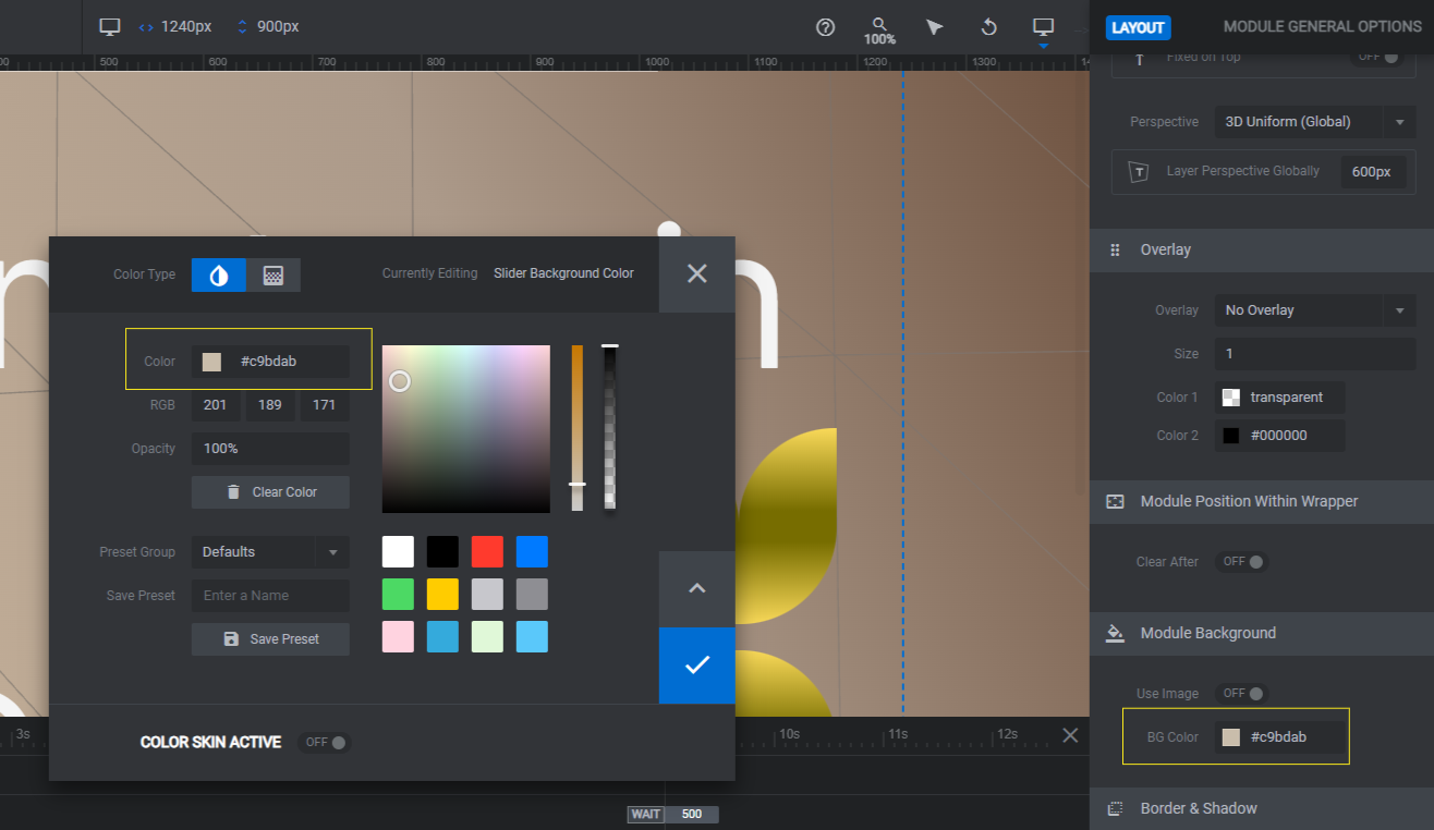
Save your changes when you’re done.
Learn more:
Step 3: Edit the text
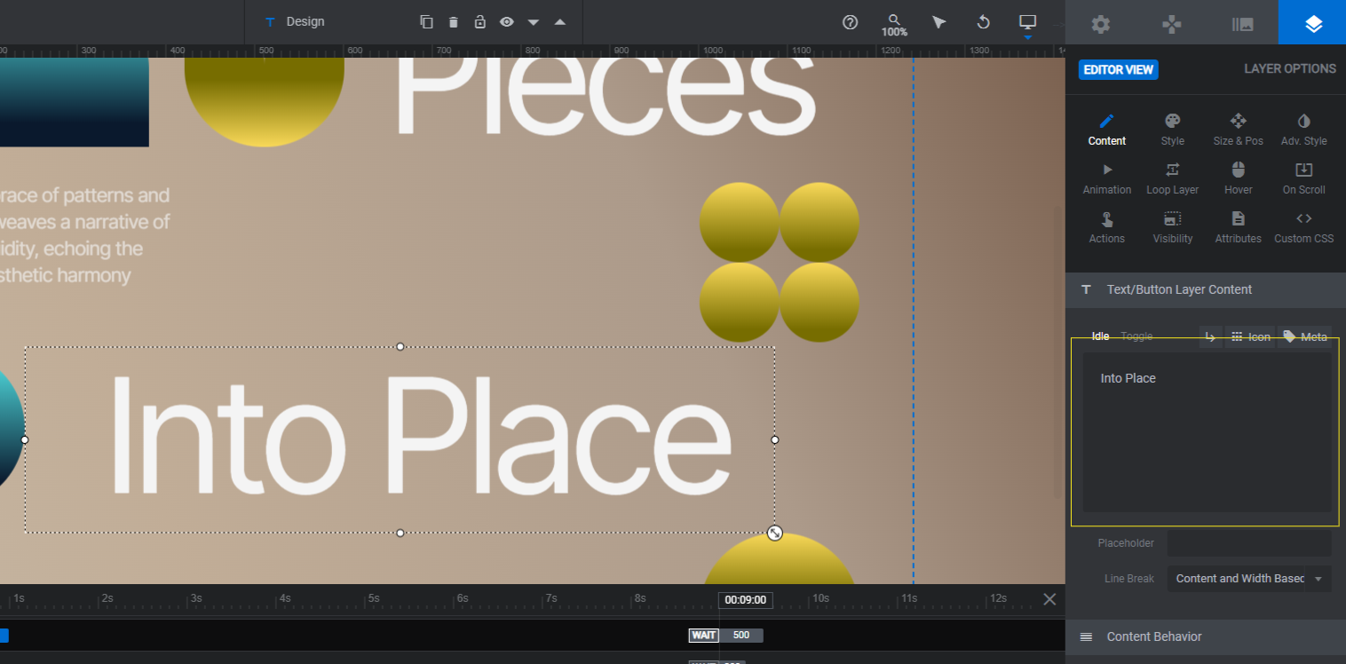
There is a headline and a description in each slide.
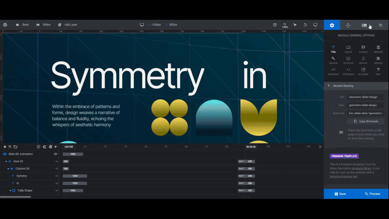
The headline text layers are scattered through each slide. You can either select them in the canvas or down below in the timeline editor (look for each word as its own text layer). In Slide #1, they’re Symmetry, In, and Design.
The description layer is called Paragraph.
To change what each text layer says, go to “Content” and replace the existing text in the block with your own.
If you have more text or longer words, the design will start to shift around. That’s okay, you can make adjustments to the font, weight, spacing, and size under the “Style” panel.
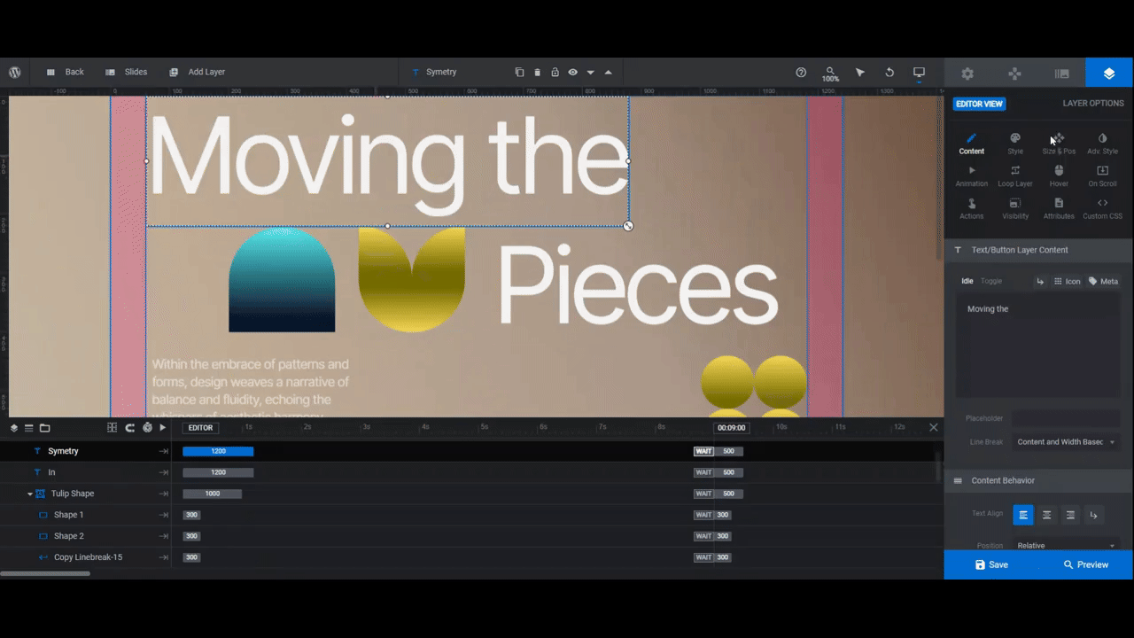
Pro tip: If you end up with an awkward space between the two headline layers that sit next to one another, remove the second layer and merge all the text into one.
If you’ve modified the size or placement of any of these text layers, a responsive check is in order. Go to the variant switcher in the top toolbar. Check your design in the Notebook, Tablet, and Mobile views.
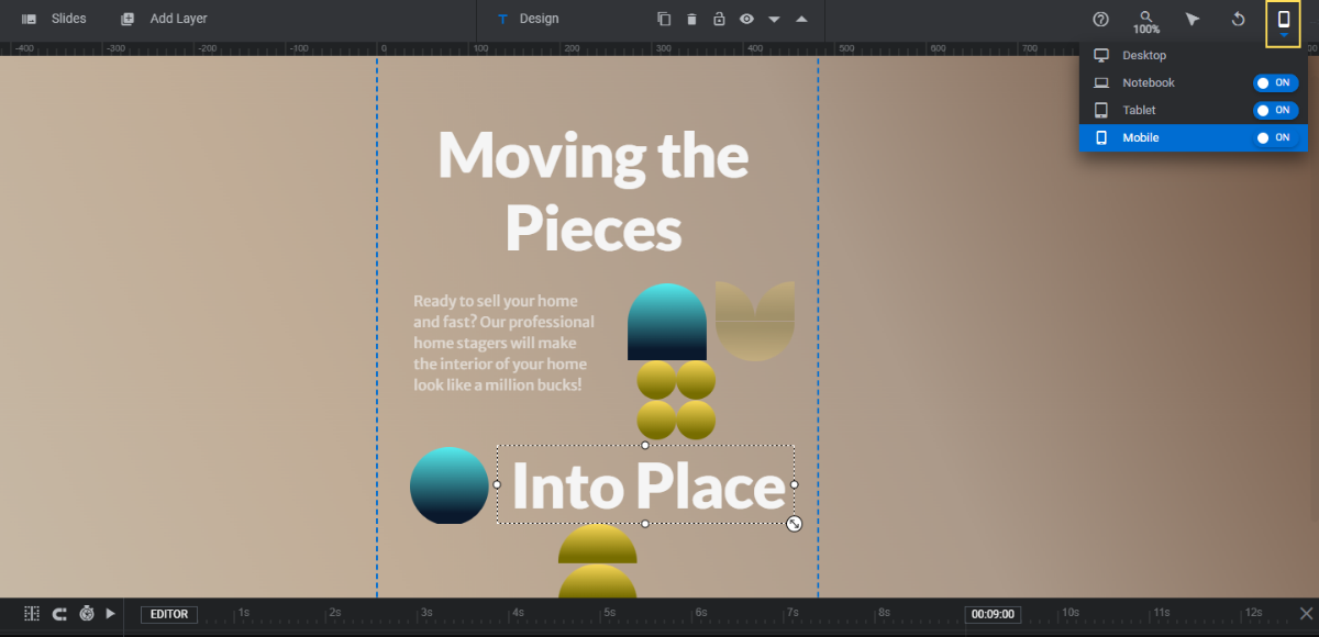
If changes are needed, select the text layers and make your modifications in the panel on the right. Anything you do from these views will apply only to the UI you’re working on.
Learn more:
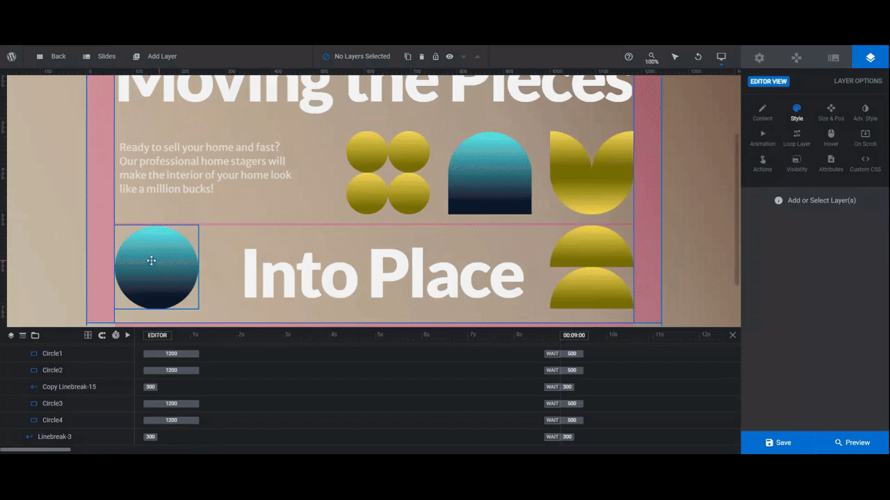
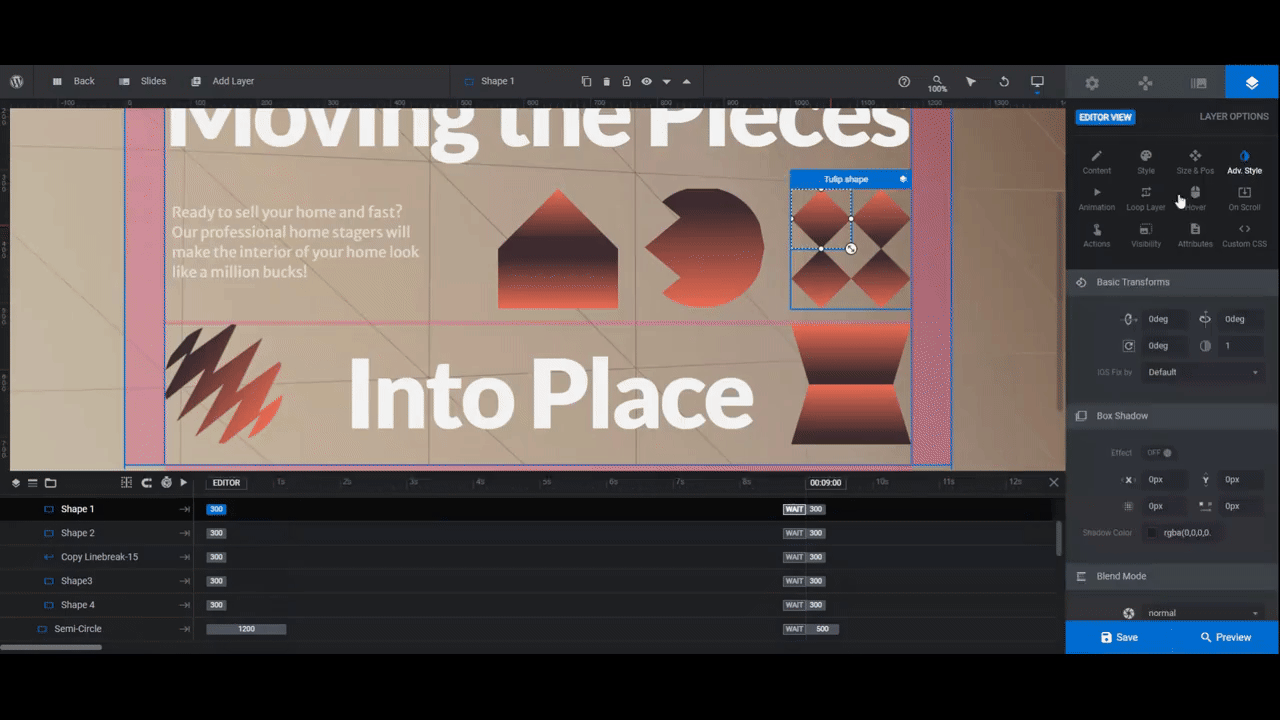
Step 4: Customize the shapes
For the most part, the shapes in this template are rounded — circles, semi-circles, as well as petal-like shapes. You can create other types of shapes using the tools inside of Slider Revolution.
Let’s start with the basics first: Color.
To change the color or gradient of any shape (or piece of a shape), select the layer in the canvas or timeline. Then go to “Content” or “Style” to open the color selection dialogue.
Pro tip: Whether you create a monotone color palette for your shapes or use a few different colors throughout, saving your custom colors or gradients is a good way to save time.
With the color selection dialogue open, go to the bottom-left corner and change the Preset Group dropdown to Custom. Enter a unique name for the color. Then click Save Preset.
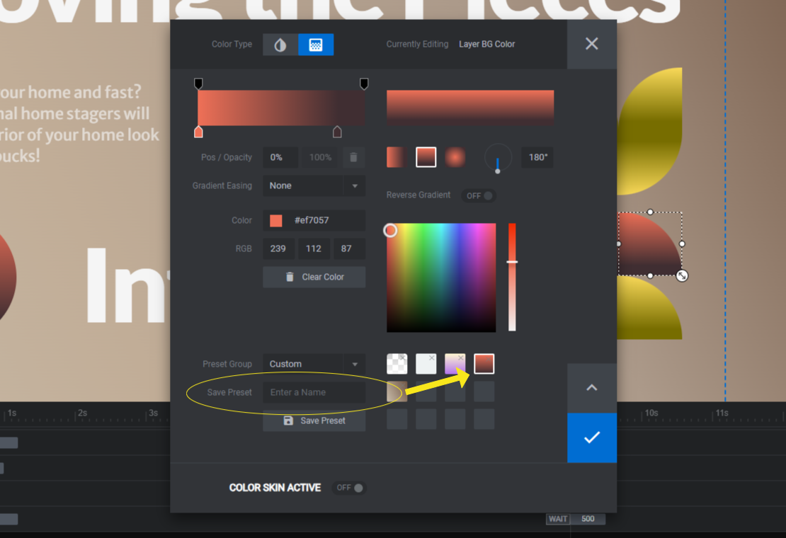
This new color or gradient will be saved to the right-hand side and can be retrieved whenever you switch the Preset Group to Custom.
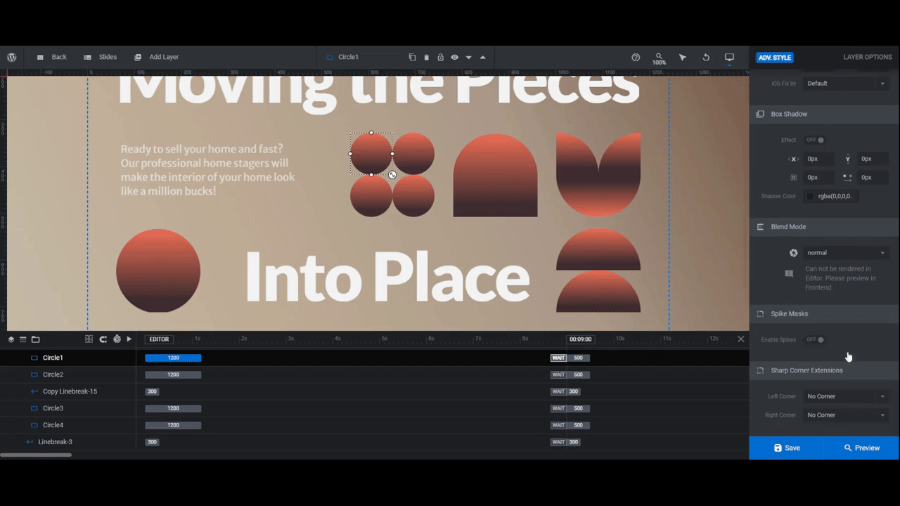
Now let’s turn our attention to modifying the shapes.
When you initially add a shape layer in Slider Revolution, it will be a square.
To round the edges, go to “Style” and use the “Border” settings. You can round certain edges or all of them. You can also change the curvature by the percentage you place in each field.
To flatten the edges and make more complex shapes like triangles, diamonds, and other polygons, go to “Adv Style” and “Spike Masks”. With this setting enabled, you can add sharp points to different sides of your shape.
Let’s use the Circles shape as our example. To turn them into diamonds (or rotated squares), we’re going to add a 50% middle spike on each side.
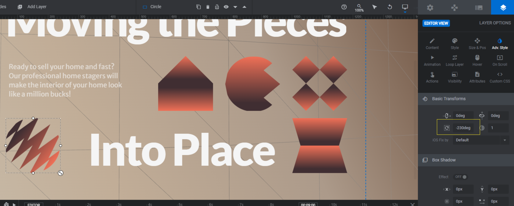
Not every geometric shape you make needs to be perfectly symmetrical. For instance, we can convert the Circle into an eye-catching squiggle shape using a different number of spikes on each side.

There are other things we can do to make our geometric design more visually engaging.
One option is to rotate your shapes. Scroll to the top of the “Adv Style” panel where you’ll find the rotation setting under Basic Transforms.
For instance, we’ve rotated our squiggle -230deg.
Something else you can do is apply hover effects to your shapes. When visitors inevitably move their cursor over one of them, they’ll probably spend some time testing out the others to see what they do (if anything).
For example, we’re going to make our diamonds spin whenever someone hovers over them. To play around with this effect, go to the “Hover” panel. Use the settings at the top to enable hover actions on desktop. Then use the settings below to spin the shapes around, change their color, make them shrink or grow, etc.
Note: If your shape has been created using numerous shape layers, select the group name (like Circles for the four small circles grouped together). Then go to “Adv Style” or “Hover to make your changes. This will make them all move in unison as opposed to individually.
Learn more:
Step 5: Update the background particle wave
Particle Wave-BG is the slow-moving geometric particle wave in the background of the slide. Because of how much is going on in the foreground, you might not need or want to do much editing.
To make changes, first locate the layer in the timeline. Then click the lock shape next to it to make it editable.
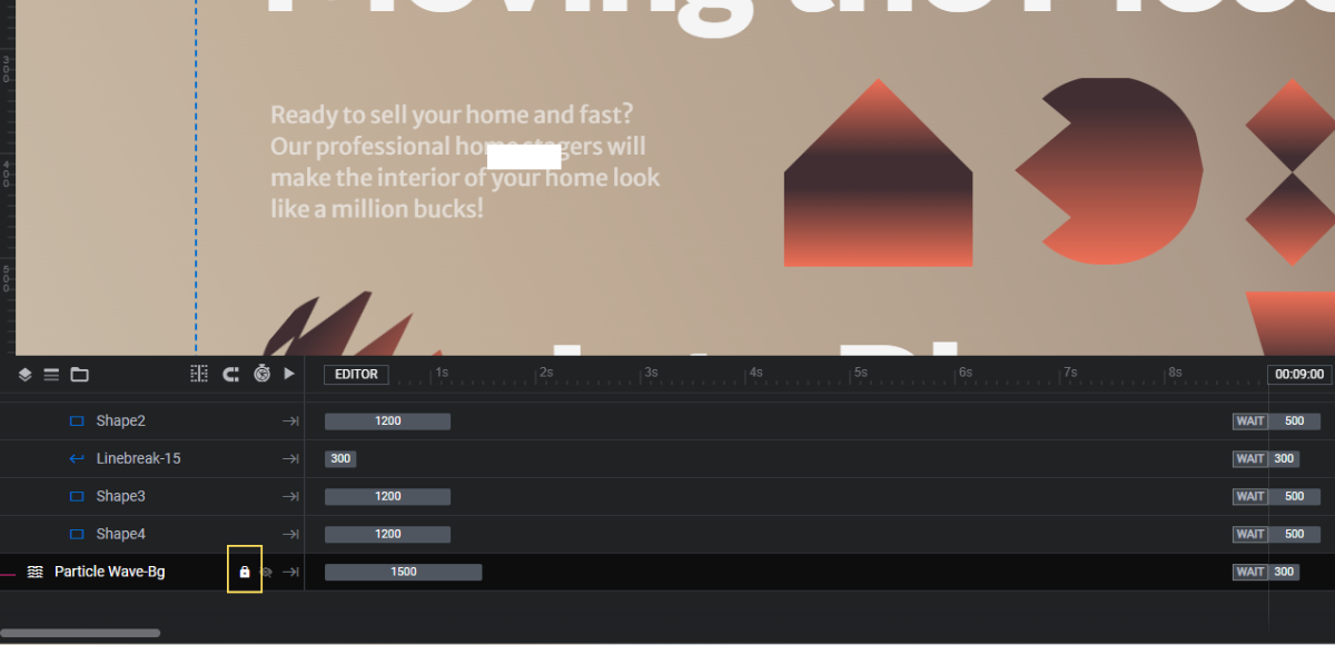
Then go to the “Particle Wave” panel on the right. From here, you can choose a different default preset or you can modify the existing Simple Light wave effect.
Using the settings, you can modify things like:
- Speed of the wave
- Curve and amplitude
- Number and size of particles
- Particle, line, and fill color or gradient
- Motion and other special effects
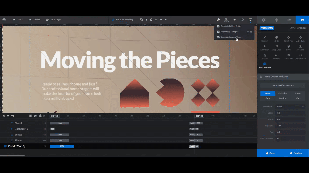
When you’re done, open the Preview and see what your particle wave looks like. Make sure to move your cursor around to see what the Motion effects look like as well.
Save your changes when you’re done editing.
Learn more:
Step 6: Remove global layers
Go to “Slides” in the top toolbar and click on Global Layers. This will open all of those layers that appear on top of the slider — the header elements as well as the navigation and social media elements at the bottom.
If you’re using your theme’s header to add a logo and navigation, you won’t need these layers. Click on the first Copy Row-25 (make sure it has the header links in it). Then hit Backspace or delete to remove it.
Within the second Copy Row-25 are various layers. If you converted this slider template into a single hero image, then you won’t need the navigation elements like the arrows or slider counter. You might not need the Instagram link either.
To delete these extraneous layers, hold down the Ctrl or command key. Then select the following:
- Prev
- Slide Counter
- Next
Hit Backspace or delete once more.
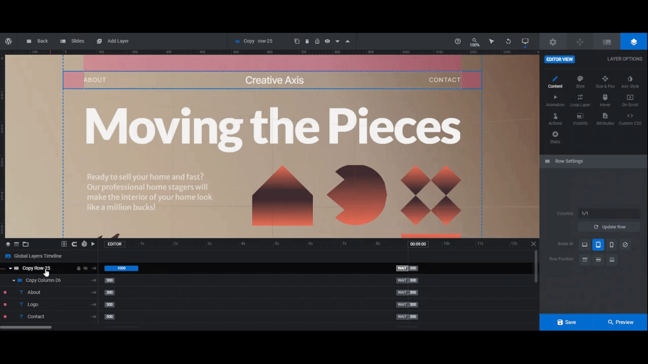
All you should be left with are the arrows and CTA button. Currently, they’re not fully centered.
To fix this, select Arrow Right and go to “Style” and “Spacings”. Change the 80px right margin to 0px.
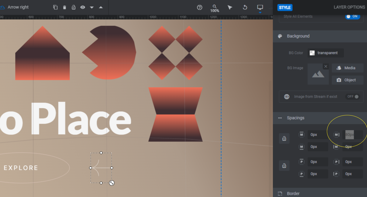
Once that’s fixed, save your changes.
Learn more:
Step 7: Customize the CTA button
What remains are two arrows pointing at an “Explore” button.
To customize the arrow designs, double-click on them in the canvas. This will open the SVG/Icon panel where you can select from a preset or upload your own design.
You can also leave the Arrow Left and Arrow Right as they are.
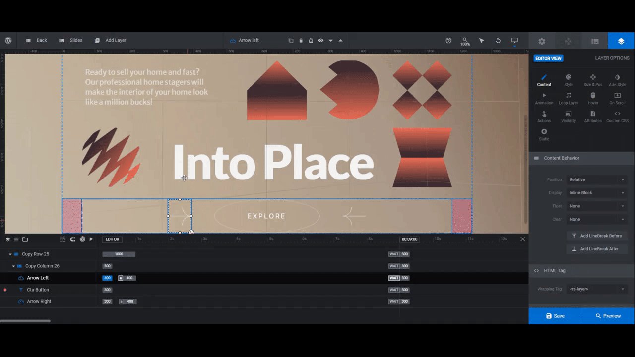
To edit the Cta-Button, go to “Content” to change the wording. Then use “Style” to modify the font, text color, background color, as well as to make other stylistic changes as needed.
You can also go to “Hover” to adjust the colors and general appearance of the button when someone hovers over it.
Lastly, open the “Actions” panel. Disregard the first four actions. Focus instead on the last Scroll Below Slider action.
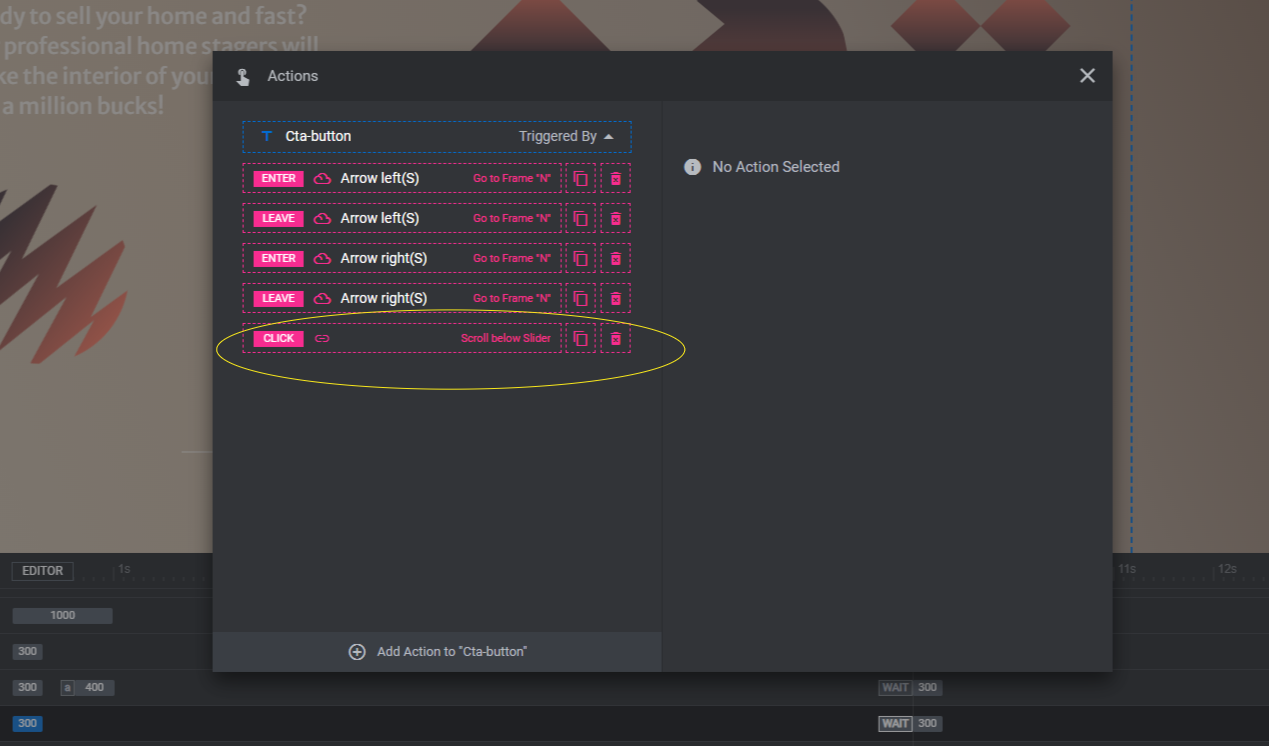
When clicked, visitors will be taken to the section below the fold and this hero section.
If you want the button to do something else — like open a new page — click the trash can icon to the right of this action. Then click Add Action to “Cta-button” in the bottom-left corner. You can add a Simple Link or choose from other actions.
When you’re done configuring your button, close the pop-up to save your changes.
Preview your work once more. When you’re satisfied with what you’ve done, use the shortcode under “Module Options” or the Slider Revolution page builder widget to embed your new hero section on the home page.
Learn more:
- Adding and Configuring Icon and SVG Layers
- Adding and Configuring Button Layers
- Editing Links in Template Modules
Get creative with geometry in design
Geometry is a useful and indispensable tool in web design. Without it, our pages would look disheveled and chaotic. But that’s not the only use for geometry. The Geometric Slider Design template proves this point. From the slow-moving wave in the background to the colorful shapes in the foreground, geometry gives us the ability to create more harmonious and engaging designs.

