
When you think of split screens in web design, you might envision a vertical scrolling layout. There’s another way to split the screen and your content in half — and it might be something your website visitors haven’t seen before.
In this tutorial, we’ll show you how to take the 50/50 Split Screen Website Design template and repurpose it for your homepage. You’ll be able to use this unique split screen layout for the hero, portfolio, or other promotional sections.
Table of Contents:
- Step 1: Update the background color
- Step 2: Reorder the slides
- Step 3: Upload the split screen background images
- Step 4: Upload the foreground images
- Step 5: Customize the text and button
- Step 6: Edit the global layers
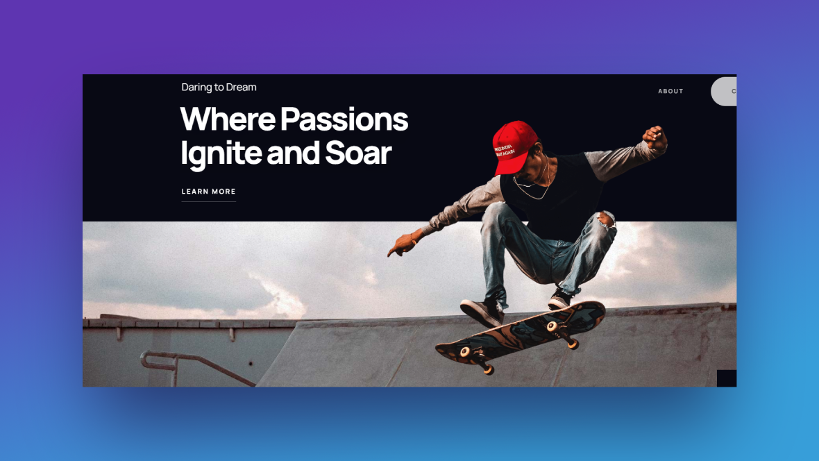
How to design a custom and surprising split screen layout
The cool thing about this template is it can be used for a variety of use cases. For example, you might use it to announce upcoming art exhibits, promote your portfolio, put a spotlight on local residents, and more.
In this tutorial, we’re going to repurpose this template for our “Visit Greenville” website. Each screen will recommend a different holiday-related event for residents and visitors to partake in.
New to Slider Revolution? Here are some quick explainers to get you started:
Step 1: Update the background color
There are two different areas in Slider Revolution where you’ll have to update the background color.
Tip: Use the same color throughout the split screen slider. That way, each screen will seamlessly flow from one to the next.
Start by going to “Module Options” and “Layout”. Scroll down to “Module Background” and click the color block next to BG Color.
You can either select one of the presets in the bottom-right corner or enter the HEX code of a different color in the Color field.
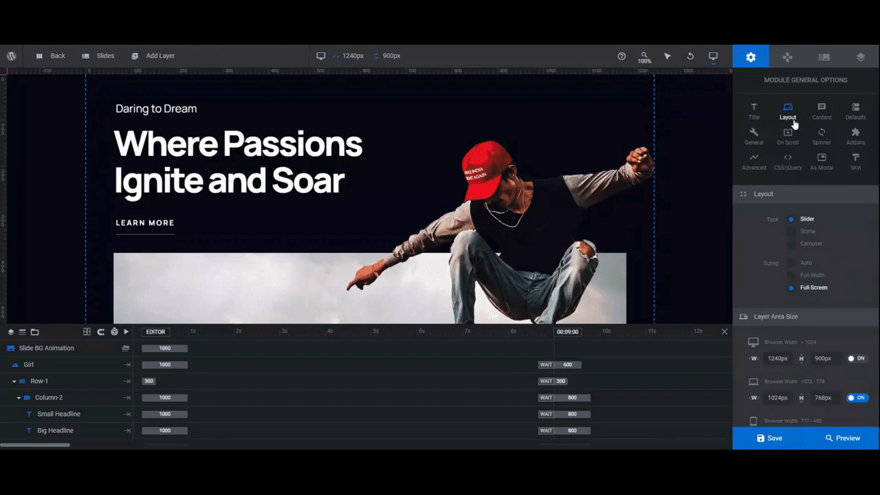
This will update the color that appears before the slider loads.
Next, go to “Slide Options” and “Background”. This will update the color in the split screen.
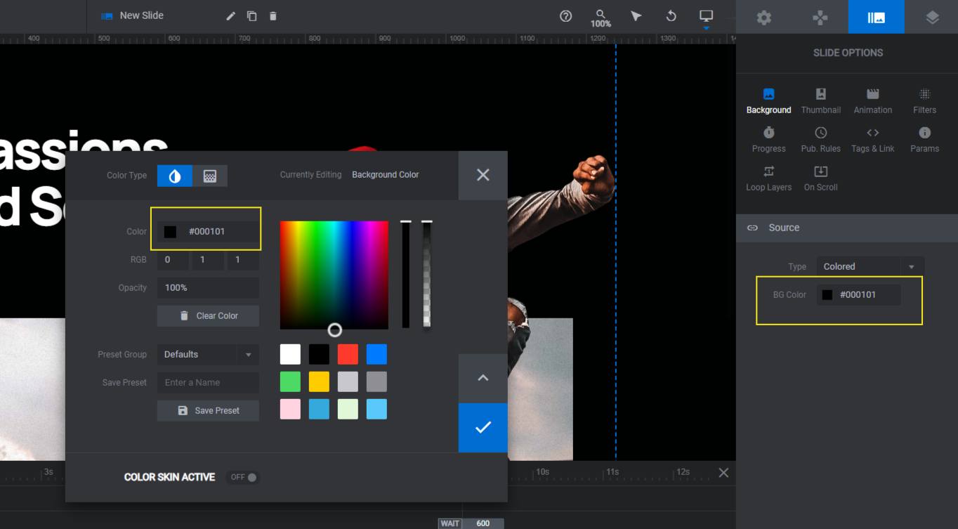
Edit the slide background color in the other slides. When you’re done, save your changes.
Learn more:
Step 2: Reorder the slides
Slides #1 and #3 have the split screen image at the bottom. Slides #2 and #4 have it at the top. If you want to change the order in which these slides appear, go to “Slides” in the top toolbar. Then drag-and-drop the slide names around until they’re in the right order.
When you’re done, save your changes.
Step 3: Upload the split screen background images
To replace the split screen images, look for the layer called Image Bg in each slide. Or you can select it directly in the canvas.
To ensure your images fit within the allotted space, make sure they’re each 1920px by 600px.
Pro tip: Finding images that fit within such a long and short space can be tricky. You also have to consider the graphic that sits on top of it. Avoid using busy or complex images. Instead, find abstract imagery, environmental panoramas, scenery close-ups, or relevant textures to fill the space.
Find and select the shape/image layer. Then go to “Layer Options” and “Content” or “Style”. You can upload the replacement image under either panel. Just look for the thumbnail and Media button.
Repeat this for the other slides.
Learn more:
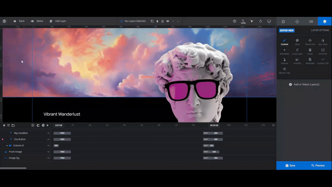
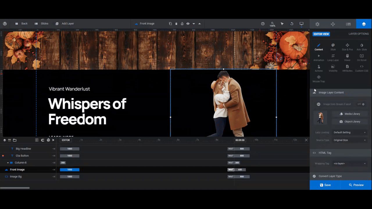
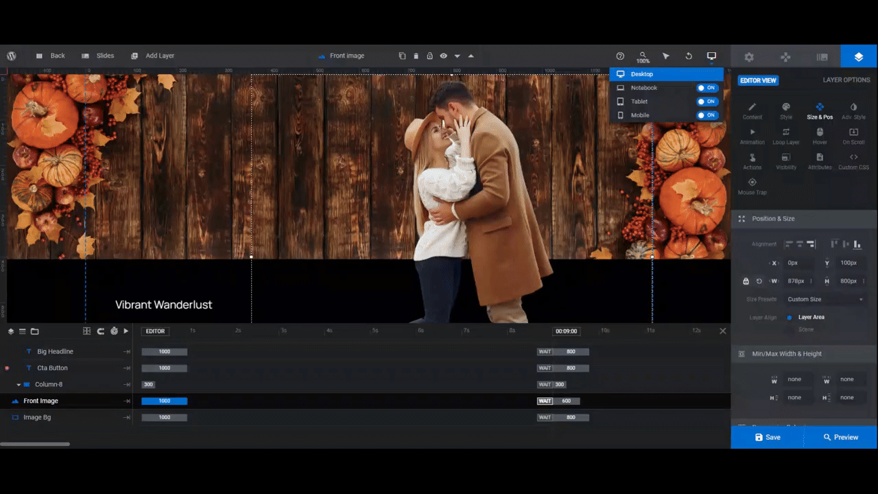
Step 4: Upload the foreground images
The name of this layer in each slide is a little different. Look for Front Image, Painter, or Girl in the timeline editor. Or just select it in the visual canvas.
The dimensions differ for each of the images as well. If you’d like your images to mirror the ones currently in the slides, here are the existing dimensions for each:
- Skater: 1000px by 911px
- Sculpture: 479px by 737px
- Floating girl: 351px by 1140px
- Graffiti artist: 417px by 897px
Another option is to set them all to the same size. For instance, we wanted all of our replacements to be more or less the same size, so we set them to 1000px by 1000px.
Once you have your images ready to go, export them with a transparent background. Then upload them to the Media Library under “Layer Options” and “Content”.
Take a look at your images in the canvas. If you’re unhappy with their size or placement, go to the “Size & Pos” panel. Use the W (width) and H (height) settings to resize and the X (horizontal) and Y (vertical) settings to reposition them.
If you make any changes, you’ll also have to do some responsive editing.
In the toolbar, use the responsive variant switcher. Go through each of the devices one at a time and edit the foreground image as needed.
Note: Any changes you make from these views apply only to these devices.
Repeat this process of uploading, resizing, and responsive editing for your other slides.
Learn more:
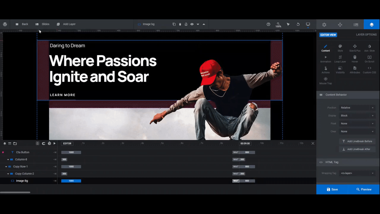
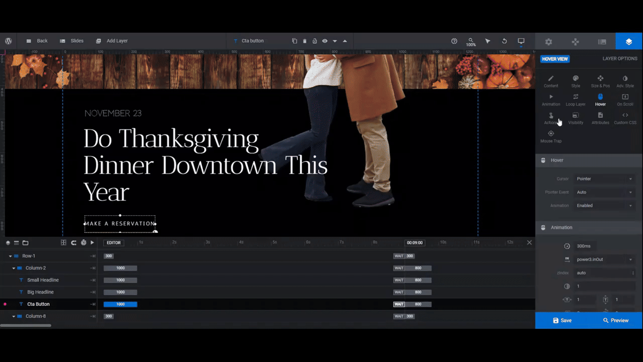
Step 5: Customize the text and button
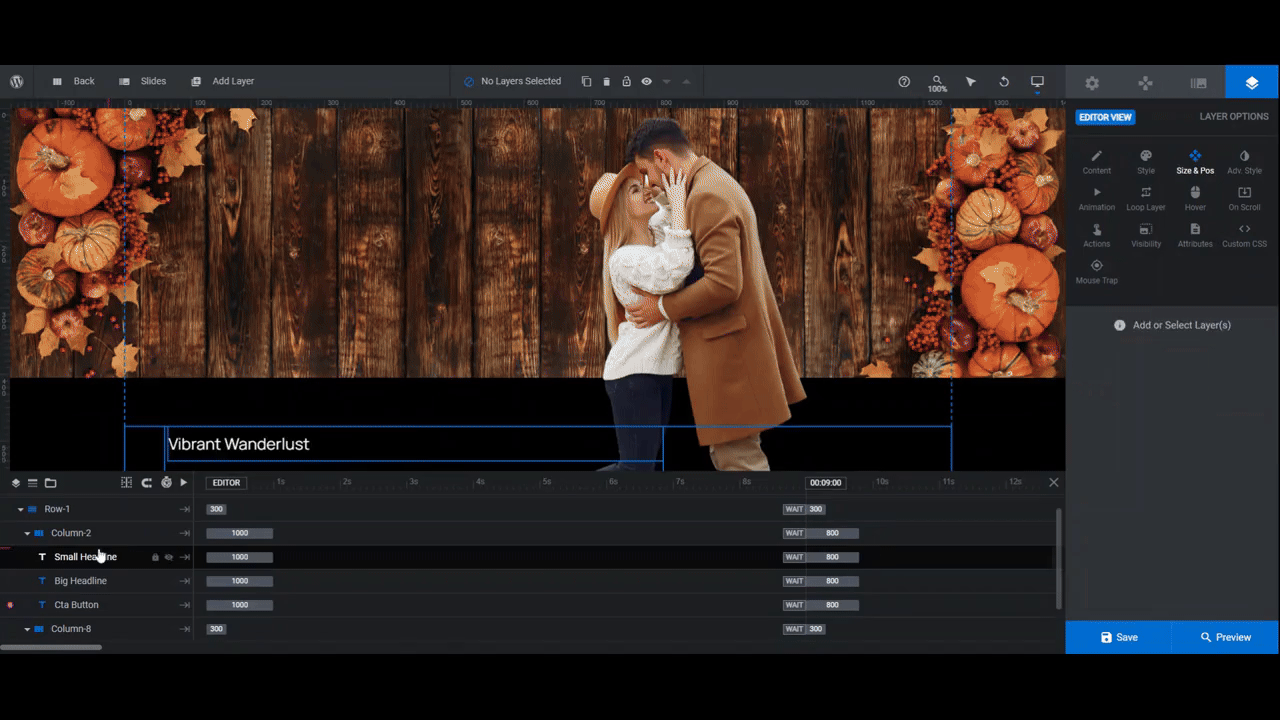
The smaller text layer at the top is called Small Headline. This is good for subheadlines, categories, dates, and other short snippets of info.
The larger text layer in the middle is called Big Headline. This can be the name of your exhibit, event, promotion, etc.
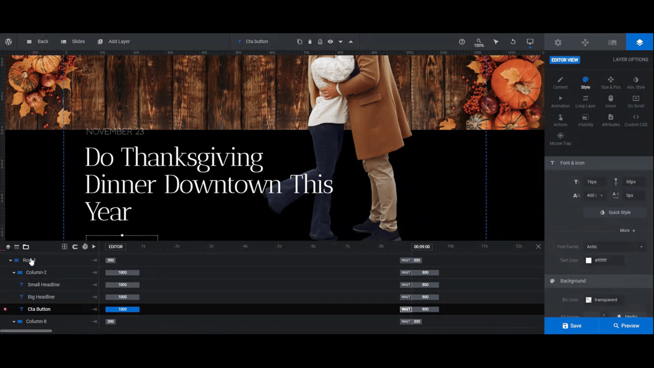
The text button layer is called Cta Button.
To edit what each of these layers says, go to “Content” settings and edit the text in the box. Then go to “Style” to change the font, color, and other styling.
If you find that your text starts to overlap with the split screen image, click on the Row-1 container in the timeline. Go to “Style” and “Spacings”. Then modify the bottom or top margin value so that it fits within the color space.
Note: If you do this, do another responsive check before moving on.
The text layers should be all set now. Now let’s focus on the button’s extra functionality.
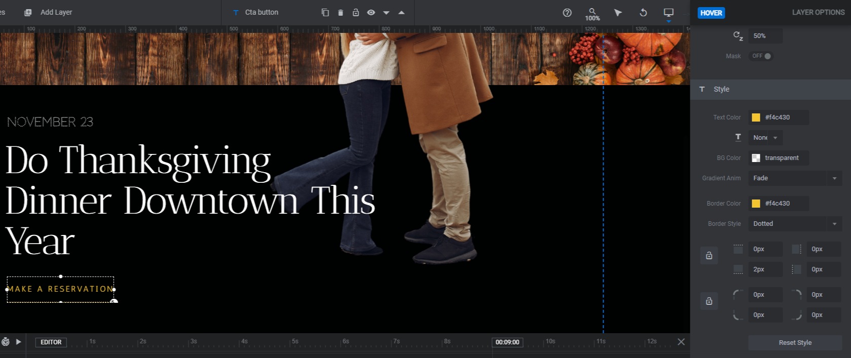
Select Cta Button and go to the “Hover” settings panel. From here, you can change the button’s appearance whenever someone hovers over it.
The last thing to do is modify the button link. Go to “Actions” and a new panel will open up. If you’re promoting different things in the slider, then you’ll probably want to swap out the action so each one has a unique link.
Currently, the buttons direct visitors to the section below the slider. To delete this action, click the trash can icon next to it. Then select Simple Link from the panel. Add the relevant details and close the panel to save your changes.
Repeat this process for all your slides.
Learn more:
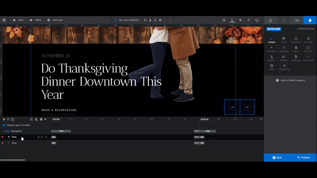
Step 6: Edit the global layers
To finish this off, go to Global Layers. You’ll find them under the “Slides” dropdown in the top toolbar.
There are two components here. Row-7 contains the header elements. Navigation contains the arrow buttons in the bottom-right corner of the screen.
If you don’t need the header, delete it. To do this, select Row-7 (or whichever individual elements you don’t need). Then hit Backspace or delete.
The Navigation arrows are currently the only form of navigation in this split screen slider. Because of the layout, it’s best to keep them and make modifications as needed.
“Content” enables you to change the arrow style. You’ll need to go into Icon to look up alternate designs and then replace the existing code with the new one.
“Style” enables you to change the color. If you’re using a lighter background color, this will come in handy.
“Hover” enables you to modify the color as well as other stylistic changes that occur when someone hovers over each navigation button.
When you’re done, save your changes and then preview your work. When the slider is ready to go, you can either embed it on your homepage using the shortcode under “Module Options” or use the Slider Revolution widget in your page builder.
Learn more:
Surprise your homepage visitors with a unique split screen design
Thanks to the split screen layout and different moving components built into it, the 50/50 Split Screen Website Design template makes for a unique and eye-catching user experience. There are so many ways to put this slider design to use on your homepage. From promoting upcoming events to sharing info about your work, this template will come in handy when you want to make a big impression on website visitors.

