

You don’t need to have a creative business or a bold brand in order to create a website design that makes your visitors go “Wow!”. So long as you don’t overdo it, and you stick to a theme that fits well with your company’s personality and mission, you can shake things up with design.
In this tutorial, we’re going to show you how to take the Urban Street Skate Slider template and create a modern slider design for a medical practice’s website.
Table of Contents:
- Step 1: Delete the video slides
- Step 2: Customize the slide background
- Step 3: Edit the module background and settings
- Step 4: Delete the layers you don’t need
- Step 5: Update the images
- Step 6: Edit the text
- Step 7: Update the button links
- Step 8: Customize the Global Layers
How to design a modern slider for a dental or medical practice
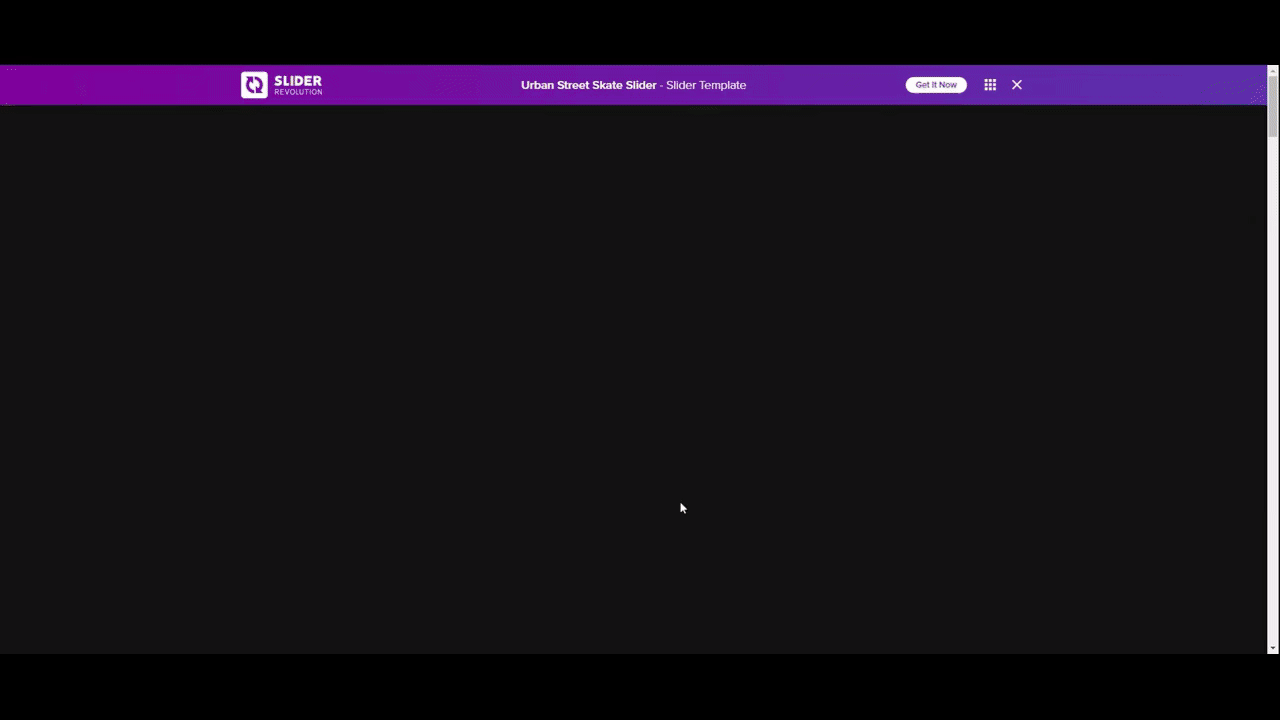
To be honest, medical practices don’t typically have the most exciting looking websites. But that doesn’t mean they have to be boring or outdated. In this tutorial, we’re going to show you how to take this exciting and modern slider design:
And use it to come up with this attractive slider for the homepage of a dentist’s website:
Here are some references to help you get started with Slider Revolution if this is your first time using the plugin:
Step 1: Delete the video slides
Go to “Slides” in the top toolbar and you’ll find 12 slides there (you have to scroll down to see them all). Six of them are regular slides that you see when scrolling through the slider on the frontend. The other six are video pop-up slides that appear when someone clicks the “Watch Video” call-to-action buttons.
In a later step, we’ll be converting the button actions to simple links, so we don’t need these video slides. If you’d like to remove them as well, hover over each of the video slides and click the trash can icon that appears to the right of them.
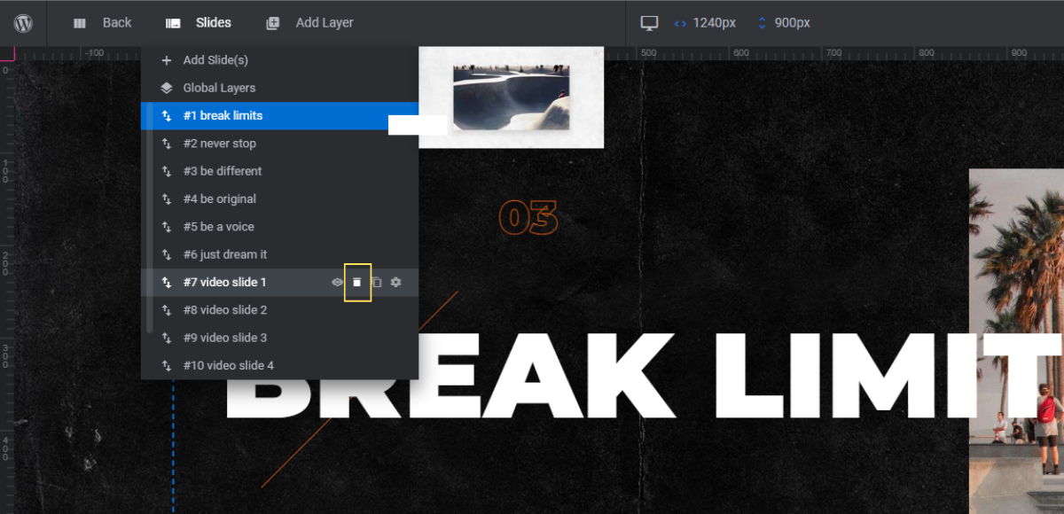
When you’re done, you’ll be left with six slides.
Note: If you don’t have enough content for six (regular) slides or don’t want that many in your slider, you can delete some of the regular slides. Just be careful about which ones you delete. Start by deleting the last slides and make sure you’re left with an even number of them in the end. We’ll demonstrate why this is important in a later step.
Learn more:
Step 2: Customize the slide background
Each slide currently has a gritty, grunge-inspired black background image. You can replace the image with a different textured background image if you’d like. Another option is to use color.
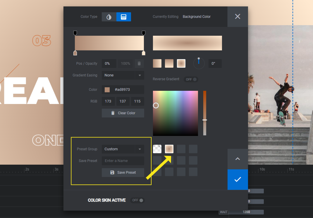
To switch to a color background, go to “Slide Options” and “Background”. Click the dropdown and select the Colored option. Then open the color selection dialogue to apply the new color or gradient.
To use a gradient, click the corresponding tab in the top-left. You can choose a preset gradient from the options in the bottom-right corner or use the settings at the top to create your own.
In many cases, medical and dental websites are drenched in blue color. Instead, we’re going to apply a neutral gradient to the background to offset all the blue-accented imagery we’re going to use.
Note: If you’re going to use the same custom color or gradient in each slide, save it as a preset for easy retrieval. In the color selection dialogue, go down to “Preset Group” and set it to Custom. Enter a name for it in the “Save Preset” field. Then click the Save Preset button.
When you’re done, save your changes. Then update the rest of the slide backgrounds.
Learn more:
Step 3: Edit the module background and settings
The module background is the one that visitors see as the slider loads. It doesn’t appear for very long. However, if you want it to seamlessly blend with your slide backgrounds, you can adjust it as well.
To do this, go to “Module Options” and “Layout”. Scroll down to the “Module Background” section. Click the color block to edit it.
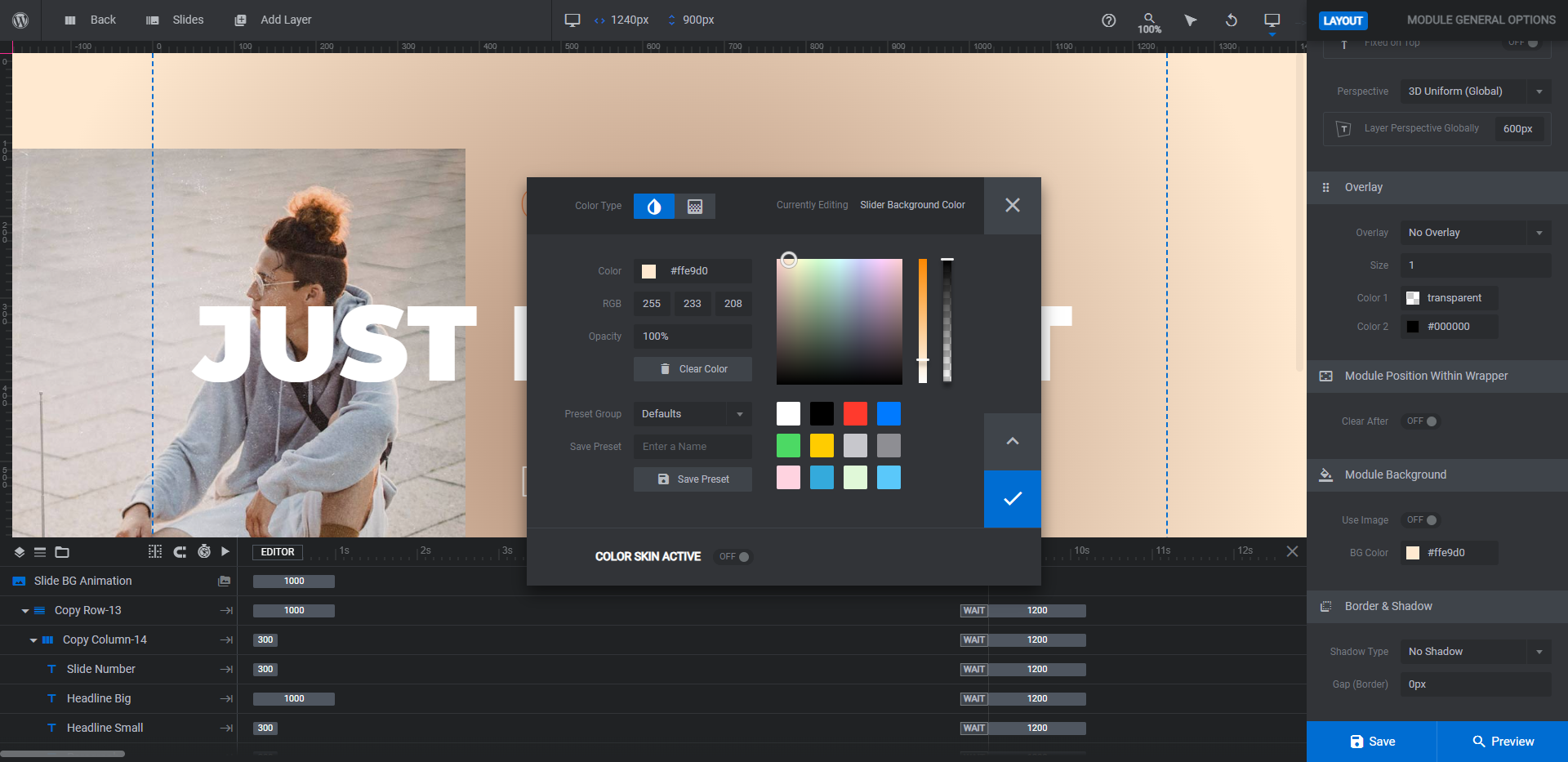
Although we used a gradient in our slides, we’re going to apply a solid color to the background of the module. It’s the lighter of the two colors used on the outer edges of our gradient.
One other thing you might want to edit in terms of the module is the parallax setting. It’s what makes the text and images move back and forth as the user’s cursor moves.
To edit or disable this setting, go to the “On Scroll” tab.
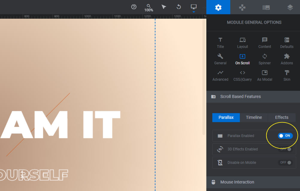
For a skater site, the movement fits well with the theme. For our dental practice, though, it will probably be too much. To disable this setting on your end as well, switch the Parallax Enabled toggle to OFF.
Learn more:
Step 4: Delete the layers you don’t need
Because we’re designing this slider for a more conservative company, we need to tame it down a bit. The color change helps. We’re also going to remove extraneous elements.
To delete the Slide Number and Orange-Line layers, click on them in the timeline editor at the bottom. (You can select them at the same time by holding down the Ctrl or command key). Then hit Backspace or delete.
Repeat this process for all slides.
Learn more:
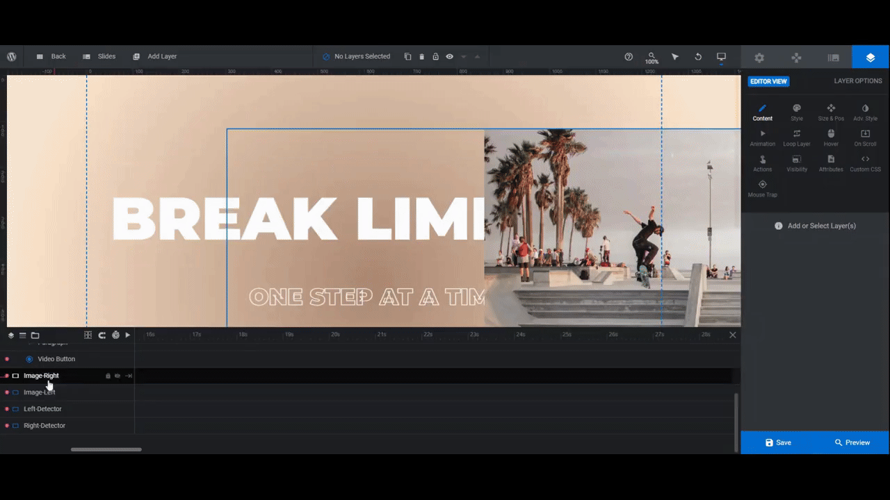
Step 5: Update the images
The slider template looks like it’s chock full of images, doesn’t it? In reality, there are only six images used to design the entire thing.
If you didn’t spot it the first time, watch what happens to the images on the right side of each slide as you scroll through. The rest of the image slides into place on the left side of the next screen.
You don’t need to configure this setting yourself as it’s already done for you. What you need to do, however, is to find images that look good when cut in half. There should be something visually interesting about both sides. At the very least, they should tell a story as each half is revealed.
You’ll need the following image sizes:
- Three (3) 1920px by 1080px files for the larger images
- Three (3) 1400px by 788px files for the smaller images
To upload the images, select the Image-Left and Image-Right layers from the timeline editor. (If you try to select them in the canvas, you might accidentally select the Detector layers.) Then go to “Layer Options” and upload the replacement under “Content” or “Style”.
When uploading the images, make sure to upload the same image to the left side of the slide as you did to the right side of the previous slide. Here’s how it will look:
Save your changes when you’re done.
Learn more:
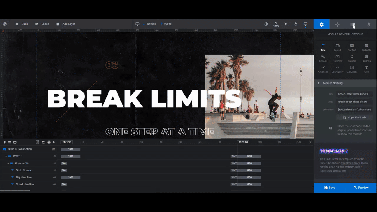
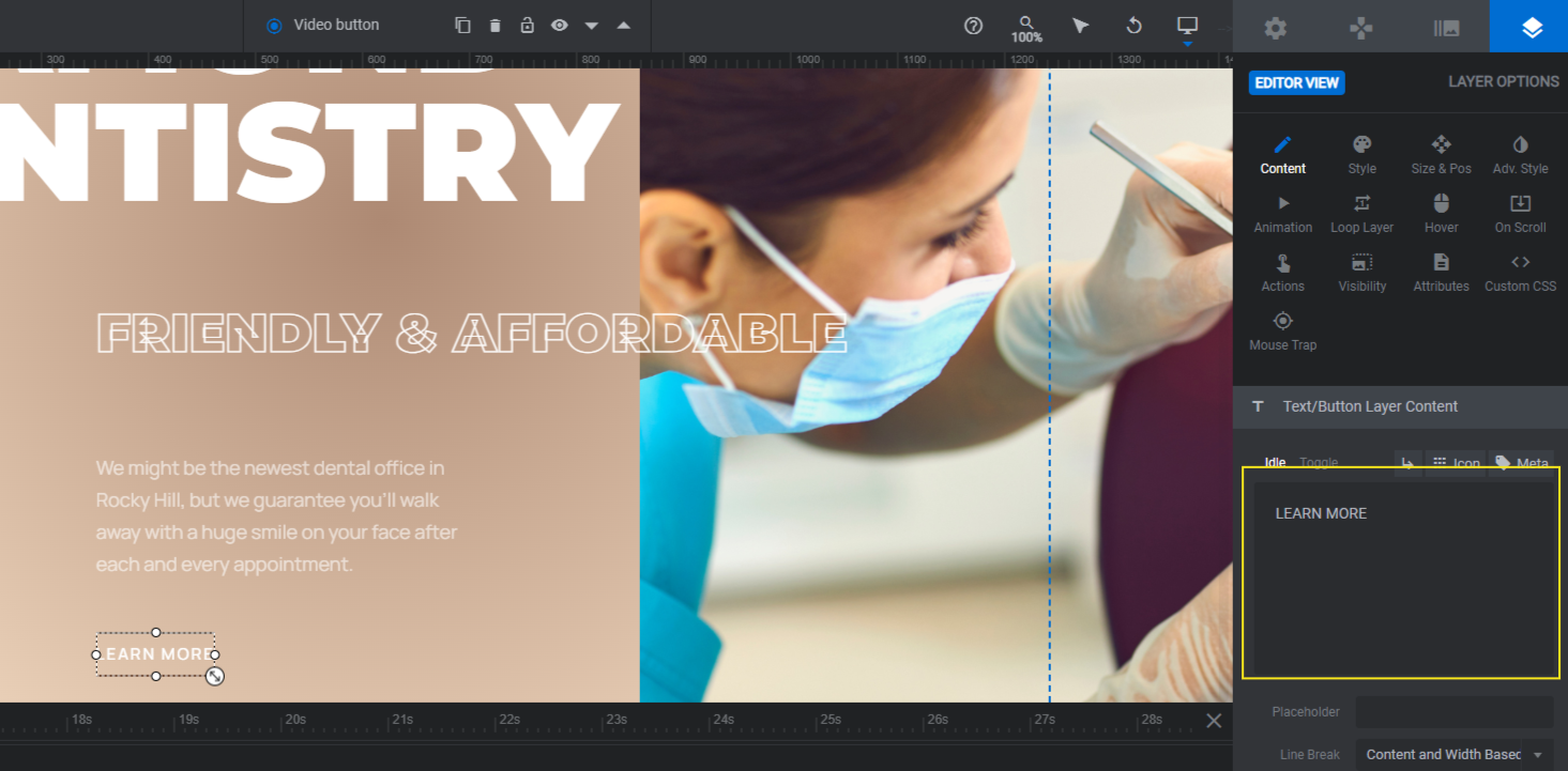
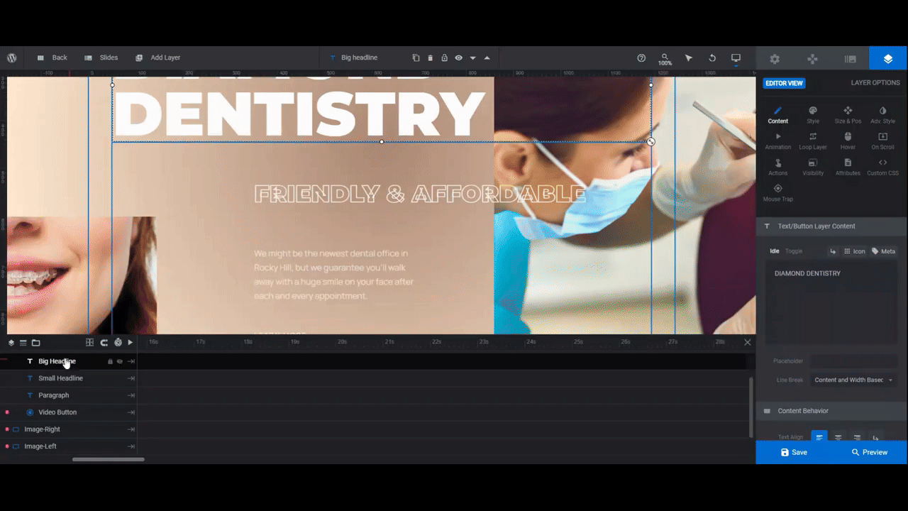
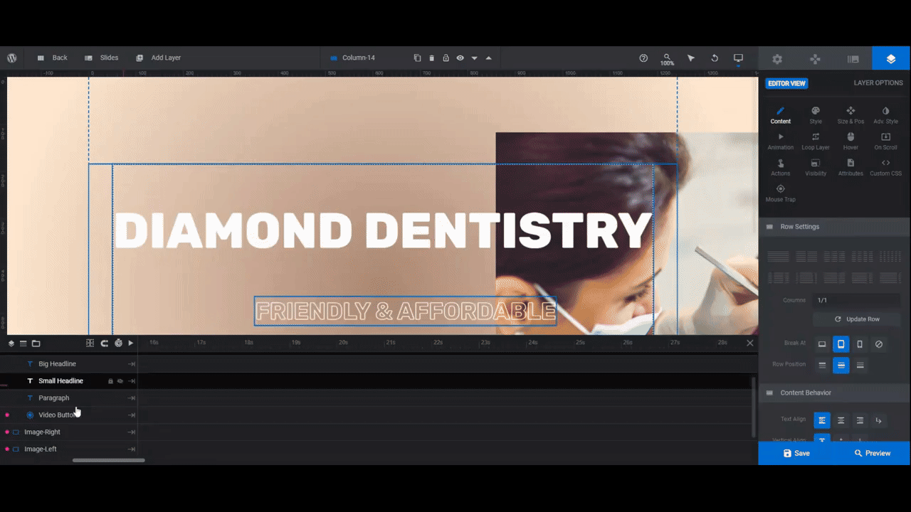
Step 6: Edit the text
There are three text layers and one button layer to customize:
- Big Headline is the bold headline at the top.
- Small Headline is the lined subheadline in the middle.
- Paragraph is the lighter paragraph text below.
- Video Button is the “Watch Video” text link.
To edit what each layer says, go to “Layer Options” and “Content”. Swap out the text in each box.
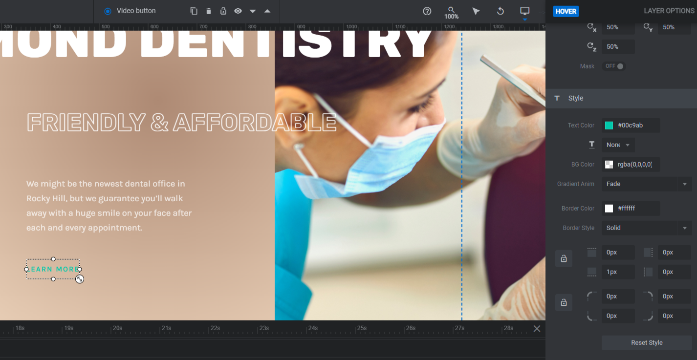
Next, go to “Style” to edit the font, weight, and color of each layer of text. If you want to make more drastic changes to the button’s appearance — like changing the underline/border color — you can do that from this panel as well.
Note: If you’d like to do away with the outline appearance of the Small Headline, go to “Adv Style” and disable the Text Stroke setting.
If you modified the look of the button in this step, the last thing to do is open the “Hover” panel. You can adjust the appearance of the button, including its color, using the settings down below.
When you’re done, go through each slide and apply the same stylistic settings to your text layers. Save your changes after you finish.
Learn more:
Step 7: Update the button links
If you’re planning to add pop-up videos to the buttons in your slider design, now is the time to go through and edit your video slides. If you’re going to convert those buttons to regular hyperlinks, follow along with the rest of this step.
Click on the Video Button layer and go to “Actions”. Remove the existing actions by clicking the trash can icon to the right of each. Then click the Simple Link option on the right. Fill in the details and close the screen to save your changes.
Do this for the other slides, pointing each a link to a different internal page.
Learn more:
Step 8: Customize the Global Layers
Go to “Slides” in the top toolbar and click on Global Layers. This screen is where you’ll edit the layers that sit on top of the slider.
Let’s start with the header row at the top of the slider. It contains a logo, navigation links, along with social media icons.
If you’d like to keep these components, edit them using the same “Layer Options” settings as you did the other layers in this tutorial.
To remove them, locate the group layer called Row-1. Click on it and hit Backspace or delete. This will remove the header entirely.
The fullscreen menu that appears when someone clicks the hamburger menu icon remains though. To remove it as well, you have to first unlock it.
Find the Menu layer in the timeline editor. Click the crossed-out eyeball icon to the right of it to open it up to editing and make it visible in the canvas.
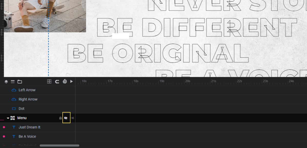
You can now hit the Backspace or delete key to remove it.
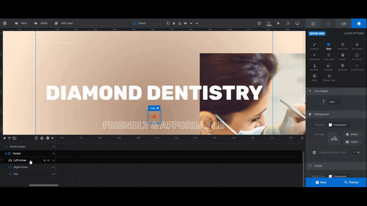
The layers that remain are what create the custom cursor and navigation arrows in this slider design. You shouldn’t need to do much in this step except to change the accent color of each layer to the same accent color you used for your button.
Navigation Hint is a text-based hint that appears on smaller screens. If you need to lighten or darken the text, make this change under “Style”.
For Left Arrow, Right Arrow, and Dot, go to “Style” and apply your accent color to the relevant settings.
When you’re done, preview your changes on the frontend and make sure you’re happy with how the slider turned out. You can embed the finished slider into your homepage using the shortcode under “Module Options” or you can do it with the Slider Revolution page builder widget.
Learn more:
Create a modern-looking slider design that the competition can’t beat
Want your dental or medical practice website to stand out? Then give it a professional touch with this modern slider design. No advanced coding or design skills are needed. All you have to do is install the Urban Street Skate Slider template and customize the colors, text, and images.

