

The web’s always evolving, right? A few years back, you’d see sites cramped with info, tiny images tucked in corners, and navigations that felt like you were solving a Rubik’s cube. Today, the full width slider has turned the tables. They’ve become the rockstars of modern web design, with full-blown images stretching edge to edge, text overlaying them, and fluid motions guiding users.
What’s the big deal? Well, these sliders provide users with a visual experience like no other. It’s almost cinematic. Imagine you’re watching a movie trailer: in mere seconds, you get the gist, the emotion, the excitement. That’s what a full width slider does for websites. It’s a quick, dynamic glimpse into what the site offers.
What’s Behind The Trend?
Ever wonder why they’re becoming so common? It’s not just because they’re fancy or slick (though, they are). It’s mainly because:
- Less is more: With full width sliders, the focus is on a few key messages or images, eliminating distractions. A user isn’t bombarded; they’re drawn in.
- Visual stories: Humans are visual creatures. We prefer stories over long paragraphs of text. A full width slider tells a story, visually. It’s compelling, evocative, and persuasive.
- Responsive by design: In a world swarming with devices of all sizes, these sliders are inherently designed to adapt, maintaining their aesthetics and function.
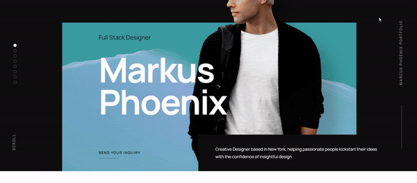
What is a Full Width Slider?

A full width slider is basically a design element that slides. Duh, right? But here’s the catch: it’s not just any slider; it’s one that takes up the full width of your screen or browser window.
Think of your favorite superhero stretching from one side of a city to the other. That’s the kind of visual dominance we’re talking about.
Primary Features
- Screen Dominance: This isn’t your tiny carousel in the corner. It’s a big statement piece.
- Dynamic Content: Slides can contain images, videos, text, you name it. It’s a visual buffet!
- Automatic or Manual Slide: Some sliders move on their own, while others wait for a little nudge from you. Kind of like my cat when she’s hungry.
Benefits for Websites
Visual Engagement
First things first, it’s drop-dead gorgeous. When you have a full width slider showcasing your top-notch images or essential messages, it’s like putting your best foot forward in a dance-off. People can’t help but stare.
Navigation Efficiency
Ever got lost on a website? Yeah, it’s a nightmare. With these sliders, you can guide visitors through your content, like holding their hand through a digital journey.
Highlighting Key Content
Want to show off that killer product or highlight a crucial piece of info? Put it in the slider! It’s like yelling, “Hey, look over here!” but in a classy way.
Popular Use Cases
So, where might you see one of these babies in the wild?
E-commerce websites

These sites are selling stuff, right?
And what better way to entice shoppers than with some swanky visuals of the latest and greatest products?
From snazzy sneakers to the newest tech gadgets, a full width slider showcases them in all their glory.
Portfolio sites
Artists, photographers, web designers (wink, wink) – we love to show off our work. And these sliders? They’re like our digital galleries.
News and magazine sites

In a world where attention spans are shorter than a goldfish’s memory, news sites use full width sliders to give snippets of the hottest stories, drawing readers in like moths to a flame.
Alright, now that we’ve taken a whirlwind tour through the fundamentals of the full width slider, next time you’re surfing the web and you see one, give a little nod. Know that behind that simple slide is a world of strategy, creativity, and design magic.
Designing Impactful Full Width Sliders

Alright, pals, it’s showtime! You’ve heard the hype about the full width slider. You’re like, “I get it! They’re rad.”
But now, let’s get our hands dirty and chat about how to design these bad boys. Because, let’s face it, while they’re super cool, a poorly designed slider is like a pizza without cheese. Pointless.
When you’re cooking up a full width slider, there are some must-follow principles. Kind of like the secret sauce in your grandma’s famous recipe.
Clarity and Simplicity
Overloading a full width slider with too much stuff is a rookie mistake. Trust me, I’ve been there. It’s tempting to throw everything in, but remember, less is often more.
Make sure each slide has one clear message or focal point. It’s kind of like dating; you don’t want to spill all your secrets on the first date.
Consistent Branding
Imagine wearing a tuxedo with flip-flops. Doesn’t fit, right? Similarly, every slide in your slider should scream ‘YOU!’ Or, well, your brand. Colors, fonts, styles – keep it consistent.
Mobile Responsiveness
People aren’t just sitting at desktops anymore.
They’re on their phones, tablets, smart fridges—okay, maybe not the fridge. But you get the point.
Make sure your slider looks dapper on all devices. Squished images or cut-off text? Big no-no.
Best Practices
Alright, getting into the real meat and potatoes here. If you’re taking notes, now’s the time to grab that highlighter.
Limiting the Number of Slides
Three? Four? Twenty? Nah, just kidding about the twenty. Aim for a handful of slides. Remember, attention spans nowadays?
Yeah, they’re super short. Don’t make people wait for the main event.
Optimal Image Quality
Pixelated images are a total buzzkill. Use crisp, high-quality visuals, but also keep an eye on load times.
A full width slider that takes ages to load is like waiting forever for that sneeze that never comes.
Thoughtful Transitions
Slide transitions can be fun, but don’t get too carried away. A simple fade or a swipe usually does the trick.
Avoid those wild spinning or zig-zag effects. This isn’t a 90s PowerPoint presentation, after all.
Common Mistakes to Avoid
Yep, even pros goof up sometimes. But, hey, that’s how we learn. Here are some pitfalls you should dodge when crafting your full width slider.
Overloading with Information
Remember our chat about clarity? Stick to it. One core message per slide, please. It’s not a contest to see how much you can cram in.
Poor Image Scaling
Nothing screams amateur hour like a stretched or squished image. Respect the proportions. Treat your visuals like the crown jewels they are.
Ignoring User Controls
Ever been stuck on a slide you don’t care about? It’s frustrating. Give users some control, like arrows or pause buttons. Let them navigate the slider at their own pace.
Wrapping this section up, designing a stellar full width slider is a mix of art and science. It’s about understanding your audience, being in sync with your brand, and always, always keeping the user experience in mind. It’s like baking – follow the recipe, add a sprinkle of creativity, and voilà! You’ve got yourself a showstopper.
The Best Tool to Create Full Width Sliders: Slider Revolution
Ever wondered what’s in a web designer’s toolkit?
Among the swanky brushes, quirky fonts, and zillions of color palettes, there’s one name that pops out when it comes to crafting epic full width sliders: Slider Revolution. No, it’s not a new dance move. Let’s dive in and spill some tea on this.
Slider Revolution is not just any tool; it’s the tool. It’s like if you gave a paintbrush to Picasso or a guitar to Hendrix. Pure magic!
Diverse Functionalities
You want a simple fade transition? Got it. How about some layered animations with 3D parallax effects?
Done.
Slider Revolution is more versatile than my favorite multi-pocket backpack.
Drag-and-Drop Editor
Oh boy, this is the real MVP feature. No more fumbling around with crazy code. Just drag, drop, slide, and bam!
Your full width slider is ready to rock and roll. It’s like playing with digital LEGO.
Responsive Designs
Remember when we talked about mobile responsiveness? Slider Revolution has got your back.
Your sliders will look stunning on a smartphone, tablet, or whatever screen size aliens might use.
Some Cool Features to Play Around With
Let’s peek behind the curtain and see what tricks Slider Revolution has up its sleeve.
Hero Modules
Want to make a big splash right at the start? Hero modules let you create that striking first impression. Think of them as the headline act at a concert.
Multimedia Content
Images are great, but what about videos? Or maybe a sound clip? Yup, you can embed all of that. It’s like turning your full width slider into a multimedia jukebox.
Visual Adjustments
You can play around with colors, gradients, overlays, and shadows. It’s like having a mini Photoshop built right into the tool.
Interactive Elements
Add buttons, call-to-actions, or even interactive hotspots. It’s a digital playground where your audience doesn’t just watch; they engage!
The Community and Resources
Having a great tool is one thing. But what if you hit a roadblock? Enter the Slider Revolution community.
Knowledge Base
Got a query? There’s a good chance someone else had it too. Dive into the rich knowledge base and get answers, tips, and tricks.
Templates Galore
Need some inspo? There’s a treasure trove of templates waiting for you. Pick one, tweak it, and set the digital stage on fire.
Regular Updates
The digital world is ever-evolving, just like fashion. What was trendy last year (looking at you, neon pants) might be outdated now. Slider Revolution stays ahead of the curve with regular feature updates.
Wrapping it up, when it comes to crafting a smashing full width slider, Slider Revolution is like the Swiss Army knife in a web designer’s pocket. Whether you’re a newbie starting out or a seasoned pro looking for more bells and whistles, this tool has got everything to turn your vision into a digital masterpiece.
FAQ on Full Width Sliders
What’s a Full Width Slider Anyway?
Oh, that’s an easy one to start with. A full-width slider is a design feature that spreads across the entire width of your user’s screen. It’s pretty popular on websites, showcasing images or content, sliding from one item to the next. Gives a website that real modern look, don’t you think?
How Do You Add One of These to a Website?
Ah, adding one of these bad boys? You’ll find different ways, depending on the platform you’re using. For WordPress folks, there’s a whole bunch of plugins. If you’re into coding, HTML, CSS, and a sprinkle of JavaScript can make this magic happen. No sweat!
Can I Customize the Content Inside?
Customize it? You bet! These sliders aren’t just for pretty pictures. You can throw in text, videos, links, or whatever tickles your fancy. It’s your website, so make it sing your tune.
Is It Mobile-Friendly?
Most of the time, yeah! Modern sliders are designed to look good on smartphones and tablets. You might need to check some settings or do some extra fiddling to make sure it’s perfect. But hey, that’s what makes web design fun, right?
What If It’s Not Sliding Properly?
Ugh, that’s a headache. But don’t worry! It could be a bunch of things like a JavaScript conflict or some CSS going haywire. Play around with the settings, check the code, or hit up a forum. There’s a fix out there somewhere.
Does It Slow Down the Website?
That’s a good one! It can slow things down if it’s too heavy, especially with high-res images or complex animations. So, keep an eye on that. Optimize images and keep things lean. Your visitors will thank you.
Can I Add as Many Slides as I Want?
Well, technically, yeah, but think about your users here. Too many slides, and they might lose interest or get lost. A handful of slides, each with a strong message, that’s where it’s at!
How Much Does It Cost to Use a Full Width Slider?
Cost? Well, that depends. Some plugins or themes might be free, others might have a price tag. If you’re doing it all by hand, the cost is your time and energy. So, choose wisely!
Is It Good for SEO?
SEO, huh? Tricky. A slider can be okay for SEO if done right. Don’t overload it with images, use proper alt tags, and make sure it’s not hiding valuable content. Keep Google happy, and you’ll be fine.
Can I Make It Without Coding Skills?
Sure thing! You don’t have to be a code wizard for this. Plenty of tools and plugins out there are drag-and-drop. Pick one that suits your style and get sliding! It’s web design for the rest of us. Cool, right?
Conclusion on Full Width Sliders
Here’s the deal.
The full width slider is like that cool kid at a party. It grabs attention, tells rad stories, and makes sites pop! Imagine a buffet, but instead of food, you’ve got visuals sliding smoothly across your screen. Delicious, right?
Why’s it a big deal?
Well, it’s simple. Sliders mean:
- More Eyeballs: Because who doesn’t pause at something shiny?
- Epic Stories: One slide, two slide, red slide, blue slide. It’s a narrative, peeps!
- Standing Out: In a sea of ‘meh’ sites, be the narwhal with a slider.
In a nutshell, the full width slider has shaken the web design world like a pinata. And trust me, there’s plenty of good stuff spilling out. The future’s looking bright, and sliders are riding shotgun.
If you liked this article about full width sliders, you should check out this article about something better than Master Slider.
There are also similar articles discussing a plugin beyond RoyalSlider, a MetaSlider alternative, a Soliloquy slider alternative, and a slider better than Flickity.
And let’s not forget about articles on a TinySlider alternative, news sliders, vertical sliders, and CSS sliders.

