
Retro designs are neat for a number of reasons. For starters, there’s a good chance they’ll stand out in whatever market you’re in since most brands opt for modern design trends. Retro designs also tend to elicit a positive reaction as they harken back to the good ol’ days.
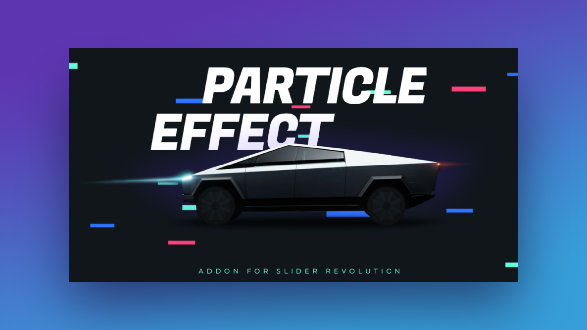
While you can choose photographs or videos that look retro-like in appearance and style, we have another way for you to create a retro-inspired design for your home page. Using the Particle Effect Template, you’ll be able to create a totally custom and interactive hero section for your site.
Table of Contents:
- Step 1: Replace the main image
- Step 2: Edit the text
- Step 3: Add a button
- Step 4: Customize the particle effects
- Step 5: Do responsive editing
How to create a retro-inspired design for your home page
As you’ll see in the tutorial below, it doesn’t take much to turn a modern, cyber-inspired hero section like the one in the Particle Effect 2 template into a retro-inspired design.
Whether you sell a hi-tech product, run a quirky establishment, or have retro-inspired branding, this template will be a fun one to play around with. In this tutorial, we’ll show you how to repurpose it for a video arcade’s website.
If this is your first time using Slider Revolution and have questions about the editor, start here:
Step 1: Replace the main image
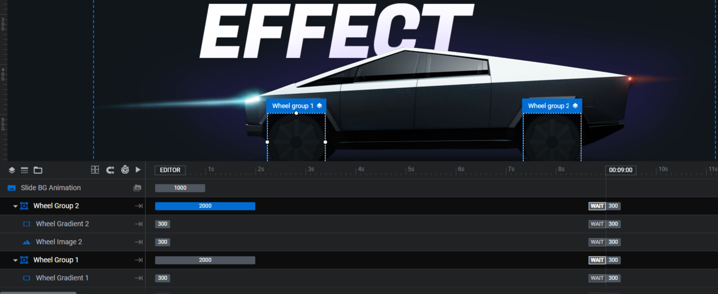
There are various layers in this template that make up the car with the spinning wheels.
Car Image is the main graphic. That’s the one we’ll be editing.
Wheel Group 1 and Wheel Group 2 consist of a spinning Wheel Image and Wheel Gradient each. Unless you’re planning to keep the existing car graphic or replace it with one of your own, you won’t need these layers.
The easiest way to delete them is to hold down the Ctrl or command key, then select Wheel Group 1 and Wheel Group 2. Hit Backspace or delete and it will remove all of the wheel components at once.
To edit the Car Image, select it in the canvas or timeline. Then go to “Layer Options” and “Content” to upload your graphic to the media library.
Note: If you want to add an image that has similar dimensions as the car, the original graphic is 1389px by 411px. Try to keep yours around the same size so that it neatly fits between the text layers. If you’d prefer to add one that’s taller (like ours), we’ve sized ours to 800px by 1200px.
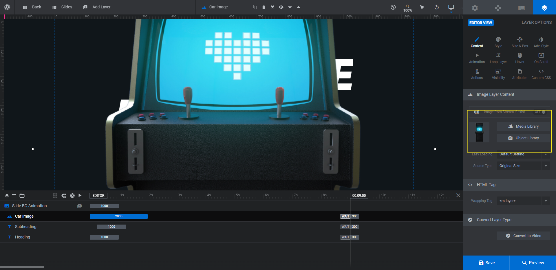
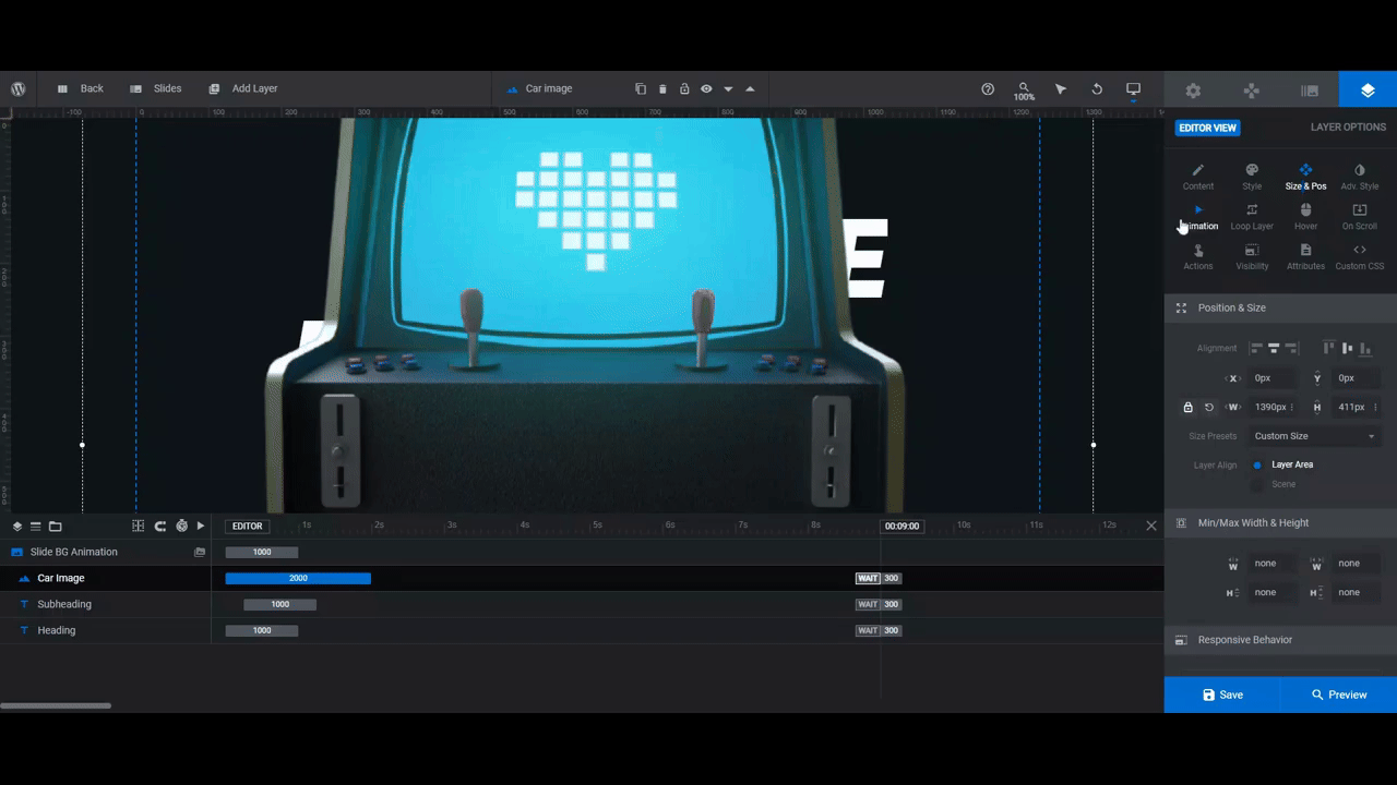
Because our image isn’t the same size as the original, we’re going to need to modify both its size and placement. To do the same on your end, go to the “Size & Pos” settings.
Modify the general alignment of the layer using the Alignment settings. To be more precise in where the Car Image is placed, use X to move it left and right and Y to move it up and down.
Then use W to change the width of the image if it needs resizing.
Now, if your image covers any of the text, you’ll need to reposition it in another way. To move the Car Image layer behind the text layers, go to the timeline editor at the bottom.
Drag-and-drop the layer to the bottom of the list of layers to position it behind the text. The lower a layer appears in the list, the further back it goes in terms of spatial layering.
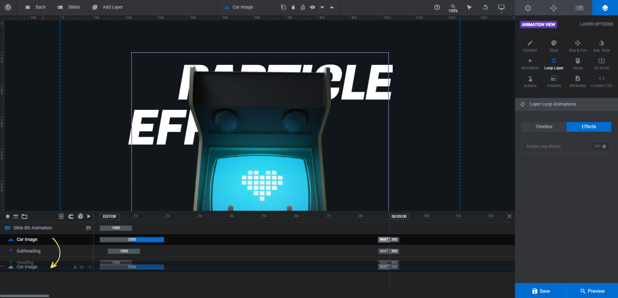
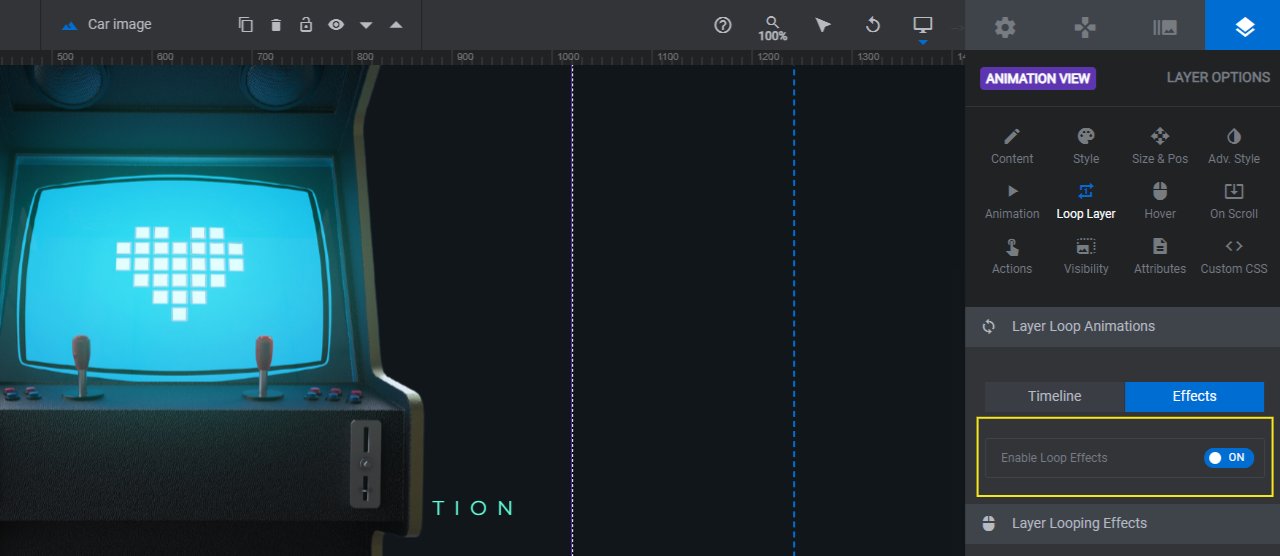
Next, we’re going to disable the yoyo effect that gently moves the car around when someone moves their cursor. While it works well for the car concept, we want our arcade console to stay put.
If you’d like to turn this setting off, go to “Loop Layer” settings and click on the Effects tab. Click the toggle to disable the loop effects.
Preview your work on the frontend. If you’re happy with how it looks, move to the next step.
Learn more:
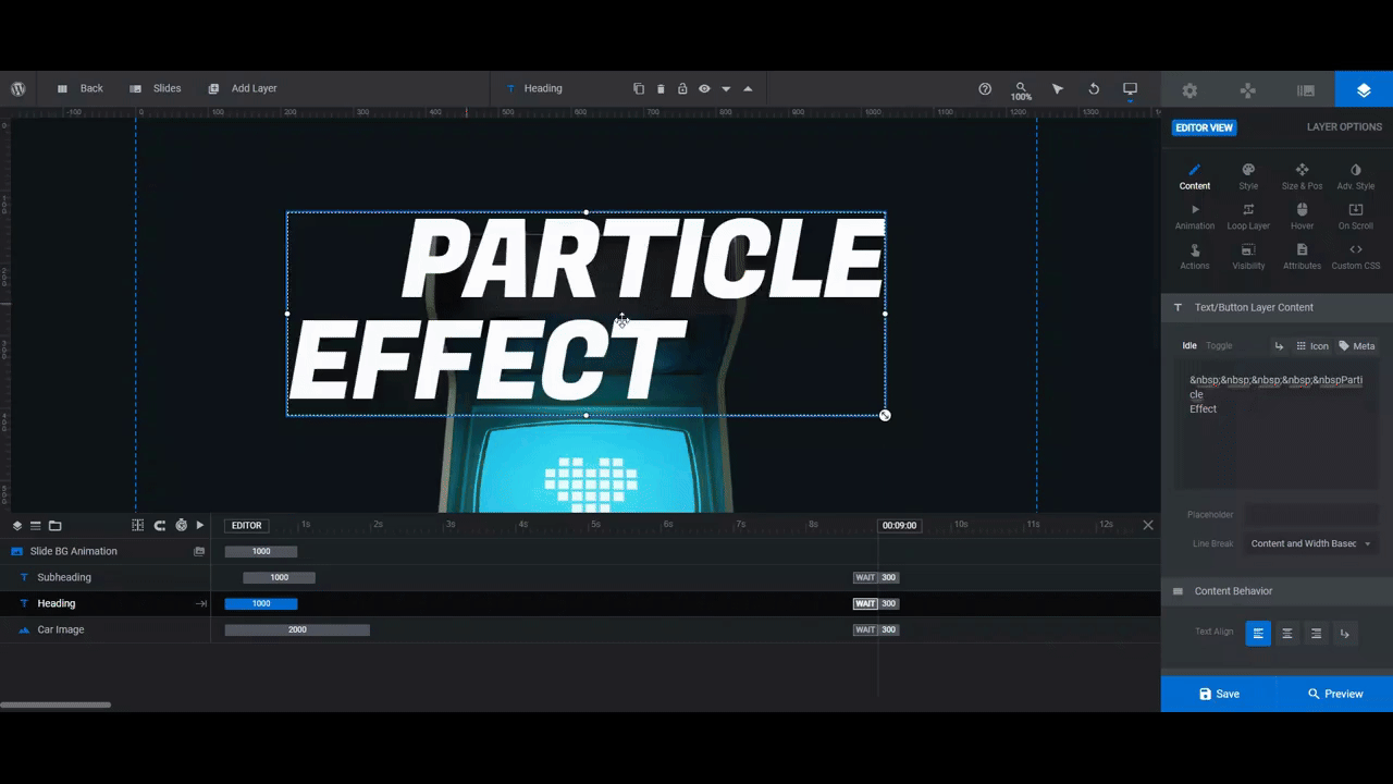
Step 2: Edit the text
We have two text layers to edit. The big text at the top is the Heading and the smaller text at the bottom is the Subheading.
Let’s start with some basic editing. To update what the text says, go to “Layer Options” and “Content”.
Note: In order to preserve the indented, double-lined styling of the Heading, you’ll need to do a couple of things. First, keep the following code in the text box:  . This is what indents the first line.
Then, to force your headline to the next line, you can either hit Enter, click the return-arrow key above the text editor box, or type <br /> at the breaking point.
To change the fonts, colors, and styling of the text, use the settings under “Style”.
If you’re not following the same format of the original template, you may also need to modify the positioning of these text layers.
For instance, the Subheading layer slightly pulls to the right. To center it, go to “Size & Pos”. Next to Alignment, click the horizontal-center option. Another option is to enter 0px in the X field.
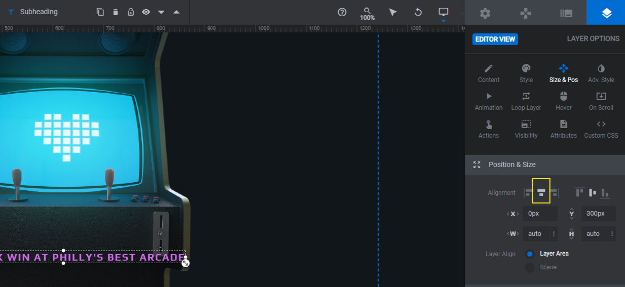
If you want to move these layers up and down in the canvas, use the X and Y settings to do so. Save your changes when you’re done.
Learn more:
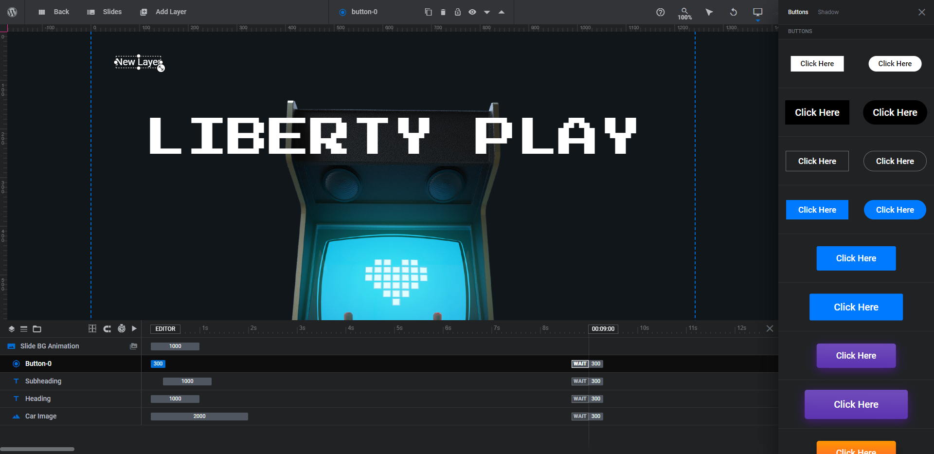
Step 3: Add a button
The interactivity of this retro-inspired design is neat. However, we want visitors to do more than just make particles repel away from their cursor.
To add a button, go to “Add Layer” in the top toolbar and select Button. A new layer will be added to the canvas while a sidebar of premade styles will open on the right. Choose the button design and hover style that’s closest to the one you want to use.
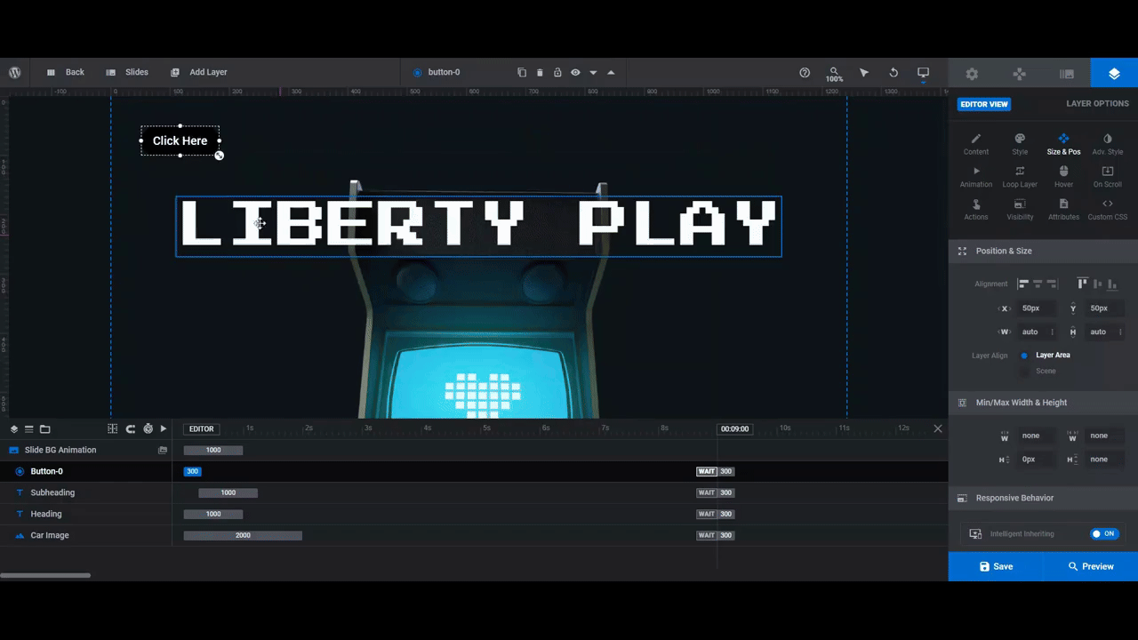
To move the button into place, click on it in the canvas and drag it to more or less where you want it to appear. Then use the “Size & Pos” Alignment, X, and Y settings to perfect its placement.
Next you can modify the style of the button similar to what you did for your text layers.
- Use “Content” to change what the text says.
- Use “Style” to customize the font, button color, borders, and more.
- Use “Size & Pos” to make further customizations to the size or placement.
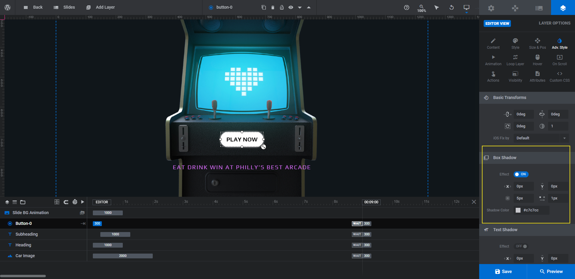
We’re going to do a bit more to modify this button.
First, we’re going to go to “Adv Style” to add a glowing effect using the Box Shadow tool. To do this, enable the setting. Update the color and modify the other settings to your liking.
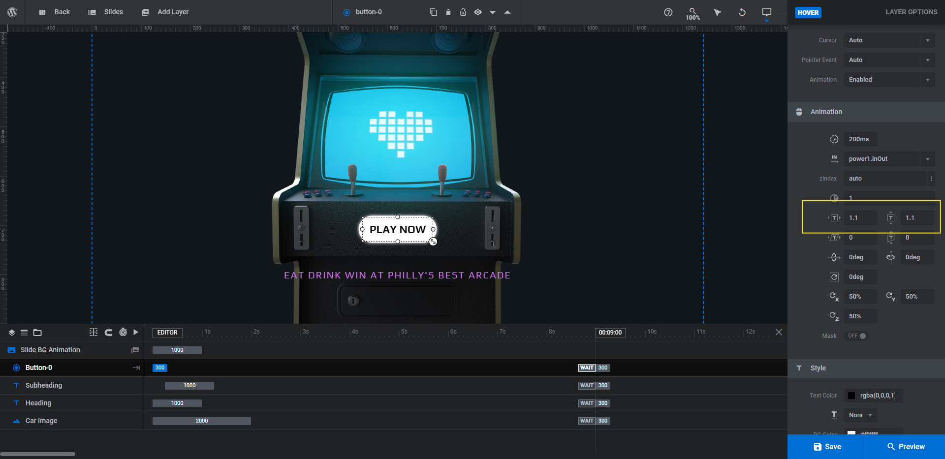
Next we’re going to update the hover effect.
Go to “Hover” settings and scroll down. We’re going to leave everything under Style as is. What we’re going to change is how much the button grows in size. You’ll find this setting under the Animation section.
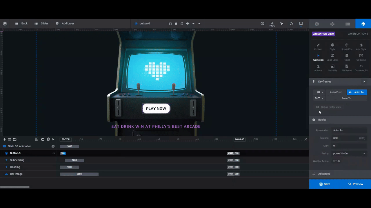
Next, we’re going to play around with the regular “Animation” settings.
Go to the tab and scroll down to the Basics section. We want the button to appear a short while after everything else has loaded and the visitor has had a chance to play around with the particle effects.
To set this up, change the Start value to 3000 (milliseconds or 3 seconds). Then change the Easing to slow.
The last thing to do is to program the button.
Go to “Actions”. If you want to point visitors to a different page, choose the Simple Link option. If you want the click to instantly scroll visitors below the fold or to another position on the home page, select the Scroll Below Slider or Scroll to ID option.
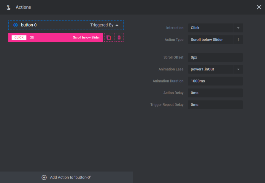
Fill in all the relevant details. Then close the pop-up to save your changes.
Learn more:
- Adding and Configuring Button Layers
- The Fundamentals of Animation in Slider Revolution
- Editing Links in Template Modules
Step 4: Customize the particle effects
To locate the background particle effects, go to “Slide Options” and “Particle Eff”.
The effect as it stands now has a retro-ish vibe to it. Rather than try to recreate it on your own, use the settings down below to customize it.
Particles allows you to set the shape, number, size, and variation of particles that appear at any given time.
Style allows you to change the colors, opacity, and borders.
Movement allows you to configure the particle speed, direction, and bounce.
Interactivity allows you to decide what happens when someone hovers over the particles (if anything).
Pulse is not currently activated, but you can set this to make your particles pulse.
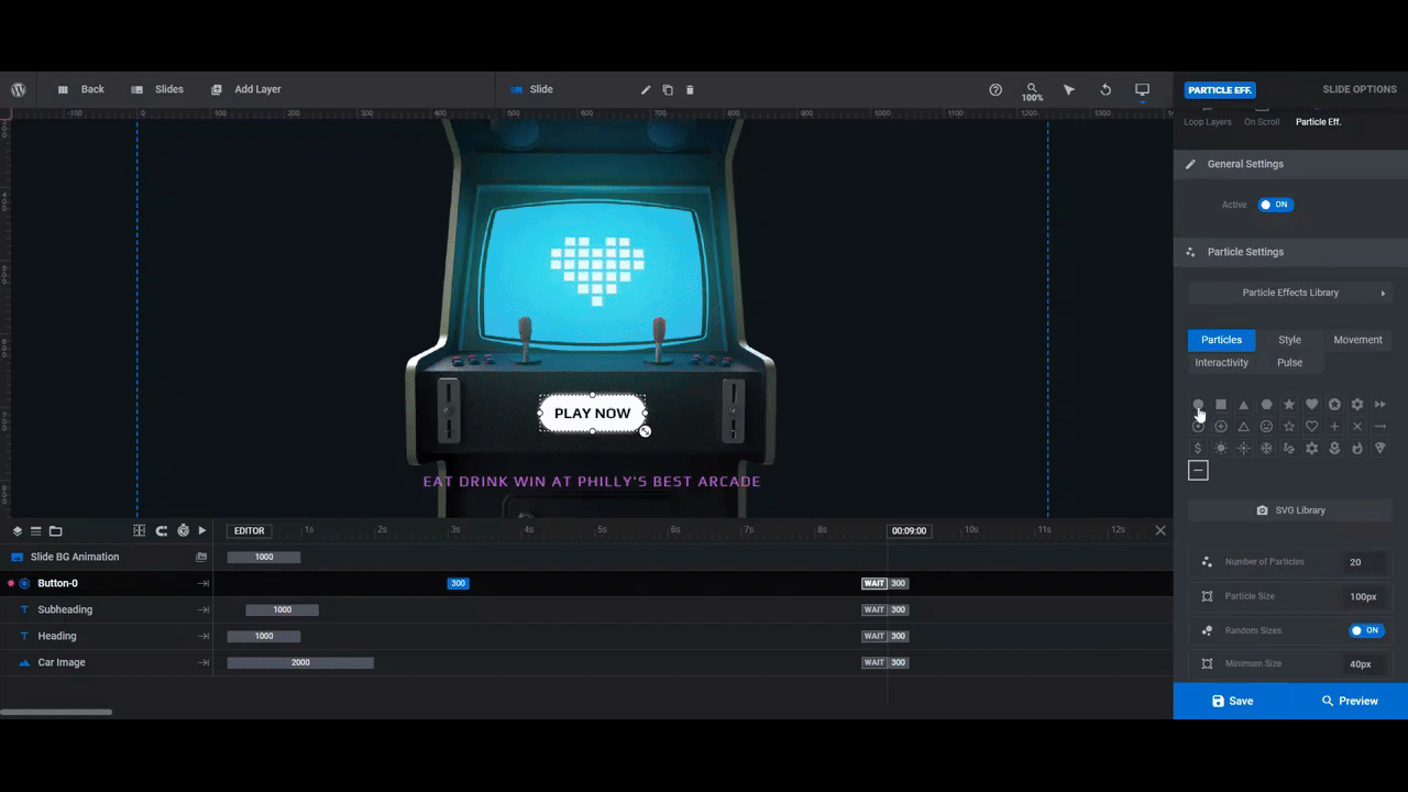
Check the Preview from time to time. This will allow you to see how your modifications play out on the frontend.
Learn more:
Step 5: Do responsive editing
The last thing we need to do is a responsive check. Since our hero section has been heavily edited, it could have disrupted its appearance on smaller devices.
To check, go to the variant switcher in the top toolbar and open the Mobile view.
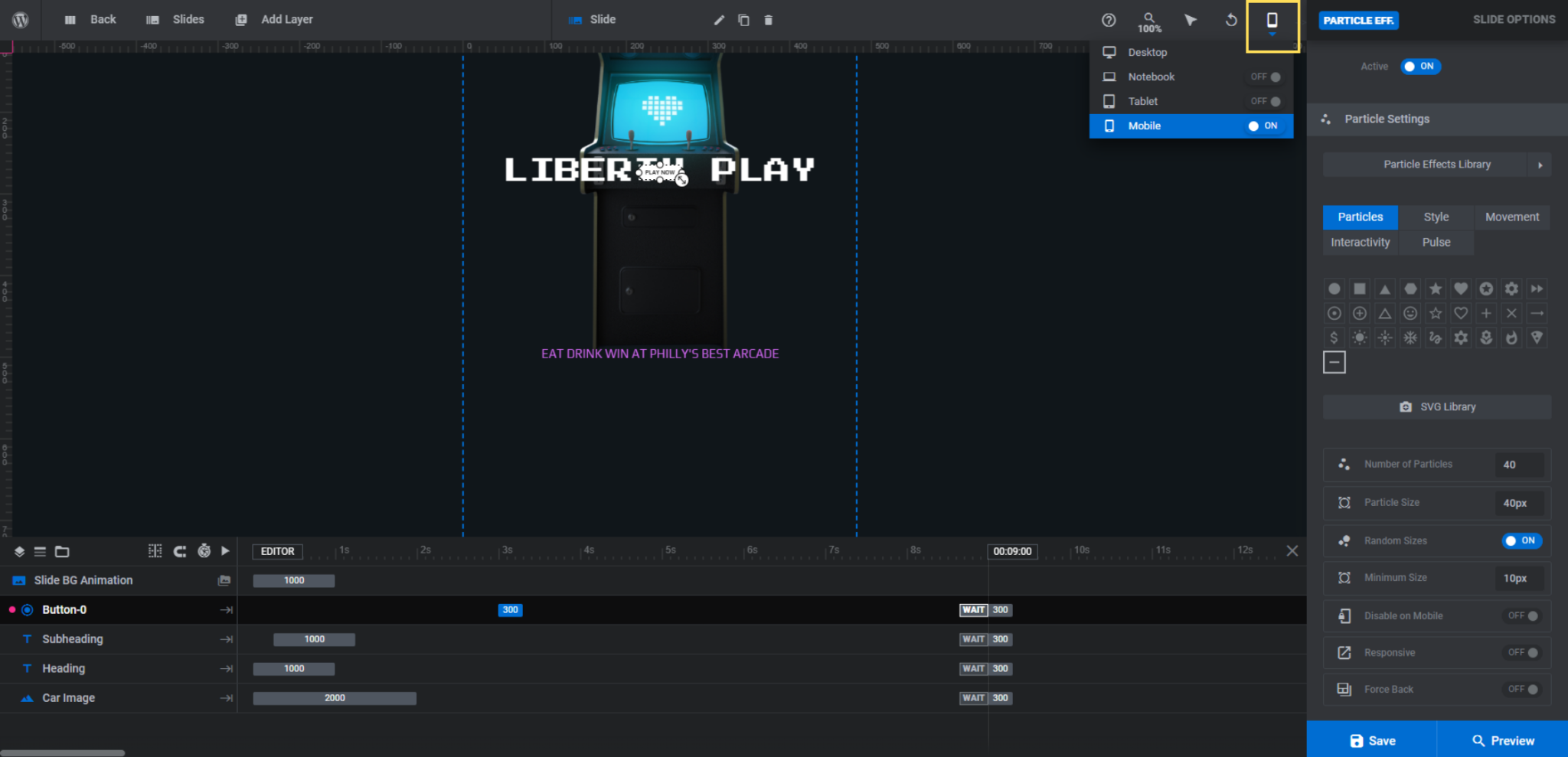
Go through and edit as much as you need to using the relevant “Layer Options” settings. Any changes you make here will only apply to the mobile design.
Check the frontend preview as well. You’ll be able to toggle between the different devices to see how the finished design looks.
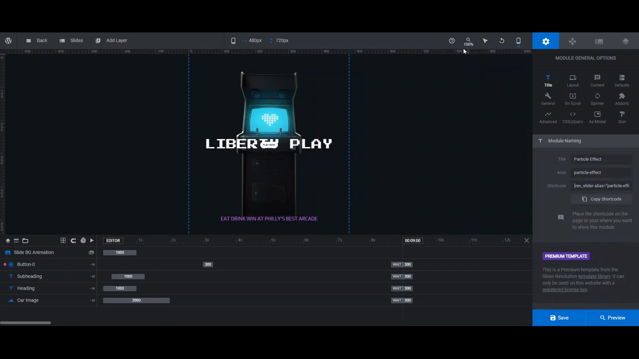
When you’re happy with what you’ve done, save your changes. You can then grab the embeddable shortcode from under “Module Options” and add the new hero section to your home page. Alternatively, you can use the Slider Revolution widget in your page builder to embed the section in the page.
Learn more:
Design your own custom, interactive, retro hero section with ease
Want website visitors to enter your site and immediately get excited about your business? Create a hero section that looks unlike anything your competition could ever dream of coming up with.
Start by installing the Cyber Particle Effect template. Then follow the steps above to put your own unique spin on this retro-inspired design.

