
When you have new content to promote on your website, you want to get as many eyeballs on it as possible. The hero section on the home page is the perfect place to shine a spotlight on this latest content and work.
In this tutorial, we’re going to show you how to build a colorful hero design to promote content of all different types using the Art Gallery Slider template.
Table of Contents:
- Step 1: Delete any slide designs you don’t need
- Step 2: Upload your images
- Step 3: Change the slide background colors
- Step 4: Customize the shape colors
- Step 5: Update the text layers
- Step 6: Move the image layer to the front
- Step 7: Edit the navigation elements
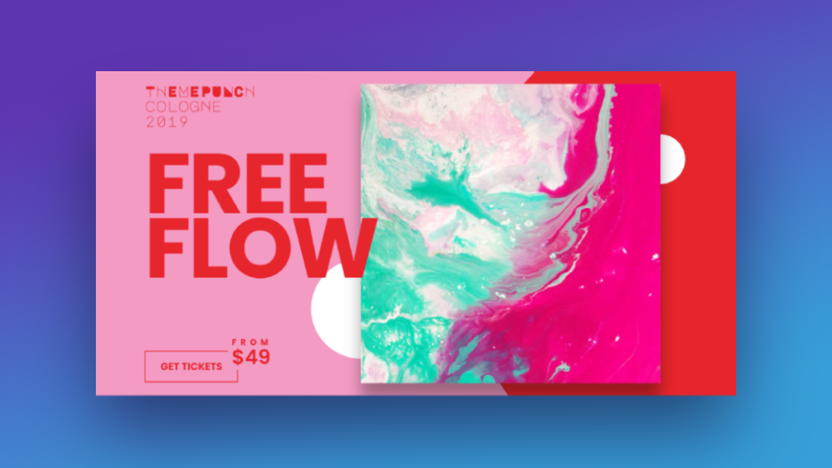
How to create a colorful hero design that beautifully promotes your content
The Art Gallery Slider template gives us just one way to use this colorful hero slider design — to promote an upcoming art show.
In this tutorial, we’re going to show you how to repurpose this template in order to promote your latest content. It could be for blog posts, new stories published to a literary journal, or the latest editions of your magazine.
Here are some quick-start references to check out if you’re new to Slider Revolution:
Step 1: Delete any slide designs you don’t need
There are four different slide designs included in the template. You can do a number of things with them.
You can delete all but the one layout you like and then duplicate it so your slider has a uniform design. Another option is to preserve the different layouts. If there are any layouts you don’t like, just delete those slides.
Since Slide #1 doesn’t have a background shape like the others, we’re going to delete that one. Then we’ll keep the other three to give our hero section a more intriguing and unpredictable look from slide to slide.
To delete slides, go to the “Slides” menu in the top admin bar. Hover over the slide number you want to delete and click the trash can icon that appears to the right of it:
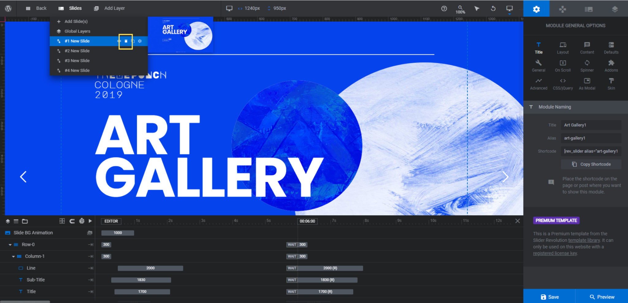
Save your changes when you’re done.
Learn more:
Step 2: Upload your images
There’s a single image in each slide. The shapes and positioning vary a bit in each though. Again, you’ll want to consider if you want to give your images a consistent look as you promote your content from slide to slide or make them vary.
While we’re going to make the designs differ in each, we’re going to set up each image the same way. Here’s how to do the same:
First, upload your new images in place of the existing ones. Look for the Image layer in the timeline editor at the bottom. Then go to “Layer Options” and “Content” to upload the new image to the Media Library.
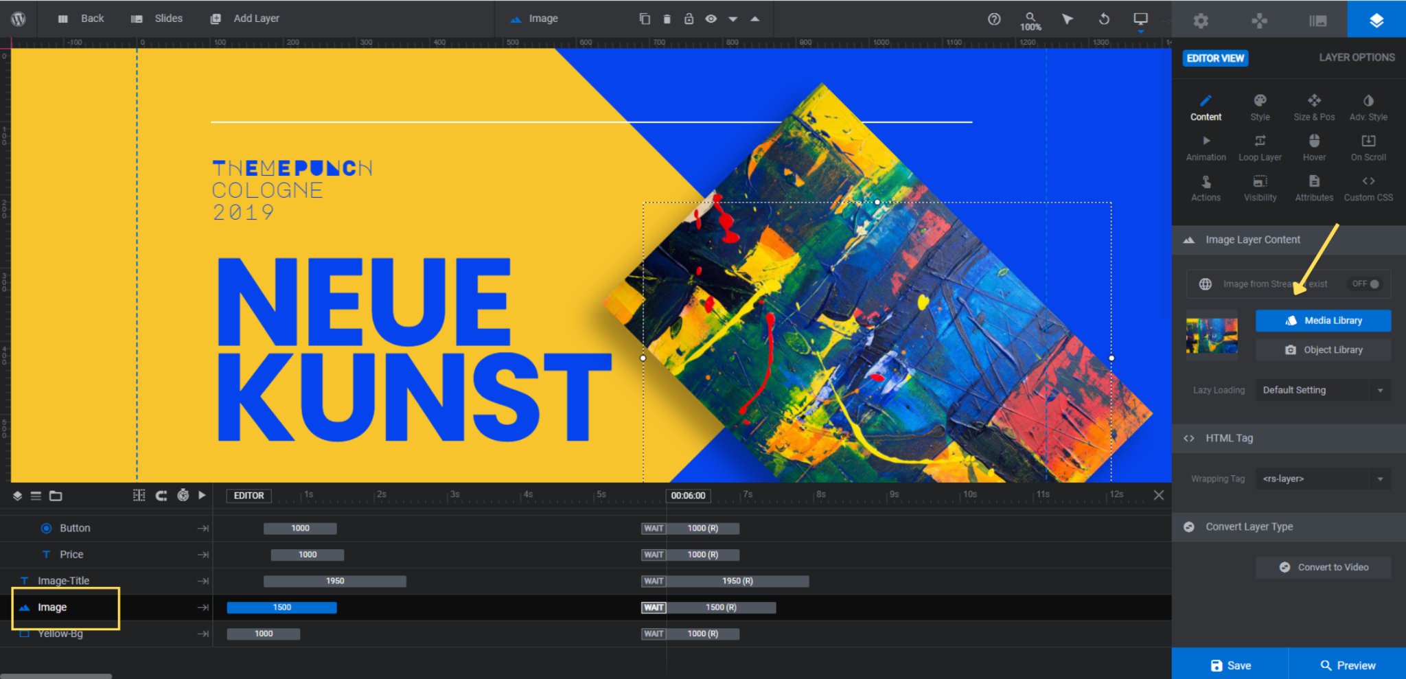
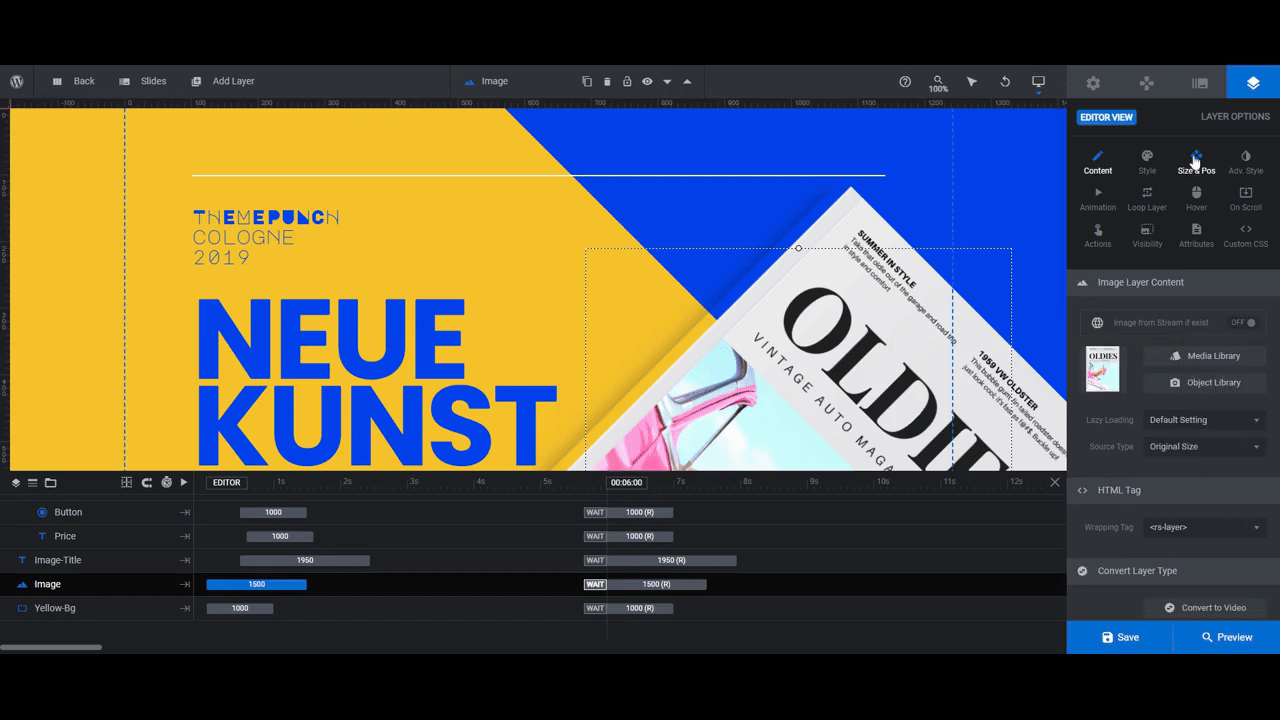
Next, go to “Size & Pos”.
Use the Alignment settings to change the position of the image relative to the slide. Use X and Y to move the image horizontally and vertically. And if you want to update the size, use W to edit the width and H the height.
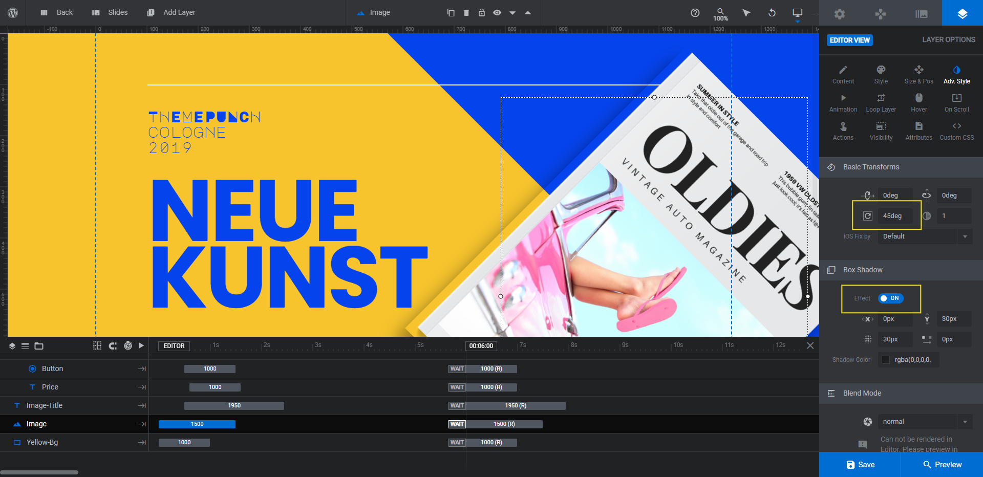
Go to the “Adv Style” tab next. There are a couple of settings you may want to adjust here.
The first is the rotation setting under Basic Transforms. The rotation is currently set to 45 degrees. We’ve adjusted ours to 15deg.
The other setting is the Box Shadow effect. Because our magazine image has a shadow built into it, we’re going to turn this setting off. However, if yours does not and you want to preserve the 3D effect, take some time to customize these settings to your liking.
The last thing to do in this step is a responsive check. Anytime you change the size or positioning of layers in a template, this is a must.
Go to the top toolbar to see the responsive variant options.

Go through each and edit the Image layer as needed. Any changes you make within the variant views will apply only to those devices.
Repeat this process for each of the slides.
Learn more:
Step 3: Change the slide background colors
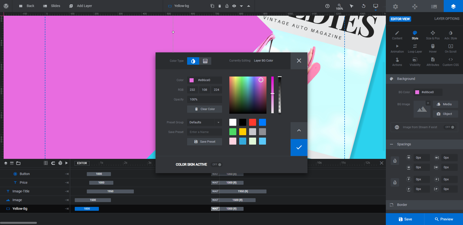
Now that you have your images set, you can create the color palette for each slide. The first colorful component is the slide background.
To edit the background, go to “Slide Options” and “Background”. Click on the color block next to BG Color. Then add your custom HEX code or choose a color from the presets at the bottom.
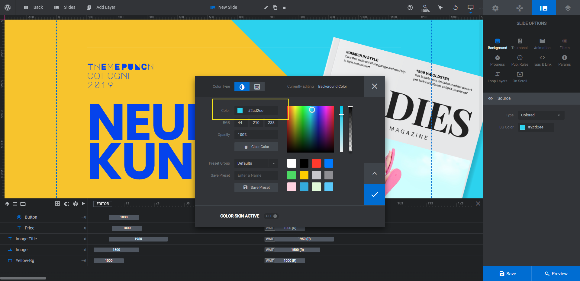
Repeat this process in the other slides. Then save your changes.
Learn more:
Step 4: Customize the shape colors
There are various layers in the slides (except Slide #1) that make up the colorful shape components.
In Slide #2, look for Yellow-Bg.
In Slide #3, look for the -Circle layers.
In Slide #4, look for the -Spike layers.
Note: You don’t have to keep all of the shapes. For instance, some of the circles and spikes are going to be hidden by our magazine covers. To delete any of the shapes you don’t want or need, locate them in the timeline editor and hit the Backspace or delete key to get rid of them.
To edit these shapes, go to “Layer Options” and “Content” or “Style”. Click the block next to BG Color. Then apply your new colors.
Do the same in the other slides.
Learn more:
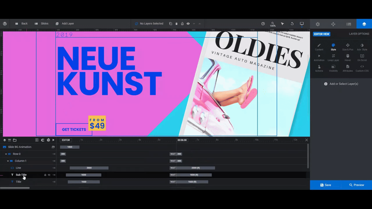
Step 5: Update the text layers
There are four text layers, a button layer, and a line layer in each slide. You can use the included layers or remove the ones you don’t need.
For example, we’re going to delete the Price and Image-Title layers. This will leave us with the following:
- Sub-Title
- Title
- Button
- Line
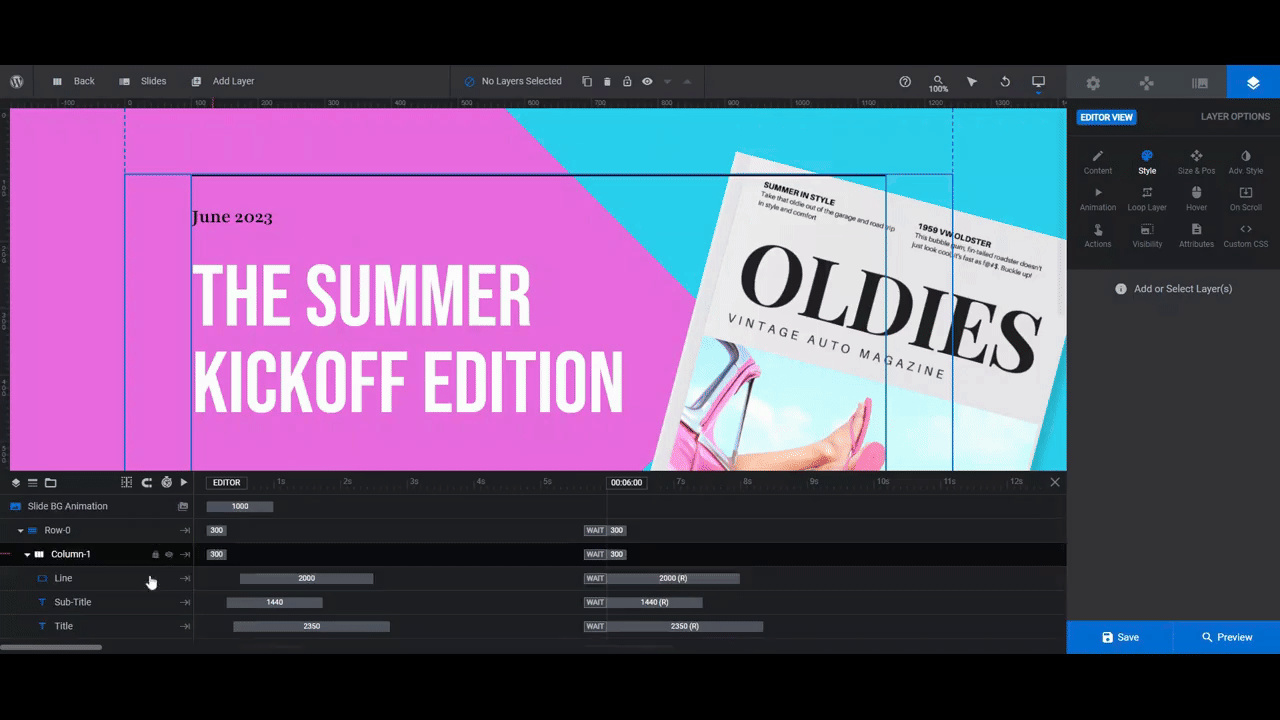
Let’s start by customizing the Sub-Title and Title. Select each layer in the canvas or timeline. Go to “Content” to update what the text says. Go to “Style” to change the font, color, size, spacing, and other stylistic settings.
Next, let’s edit the Line layer. This is a simple shape layer. You can change the color of it under “Content” or “Style” (just as you did the other shapes).
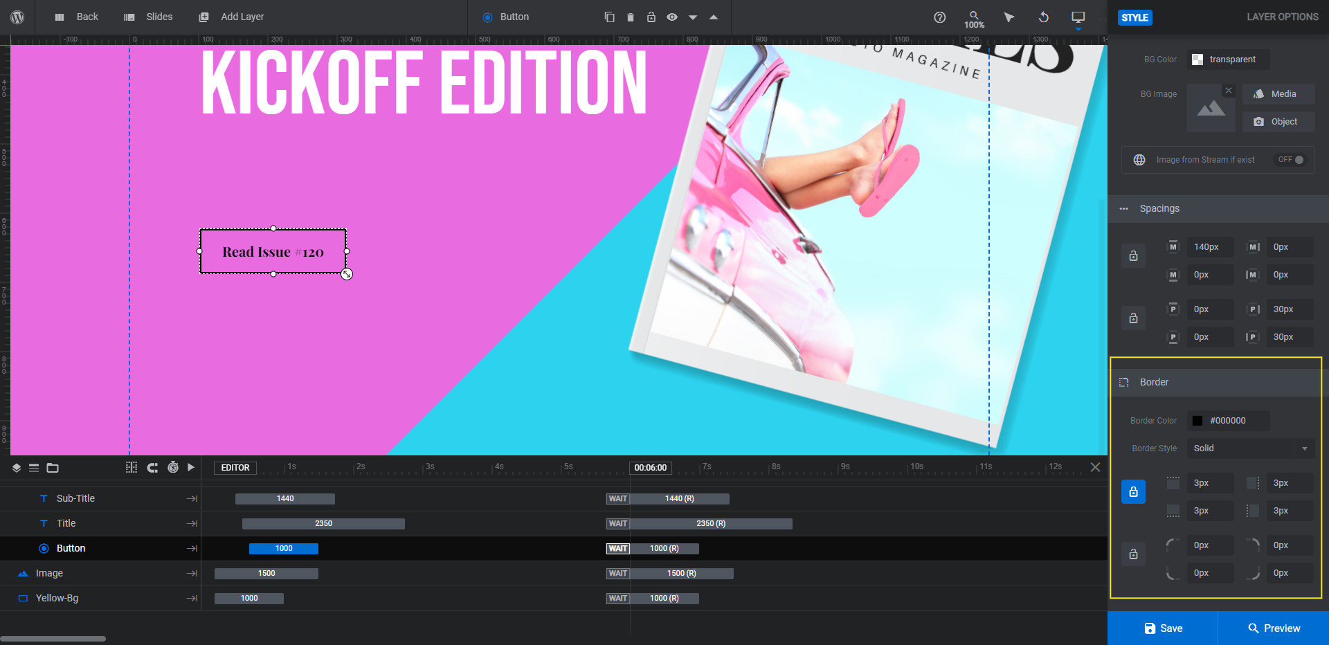
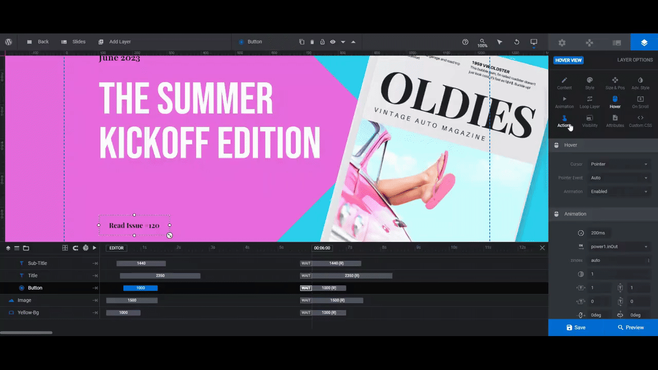
Finally, let’s customize the Button. To edit the text, use the same settings as you did for the regular text layers.
To customize the button design, start under the “Style” tab. Scroll down to the Border section to change the color and width of the button.
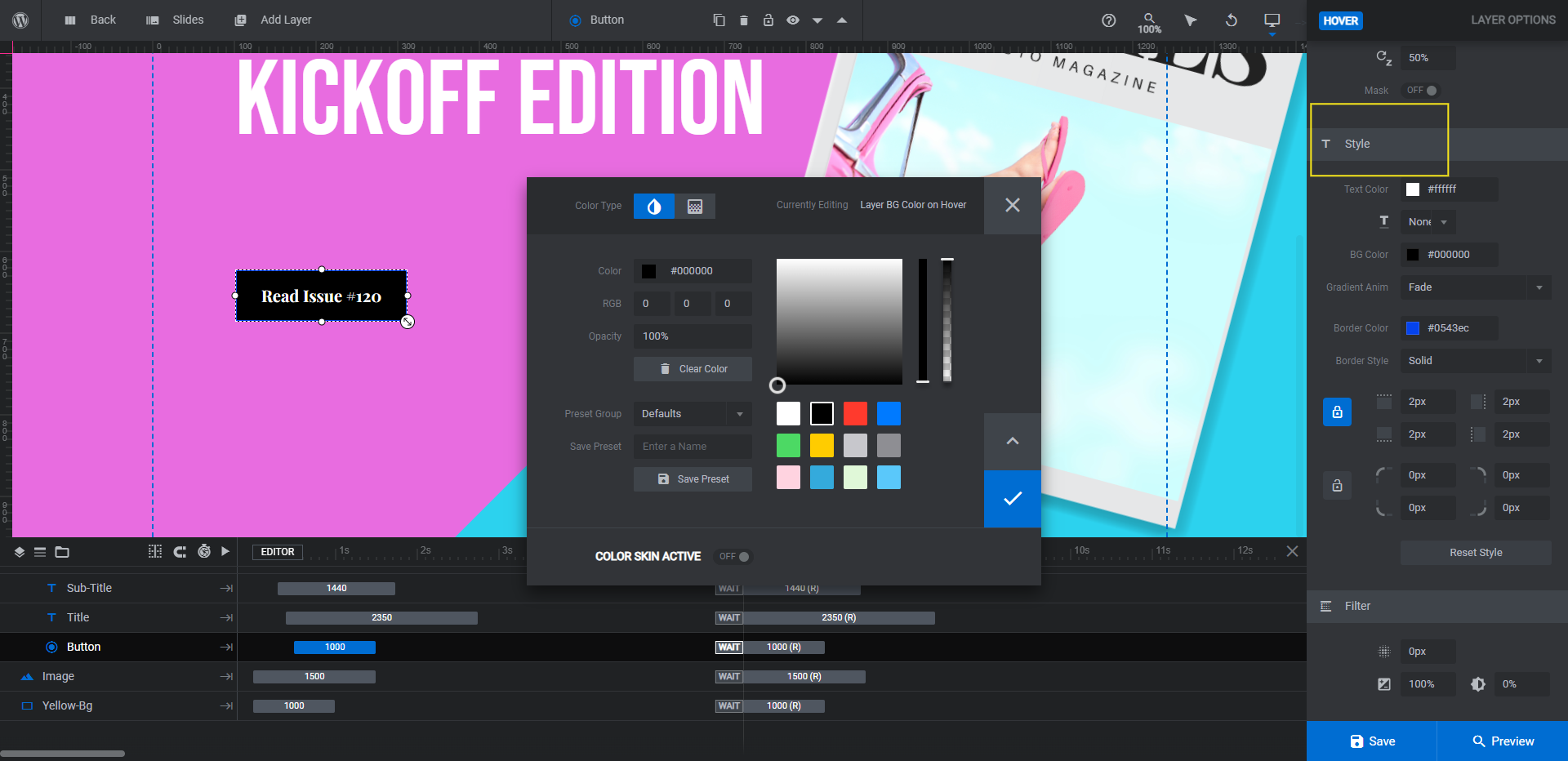
Then go to “Hover” to customize the button’s appearance when a visitor hovers over it. You can change the background color, border, and special effects under the Style section.
Finally, add an action to each button. We need ours to link to the magazine edition we’re promoting.
Open the “Actions” tab. Select Simple Link from the list on the right. Add your hyperlink on the right and customize the settings as needed. Close the pop-up to save your changes.
When you’re done, go through and customize the other slides.
Learn more:
- Editing Text from Template Modules
- Adding and Configuring Button Layers
- Editing Links from Template Modules
Step 6: Move the image layer to the front
The smaller artwork images were fine in terms of positioning. However, because our auto magazines take up more space in the canvas, we’re going to move them forward so the line and text layers don’t cover them.
To move layers in front of one another, you’ll need to use the timeline editor at the bottom. The order in which the layers appear in the timeline dictates how they’re layered atop one another. The closer to the top they are, the more forward they appear. And vice versa.
For instance, Row-0 containing our line, text, and button is in front of all the other layers. To place the Image layer in front of this row, drag and drop it to the top of the layer list.
Drop it into place when you see the blue line appear behind it.
When you’re done, make this same update in the other slides.
Learn more:
Step 7: Edit the navigation elements
The last thing to do is customize the navigation elements. There are two types currently active: Arrows and Bullets. You’ll be able to configure the settings for both under “Navigation Options”.
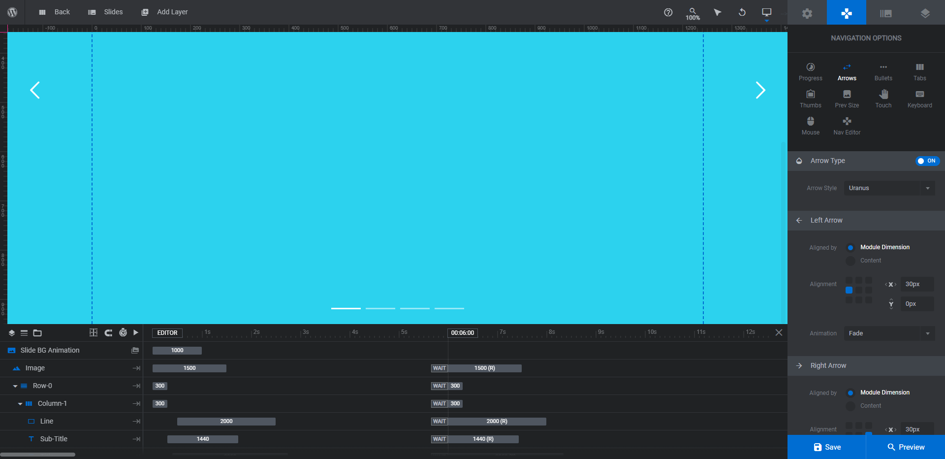
You can change the styles of the arrows and bullets, their color, positioning, and other settings from these panels.
Note: You can also leave the settings be if you’re happy with how they look on the frontend (that’s what we’re doing with this redesign). If you haven’t changed much in terms of the layout, then that might be the case. The only thing you might need to customize is the color if the navigation elements don’t show up well against your background.
Learn more:
Promote your latest content with a stunning hero design
As you can see from this tutorial, there isn’t a lot of customization needed to make this hero slider template look different from the original design. If you’re looking for an easy way to create a colorful hero design to promote your content with, start with the Art Gallery Slider template and have fun playing around with the colors and shapes.

