

One of the best ways to get new blog visitors interested enough to read your content is to showcase your best, most popular content up front. So rather than start your blog out with a chronological timeline of posts, add a featured content section right at the top of it.
In this tutorial, we’ll show you how to edit the Cyber Carousel With Lightbox template to create a beautiful featured content area of your own.
Table of Contents:
- Step 1: Install the Cyber Carousel module
- Step 2: Upload your imagery
- Step 3: Edit the text for each slide
- Step 4: Add a custom action to each button
- Step 5: Customize the tabs text
- Step 6: Add a custom accent color to your design
- Step 7: Customize the tabs navigation
How to create an impressive featured content section for your blog
This template is called a “cyber” carousel because of the techno style of the imagery as well as the lighted button design and highlights throughout the slider:
That said, this template is easy to modify if you’d like to move away from the cyber style while preserving the basic layout and functionality of the content carousel.
In the following tutorial, we’ll show you how to repurpose this featured content section for a health and wellness blog:
If you need a Slider Revolution refresher before starting the tutorial, check these out first:
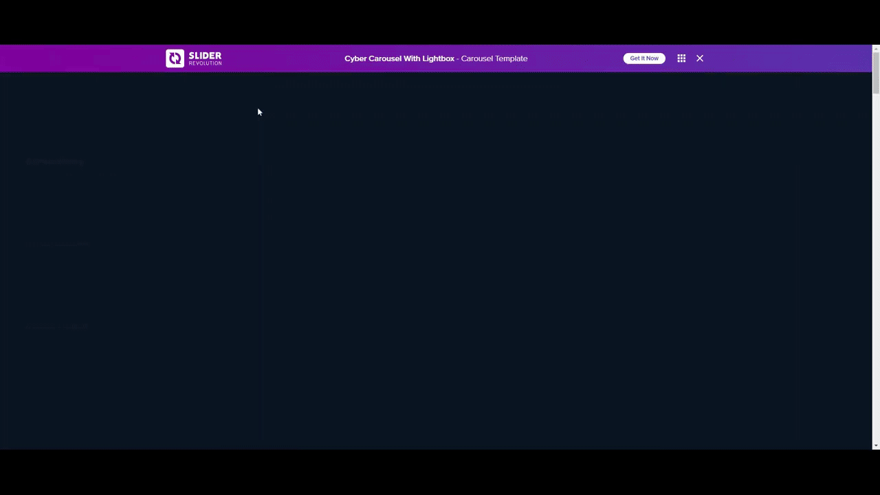
Step 1: Install the Cyber Carousel module
Click on “New Module from Template” and then do a search for “cyber carousel” and you’ll find three templates.
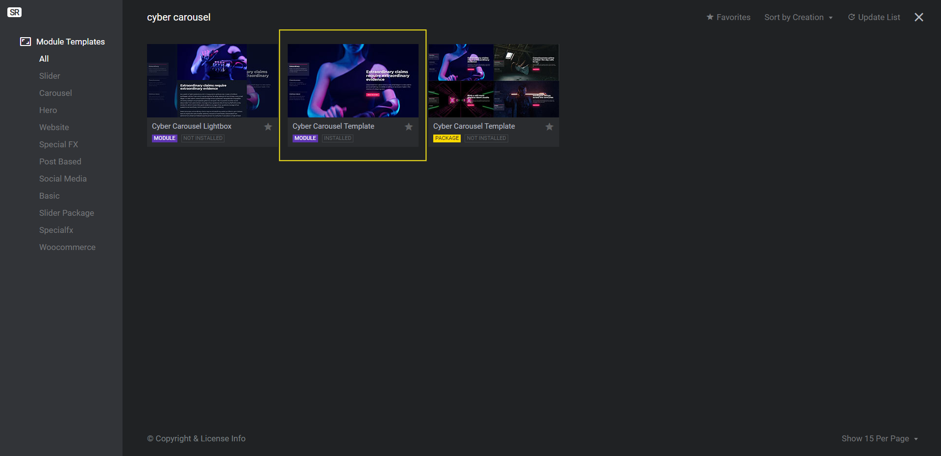
One is for the lightbox module (the pop-up containing the full blog post). One is for the featured content carousel module. The other is for the package containing both.
We’re not going to be adding the full posts with a lightbox to our carousel. Instead, we’ll use the “Read More” button to direct visitors to the corresponding blog content. So the file we need to install is the Cyber Carousel template module(the one in purple).
Learn more:
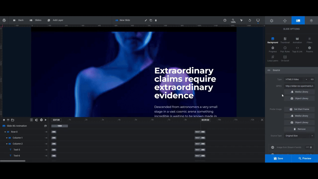
Step 2: Upload your imagery
There are four slides in this featured content section. The first and third use a background video while the second and fourth have a photo with a Ken Burns effect applied to each.
You don’t have to follow this same pattern when adding featured imagery to your slider. That said, here are some tips as to what you should do when selecting your imagery:
- Size your photo or illustration files to 1920px by 1080px.
- Choose imagery that isn’t too light in color unless you plan on changing the color of the fonts.
- Find imagery that’s not too busy in terms of moving parts and colors. This can make text difficult to read even with strong color contrast.
Once you’ve found the featured imagery for your posts, upload them into your slides.
Go to “Slide Options” and “Background”. If the slide uses a different type of imagery than you want to use, click the “Type” dropdown to choose from the other options.
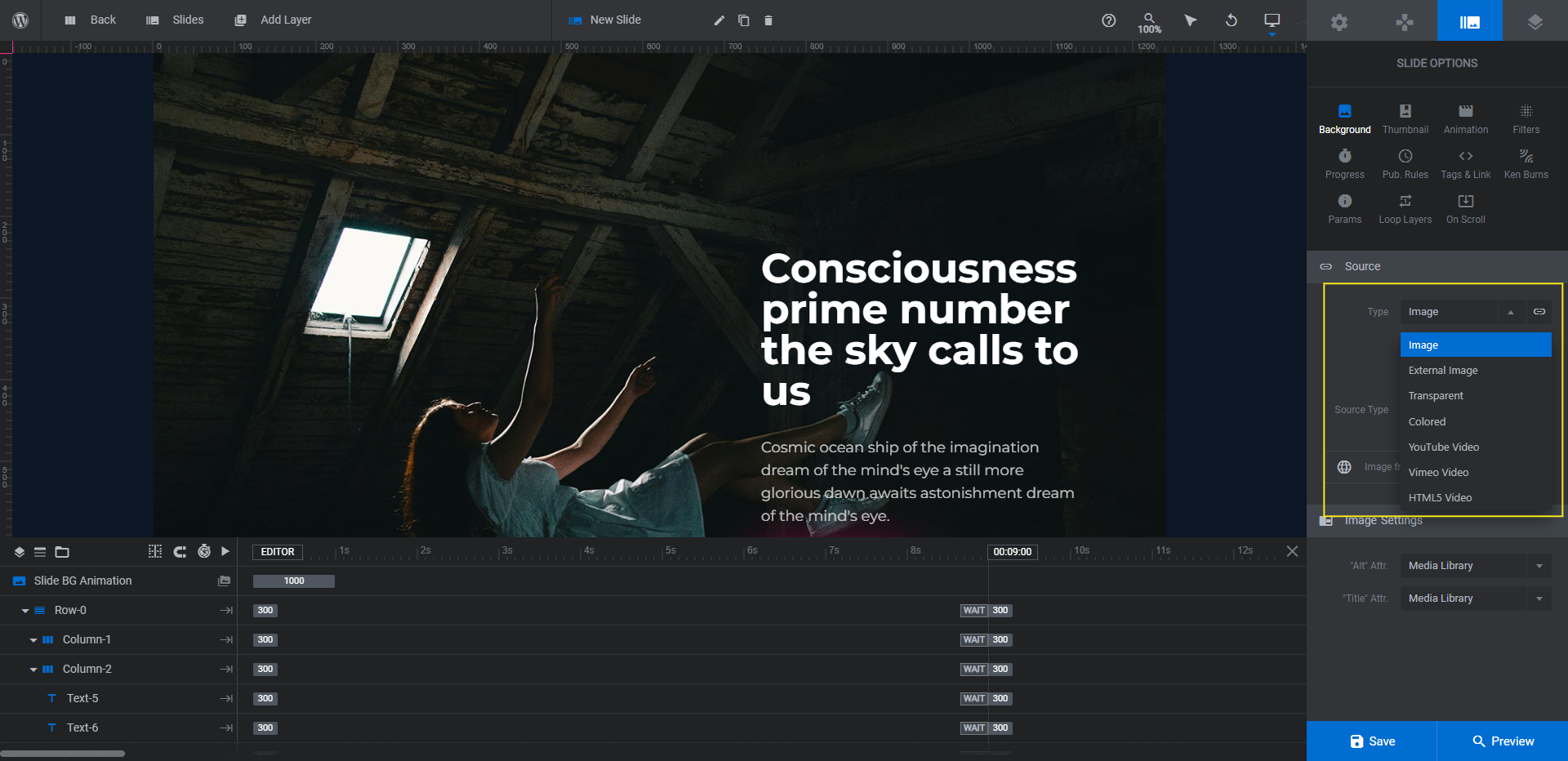
Image and HTML Video are the most common. However, you can also import photos and videos from external sources so long as you own the licenses to them (like if you’re hosting a video on YouTube or Vimeo).
Next, click the Media Library button to upload your new image.
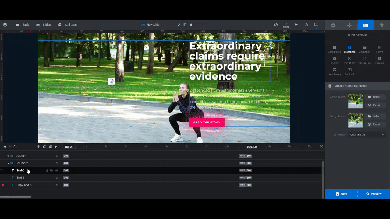
Note: If you end up changing the navigation tabs style in Step 7 to one that includes an image, return to this step and update the thumbnail images for each slide. Go to “Slide Options” and “Thumbnail”. Click the Reset button next to both of the thumbnail blocks. Or you can upload a custom one to the media library.
Learn more:
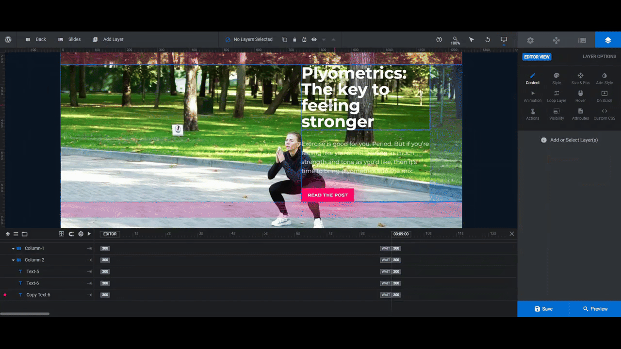
Step 3: Edit the text for each slide
Each slide has three text layers:
- Text-5 is the headline of the post.
- Text-6 is the content description.
- Copy Text-6 is the “Read the Story” button.
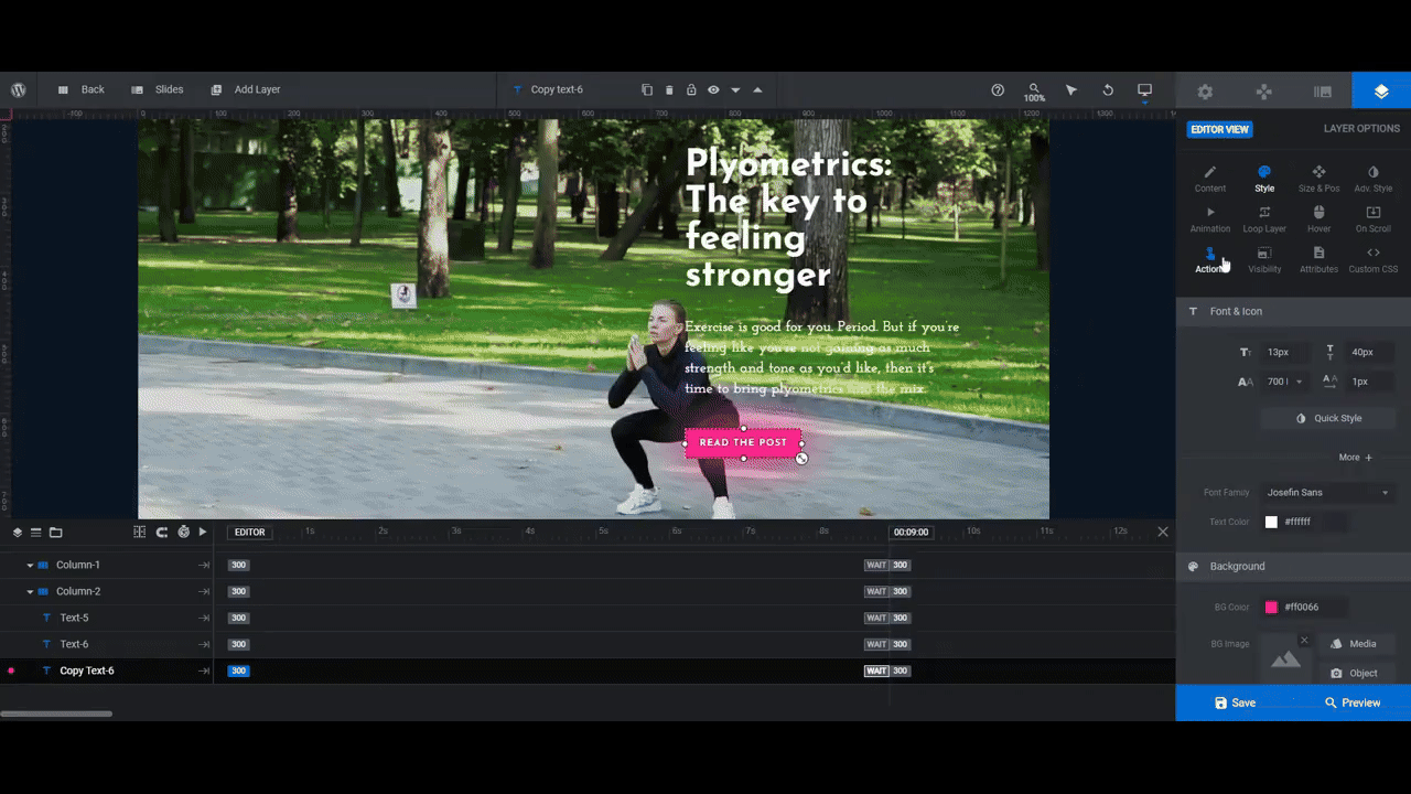
In this step we’re going to modify what the text says and what it looks like. We’ll leave the button action and design for another step.
To change what the text says in each layer, select it from the timeline editor or canvas. Then go to “Layer Options” and “Content”. Replace the existing text with your own.
Note: The text spans the full width of the column on the frontend. If you’d like to make your text appear narrower as it does in the canvas you can force a line break by hitting the Enter or return key or adding a <br /> at the breakpoint. You can do this for both the headline and description.
To change the font and the appearance of the text, go to the “Style” tab to modify the settings for each. Be sure to apply the same stylistic changes to each slide.
Tip: Before moving on, preview your featured content section. See how your font and color choices work against your background imagery. Do this for all devices by switching through the responsive variants at the top of the Preview screen. If you’re having too hard of a time reading any of the text, you may need a different font color or image altogether.
Learn more:
Step 4: Add a custom action to each button
The Copy Text-6 buttons are currently set to do two things:
- Pause the slider.
- Open the corresponding post in a lightbox.
To edit or delete these actions, select the button layer and then go to “Layer Options” and “Actions”.
To remove the existing actions, click the trash can icon that appears next to each. Then select Simple Link from the list of options on the right to add a custom hyperlink to your blog post.
Do this for each slide.
Learn more:
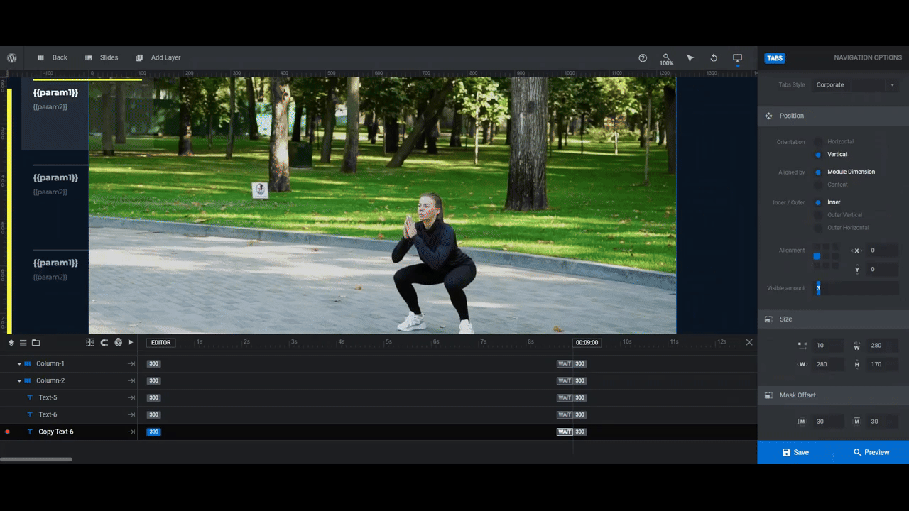
Step 5: Customize the tabs text
To change the text in the navigation tabs on the left, you’ll need to add this data under “Slide Options” and “Params”.
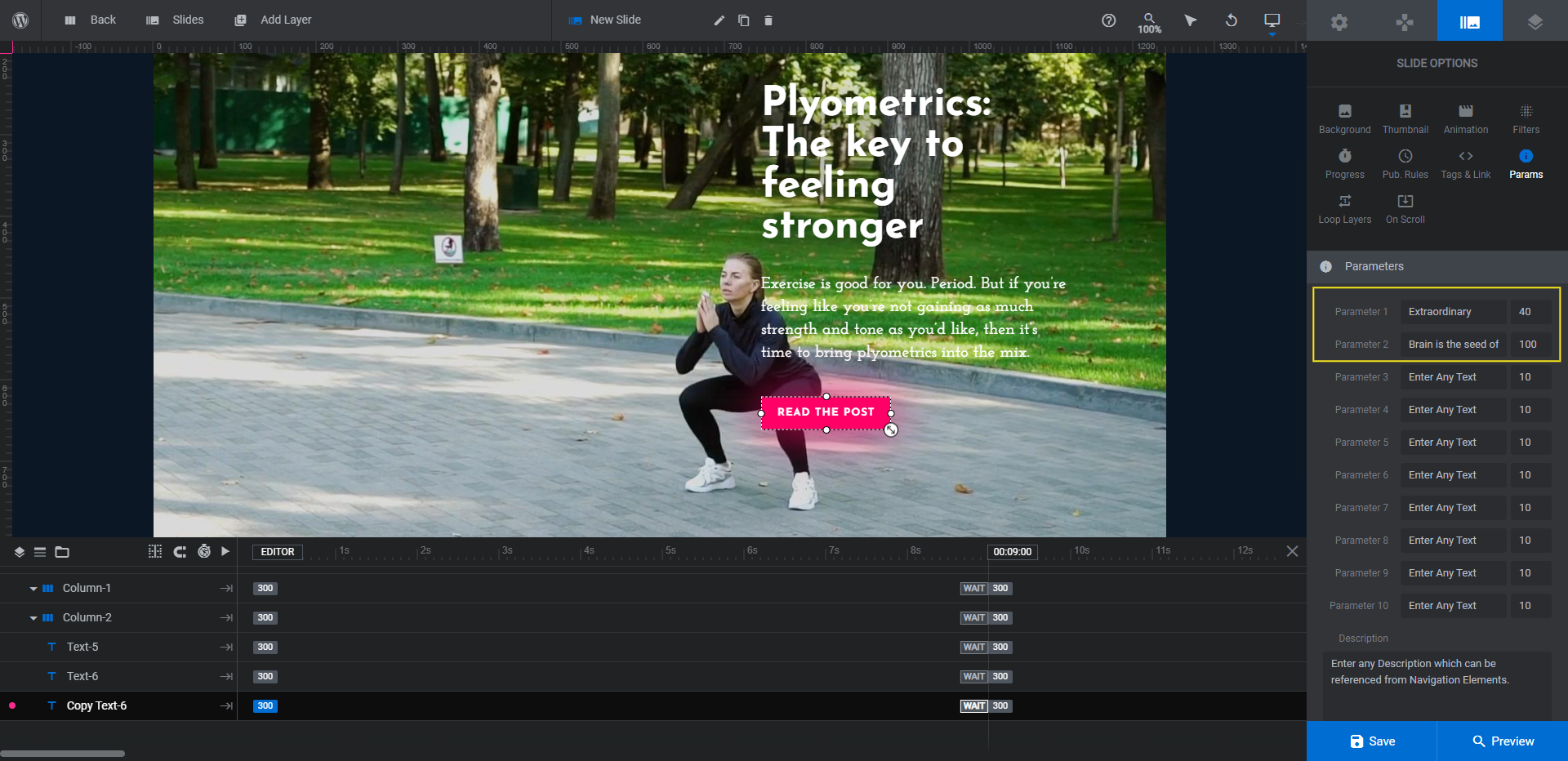
Parameter 1 is the shortened version of your post’s headline. You can add up to 40 characters in this field.
Parameter 2 is the shortened version of your post’s description. You can add up to 100 characters in this field.
Pro tip: Shorter is better. It’s also a good idea to keep these blog post previews the same length as one another so the tabs are consistent in appearance.
Go through each slide and add custom text for your tabs under “Params”. Then save your changes.
Learn more:
Step 6: Add a custom accent color to your design
There are a few elements in this featured content slider that use the same accent color:
- The progress bar that runs up the left side of the section
- The active bar at the top of each tab
- The call-to-action button
Two of these components are connected to the module’s Skin tool. Go to “Module Options” and “Skin” and you’ll see a single Highlight color has been set. When you update it, the progress bar and all your CTA buttons will update to that color.
Note: Because the yellow we’re using doesn’t contrast well with the white button text, we also need to go through and edit the button text color to black. Check your own design to ensure that the color contrast is sufficient. This text color will need to be updated under both “Style” and “Hover” for each slide’s button.
You may also decide that you don’t want as prominent of a glow to emanate from the button, if at all. To adjust this setting, select the button in each slide and go to “Adv Style” and “Box Shadow”.
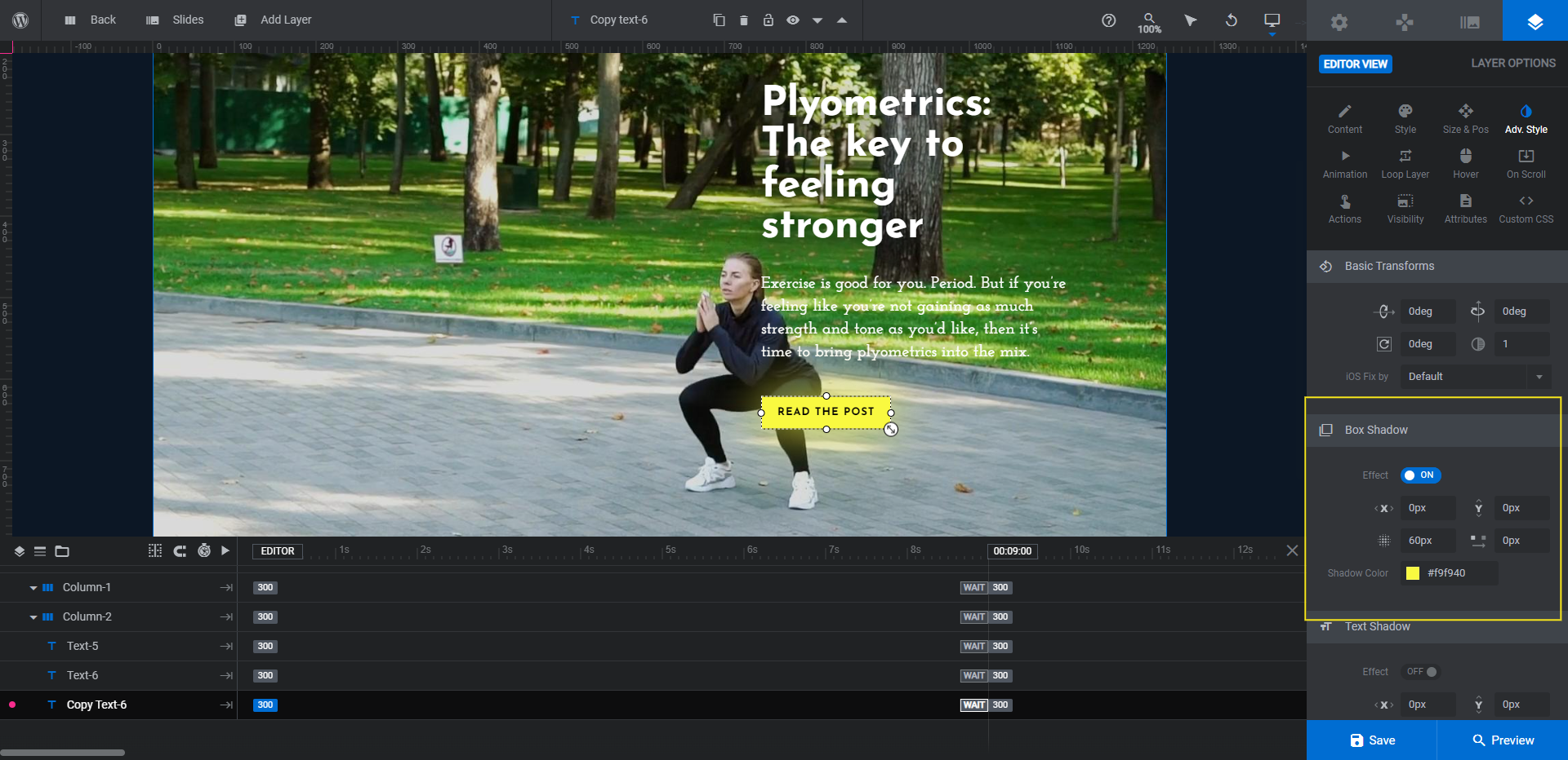
The shadow color has already been set based on the skin Highlight color. The setting above it will allow you to enhance or diminish the box shadow effect.
The last thing to do in this step is to edit the highlight color in the tabs.
Go to “Navigation Options” and “Tabs”. Scroll down to the “Style Global” section and make the Selected-Bar-Color match your new highlight.
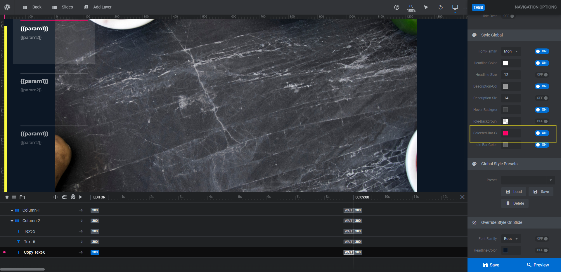
Save your changes. Then stay where you are as we’ll finish customizing the tabs navigation in the final step.
Learn more:
- Skin Based Color Schemes
- Adding and Configuring Button Layers
- The Tools of the Color Selection Dialogue
Step 7: Customize the tabs navigation
The navigation tabs are currently designed to show up well against a darker background. If you’ve switched up the look of this featured section, then you might find that it’s difficult to see the tabs and their content clearly. Or perhaps you’re wanting to revise the design anyway.
You can do all of this and more from the “Tabs” panel. You can:
- Change the style of tabs.
- Move or realign the tabs bar.
- Make more or fewer tabs appear at once.
- Adjust the size of each block.
- Modify the visibility of the tabs.
- Match the font to the ones used in the slider design.
- Apply different colors and transparency levels to the backgrounds as well as the text.
Here’s an example of what that might look like:
When you’re done, preview your work. If you’re happy with how it looks, save your changes. Then embed this new featured content section into the top of your blog page using the embed shortcode or by adding a Slider Revolution block in your page builder.
Learn more:
Showcase your top content with a beautiful featured content slider
Blogs might have fewer resources and revenue than luxury magazines or publications do. However, you don’t need thousands of dollars or a team of coding pros to create a featured content section that rivals what you’d see on those publications’ websites.
All you need is an easy-to-customize featured content design like the Cyber Carousel template and some high-quality posts to fill it with.

