
Are you tired of having a boring website design? We got your back with CSS Shadow Effects.
CSS shadow effects are a great way to add stylish effects to make your web pages look more elegant than before. It is pretty easy to use and provides an array of different options which can be applied in other contexts. Using the shadow property, we can create drop shadows on text or boxes, providing an eye-catching design to bring life to your website.
What Are CSS Shadow Effects?
Shadow effects are a popular design technique that can add depth and dimension to an element. They are commonly used in web design to create the appearance of depth and space within a flat, two-dimensional layout. A shadow is an area of darkness created by an object blocking a light source.
In design, shadows can be created using drop shadow, horizontal shadow position, layered shadows, blur effect, box shadow, and text-shadow. Using shadows can make a design look more dynamic and visually exciting and help create a sense of hierarchy or emphasis. In this article, we will explore the different types of shadow effects and how they can be used to make a statement in your designs.
Different CSS Shadow Effects
Here are some examples of different CSS Shadow Effects:
Brewery Website Slider Template
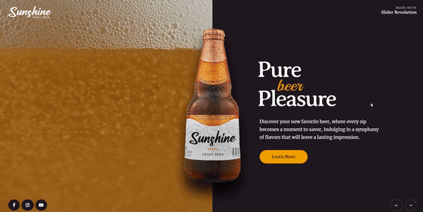
The Brewery Website Slider Template is your key to establishing a distinct online identity. Ideal for breweries, it showcases stunning typography and a dynamic color scheme. This template goes beyond mere visual appeal; it serves as an effective medium to display your variety of craft beers. Embrace the blend of elegance and utility today!
Multiple Shadows
Design of Andrew Spencer
To make these multiple shadows, you just need to define various shadow values and separate them with a comma. The result is a “natural” shadow that looks like a light shining on the page.
Popout Text with Background Image Shadow
Design of Mark Mead
Adding a text-shadow can make the text more visible and distinct from its background.
CSS Dashed Shadow
Design of Lucas Bebber
Do you want something different? Using this pure CSS hipster-ish style dashed shadow will amaze you.
Text Shadow CSS Snippets
Design of 𝔑icolas ℜeibnitz
Check out these variations of elegant shadow, deep shadow, inset shadow, and retro shadow for your reference.
Direction-aware text-shadow
Design of Martin Picod
Create stunning 3D light effects with direction-fueled text-shadow, unlock the powers of CSS variables, and give your audience a unique perspective that will take their breath away!
Isolating CSS Box-Shadows
Design of TundraTech
To create a single shadow:
- Use a negative spread and offset in the desired direction with an equal distance blur radius.
- When making inset shadows, the space remains constant but the offset moves in the opposite direction.
- Combine single-side rules into a comma-separated list to have multiple sides or shadows.
Zebra Gradient Text Shadow CSS+SVG
Design of Tommy Hodgins
Text Shadow Compilation
Design of Theodoros Mouratidis
You will enjoy this collection of unique text-shadows in CSS. There are nice looking ones as well as “unique” ones too.
CSS Shadow Effects
Design of Evgeniy
CSS Pixel Animation
Design of Lorena Sarasua
Picture a pixelated woman in 8-bit using box-shadows on a single div.
Inset text Shadow – CSS background-clip
Design of Alex Brown
An excellent demonstration for inset text-shadows.
Text Shadow CSS Flat
Design of Dennys Dionigi
Long Shadow Generator | Prototype
Design of Jessica Skye
Long-shadow generator. You can play around with the length and color gradation.
text shadow css
Design of Lucas Azevedo
Beautiful Wedding Page
Design of Eric Franklin
Just a responsive site layout I made for a wedding.
CSS Shadow Effects
Design of Mohsin Saiyed
Button hover effects with box-shadow
Design of Giana
Making some basic animations with box-shadows. No extra elements or even pseudo-elements are required.
cookie clicker
Design of Broyojo
Week One Example
Design of Andy Hullinger
Displaying shadow effect on Leo Burnett’s Quotes.
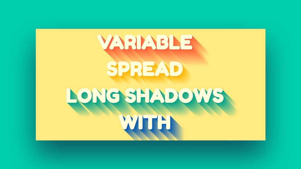
Variable Longshadow with Gradients Mixin
Design of Dario Corsi
A Sass mixin can be used to create long-shadows with different colors and spreads.
Animated Text-Shadow
Design of Erin E. Sullivan
A fantastic combination of animation and CSS with a bounce effect.
SAVE!
Design of Sebastian Opperman
Quirky CSS banner using box-shadows.
A pen by Circuit27
Design of Circuit27
Task3 Text Effects and shadows
Design of Nisitha-kode
Complex Text Shadow Examples
Design of Chris Coyier
Inspiration of text-shadows for you.
A Pen by Miriam
Design of Miriam
Simple Skewed Text Shadow (CSS)
Design of SpillnerDesign
Mousemove Text Shadow CSS and Javascript
Design of Anastasia Kas
A Pen by Dylan
Design of Dylan
Layered text-shadow effect CSS
Design of Shireen Taj
You can turn any simple text into beautiful art with layered text-shadow. An excellent CSS style that will elevate your website.
A collection of CSS text-shadow and pattern effects
Design of Ashley Watson-Nolan
The pen utilizes text-shadow and hover transitions to generate text effects. Additionally, it features a textured hover text effect and incorporates SVG.
3D Cartoon Text w/CSS text-shadow
Design of Fielding Johnston
Exploring the application of CSS text-shadow and the typeface “Luckiest Guy” from Google Fonts.
Box-shadow spill
Design of timaronan
Box-shadows can give a visual effect of a three-dimensional appearance.
SCSS 3D text mixin
Design of Liam Egan
A fresh and straightforward mix of SCSS creating 3D block-looking text with text-shadows.
box-shadow pseudo loaders
Design of Jhey
- Box-shadow on pseudo elements can produce loading effects.
- Adding a class to an element could make a loading animation display as an overlay.
Text Shadow CSS
Design of Erik Cruz
Play around with the CSS text-shadow property.
Isolating CSS Box Shadows
Design of TundraTech
CSS fundamentals can be misinterpreted. To create a single shadow:
- Use a negative spread and offset in the desired direction with an equal distance blur radius.
- When making inset shadows, the space remains constant but the offset moves in the opposite direction.
- Combine single-side rules into a comma-separated list to have multiple sides or shadows.
Live stripes
Design of yoksel
Created using box-shadows. CSS only.
CSS 3D floating Credit Card!
Design of Kivanfan
Groovy CSS Effect
Design of Daniel Gonzalez
Use vintage 1960’s font and combine with effect using CSS text-shadow property, SASS function, and mixins to keep code DRY.
Netflix-style text animation with CSS
Design of Nooray Yemon
Using CSS and SCSS function on text animation gives you a long text-shadow.
jQuery | Simple Theme Coloring (CSS Variables)
Design of Tobias Bogliolo
3D Cartoon Text w/CSS text-shadow
Design of Fielding Johnston
Showcase how CSS text-shadow is used to create the 3D cartoon effect.
CSS text shadow effect
Design of Mark
A CSS text background shadow effect using the content attribute.
CSS box shadow animation
Design of jun xu
If you want a nice hover animation, try using box-shadow.
text-shadow
Design of IMarty
You will enjoy the modern shadow effect for text with CSS text-shadow—a nice variation of realistic shadows.
Cool title
Design of William A. Keyon
Pretty shadow
Design of Alex Moore
Quite an interesting, lovely text-shadow.
Headlight.js – text and box shading based on cursor movement
Design of Twixes
Simple CSS BAR-GRAPH
Design of Unmesh Shukla
This is a customizable CSS 3D Gradient Meter designed to display statistics cleanly and responsively. It includes a small amount of JavaScript to ensure responsiveness and utilizes SCSS random() for color selection. The 3D feature is exclusive to Webkit.
Text Shadow Effect
Design of Monica Wheeler
Experimenting with text and shadow to create a unique design inspired by Instagram.
Neon text-shadow effect
Design of Erik Jung
A cool neon text-shadow effects.
Awesome Text-Shadow
Design of Nguyen Hoang Nam
This is your pick if you are looking for a flat and straightforward text-shadow effect.
A pen by Nikita Jadhao
Design of Nikita Jadhao
CSS box-shadow property // Box Shadow // Example
Design of Waterproof Web Wizard
Icon Mock Background
Design of Nathan Taylor
You can choose a color using the sliders. Then, it will automatically generate a complimentary gradient background and shadow.
It begins with a circle
Design of Nathan Taylor
Take the joystick and pull it to interact with the website.
box-shadow border
Design of PositionRelativ
With horizontal and vertical properties, you can play around with the CSS box-shadow property. You can even blur the box-shadow property.
Long Shadow Gradient Mixin
Design of Rory Ashford-Bentley
This Sass (SCSS) mixed efficiently produces lengthy shadow gradients appropriate for both text-shadow and single-box shadow.
Box Shadow Editor
Design of Coding Journey
koro
Design of Nikita Jadhao
SVG Multi-Color Speedtest Gauge
Design of Brandon McConnell
The speed test simulator was developed using SVG, CSS, and jQuery.
dropplets
Design of Oscar Salazar
SVG filters and CSS shadows.
Text shadow CSS
Design of Smoothemes
Simple Skewed Text Shadow (CSS)
Design of Matt Sullivan
Nice Looking CSS box-shadow
Design of Airen
Performant CSS Box-Shadow Transition
Design of Joshua Bemenderfer
3D Interactive Card Hover
Design of Josh
The hover effect on this card rotates it using CSS 3-D transformations, with the glare position determined by the same calculation used for the card rotation. Steam’s 3-D card interaction inspires the design.
FAQ on CSS Shadow Effects
What’s up with these shadow effects in CSS, anyway?
These shadow effects in CSS, they’re wicked! They let you add depth and dimension to your web elements. Think about it as giving your flat designs a bit of 3D pop. Shadows can be added to boxes (like divs) and text.
All this magic is done using properties like box-shadow and text-shadow.
How do I add a simple shadow to a box?
Ah, creating shadows, that’s cool! For a box, use the box-shadow property. The syntax goes like this: box-shadow: horizontal-offset vertical-offset blur-radius spread-radius color;. Each value separates by spaces.
Offset values decide where your shadow will fall, the blur-radius controls how fuzzy it gets, spread-radius decides its size, and color, well that’s self-explanatory, right?
What’s this “inset” thing I’ve seen in box shadows?
“Inset”, it’s a sneaky little keyword. Normally, your shadows are outside of the box, but with “inset”, you bring the shadow inside the box.
This creates an inner shadow. You just put inset at the beginning of your box-shadow value, and voila, inner shadow!
How can I use multiple shadows on a single element?
Heard about layering shadows? Super neat! You just separate each shadow with a comma in your box-shadow or text-shadow property. Like: box-shadow: shadow1, shadow2, shadow3;.
More shadows, more depth. Just keep in mind, your topmost shadow in the stack should be first in your list.
Can I make my text shadowy?
Text shadows? Oh yeah, you can! Use the text-shadow property, it’s a lot like box-shadow. The syntax is: text-shadow: horizontal-offset vertical-offset blur-radius color;. It adds a shadow to your text, making it more dramatic.
Is it possible to create a glowing effect with CSS shadows?
Glowing effects? Totally possible! To make an element appear to glow, just use a large blur-radius and a bright color for your shadow.
It’s like adding a soft light behind your object. For a stronger glow, stack multiple shadows with increasing blur-radii.
How can I animate CSS shadows?
Animating shadows? It’s a whole level up! Use CSS animations or transitions on your box-shadow or text-shadow properties.
When your animations or transitions change the shadow’s properties, you get that shadow moving effect, adding some life to your page.
Can I use CSS shadows to create 3D effects?
3D effects with CSS shadows? You bet! By skillfully layering multiple shadows, you can create an illusion of depth, making your element look like it’s floating. It’s a bit tricky, but when done right, it looks awesome.
Can CSS shadows affect the performance of my website?
Well, here’s a downer, yes they can. CSS shadows require more processing power, especially animated or layered shadows.
So, if you go all shadow crazy, it might slow down your website’s performance. As always, moderation is key!
Are there any browser compatibility issues with CSS shadows?
Bummer alert! Older browsers might have trouble with CSS shadows. But, most modern browsers support box-shadow and text-shadow pretty well.
So unless you’re designing for the Stone Age, you should be good to go! Always check browser compatibility if you’re unsure, though.
Final Words on These CSS Shadow Effects
Having a clean and aesthetically beautiful website does not need to be a complicated task. With a simple CSS Shadow Effects technique, you can elevate your website appearance from mediocre to stunning, elegant, and beautiful.
By learning all about shadows, you are well on your way to becoming a shadow expert! Practice makes perfect when designing shadows and finding your style. You can use box-shadow layers to get creative with the designs of elements or combine colors for a personalized look. To make sure the shadow looks great on all devices, it is essential to test them out.
If you liked this article about CSS shadow effects, you should check out this article about CSS animation libraries.
There are also similar articles discussing cool CSS buttons, CSS blockquotes, CSS blur effects, and CSS charts.
And let’s not forget about articles on CSS headers, CSS parallax effects, CSS animations on scroll, and CSS page transitions.

