In the world of web design, content sliders are your best friends. Picture a revolving carousel of multimedia elements on a website’s homepage, seamlessly switching from one frame to another. That’s a content slider for you! It adds dynamic, interactive flair to your pages, giving your users a peek into your world in a way that’s compact yet captivating.
A content slider can be a game-changer. It transforms the web design landscape and shapes the User Experience (UX) in many significant ways. One moment, your users are engaging with a captivating video clip, the next, they’re drawn into an enticing offer, all within the same space. It’s all about giving them a visual tour without making them click too much.
Engaging and easy?
That’s a winning combo!
In the end, you’ll be ready to take your website to the next level with a content slider, because trust me, it can truly elevate your site’s appeal.
Understanding the Basics of a Content Slider
Alright, let’s start with the basics.
A content slider is this nifty tool in web design that lets you place multiple pieces of content — images, videos, text, and more — into a single, unified space. It’s like this magic box where, instead of pulling out rabbits, you’re pulling out various engaging content for your users.
The content in this ‘magic box’ rotates, either automatically or manually through navigational arrows, creating a dynamic, interactive experience. In a nutshell, that’s what a content slider is.
Common Uses for Content Sliders

Content sliders are super versatile. You can use them in so many different ways!
- Showcase Your Products: Got a new product you want to hype up? Put it in the content slider with a killer image and a catchy description.
- Highlight Services: You offer multiple services? Use the content slider to introduce them one by one.
- Display Testimonials: Let the world know how loved you are. Rotate through your glowing testimonials.
- Promote Offers: Have a special sale or offer? Use the content slider to capture your visitors’ attention.
The possibilities are endless, really.
The Anatomy of an Effective Content Slider
Creating an effective content slider is like making the perfect burger. Hear me out!
The bun is your frame, setting the boundaries of your content slider. The meat is the content itself — images, videos, text, and so on. The cheese, lettuce, and tomatoes are your transition effects adding that extra zing. The sauce? That’s your call-to-action (CTA), the element that ties everything together and pushes your users to engage further.
Advantages of Using a Content Slider
Enhancing User Experience

Let’s talk about the benefits of using a content slider. The first one on the list is user experience or UX. Imagine you’re at a buffet where all the dishes are scattered and unorganized. Kinda ruins the experience, right? Well, your website is the same. You don’t want your users to feel lost and frustrated when they land on your page.
Here’s where a content slider comes in. It neatly organizes your content into an easy-to-digest format that guides your users through what you have to offer, one frame at a time. Smooth, organized, and enjoyable. That’s what good UX looks like.
Showcasing Featured Content
Now, onto the second perk. You’ve got a brand new product, or maybe you’ve launched a fantastic service. But, how do you get your users to see it? Placing it smack in the middle of your homepage might work, but that’s so old-school, and honestly, a little boring.
Instead, give your content slider the spotlight. By featuring your new product or service in your slider, you’re not just showing it off — you’re making it a part of the dynamic, interactive experience that is your website.
Optimizing Space Utilization

Lastly, a content slider is like that handy bag that somehow fits everything you need. In the digital world where every pixel matters, a content slider lets you make the most out of your webpage real estate.
You can place multiple pieces of content in the same space without it feeling cluttered or overwhelming. Your users get to see everything you want to show them without having to scroll endlessly. A win-win situation, don’t you think?
So, that’s the deal. A content slider is a simple tool that brings a bunch of benefits to your website — from enhancing user experience to showcasing your best offerings and making the best use of your website space.
Designing Your Content Slider
Essential Design Principles
Alright, so you’re convinced that a content slider is what your website needs. Great! But how do you design one that really pops and gets your message across? Let’s break it down.
- Keep it Simple: Overly complex designs can confuse your users. Your slider should be clean and straightforward, allowing your content to shine.
- Consistency is Key: Keep the design elements of your slider frames consistent. Similar fonts, color schemes, and layout styles make for a visually pleasing experience.
- Quality Over Quantity: It’s better to have a few high-quality images or pieces of content in your slider than many poor-quality ones. It’s all about making a great impression!
Selecting Appropriate Images and Content

When it comes to your content slider, think of it as a movie trailer. It should have the most engaging and compelling bits of what you’re offering.
Choose high-resolution images that pop. Go for clear, crisp text that communicates your message concisely. If you’re using video or audio content, ensure it’s of high quality and adds value to the user experience.
And always remember, each slide should have a single focus. Clarity and simplicity, that’s the mantra.
Crafting Compelling Call-to-Action Buttons

Call-to-action buttons or CTAs are your secret weapon in the content slider game. They’re the cherry on top of your perfectly baked slider cake, the element that compels your users to take action.
Your CTAs should be clear and compelling. Phrases like “Shop Now,” “Learn More,” or “Sign Up” work well. Design-wise, they should stand out from the rest of the content but still fit in with the overall aesthetic.
Designing a content slider may seem like a task, but it’s an exciting one. Play around with your ideas, keep your users in mind, and you’re sure to create a slider that’s not only engaging but also effective.
Technical Aspects of a Content Slider
Understanding the Technical Requirements
Now that we’ve got design covered, let’s move on to some of the tech stuff. Don’t worry, I’ll keep it light.
There are a few technical requirements you’ll want to keep in mind when creating a content slider. One of the key ones is ensuring that your slider is compatible with various browsers and devices. Because, you know, not all your users will be using the same browser or device to access your website.
Your content should display correctly, regardless of whether your users are on Chrome, Firefox, Safari, or any other browser. The same goes for different devices — smartphones, tablets, desktops, you name it.
Mobile Responsiveness
In the world we live in, mobile responsiveness is not just an add-on; it’s a necessity. More and more people are using their mobile devices to browse the internet. So, it’s super important that your content slider looks just as good on a small mobile screen as it does on a big desktop screen.
A responsive content slider will automatically adjust its size and layout depending on the screen it’s being viewed on. Pretty neat, huh? Trust me, your mobile users will thank you for it.
Speed and Performance Considerations
Last, but definitely not least, let’s talk about speed and performance. Your content slider might be the most stunning thing ever, but if it takes forever to load or stutters while transitioning between slides, it’s not going to impress your users.
Optimize your images and other media for the web to ensure that they don’t slow down your page loading speed. And test your slider to make sure the transitions are smooth.
When it comes to technical aspects, it’s all about balancing form and function. You want a content slider that’s not just beautiful, but also works flawlessly, loads quickly, and delivers a seamless experience on all devices.
Best Practices for Content Sliders
Okay, let’s get into the nitty-gritty of making your content slider the best it can be. Here are some best practices to follow when you’re creating your slider.
Focusing on User Navigation

First things first, user navigation. Users should be able to go through your slider at their own pace. Auto-scrolling is cool, but giving users the ability to manually navigate through the slider is even cooler.
Arrow keys or clear navigation dots can guide users through your slider. Plus, a pause button can be a good add-on. After all, nobody likes to feel rushed, especially when they’re trying to absorb your content.
Accessibility Considerations
Next up, accessibility. Your content slider should be accessible to everyone, including those with disabilities. That means using alt text for images and ensuring that your slider is keyboard-friendly for those who can’t use a mouse.
Also, consider using ARIA (Accessible Rich Internet Applications) attributes if you can. This might sound complicated, but it’s basically about making your slider more readable for assistive technologies like screen readers.
Striking a Balance Between Aesthetics and Functionality
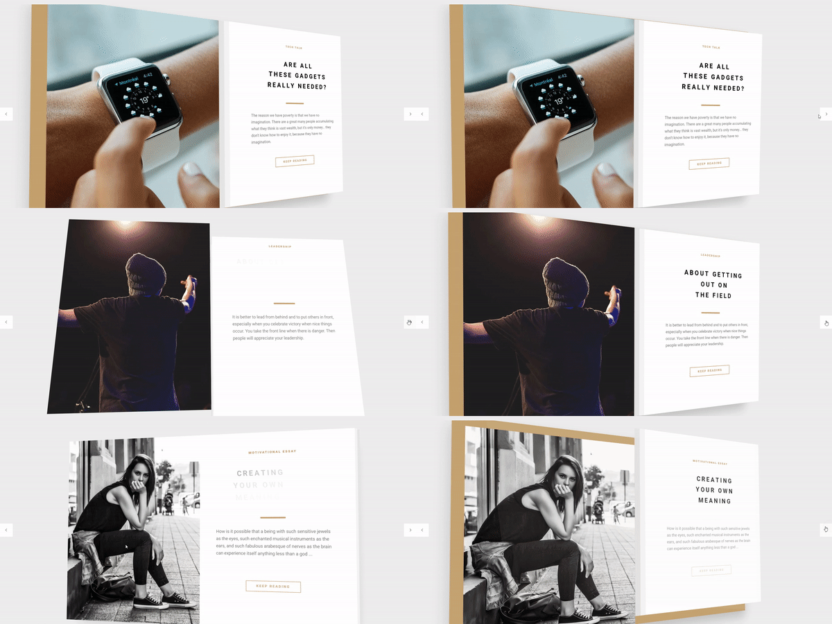
Lastly, always strive for a balance between aesthetics and functionality. Yes, a stunningly beautiful slider can capture attention, but if it’s not user-friendly, it’ll frustrate users more than anything.
Keep the design clean and the navigation intuitive. Prioritize readability and usability. Remember, your content slider is there to enhance the user experience, not complicate it.
So, those are some best practices for creating a content slider. Keep these in mind, and you’re on your way to creating a slider that not only looks great but also works great.
Content Slider Mistakes to Avoid
Even with the best practices in mind, there are still some pitfalls you’ll want to avoid when creating a content slider. Here are a few of them:
Overloading the Slider with Information
Here’s the thing. It’s super easy to get carried away and try to cram as much information as possible into your slider. But remember, less is more.
Your content slider is not a novel. It’s a highlight reel. It’s there to showcase the best of what you’ve got, not to overwhelm users with information. Stick to the essentials and leave some room for curiosity. That way, users will be encouraged to explore your site further.
Neglecting SEO
SEO might not be the first thing that comes to mind when you’re designing a slider, but it’s something you shouldn’t overlook. Remember, search engines can’t ‘see’ images like humans do. They rely on alt text, file names, and other textual cues to understand what the images are about.
So, make sure to use descriptive alt text for your images, incorporate keywords naturally, and ensure your content slider is coded in a way that’s SEO-friendly.
Ignoring Testing and Optimization
Lastly, the “set it and forget it” approach doesn’t work with content sliders. Just like any other element of your website, your slider needs to be tested and optimized regularly.
Check how it performs on different devices and browsers, how it impacts your page loading speed, and how users are interacting with it. Use this information to make necessary tweaks and improvements.
Remember, creating a great content slider is not a one-and-done deal. It’s a continuous process of testing, learning, and optimizing. And that’s the beauty of it. Each optimization brings you one step closer to a slider that not only looks awesome but also delivers value to your users and achieves your business goals.
How to Measure the Success of Your Content Slider
Alright, let’s say you’ve got your content slider up and running. It looks fantastic, it works smoothly, and you’re proud of it. But how do you know if it’s actually successful? Let’s break it down.
Tracking User Engagement
Firstly, pay attention to how users interact with your slider. Are they clicking through all the slides? Are they interacting with the call-to-action buttons? How long are they spending on each slide?
There are various tools out there that allow you to track these interactions. Use this data to get a feel for how engaging your content slider is.
Utilizing Analytics
Next, dive into your website analytics. Look at metrics like bounce rate, time on page, and conversion rate.
A high bounce rate or low time on page might indicate that users are not finding your slider (or your website) interesting enough. On the other hand, if your content slider is leading to conversions (like newsletter sign-ups, purchases, or form completions), that’s a clear sign of success.
Adjusting Your Strategy Based on Metrics
Finally, use all these insights to adjust your strategy. If a particular slide is not performing well, tweak it. If users are not interacting with your call-to-action, make it more enticing.
Remember, measuring the success of your content slider is not about getting perfect results right off the bat. It’s about learning, experimenting, and improving over time. So, don’t be disheartened by less-than-stellar numbers. Use them as a roadmap to a better, more successful content slider.
After all, the goal is to create a content slider that not only looks great but also contributes to your website’s overall success.
FAQ on Content Sliders
What is a content slider?
A content slider is a neat piece of web design magic. Think of it like a digital carousel. It rotates through different chunks of content – could be images, could be text, could be both.
It’s interactive, it’s dynamic, and it’s a great way to showcase multiple pieces of content without taking up a lot of screen real estate.
How do I add a content slider to my website?
Well, that’s simpler than you might think. There are a few ways you could go about it. One, you could use a CMS like WordPress that has Slider Revolution as an option to use.
Or, if you’re a coding whiz, you could build one yourself with HTML, CSS, and JavaScript. There are also plenty of third-party libraries you can use. It’s all about finding the right tool for your needs.
What are the benefits of using a content slider?
So many benefits! For starters, it can make your website more engaging. Content sliders can display images, text, videos, and more in a fluid, attractive way. They allow you to highlight important info or promotions.
Plus, they save space. Instead of scattering bits of content across a page, you can consolidate them in one spot. A content slider is like your website’s highlight reel.
Are there any downsides to using a content slider?
Sure, there can be. Like most things, it depends on how you use it. A content slider can sometimes be a distraction if it’s too flashy or fast. It’s also important to make sure your slider is mobile-friendly.
Not all sliders play nice with touchscreen swiping. And remember, too much information in a slider might confuse visitors. So, use it wisely!
How can I make my content slider more effective?
Content sliders should be all about user experience. Here’s what you can do: Keep it simple. Too many slides and your users will lose interest. Make sure the slider controls are easy to find and use.
Also, don’t forget about the speed. You don’t want to rush your visitors through the slides. Lastly, make sure the content in your slider is relevant. It should enhance your site, not detract from it.
How should I design my content slider?
Designing a content slider is like designing a mini-website. It needs to be visually appealing and user-friendly. Keep the design consistent with your website.
Limit the number of slides to keep users’ attention. Choose a slider size that works well on all devices. And don’t forget to design for touchscreens – swiping should be a breeze!
Is it difficult to maintain a content slider?
Not necessarily. If you’re using a CMS or a third-party library, you can usually add, remove, or rearrange slides without too much fuss. If you’ve coded your slider, you might need some more tech skills to keep it updated. But as with anything in web design, a little bit of maintenance can go a long way.
How can I test the effectiveness of my content slider?
Analytics, my friend! Use tools like Google Analytics to track how users interact with your slider. Look for metrics like click-through rates and time spent on your page.
Also, consider using A/B testing to see how changes to your slider affect user engagement. It’s all about figuring out what works for your audience.
Are content sliders accessible?
They can be, but it requires some work. Ensure your slider has accessible controls that can be used with keyboard navigation. Don’t forget about screen readers – they need to be able to read the content too.
And always include pause controls.
This allows users with cognitive disabilities to take their time going through your content. Accessibility is important, so don’t overlook it!
Elevating Your Website with a Content Slider
Here we are, at the end of this journey. Together, we’ve uncovered the purpose, the design, the benefits, the technicalities, the do’s, and the don’ts of a content slider. It’s a wrap, but before we go, let’s quickly touch on the main points.
A content slider is more than just a design element. It’s a tool that can enhance the user experience, showcase important content, and optimize space on your website. When designed with the user in mind, and when it aligns with your brand and message, a content slider can be a powerful addition to your digital canvas.
I can’t stress enough the significance of a content slider in modern web design. It’s not just about aesthetics; it’s about functionality, user experience, and conversion optimization. With a well-designed slider, your website can leave a lasting impression and drive users to take action.
In a world where first impressions matter, and where users have shorter attention spans, a content slider can make all the difference. It can showcase what’s crucial, guide users on what to do next, and help turn visitors into customers or followers.
So, I encourage you to embrace the power of the content slider. Experiment with different designs, layouts, and contents. Measure their success and continue refining them. Most importantly, always keep your users in mind. They are the ones who interact with your website, and their experience can determine your website’s success.
Remember, as a web designer, our job is to bridge the gap between the user and the information they need. And a content slider, when done right, can do just that.
If you liked this article about content sliders, you should check out this article about JavaScript sliders.
There are also similar articles discussing thumbnail sliders, responsive sliders, automatic slideshows, and something better than FlexSlider.
And let’s not forget about articles on parallax sliders, a Splide alternative, what is a slider, and slider types.

