
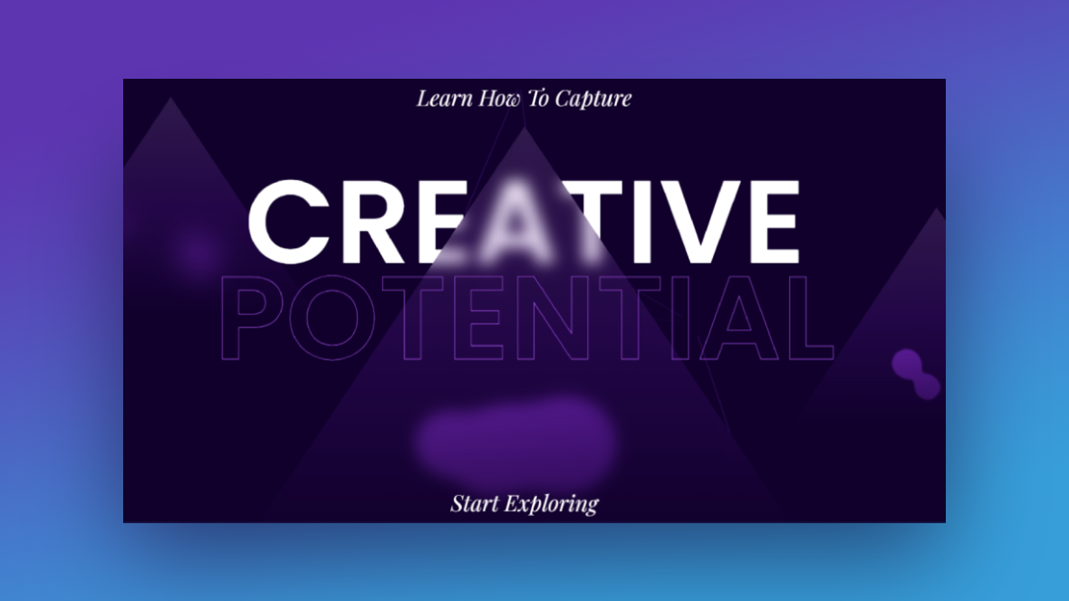
If your branding doesn’t call for a ton of images or you want to try something different this time, you can still build a beautiful and intriguing hero section. The trick is to use bold typographic styles and interesting special effects to capture the attention of your visitors first thing when they enter your site.
In this tutorial, we’ll demonstrate how to use the Creative Hero Collection to create a memorable hero section without images or videos.
Table of Contents:
- Step 1: Delete extra slides
- Step 2: Disable the navigation
- Step 3: Update the background colors
- Step 4: Customize the background particle effects
- Step 5: Edit the text
- Step 6: Delete the bubble morphs
- Step 7: Customize the shapes
- Step 8: Update the call-to-action
- Step 9: Customize the parallax settings
How to create an engaging hero section with typography and special effects
The Creative Hero Collection comes with three similarly designed templates. Each demonstrates how striking color choices, bold typography, and special effects can create an interesting visual experience.
In the following tutorial, we’ll show you how to pick-and-choose which of these elements and effects you want to play around with in order to come up with something original:
Take a few minutes to read through these overviews if you’re new to Slider Revolution:
Step 1: Delete extra slides
You only need one of the hero slides in this collection to create an engaging home page experience. Choose the template that’s closest to the color palette and style you’re going to create for your own. Then delete the other two slides.
Go to “Slides” in the top toolbar. Hover over the slides you don’t need. Then click the trash can icon that appears to the right of them.
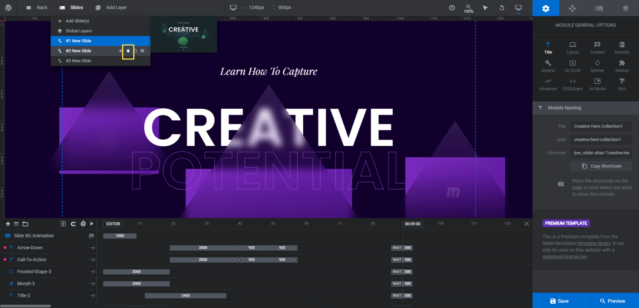
Save your changes when you’re done.
Learn more:
Step 2: Disable the navigation
Because this is a single hero section instead of a slider, we need to turn the navigation off. Go to “Navigation Options” and switch the toggles to the Off position for Arrows and Bullets.
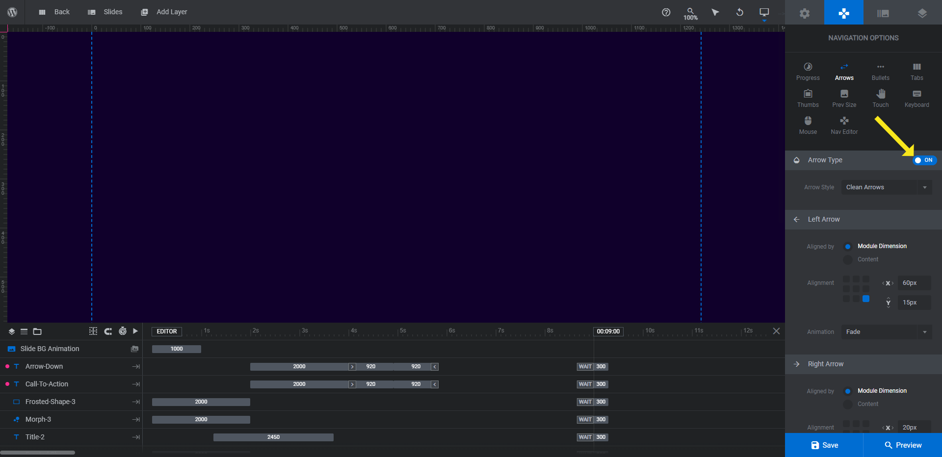
Move to “Slide Options” next.
Learn more:
Step 3: Update the background color
Under “Background” settings, click on the BG Color block. This will open the color selection dialogue.
Update the HEX code in the Color field or select one of the presets at the bottom.
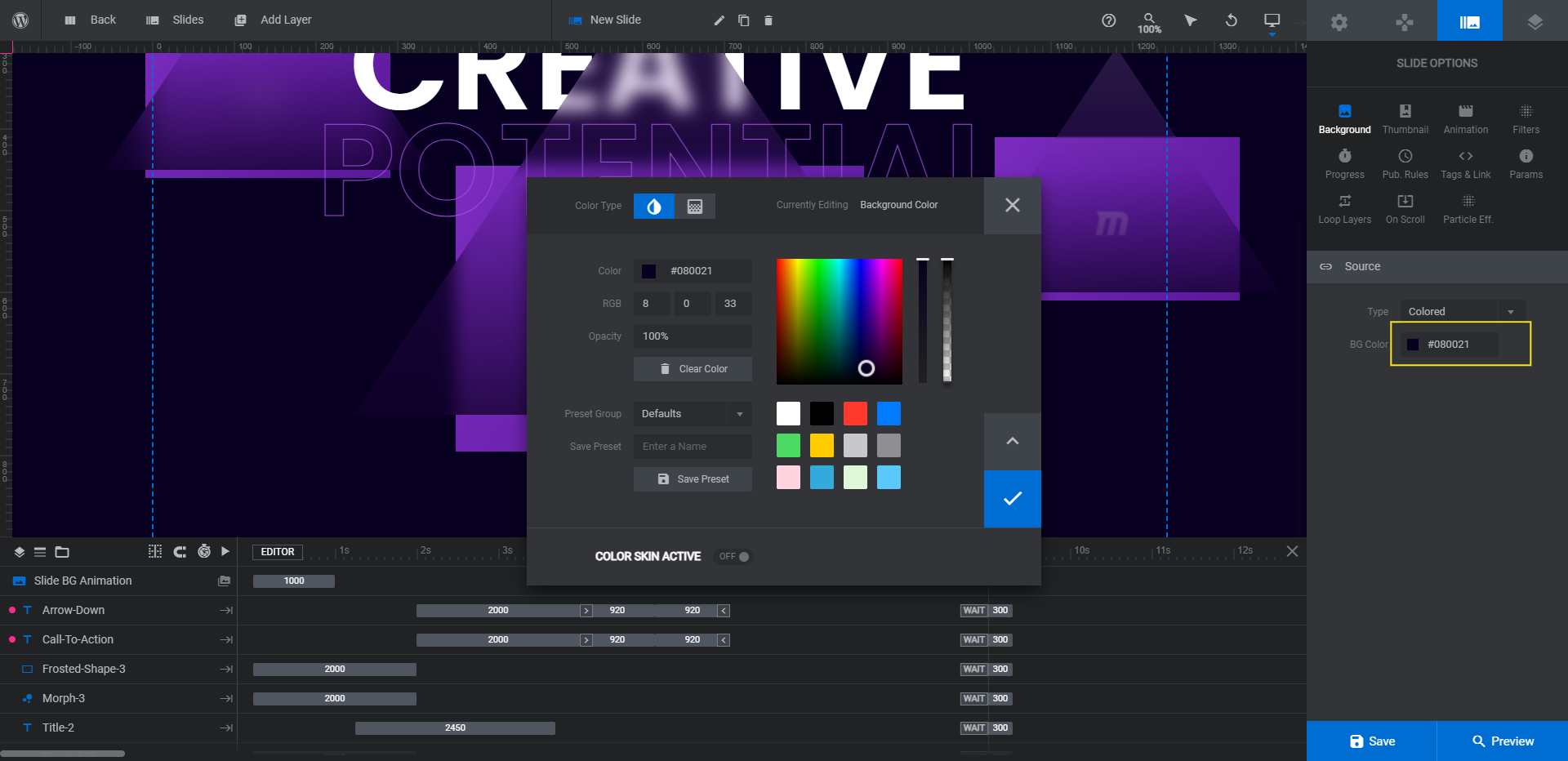
Click the checkmark to save your changes and close the dialogue.
Learn more:
Step 4: Customize the background particle effects
There are a number of special effects applied to this hero section design. The particle effects in the background are subtly done so you may not have noticed them at first glance.
To modify them, go to “Particle Eff”.
If you’d like, you can keep the settings as they are and adjust the colors as needed. Another option is to open the presets, choose one of the premade settings, and then customize.
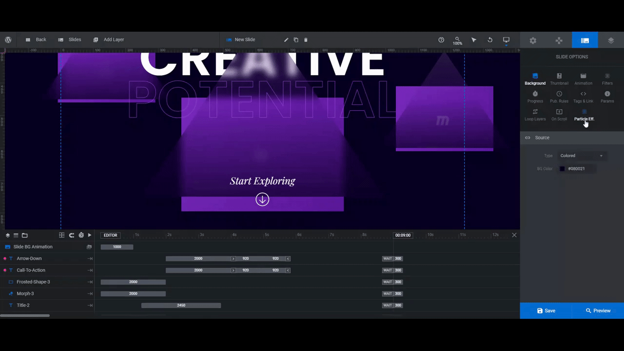
Because there’s a lot of stuff going on in this design already, it’s a good idea to keep whatever you choose more on the subtle side. You want it to add a little texture and light to the background without stealing the stage.
Learn more:
Step 5: Edit the text
There are three text layers to edit in this step. Small-Title is the subheadline at the top. Title is the solid part of the main headline and Title-2 is the outlined text.
To edit what these layers say, go to “Layer Options” and “Content” to replace the text.
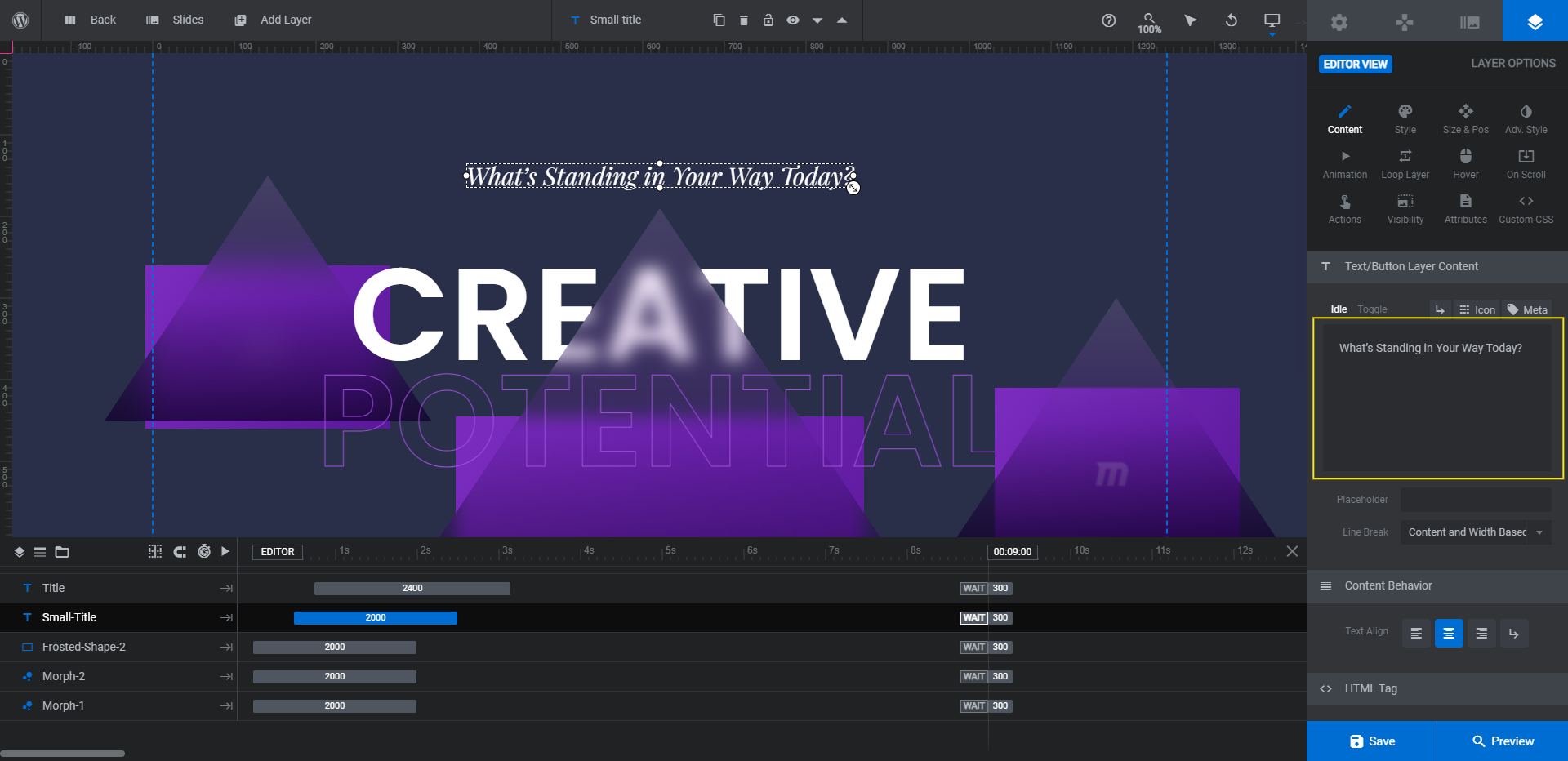
To change the font used in these layers, go to “Style”. You can also play around with the font weight, spacing, and general styling from this tab.
To edit the colors, you’ll have to use two separate areas of the editor to do so. For Small-Title and Title, edit the Text Color under “Style”. For Title-2, go to “Adv Style” to change the Text Stroke color. You can also change the thickness of the text stroke.

When you’re done, save your changes.
Learn more:
Step 6: Delete the bubble morphs
The bubble morphs go well with the original theme of the template — to capture creative potential. However, we want our visitors to focus on the message and abstract “obstacles” (the triangle shapes) in our redesign. So we’re going to delete the morphs.
If you’d like to delete them as well, locate the layers called Morph-1, Morph-2, and Morph-3 in the timeline editor. Hold down the Ctrl or command key, select each of them, and then hit Backspace or delete.
Learn more:
Step 7: Customize the shapes
There are currently three triangle shapes that frame our headline. To change the gradient in each, select any of the Frosted-Shape layers. Go to “Content” or “Style” and click on the color block next to BG Color.
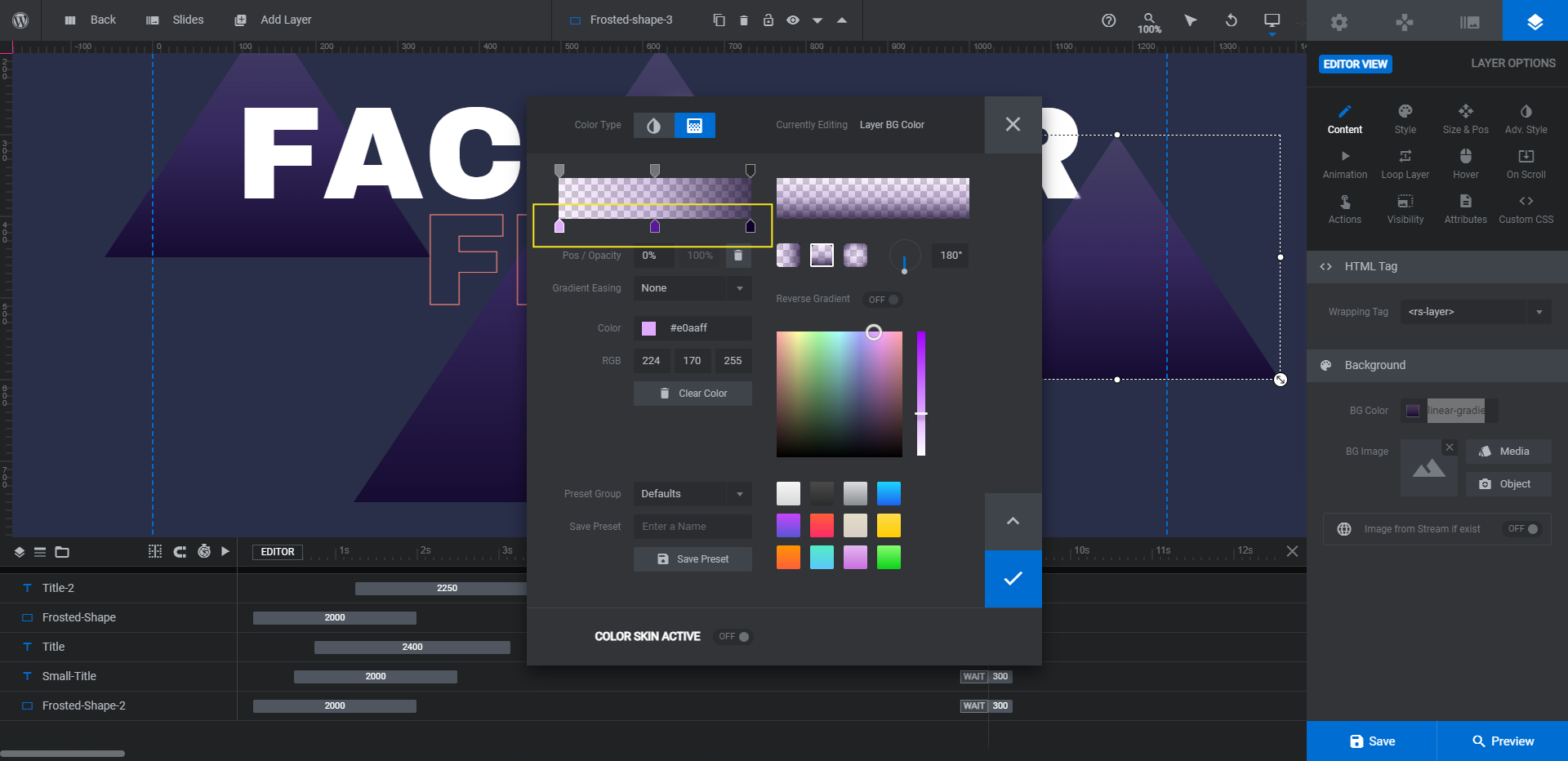
To maintain the frosted-looking gradient, edit only the colors along the bottom part of the gradient bar. Leave the transparency settings above it alone. Also, mimic the flow of colors from light to dark that are in there now.
Tip: To make your shapes blend with the background, set the darkest color in the gradient to the same color as your slide background.
Before you close the dialogue, go to the bottom area where it says “Preset Group”.
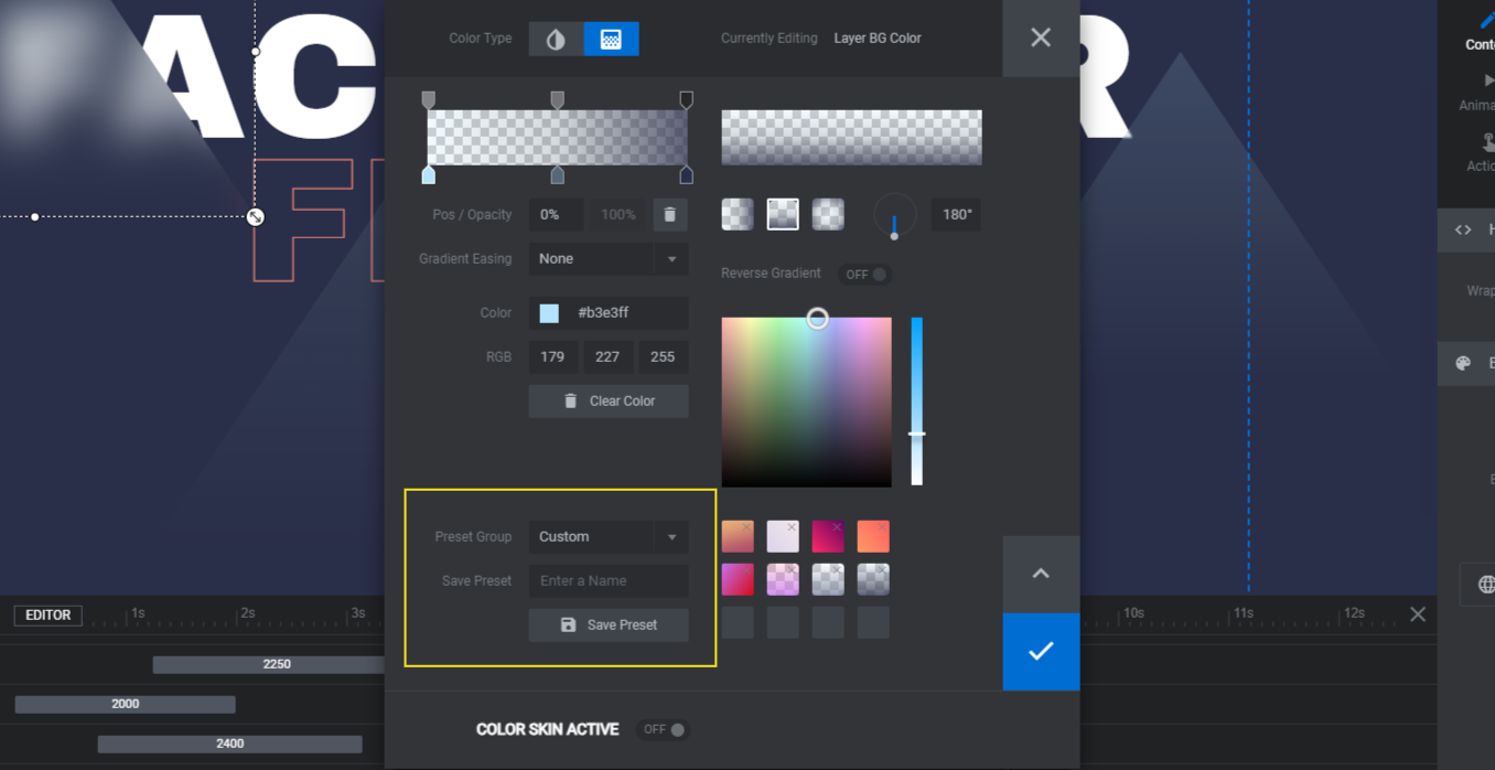
Switch the dropdown to Custom. Give your new gradient a unique name in the text field. Then click Save Preset.
When you update the other two triangles, go down to this section, switch “Preset Group” to Custom once more. You’ll then see your new gradient on the right. Select it and save your changes.
Learn more:
Step 8: Update the call-to-action
There are two layers that make up the animated call-to-action at the bottom of the hero section: Arrow-Down and Call-To-Action.
The first thing we’re going to do is edit what the Call-To-Action text layer says under “Content”:

If you’d like to edit the style of the down-arrow, you can do that from this same area. Just click the “Icon” tab at the top of the content editor and type “arrow” in the search box.

Click on the arrow (or other shape) you’d like to use. The arrow code in the text box will be updated. However, be sure to delete the old arrow code before moving on.
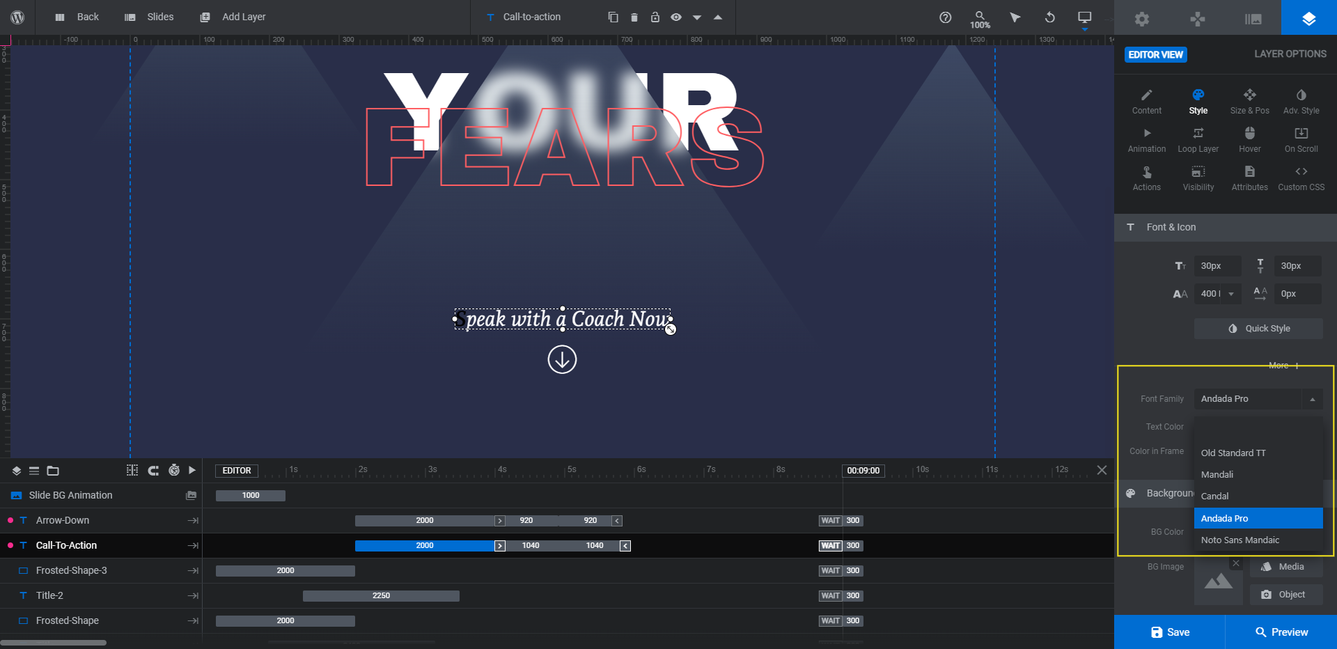
Next, we’re going to update the font for both layers under “Style” so that they match the Small-Title layer.
You’ll also want to edit the color of the text and arrow so that they match the Title-2 layer. Leave the font color under “Style” settings alone. The color to edit is the color that appears as these layers bounce up and down.
To modify the animation color, go to “Animation” settings. Scroll down to the “Advanced” section and click on the Color tab.
Go up to the keyframes section and click on the TO keyframe that says up. Update the color under “Advanced” for this keyframe.
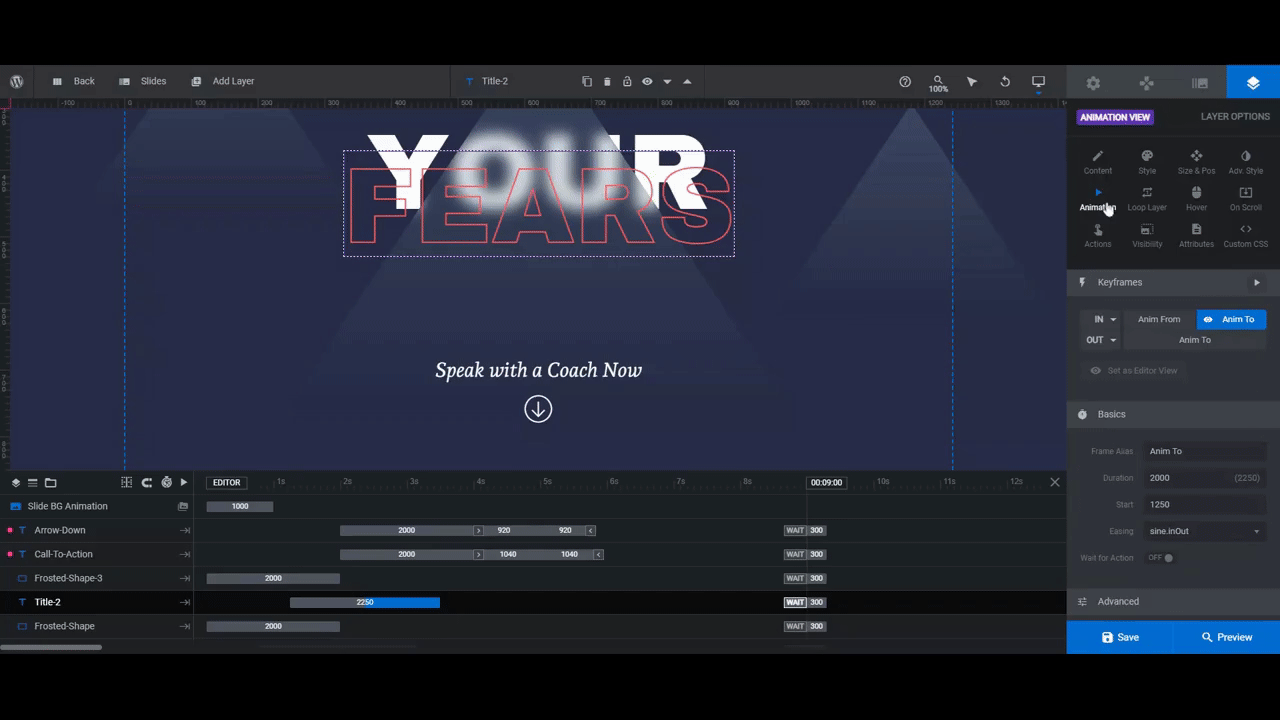
Feel free to play around with the animation settings here to come up with a custom bounce effect. For instance, we deleted the up and down keyframes for the Call-To-Action layer and changed the Easing style for the Arrow-Down layer to circ.
All the settings you need for this are under “Basics” and “Advanced”. You’ll find more information on how to customize animations down below.
Now, because we removed the bobbing animation from the CTA text, we want to give it a hover-triggered color so that it’s clear to visitors that it’s clickable. You’ll find this setting under “Hover”.
Enable the animation settings, then scroll down to “Style”.

Lastly, we want to add a custom link to both the text and arrow elements. This setting can be found under “Actions”.
Right now, the layers are programmed to move visitors to the next slide. Instead, we want to direct them to the consultation booking page.
Click the trash can icon to the right of the Next Slide action to delete it. Then select Simple Link from the list on the right. Enter a custom Link URL.
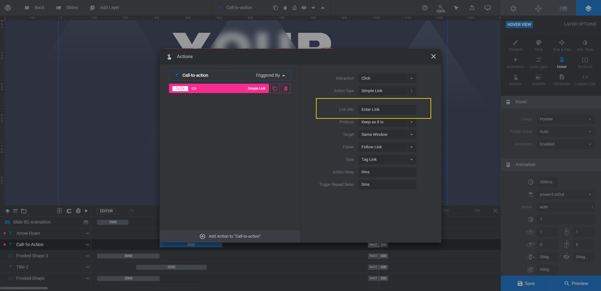
Close the pop-up to save your changes. Do this for both the text and arrow layers.
Learn more:
Step 9: Customize the parallax settings
Currently, all of the text and shape layers in this hero section have a push-pull effect when someone hovers their cursor over the section. To customize this, we’re going to customize the “On Scroll” parallax settings.
If you’d like to disable parallax for any of the layers, click the Level dropdown and select No Parallax. You can also use these settings to customize how far each of the layers move and in what direction.
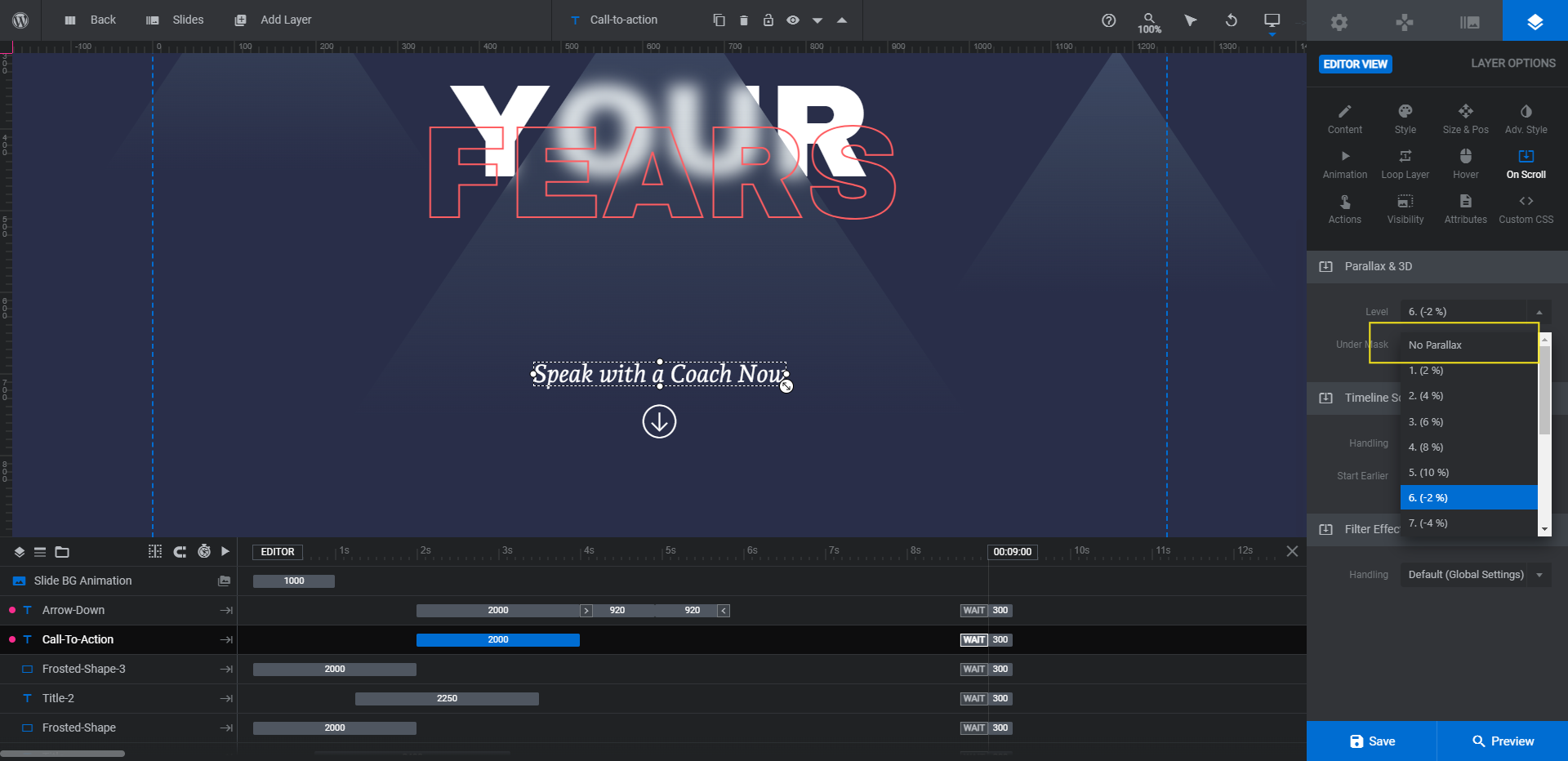
We’ve applied the No Parallax setting to the Small-Title, Call-To-Action, and Arrow-Down layers. This way, our visitors’ eyes will be drawn to the opposing shapes and main headline text. The bouncing arrow at the bottom will then draw their attention to the next step (i.e. conversion).
Learn more:
You don’t need imagery to create a memorable hero section
There are so many ways to design the hero section these days — layered images, video reels, creative carousels, and more. But you don’t always need photos and videos to create a visually interesting hero section.
As this tutorial demonstrates, all you need is some bold typography choices and special effects to achieve a cool, eye-catching effect. And starting with a template like the ones found in Creative Hero Collection will be a big help as well.

