
As a digital agency, your website should be one that makes prospective clients immediately go, “I want that for myself!”. But the design shouldn’t just be for show. You should create an awe-inspiring design that simultaneously educates prospects on what you do.
In this tutorial, we’re going to show you how to use the Material UI Slider template to promote your digital agency’s services in an original way.
Table of Contents:
- Step 1: Delete UI elements
- Step 2: Update the phone shell
- Step 3: Add your visuals
- Step 4: Change the background colors
- Step 5: Update the cluster effect
- Step 6: Edit the text
- Step 7: Customize the buttons
- Step 8: Remove global layers
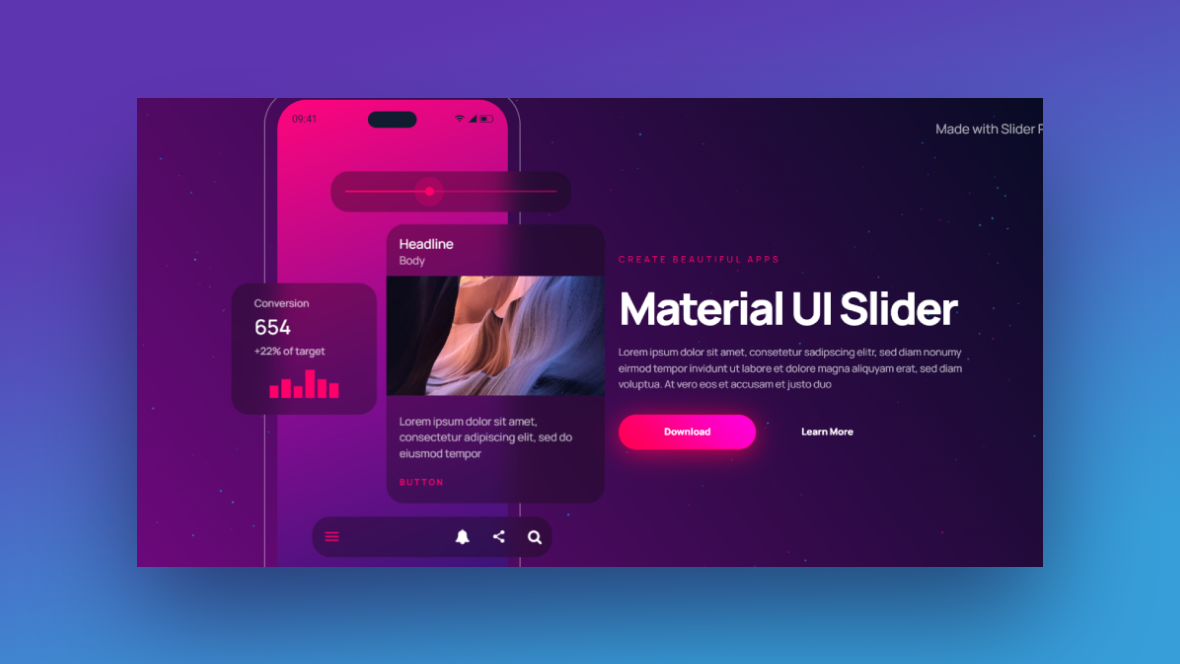
How to promote your digital agency with a completely custom slider design
This template is a great one to use if your work involves mobile apps.
While our example below promotes the services of a digital agency that specializes in app design, you could also use this template to promote general web and responsive design.
Note: The phone screens in our redesign have short auto-playing videos in them. However, screen recorders cause a delay in the auto-play functionality which is why the GIF above isn’t the best reflection of this edited template. That said, you won’t have to worry about frontend performance if you go the route of adding video screens to this template. It’s simply a glitch in our recording software.
Need a Slider Revolution refresher? Start here:
Step 1: Delete UI elements
If you’d like to take a general approach to promoting your mobile design services (meaning you won’t show off real projects in the slider), keep the phone UI elements. All you’d need to do then is customize the colors and what the content says in each slide.
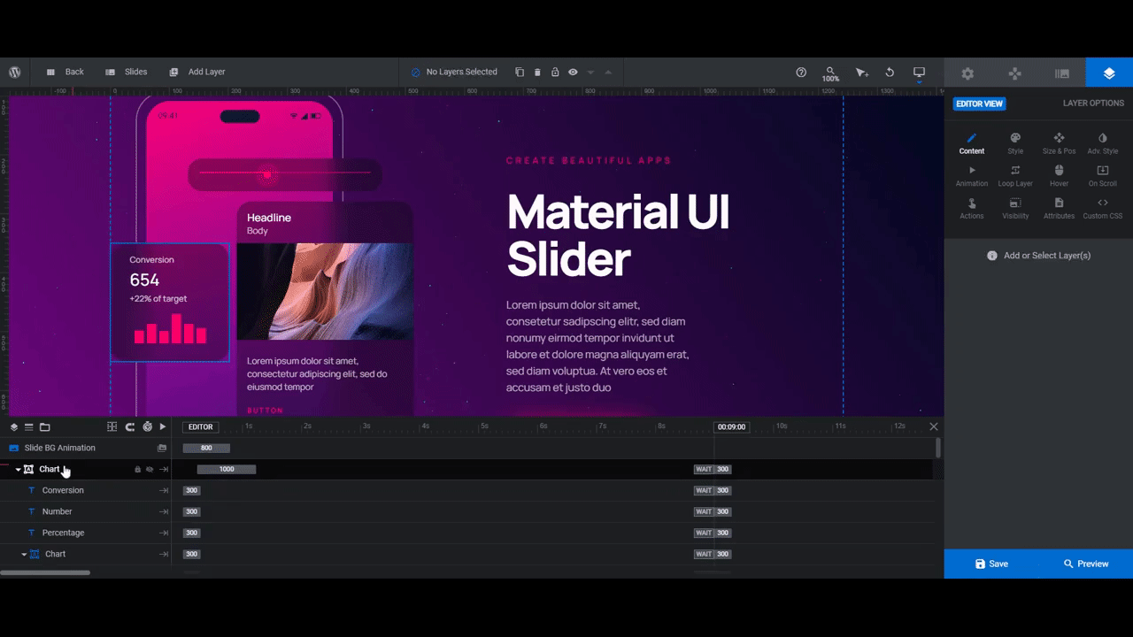
If you’d like to incorporate real portfolio projects instead, the first step is delete the UI elements that stand out from the phone screen.
The easiest way to delete them is to hold down the Ctrl or command key. Then select the top-level container or group that contains them.
In Slide 1, they are:
- Chart
- Card-Ui
- Slider-Ui
- Nav-Ui
In Slide 2, they are:
- Chart
- Card
- Form
- Nav
In Slide 3, they are:
- Card-Ui
- Nav
When you’re done, save your changes.
Learn more:
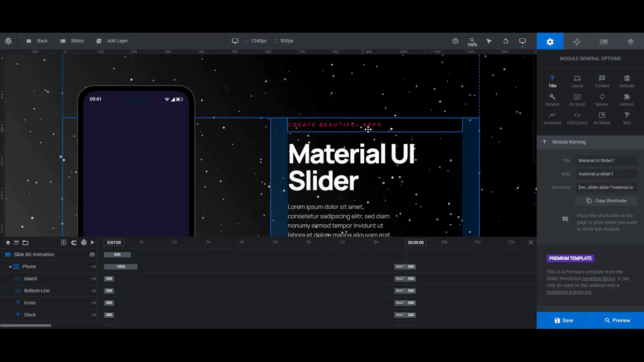
Step 2: Update the phone shell
There are two shape layers that make up the phone: Frame and Screen. We don’t need the Screen layer since our video layer is going to take the place of it. So you can delete that layer.
To update the Frame, we’re going to need to do a few things.
First, we’re going to make the frame itself black. To do this, select Frame from the canvas or timeline editor. Then go to “Layer Options” and “Style”. Click the block next to BG Color to change it to a solid black.

You can leave the Island and Bottom-Line layers alone. The Icons and Clock layers, however, need to be changed to white so that they stand out against the screen background.
They’re both text layers, so select them in the canvas or timeline. Then go to “Style” to change the Text Color to white.
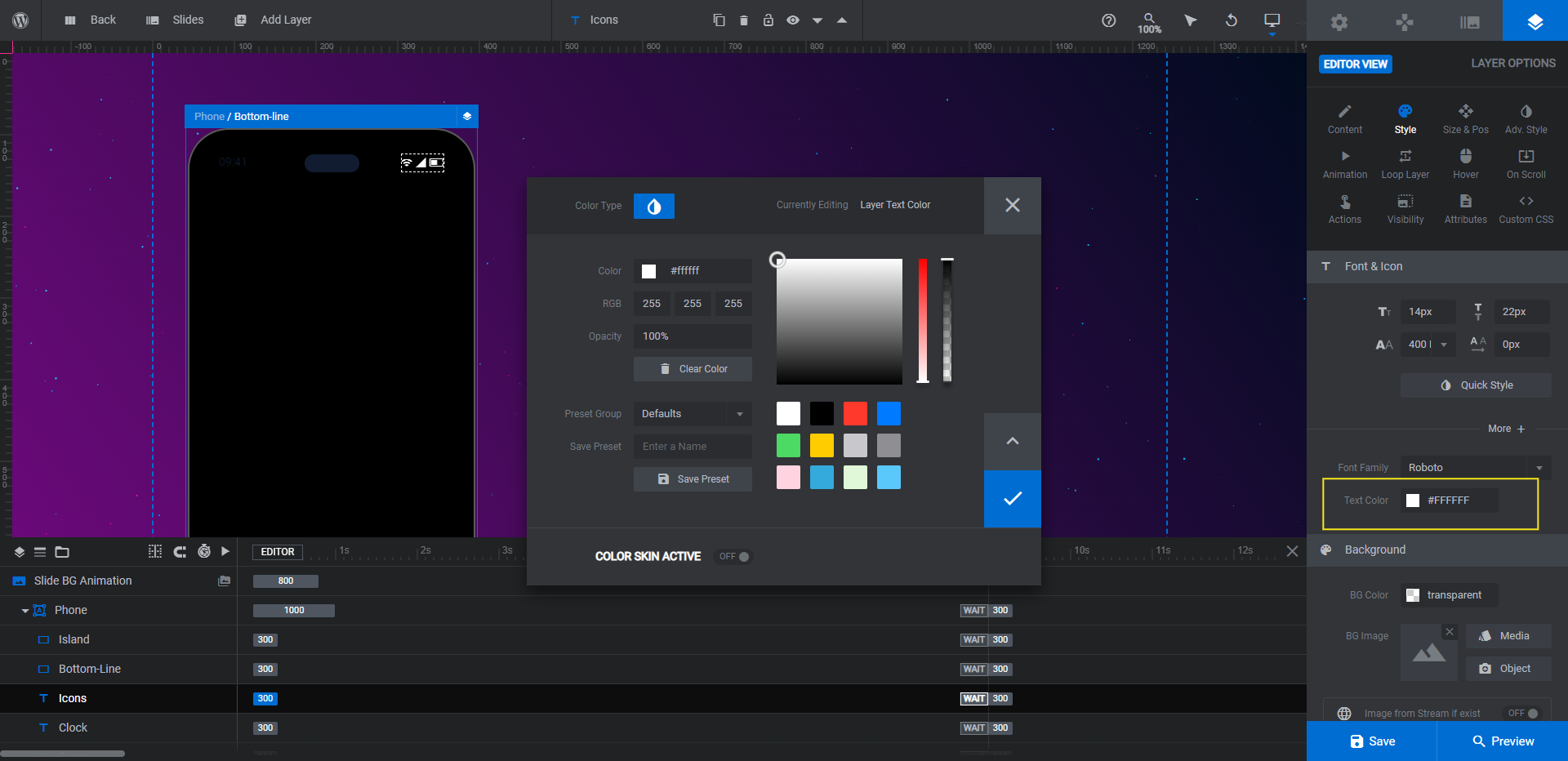
Repeat this process for each slide.
Learn more:
- Adding and Configuring Shape Layers
- Additional Text Content Options
- The Tools of the Color Selection Dialogue
Step 3: Add your visuals
In each slide, we’re going to give a preview of the different types of mobile apps we build. To do this, we’re going to need to insert a video file.
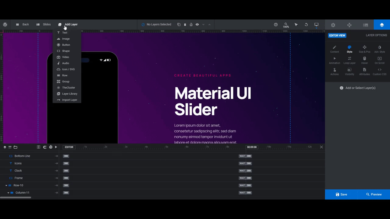
Go to “Add Layer” in the top toolbar and select Video. Go to “Content” to upload your video file.
Pro tip: Create the video in portrait format. Export it as 330px by 700px.
This video file needs to take the place of the Screen. Here’s how to prep the file to do this:
- In the timeline editor, drag the file in between the Clock and Frame layers. This will insert it into the Phone group.
- Go to “Style” and scroll down to the Border section. Set the corners to 40px all around.
- Go to “Size & Pos”. Set the video to center vertically and horizontally.
- Unlock the dimensions. Then set the width to 330px and height to 700px if the video isn’t the proper size.
Before you move on to do the same thing in the other two slides, do a responsive check using the editor in the toolbar.
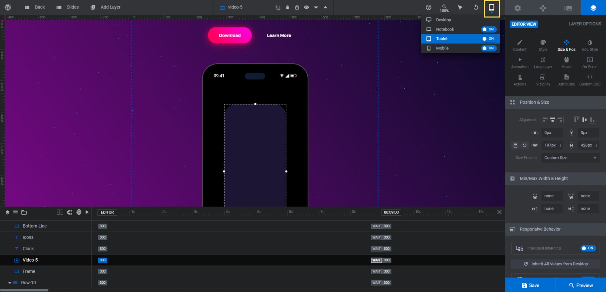
This new video layer will need to be resized to fit the phone on smaller screens.
Learn more:
Step 4: Change the background colors
Before we customize the text in the slides, let’s hash out the background colors in the slider first. This will cut down on how many times you need to edit your text and button layers.
There are two areas in Slider Revolution that will need updating. We’re going to start by going to “Slide Options” and “Background”. This is where you’ll modify the background gradient for each slide.
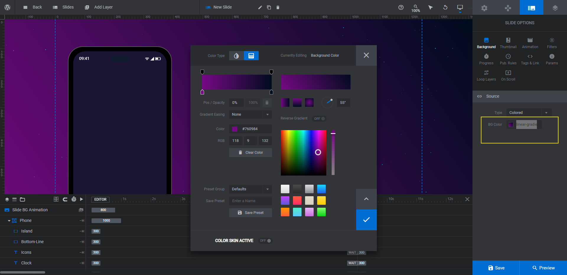
You can choose from one of the pre-made gradients in the bottom-right corner of the color selection module and then use the settings at the top to customize. Or you can create your own using the color bar and settings in the top-left corner.
Unlike the template which uses different gradients for each slide, we’re going to apply the same black gradient to ours. Because our phone screens have content that visitors should pay attention to, we don’t want the slide’s design to distract from that.
After you’re done updating the background in each slide, go to “Module Options” and “Layout”. Scroll down to the section called “Module Background”.
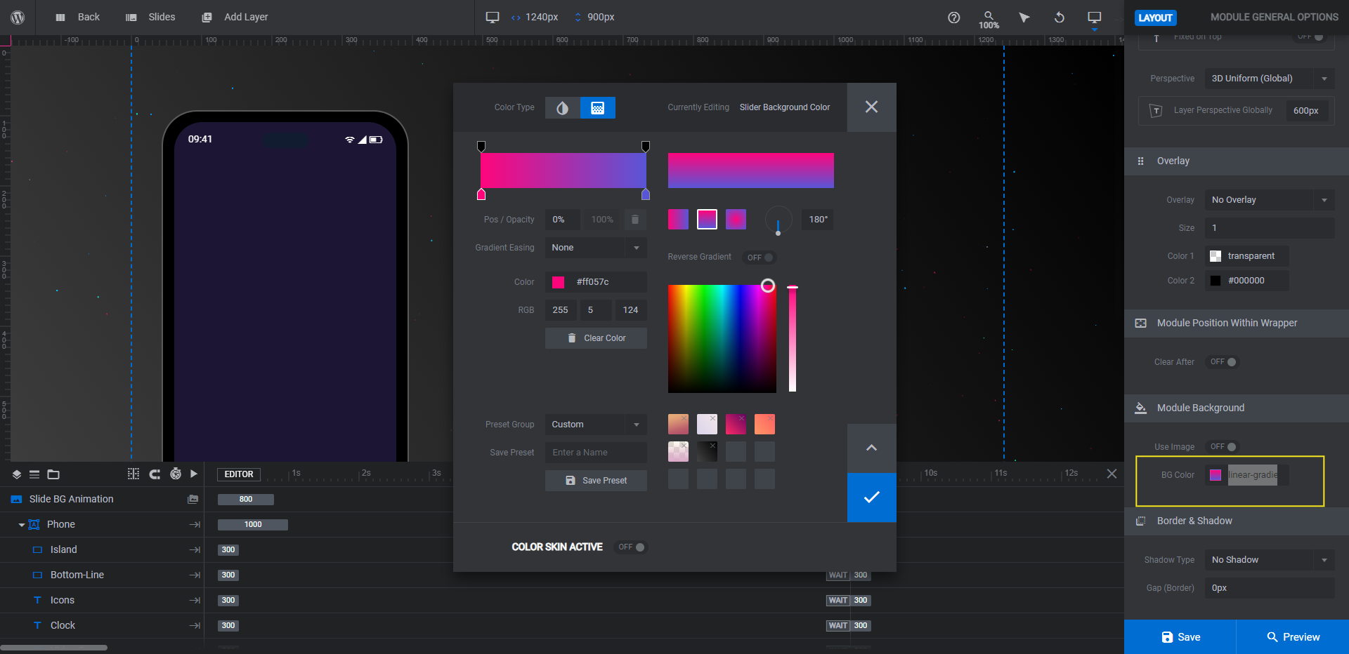
This is the gradient that appears when the slider first loads. Change it to match the gradient in your first slide so that there’s a seamless transition as your content fills the screen.
Learn more:
Step 5: Update the cluster effect
Each slide has a particle cluster layer called Cluster-Bg that sits on top of the background gradient.
To modify it, locate it in the timeline editor. Hover over it and click the lock icon to make it available for editing.
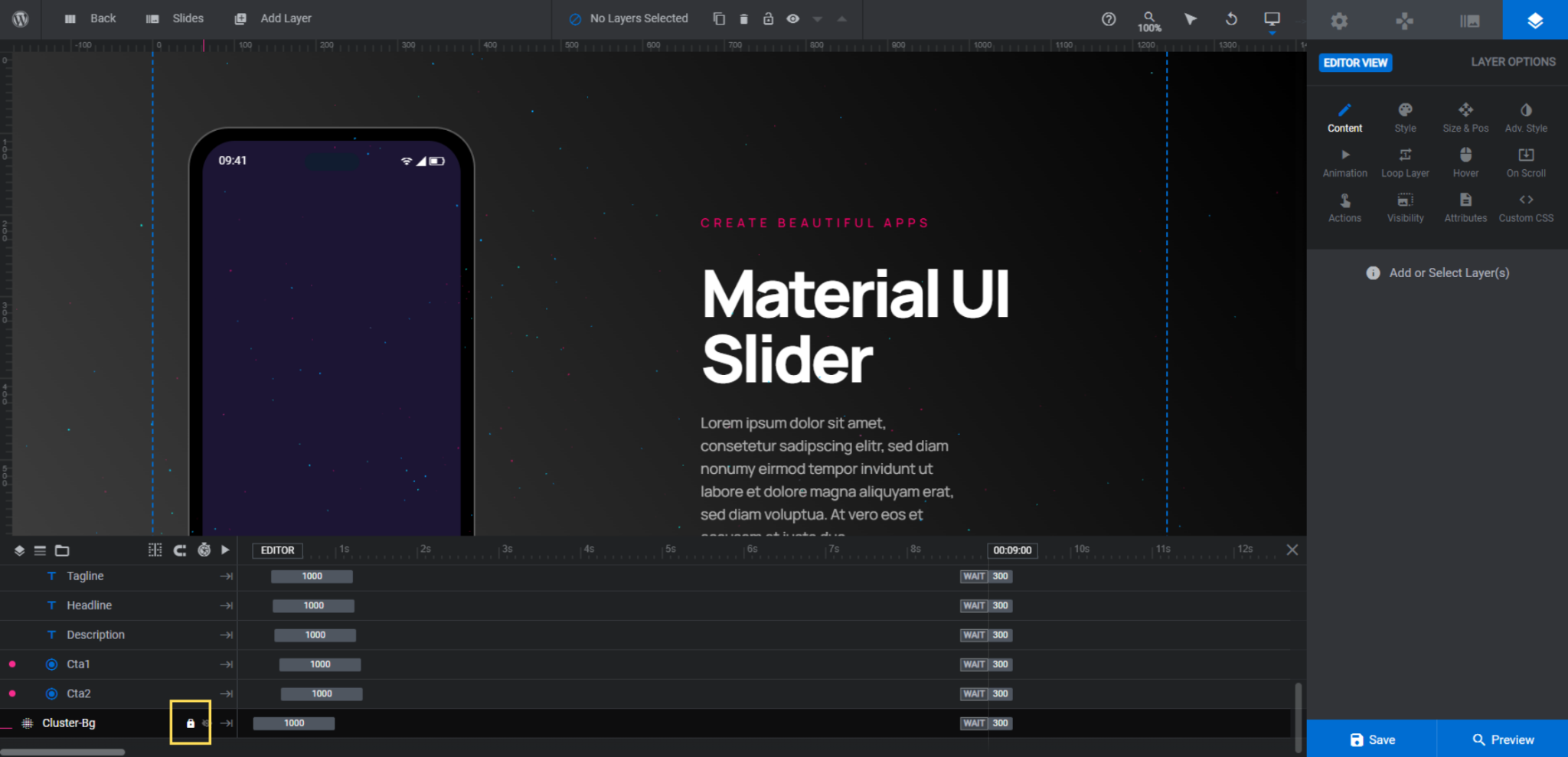
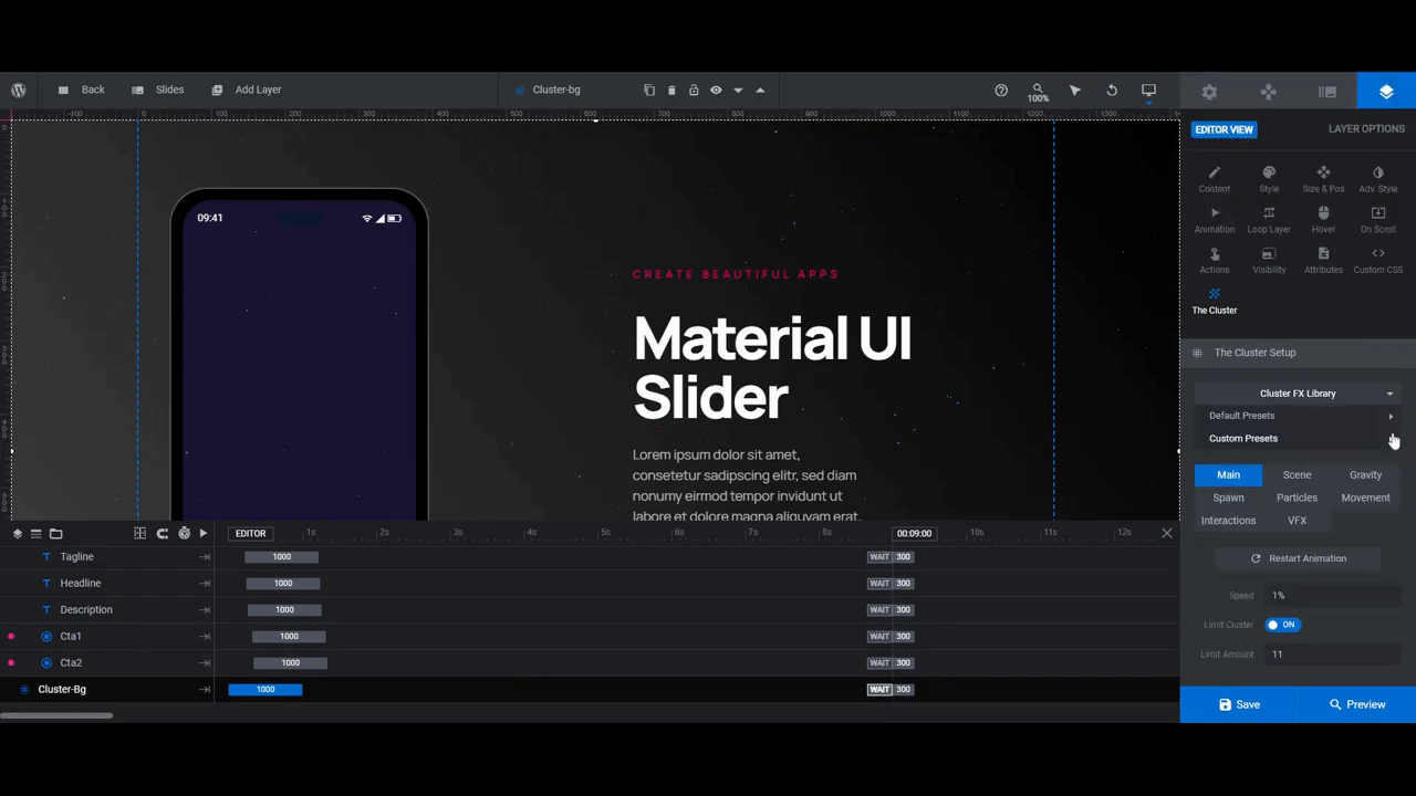
You can now select the layer and go to “Layer Options” and “The Cluster” to customize it.
There are many ways to customize this cluster effect, starting with choosing a different preset from the library.
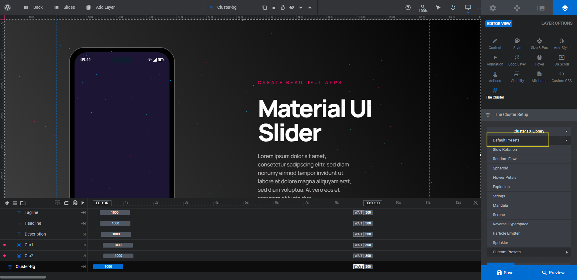
That said, you don’t have to choose a different cluster style in order to put a completely unique spin on it. All it takes is configuring a few settings down below to achieve a new effect. So you might want to start with this option first since it’s the easiest.
For reference, here’s what we’ve done to create our custom effect:
- Under “Particles”, we increased the Size to 15. We also chose a more subtle gradient Main Color.
- Under “Interactions”, we turned the setting off. This stops the particles from moving in response to the cursor movement.
- Under “VFX”, we turned on the Bokeh setting and left Breathing enabled.
This last setting, in particular, gives our cluster effect a blurred appearance for a few seconds — just enough time for visitors to focus on the phone screen. When the particles come into focus, their eyes are then drawn to the other areas of the slide along with the supporting text.
Go ahead and play around with the settings to find your own cluster style and effect. Once you’ve found one you like, apply it to the Cluster-Bg layer in each slide.
Learn more:
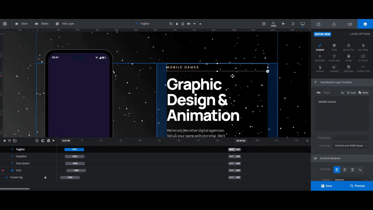
Step 6: Edit the text
There are three text layers in each slide: Tagline, Headline, and Description.
To edit the text in each, go to “Content” and replace the existing text in the box. You can then use “Style” to change the font and colors as well as to make other stylistic choices.
When you’re done, repeat this process in the other slides. The font choices should remain the same from slide to slide. However, you can change up the colors if you’d like to give each service or example a distinct look.
Learn more:
Step 7: Customize the buttons
There are two buttons in each slide: Cta1 is the button and Cta2 is the text link.
The first thing to do is decide if you want to keep both calls-to-action. If you don’t want to give visitors a second option, delete the Cta2 layer from each slide.
Next, update the text in the Cta1 button. It’s the same process you used to edit the text layers under “Content” to change the text and “Style” to modify the font.
With buttons, you also have to address the color of the button shape. There are a few places where you can make these modifications:
- Go to “Style” to edit the button background color (gradient or solid) as well as the border shape and color.
- Go to “Adv Style” to edit the box shadow effect (or turn it off altogether).
- Go to “Hover” to modify the color and general appearance of the button when someone hovers over it.
The button links also need to be updated in this step. Go to “Actions” and click on the Simple Link action that’s there.
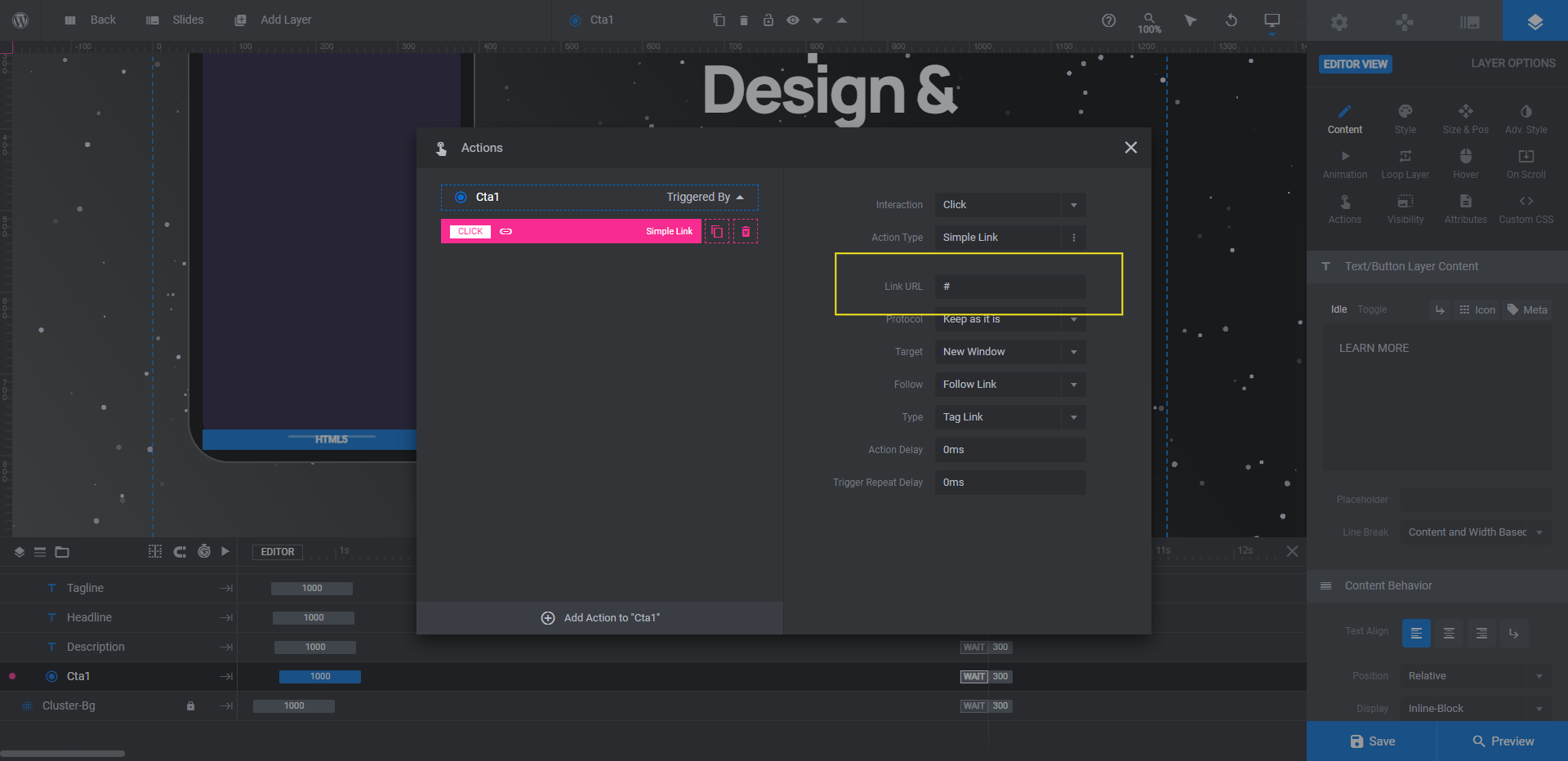
Replace the hashtag placeholder in the Link URL field with the corresponding URL for that slide. Close the pop-up to save your changes.
Learn more:
Step 8: Remove global layers
Go to “Slides” in the top toolbar and open the Global Layers from the dropdown. Here you’ll find all the elements that appear on top of the slider — the brand logo, “made with” tagline, Instagram link, and custom navigation.
We’re going to delete all of these layers except the arrows navigation that sits in the bottom-right corner of the slider.
Hold down the Ctrl or command key. Then select the following layers:
- Made With
- Insta
- Logo
Hit the Backspace or delete key. This will leave you with the three elements that make up the navigation.
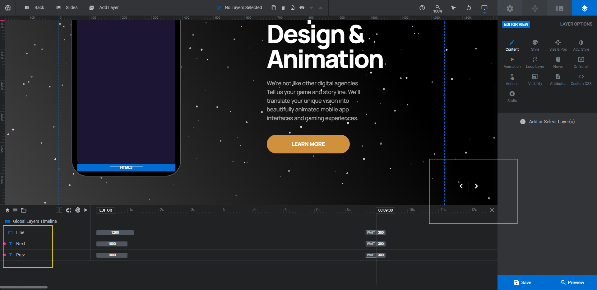
If you’d like to modify the arrows — which you may need to if you’re using a lighter background — use the “Style” settings to do so.
Create a slider for your home page that makes prospects’ jaws drop
One of the fastest and most effective ways to convince a prospect to hire your agency is to make your website one they want to have for themselves. While this tutorial demonstrates how to promote your digital agency’s services with the Material UI Slider template, you can use any number of Slider Revolution’s jaw-dropping templates to build out the rest of your site.

