
The Contact Us page is one of the essential sections of a website. It allows the visitors to contact the admin or the page’s moderator to ask queries or open up concerns. Without it, it would be more challenging to reach out to customer support.
This is where you will find a contact form to let the users or visitors fill out their information, the details of their message, and the reason for contacting the page.
When creating a Contact Us page, you should not focus on the design alone. The content, details, phone number, address, an embedded map, and complete information regarding your website really matter. The layout or style is also essential, but it’s not the priority. You can leave it to your web designer.
Although it is one of the quick-after thoughts of most people, you should never neglect it. Dedicating your time and effort in creating a well-versed content page entices more visitors. It also builds your relationship with them and turns them into potential customers.
The Difference Between Contact Form and Email Address
When you include a Contact Us page on your website, you need to know what is needed to make it more enticing to the visitors. Analyzing competitor pages give better ideas on how to create a relevant contact page that serves its purpose.
Some websites include address, phone number, email, Facebook page, and other details to their contact page. Contact forms are also available on other pages.
Here are the things you need to consider in creating a contact us page:
- Accessibility
- Complete basic details
- Straightforward captions
- Your website’s nature
- Your visitors’ needs
Your visitor would not want to look through several pages of your website to find the contact page. Sometimes, you’ll only find the Contact Us button at the bottom of the page. However, it should be readily accessible, where they can view the menu right away.
You must know what visitors look for on a contact page. There’s more to it than simply including a generic email address in that section. If you don’t have ideas on the user’s purpose in visiting that page, you should think outside the box.
For example, if a visitor wants to contact the company directly, contact forms should be available. Through this form, getting through via phones or emails is unnecessary unless there’s a huge concern. The visitor only needs to add all the information, and they’ll receive the answer to their queries. It will also let them contact the company anytime.
Don’t choose only one from either the email address or contact form. These two are essential to your contact page. Along with these two, add your employee/department contact information, phone number, and business address. With these details, visitors can contact you instantly, and you can turn them into potential clients.
How to Create an Effective Contact Page
They get more views in their contact pages for agencies and contractors rather than their blogs or other website sections. These viewers want to know how to get in touch with the company to avail themselves of their services or products. That’s one of the functions of a Contact Us page.
Some of the details you’ll find on that page are the location, phone number, and email address in a plain background. However, some contact pages lack the essential factors to entice more users to the Contact Us page and talk with your company.
On the contrary, you’ll find many websites that get a lot of attention and will allow the visitor to contact the admin or the business manager.
This article will explain what these visitors see in successful businesses with compelling ‘contact us’ sections. First of all, you need to find the right balance in allowing users to contact your business instantly. Second, your details should be complete and easy to understand by the visitors.
Here are the ways on creating a useful contact page
Provide a Contact Us menu.
The menu or button will redirect visitors to the Contact Us page. Make sure it is easy to find.
Create a Call-to-Action Section.
This is where you will explain why they should contact you and what they will get from you once they fill out the contact form.
Only Ask Relevant Questions.
Don’t make your contact form complicated. If you do, that will drive people away. Make sure to only ask relevant questions that will lead them to find the answers.
Leave Your Contact Information.
This includes your email address and phone numbers. Allowing them to contact you in other forms will help them receive answers from you right away.
Use Short Forms Using Fields.
These fields will help you to know who is contacting you.
Present Your Customer Service Team.
Introducing your customer service team assures your visitors and potential clients that they are talking not with the bots but with real people.
Add Another Call-to-Action.
Suppose the visitors do not go through completing the contact form. In that case, you can use another call-to-action to drive them to another option.
Include FAQs Links.
The links to the FAQs page will provide the answers they need. That will also prevent your page from receiving countless repetitive questions.
Link Your Social Media Accounts.
It is sometimes more convenient to message your social media account since you can receive the messages within a second. They can also engage with your business and know new updates from your website.
Proofread Your Contact Us Page.
Grammatical errors and wrong punctuation might turn off visitors. Always edit and proofread the page before publishing it.
Be Creative, but Keep It Simple.
Minimalist or plain background is beneficial depending on the type or nature of your business. If you are a graphic or web designer, it should reflect on your contact page’s design.
Tell Them Your Availability.
Receiving many letters or queries from different people would take a lot of your time. That’s why you need to set the right expectations. Highlight your response time while reassuring them you’ll get back to them as soon as possible.
Show Off Your Brand.
Tell them what your brand could offer. You can introduce your brand or products to your potential customers.
Add a Menu to Your Contact Us Landing Page.
As you add more menu, you are also adding more contact options to your visitors.
Read on to find out the 33 best examples of Contact Us pages that will improve your website and boost your monthly revenues and leads.
33 Best Examples of ‘Contact Us’ Pages
SalvageData
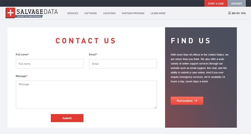
When you visit this data recovery service company’s Contact Us page, you will see their company information, along with the simple fill-out form. They say, “Friendly Service,” which makes their contact page more personal, bringing excellent customer service to their visitors and clients.
Their clean and straightforward form makes them unique. SalvageData wants to lead users to a new space instead of stuffing the page with 40 addresses. Their Find Us section is also interesting and unique for the users.
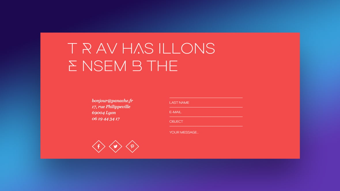
Panache
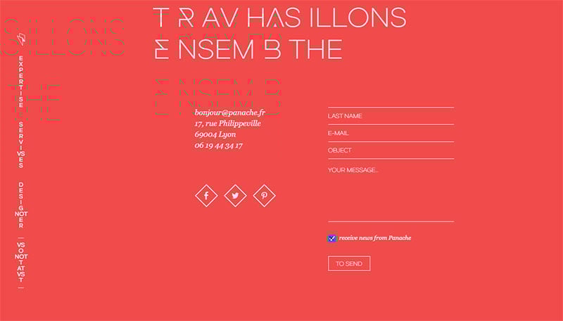
You will see a compelling call-to-action with a ‘Travaillons Ensemble’ and aesthetic design to work together and collaborate with the visitors on this website. They include the essential details, such as the social media links, contact form, phone number, location, and email address.
Broker Notes
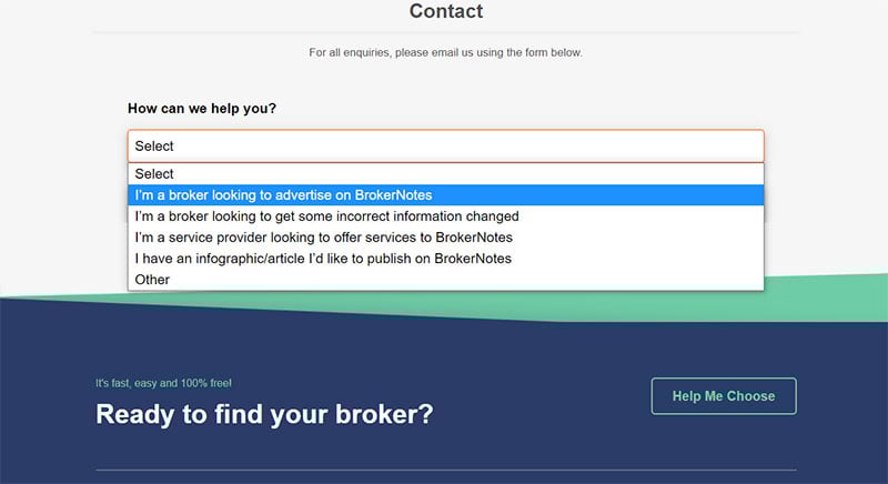
Broker Notes’ contact page looks direct and straightforward. Their design is ideal for UX but might not be too enticing to reach out to the visitors.
However, the ‘How Can We Help You?’ section allows their users to tell them their exact concerns. The simplicity of their contact page lets people know how to contact them as soon as possible.
Survicate
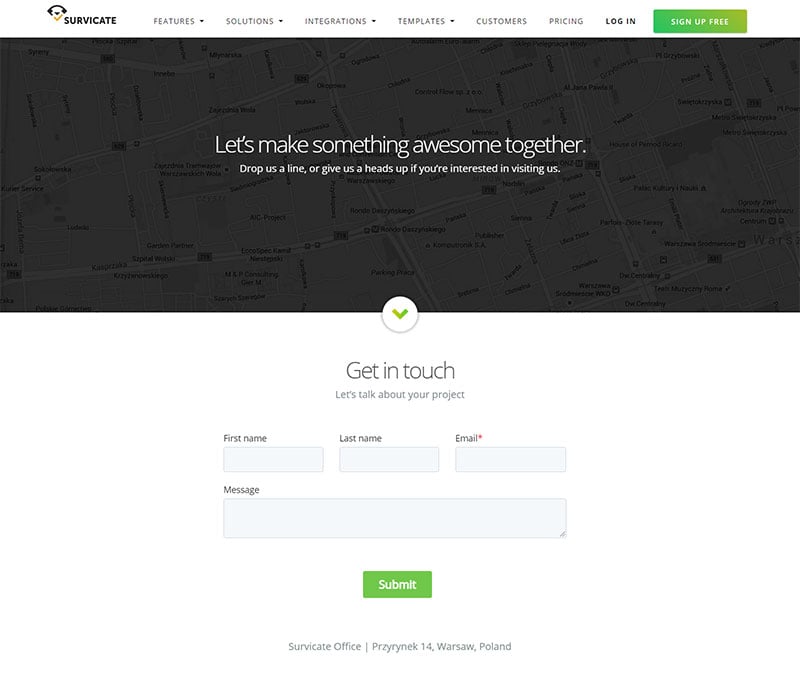
As soon as you reach the contact page of Survicate, you’ll find it friendly and welcoming to the visitors. The sub-header has a note, “Let’s Talk About Your Project.” With this simple or conversational tone, more people will feel comfortable asking their queries.
It is also mobile-friendly with its large CTA and form fields. You can obtain their operation hours, email, phone number, and office address.
Atlassian
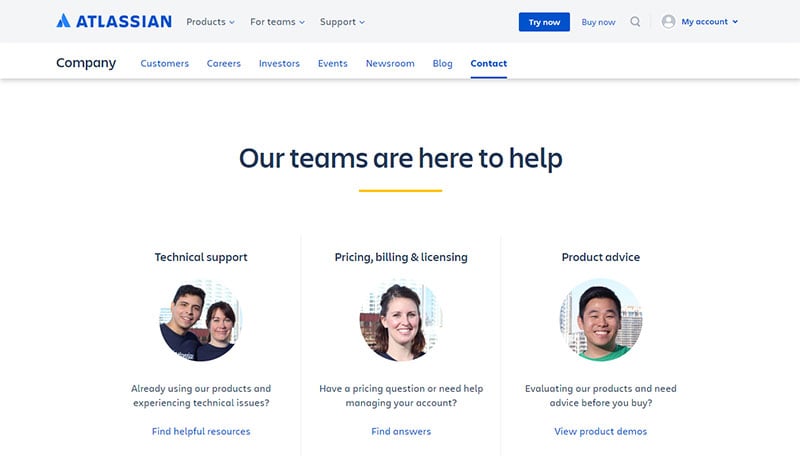
This enterprise software company aims to keep large companies organized by offering their various types of services and products.
Their Contact Us page is clean and well-organized, which reflects their nature of work. As a result, the clients or visitors can view the details or specific departments right away.
Yeti
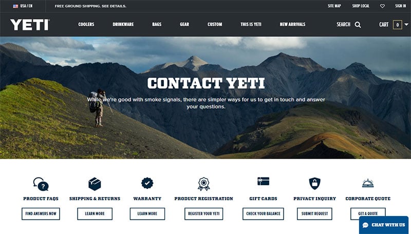
This website has an outstanding contact page. They have a photo background without distracting the viewers from the main message. They also supply the warranty info, product FAQs, and a range of resources.
They have a line of copy, “While we’re good with smoke signals, there are simpler ways for us to get in touch.”
Moz
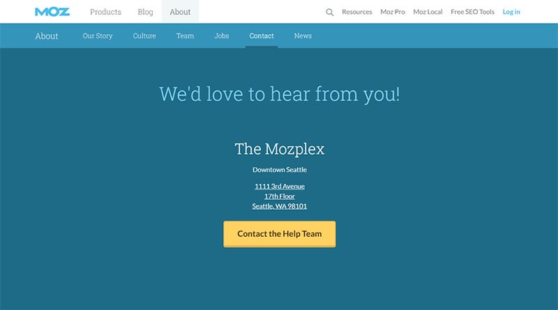
Despite having a simple or minimalist design, Moz proves they can keep their contact page unique. In their CTA, you’ll see a simple form to contact the team and an address where you can find their building.
A simple CTA enables the users to find their contact information and go straight to the next step. That is a great way to encourage people to purchase products and services right away.
Morroni
Your forms should be specific on what to ask. Ensure that the details included will help you understand the users. When you create a particular question, you will know if they will qualify as your potential leads.
When you visit the contact page, you will get a question like, “How’s your math? 2+5 equals?” to figure out if you are a human or a bot. You will also read their essential details, like their phone numbers, to reach out to them about your concerns or queries.
Basecamp
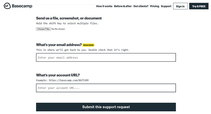
The questions and content on their contact us page are more in conversational tones, allowing more users to feel at ease when visiting their website. They have unique typography similar to a typewriter.
When a user visits the contact page, a message that calculates the response time appears. It reassures the visitors that they will respond once they fill out the form or message them.
Moreover, this strategy boosts the Basecamp brand’s reputation. With their form’s simplicity and straightforwardness, more people are confident to have their queries.
Weifield Group Contracting
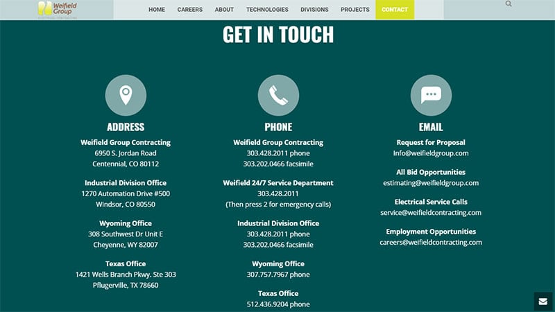
Weifield’s Contact Us page serves as a model. It is mobile-friendly and flexible on different devices. When you use a desktop, it will not look weird or out of the borders. That’s why it is crucial to test your page to see if it looks good both on mobiles or desktops.
To make their contact page mobile-friendly, they kept their form short and concise. Their CTA buttons are large enough to make it tappable and let the visitors view it right away. They also have large forms to enable the users to fill them out via their cell phones.
Stripe
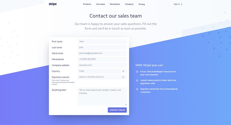
Stripe is one of the best examples of an excellent Contact Us page. When you visit it, the aesthetic design is welcoming, and their copy has a friendly tone. It also looks clean and straightforward, enabling the visitors to navigate directly to the contact form—which is their primary purpose.
Along with their Contact Us page’s contact form and details, they showcase their partnered companies next to the form. That will entice more companies and users to purchase their service. Including the best potential on your contact page will likely lead to more clients.
Grover Web Design
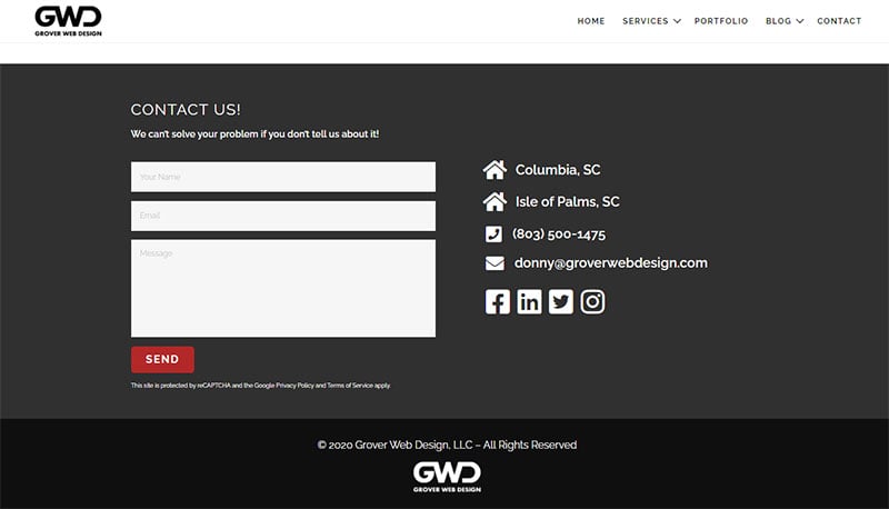
This website has a Captcha feature to their simple contact form to prevent spam submissions. By simply selecting a checkbox, you can easily answer the CAPTCHA.
They have an excellent example of the Contact Us page since they give the users many options through email, contact form, social media, telephone, and in-person visits. Users can send their contact form and let the page deliver what they need.
Yummygum
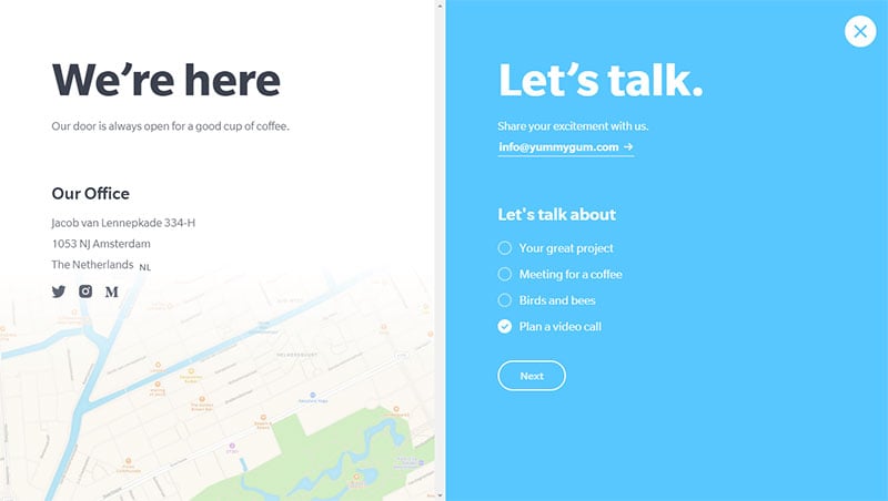
When you visit Yummygum’s contact page, you will see they offer a two-step process through filling out the contact form. It will pop out as soon as you click on the Contact button. You will find it in the site’s header section.
Its welcoming and friendly tone entices more users to get in touch with the team. Although it is not always advisable to use a casual and pitchy style, you’ll get an idea of how to use a welcoming message on your contact us page.
PayPal
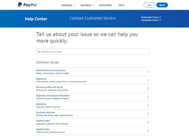
Paypal has an accessible contact page. You can get the idea of using the menu to lead the users to their specific questions. The menu-driven option is more organized and directs them to the right team.
This style would be helpful if you have a particular team for each topic or issue. Paypal’s welcome line or phrase starts with “Tell us about your issue so we can help you more quickly.” It sounds welcoming and sets the right expectation for the visitors.
You can choose from the Password and Account Access, Account Profile and Setup menu, and others. When you do the same to your website, you’ll get organized queries and answer their concerns.
Atlas 1031 Exchange
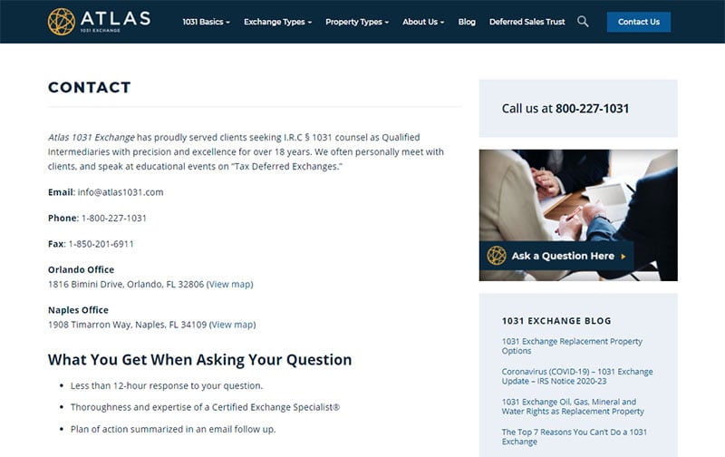
Atlas has excellent aspects of an ideal contact page. It starts with the essential functionalities to give what the users need.
On their page, they show what the visitors can expect when they contact the company. They have the phrase, “We are incredibly responsive to your requests and value your questions.” They have an organized set of topics, and the visitors can click on that for their relevant questions. Then, the company promises a response of 12 hours or less.
Rescue Agency
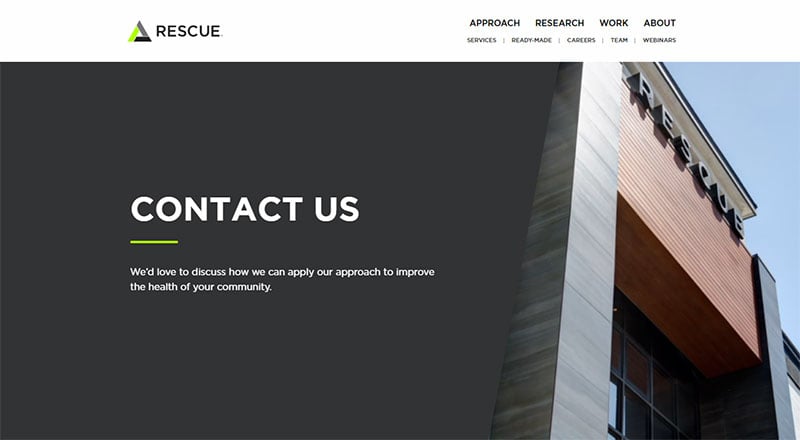
Rescue Agency focuses on getting leads and invites them to get in touch with the business admin or moderator. Every website should have this type of contact page. They want to communicate with the users and keep them engaged all throughout that section.
First, they include an area of interest in the form field. As a result, it redirects the user to the specific customer service team to get the right answer to their queries. Second, the page is simple and straightforward. Visitors can find it quickly and fill out a form without problems.
PeopleMetrics
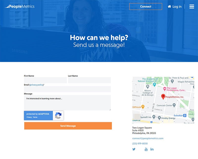
PeopleMetrics has a very straightforward approach on their contact page. That section has what the visitors need. It is also well-written and clean for better readability.
Since their purpose is to provide only the essential detail, they stick to minimal design. Besides, their audiences are more likely to scan their page for the contact details than the design itself.
Grammarly
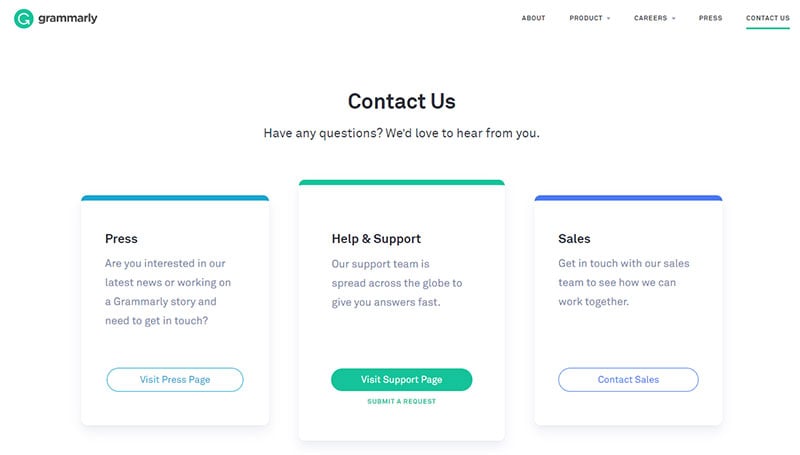
Always be specific in adding details to your contact page. That’s what Grammarly does in their Contact Us section. They refrain from adding too much unnecessary information.
Their clean Contact Us page entices more visitors to see what their website could offer. You’ll find three CTAs from their website. These are contact sales, help and support, and press page sections. Having these three sections make their contact us page more organized.
For example, when a specific user chooses the “Contact Sales” menu, the sales team will assist that person. If you have this type of CTA, it would be more hassle-free to answer queries.
Brandwatch
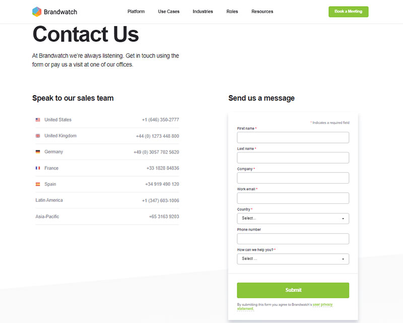
If you are searching for something unique, you can get inspiration from Brandwatch. They have the classic vertical layout for their contact page.
They have organized CTAs with five input fields and one drop-down list. You’ll find them over the text area to let the users write their message and query regarding your products or services.
This website gives the users assurance that all their messages and queries will go directly to the exceptional customer service team. However, these users should provide the complete details or information before they get the answer they want to receive.
JetBlue
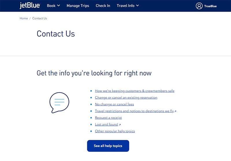
JetBlue provides a great example of a Contact Us page. First, they provide the link to the FAQs page for specific topics and answers. If the users cannot find what they are looking for, they can ask questions through their email address or phone number. Their page’s design and color scheme are inviting enough for the users.
Le Mugs
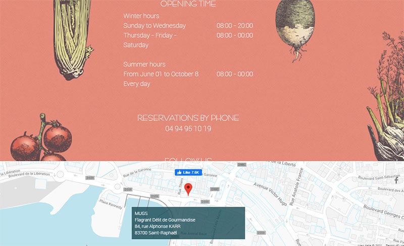
This website is for a restaurant. They include the crucial details, such as the operating hours, email address, and phone numbers, to let the customers reach out to them conveniently.
Copper
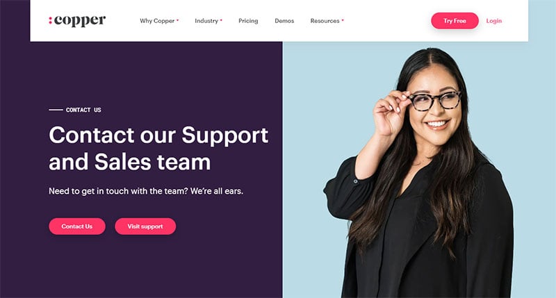
Copper has a consistent look and feel. It has an image of a smiling woman to make the page more friendly and inviting. That way of approach moves more people to ask questions with confidence.
That’s why keeping a friendly tone on your website makes interaction easier.
Gill Andrews
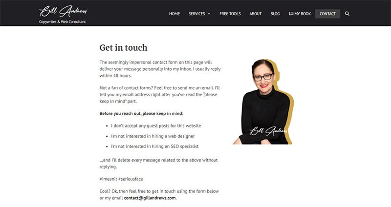
This website has two ways of receiving inquiries from the users—through the contact form and email address. Some people hate the idea of using forms. So, emailing the company’s email address is the only way.
In their contact page section, they state that the most extended reply is within 48 hours. They also include limitations to what users should not message them about—the link exchanges and guest posts.
Moosend
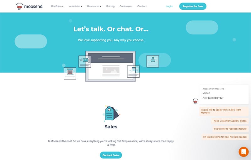
Since this company is an email marketing software provider, it should reflect on their website’s contact page. It must present extensive contact and support options. A single form might be useful for some people, but it is not enough.
Moosend creates a specific single contact page to redirect users to a section to know the answers to their inquiries.
They have a visible Contact link to the header to lead more visitors to that section. Making it more visible can help people to contact your page right away.
Inspira Marketing
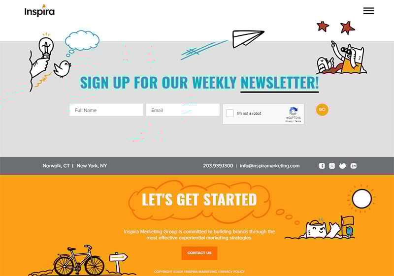
They have a phrase, “Human Connection Starts Here.” Even though this phrase is short, it connects with people, and more users feel comfortable asking questions. It gives a clear indication that the company shows interest in the people. Interacting with people means you’ll get more potential leads.
They have a simple form that is easy to understand. Their easy and practical contact page makes it more enticing to the visitors.
Pixpa
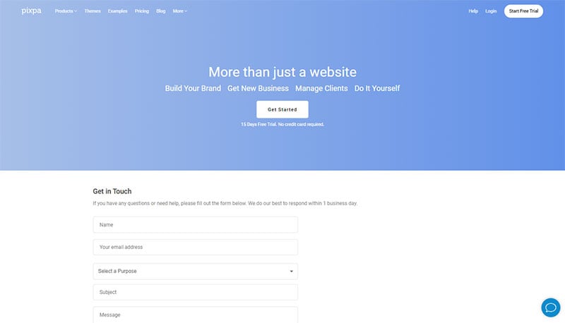
Many websites forget to include CTAs on their contact us page. Their reasons could be that it has a different purpose. However, adding CTA leads more people to your website and turns them into potential clients.
A visitor might not want to go through the bother of submitting forms but do want to know what your product could offer. Having a CTA will redirect this visitor to your product page and purchase items.
You can create a CTA that leads people to your blog, demo page, product page, or download links to a video or an ebook. That’s why Pixpa added more CTAs on their Contact Us section.
Sleeknote
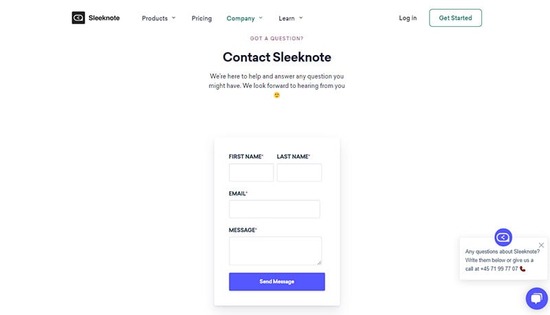
Broker Notes and Sleeknote has a relatively similar contact page format. The user will receive how the website can help them, and they will send the link on how to gain partnership or book a demo.
If not, the users can fill out the form to write their message. Sleeknote has a live chat option that allows people to chat with a real customer support team for their inquiries.
Infinum
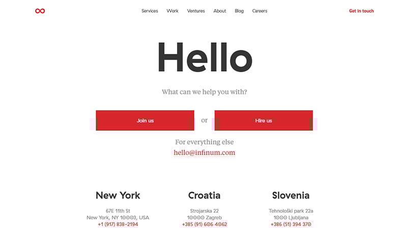
Infinum has a friendly tone contact page copy with comfortable readability. Right after you visit the contact page, you will receive the note, “What can we help you with?”. When the users click that section, they will go straight to the “Join Us” or “Hire Us” section.
Choice Screening
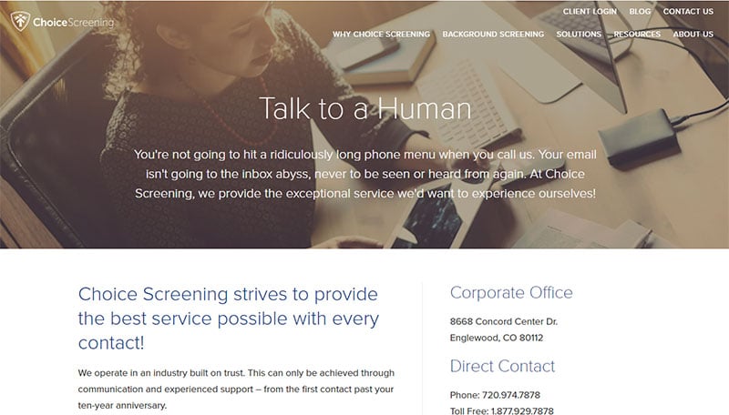
The concise and straight-to-the-point header phrase, “Talk to a Human,” will give instant solutions to the visitors who want to ask questions. Concise copy is better to lead the users to the specific page quickly.
They have a different email in every department. There’s a form available afterward to allow the visitors to write their queries or messages.
The only downside in their contact page’s form is that it is longer than the usual copy. This is because they want to background-check the users or businesses who wish to gain partnership with them.
Let’s Travel Somewhere
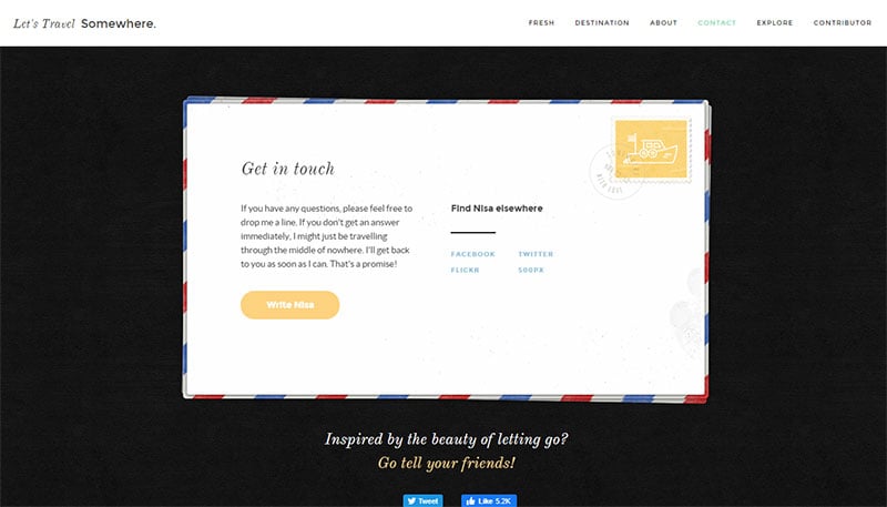
This website’s contact page looks like a postcard. The unique style is enough to entice people to go straight to the calls-to-action section.
They have a contact page that reflects their business nature. Having this type of design encourages more people to inquire about your services.
It also has a simple and straightforward CTA button, where people can click to send a quick message. On the righthand side, visitors will find more social website links to communicate and keep updated with the company’s new services.
Marvel App
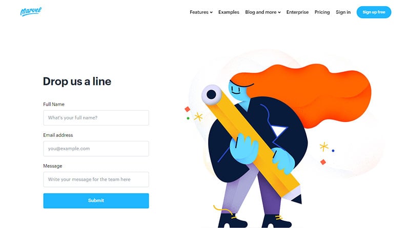
This website allows the users to fill out a straightforward form that gets enough information. Visitors can choose from the menu to answer their questions. These are the Support, Press, and Sales sections. Pick from these categories, and a specific team will be there to reach out to you.
In their location section, you’ll notice the real photography—the employees and team behind their companies. Introducing the company’s team members is establishing trust in the visitors. They will know they are talking to real people.
Tune
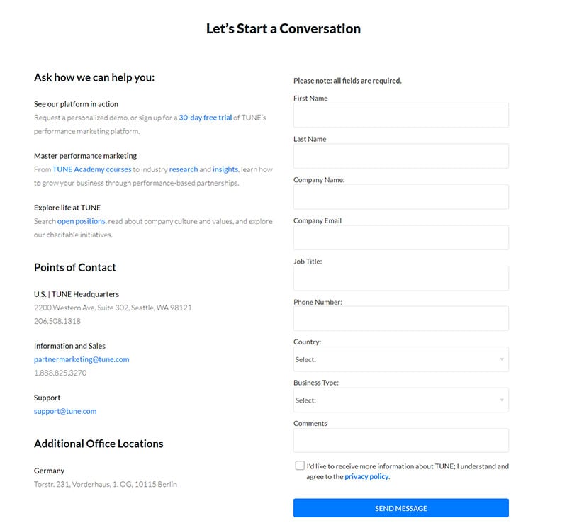
Everything you see on Tune’s contact page is something you want to see on your own website. It has well-organized calls-to-action, beautiful design, and clear and complete information. They have a contact form to get the details from the visitors and know their specific inquiries.
They also have a welcoming message with a compelling copy, such as “We are ready to lead you into the future of mobile marketing.” This short message is enough to get the visitors’ attention. The ‘Get in Touch with Us’ phrase is also a great way to lead them into the contact page.
Making a friendlier approach to your Contact Us page will lead to more leads and potential clients.
FAQs about Contact Us page design
1. What are the essential elements that should be included on a Contact Us page?
The contact details for the company, including its phone number, email address, and address, should be presented on the Contact Us page. A form that consumers can use to submit their questions and feedback is also beneficial. Links to social media profiles and other pertinent support materials are also helpful.
2. How can I make my Contact Us page more visually appealing?
Use eye-catching visuals and an easy-to-read font to give a Contact Us page greater aesthetic appeal. Give the content a tidy layout with room between paragraphs and clearly defined headings. Think about utilizing striking hues that complement the color scheme of your brand.
3. Should I include a form or just list contact information on my Contact Us page?
It can be advantageous to include a form and contact details on the Contact Us page so that customers have a variety of options to get in touch with the company. While contact information can give users the freedom to choose their preferred method of communication, a form is a great option for users who prefer to communicate without using the phone or email.
4. How can I ensure that my Contact Us page is user-friendly and easy to navigate?
Design a clear, uncomplicated layout with distinct headings and sufficient spacing to make your Contact Us page user-friendly. Add a search bar to the page to aid people in finding the data they need fast. Additionally, it’s crucial to check that the page is optimized for mobile devices and various screen sizes.
5. Is it important to include a map or directions to my business on my Contact Us page?
Users who are unfamiliar with the location or who are new to the area may find it useful if you include a map or directions to your company on the Contact Us page. For companies that depend on foot traffic or have a physical storefront, it might also be a helpful tool.
6. What is the best way to incorporate social media links on my Contact Us page?
Include icons that link to the company’s social media profiles on the Contact Us page to incorporate social media links. Ensure that the icons are visible and simple to find. Including social media accounts and links to the company’s blog or other pertinent online content is also a good idea.
7. How can I make my Contact Us page accessible for users with disabilities?
Make sure the Contact Us page adheres to the Web Content Accessibility Guidelines (WCAG) 2.1 requirements to make it accessible to users with impairments.
Make sure the page can be browsed using the keyboard, provide labels to form fields and use informative alt text for images. Test the accessibility of the page using technology like a screen reader, if possible.
8. Should I include a FAQ section on my Contact Us page to address common questions and concerns?
Users who frequently ask questions or express concerns may find it helpful if there is a FAQ section on the Contact Us page.
Businesses may decrease the number of inquiries they receive and enhance the user experience by offering solutions to frequently asked questions. Make sure the FAQ area is simple to discover, contains the correct information, and is current.
9. How can I optimize my Contact Us page for search engines?
Use pertinent keywords in the page’s content, headings, and metadata to make the Contact Us page more search engine-friendly. Make sure the page’s URL contains relevant keywords and is descriptive. Use schema markup to give search engines more information about the content and goal of the page.
10. Is it necessary to have a separate Contact Us page, or can I include the contact information on another page of my website?
Having a specific Contact Us page is still essential, even though integrating contact information on other internet pages might be useful. Users may quickly and easily find the information they require on this page without having to browse the entire website.
Additionally, it gives businesses a central location to display all of their forms and contact information. Even though it shouldn’t be seen as a replacement for the Contact Us page, including the contact information on other website pages can still be beneficial.
Before You Create a Contact Us Page
Don’t rush your Contact Us page. It is one of the essential pages on your website that needs your attention. When you create a thoughtful contact form, more people and visitors can have a great relationship with you and your business. Engaging with the users through the Contact Us page will give your more potential clients in the future.
Study the 33 examples we have provided in this article for inspiration. Keep the recommended best practices to revamp your website. Helping your website’s users with their inquiries has a positive impact on your business. When you give excellent customer service to your clients, they will likely return to you.
Before you create your Contact Us page, don’t forget to craft it well according to the nature of your business. Maintain a professional feel, and keep track of every detail, including its overall design.
If you liked this article about contact us pages, you should check out this article about unique website designs.
There are also similar articles discussing food website design, best nonprofit websites, WebGL examples, and how to start a web design business.
And let’s not forget about articles on how to get more web design clients, how much web designers make, horizontal scrolling websites, and website headers.
")
