
Web design has changed in the last few years. Currently, the cleanest website designs are attracting the most attention. A clean website is simple and organized. It is designed to give the best user experience. Simplicity in design also means the page will load faster and be compatible with different screen sizes to make your content widely available.
The cleanest website designs are built around content, quality images, and strong typography, and make CTAs stand out. Designing a website can be a daunting task. For inspiration, here are the cleanest website designs showcased by our team behind Slider Revolution, a tool that enables you to start your projects easily and efficiently.
Cleanest Website Designs Showcase
Everlane
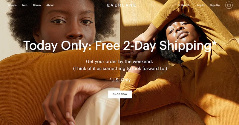
Everlane uses high-quality images and a CTA that stands out clearly; a simple design with striking bold text.
Utrust
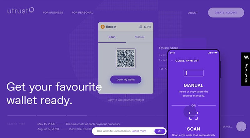
Utrust, which allows e-commerce businesses to accept crypto payments, has a modern website design. When first entering, a slideshow appears explaining the purpose and benefits of Utrust.
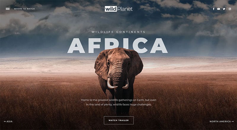
Cinematic wildlife slider
Catscarf
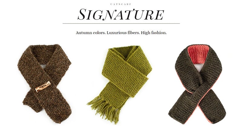
Catscarf ‘s clean design welcomes you with a charming image of a cat wearing a scarf. Below that, scarves are displayed clearly on a white background.
Alessandro Romagnoli
Alessandro Romagnoli has a unique and aesthetically pleasing website design. The page scrolls diagonally, displaying his photography categories. Plenty of whitespace between each photo makes this a very clean website design.
Story Blocks – Website Template
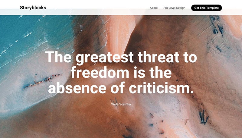
Story Blocks – Website Template offers templates to display a photo story. It presents its own photo story with stunning images, bold text, and unique scrolling.
Brave People
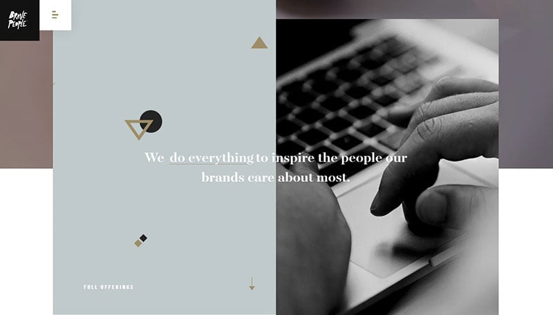
This website exhibits an innovative design, including big imagery, bold text, clear CTA, parallax scrolling, and mouseover displays.
Fuoripista
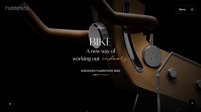
With each scroll on Fuoripista, an outline of another product appears, accompanied with inviting bold text. The yellow accent adds a splash of color.
Intersection
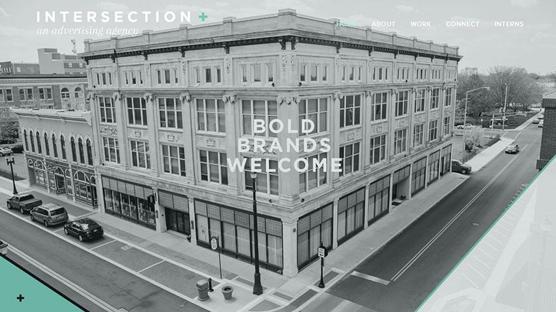
Complementing its name, the site displays an image of an intersection. It only shows five items in the menu, making it an exceptionally clean website design.
Food Delivery Hero – Hero Template
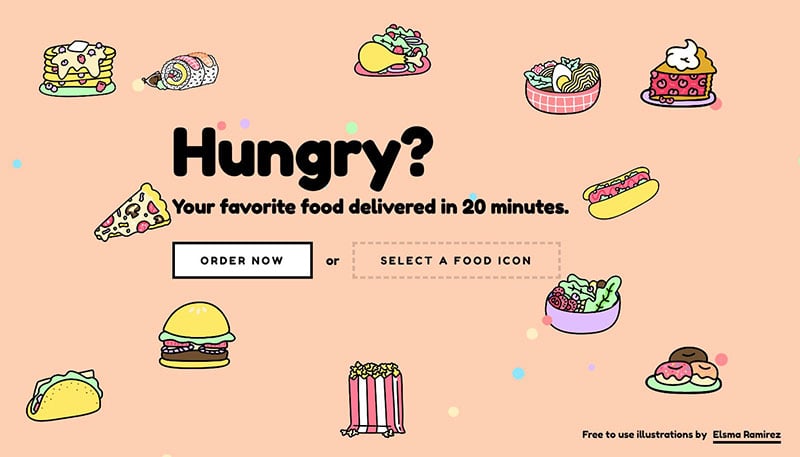
Food Delivery Hero includes bold text, alternating background color, and smooth mouseover effects.
Circle
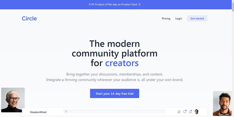
Circle, a community platform for creators, opens to a white background with big and bold text. The blue accent calls attention to the CTA.
ETQ
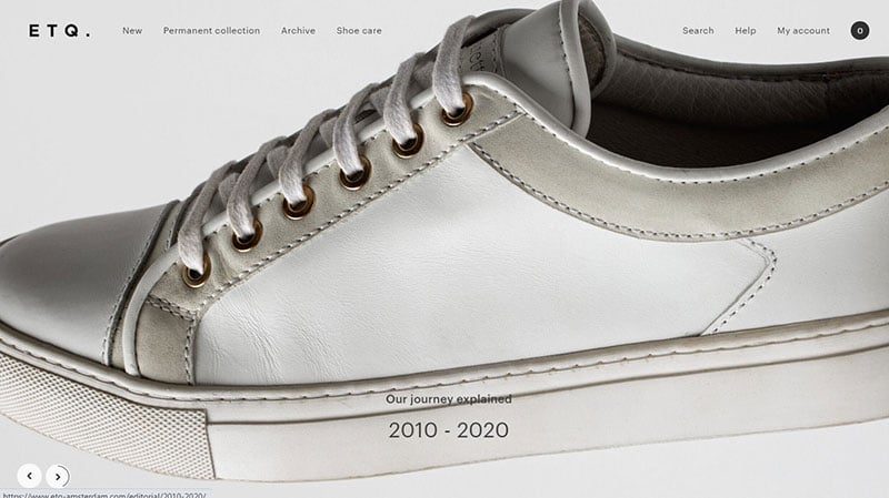
ETQ claims to have one of the cleanest website designs. Large images and plenty of whitespace create an organized look and feel. The clear black text on a white background adds to the appeal and minimalist design.
ettitude
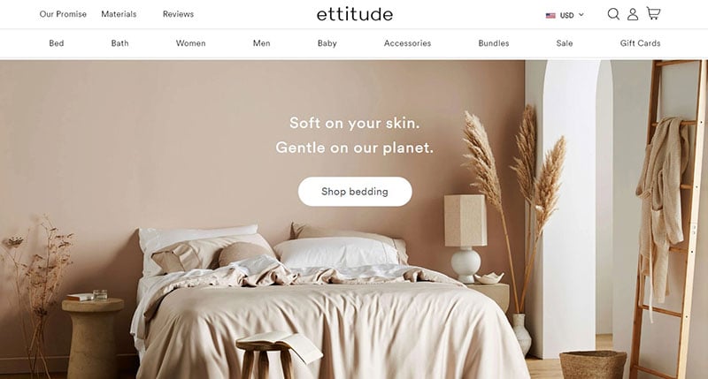
This website offers bedding, bath, and sleepwear products made from sustainable bamboo fabric. A large pastel image first appears with simple text and inviting CTA. Strong typography guides users to the desired section.
Photographer Website Template – Website Template
This website features parallax scrolling effects, high-quality images, and bold typography.
Mikiya Kobayashi
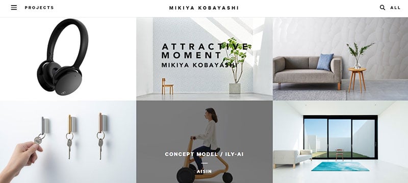
Mikiya Kobayashi displays a grid of images with mouseover effects. The site was created in Japanese and then translated to English, showing the international applications of this clean website.
Accounts Chamber of the Russian Federation
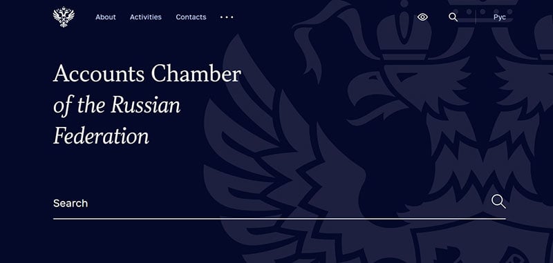
The Accounts Chamber of the Russian Federation website opens to a giant search bar. Below, the bright blue words contrast nicely against the white background.
HalloBasis
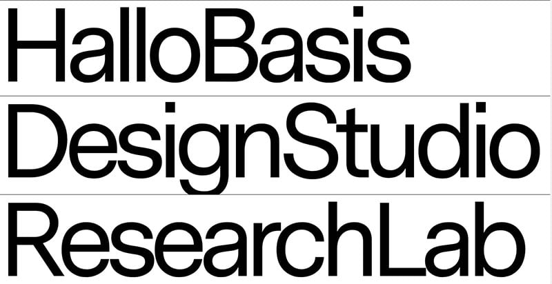
HalloBasis is not afraid to use a very large font. When opened, the animation leads to large letters introducing the site. All throughout, large fonts are used against contrasting background colors.
Landing Page Builder – Website Template
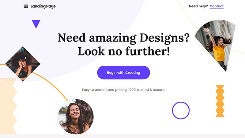
The main feature of this website is its animations. It also has bold typography and clear CTA.
Ferrumpipe
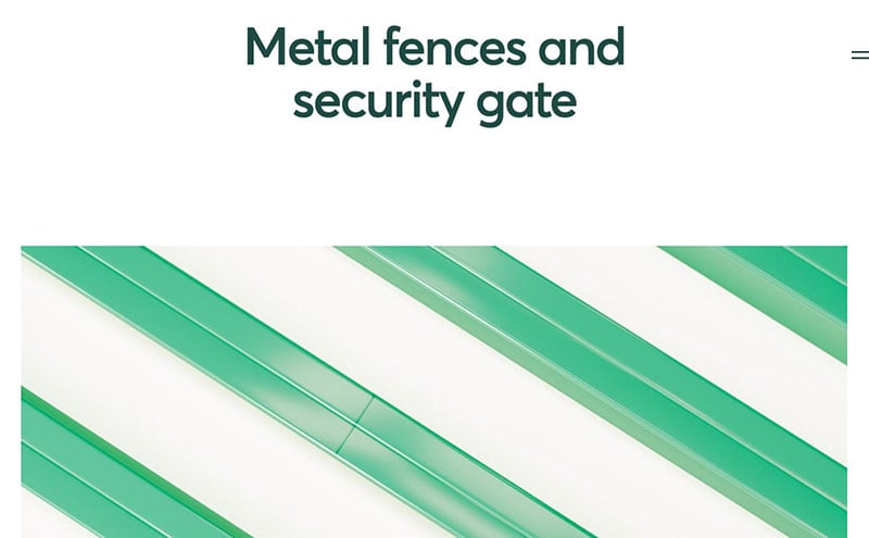
Ferrumpipe produces galvanized metal fences and partners with a large metallurgical plant. Its website takes parallax scrolling to a new level. Each scroll provides entertainment and keeps you engaged until the very end.
Jazz FM
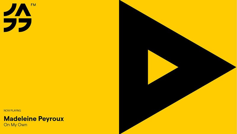
Jazz FM is a Bucharest radio station that emphasizes music by welcoming its visitors with a large play button. This colorful website displays information in bold black text with a yellow background.
Chris Wilcock
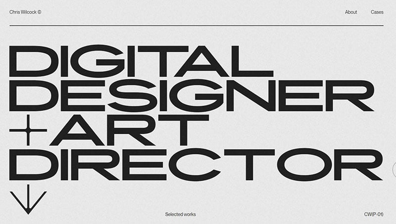
This portfolio for Chris Wilcock makes good use of large lettering. Images, bold text, and parallax effects fill the page when scrolling down.
Evoulve
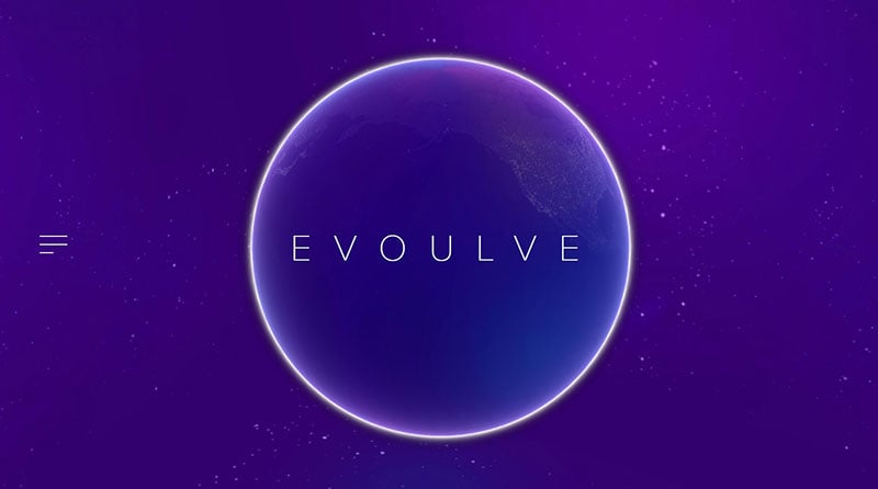
Evoulve is a digital innovation company with a site designed by the Fleava agency. Their website exhibits a spinning globe and starry sky, creating a futuristic feel. Its minimalistic design contains one navigational option.
Yolélé
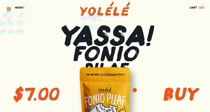
Yolélé offers African foods to support Sahel farmers. The fun large font type makes the website vibrant. Mouseover effects and parallax scrolling brings the website to life.
Tinker
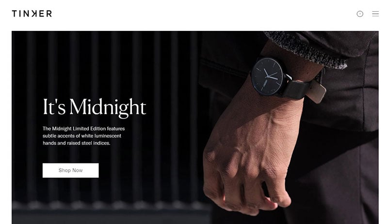
Tinker is a watch brand that allows customers to customize the size, strap color, and metal used to make the watch. The website doesn’t include unnecessary features. It displays the available options for a user to select their ideal watch combination.
Ali Ali
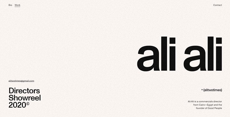
Ali Ali is a commercials director. His website features a white background with black letters. It displays samples of his work and mouseover effects for details.
Modern Portfolio Website – Website Template
This website draws the user in with an alternating background, large letters, and parallax scrolling effects.
Nua Bikes
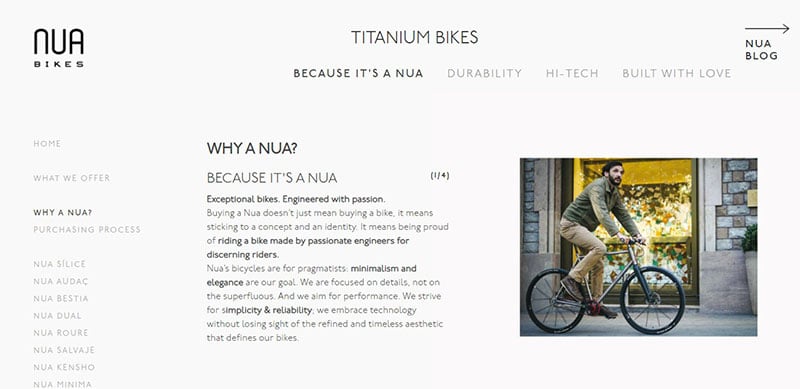
Nua Bikes is deceptive because, although the site looks minimalist, it contains many features. The company maximized the whitespace to create a clean and organized layout that focuses the attention on the bikes.
FIL-SUMI LIMITED
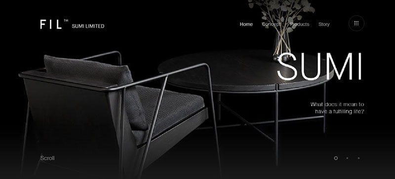
FIL-SUMI LIMITED was designed to bring awareness to a tradition called “Noyaki”. The black background makes the white text clearly stand out and adds to the elegant design.
Valdama
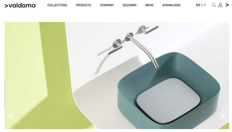
Valdama is a clean website design, which opens to a slider and has plenty of whitespace to stay uncluttered.
Golden Suisse
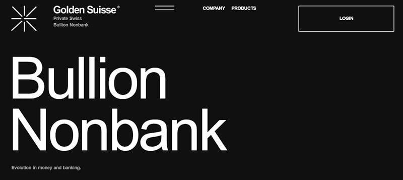
Golden Suisse is a private Swiss company. Its tasteful website has a black background and bold typography.
Ben Ashman
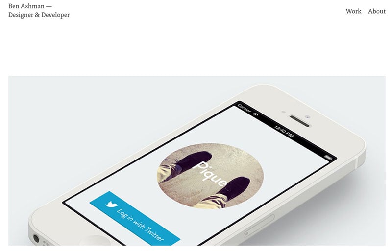
Ben Ashman is a designer and developer. He has a beautiful white website design. The whitespace as well as the balanced proportion of visuals and text contribute to its clean layout.
Anastasiia Afanasieva
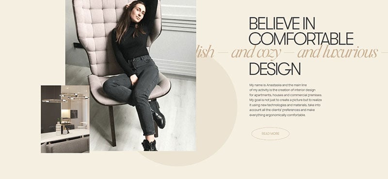
This Ukrainian interior designer uses rotating backgrounds and interactive “bubbles” to create a modern website.
iArk
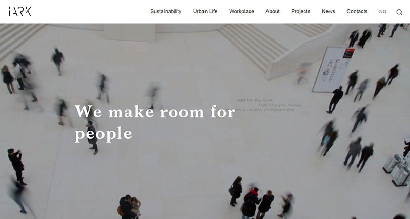
Featuring a white design, iArk focuses its visitor’s attention to the stunning images.
Minimal Template Website – Website Template
This website has plenty of whitespace, background color changes, and bold text, making it an exceptionally clean website designs
Vide Infra
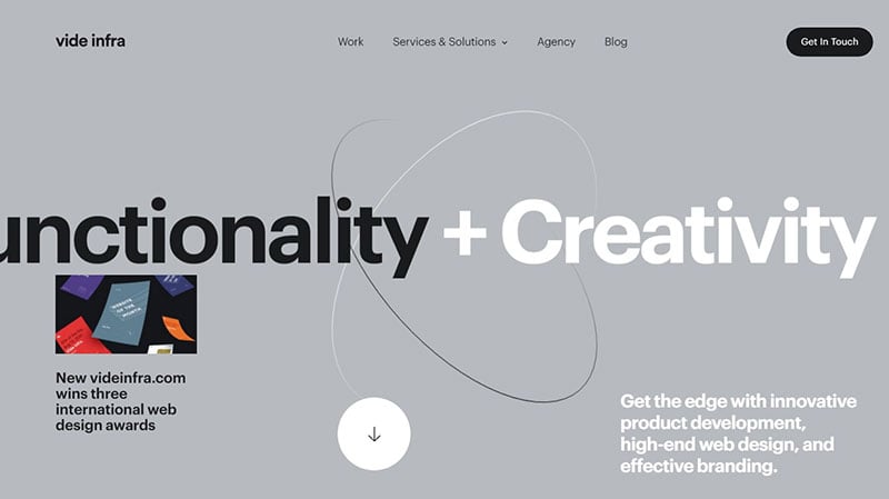
Vide Infra is a top web and product design agency. Its website includes many interactive features.
Friends of the Web
This website maintains a clean, crisp look using a white background and colorful accent boxes.
Waka Waka
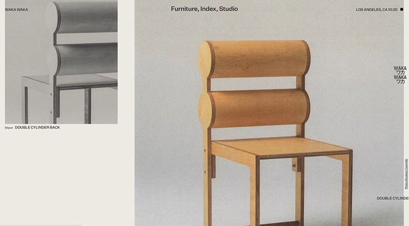
Waka Waka showcases handcrafted wood furniture from Shin Okuda. This webpage starts in a miniature form and expands to fit the screen. Contributing to its minimalist design is a three-option menu that appears at the top of the page.
Themeplicity Template Website – Website Template
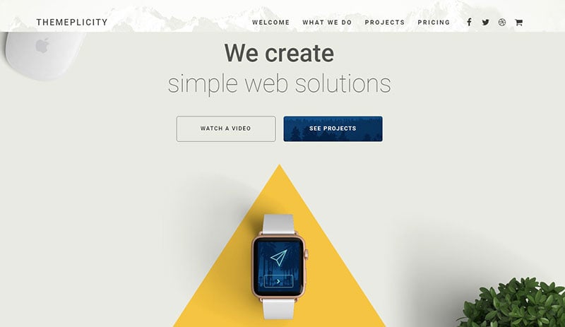
As the name portrays, this is a simple webpage. Its light background draws attention to the text and CTA buttons.
Andrew Revitt
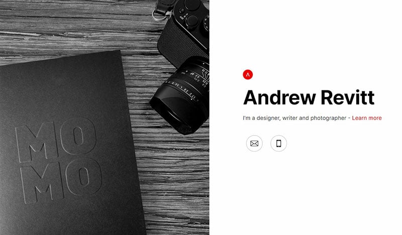
Andrew Revitt’s page is simplicity itself, with an image displayed in the left half of the screen and eight words displayed in the right half.
The Outpost
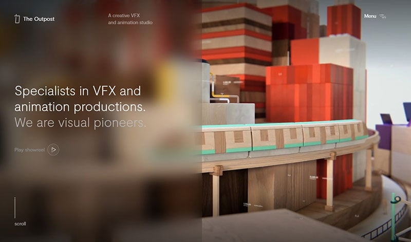
The Outpost is a VFX and animation studio. Its website shows a video playing behind the welcoming text. Scrolling down is like a rollercoaster ride, never knowing which direction the page will go next.
Electric Pulp
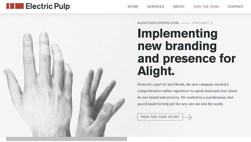
The Electric Pulp is a digital agency that works in web design and mobile E-commerce. The website’s clean design includes a white background and bold letters.
Story Line
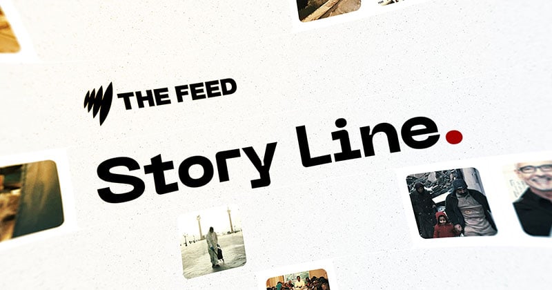
Story Line is a website that shows and plays voice calls referring to the COVID-19pandemic. It employs a click and drag technique for users to explore the voice memos.
Yaron Schoen
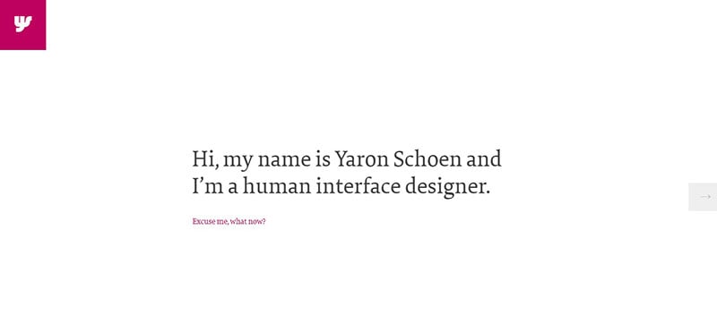
Yaron Schoen is a human interface designer. His website opens to a clean, simple, and interactive dialog.
Annatwelve Fragrances
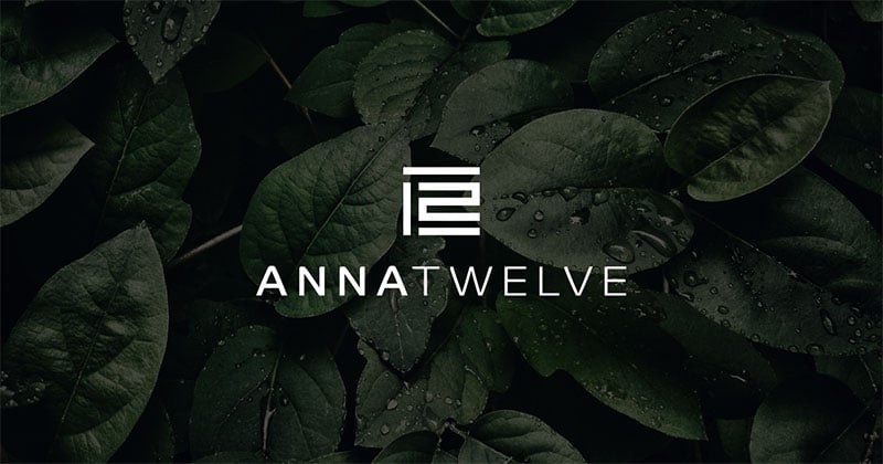
This website offers luxury fragrances from Italy. The homepage contains a simple navigation menu.
Eric Paul Snowden
The whitespace and limited text of this website focuses the attention on the images and displays an uncluttered layout.
ROM Boats
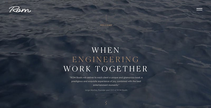
ROM stands for Rebuild Ocean Motivation. This is the only company that manufactures recreational custom motorboats on the Iberian Peninsula. Its elegant and interactive website exhibits this company’s artistry.
Hanzell Vineyards
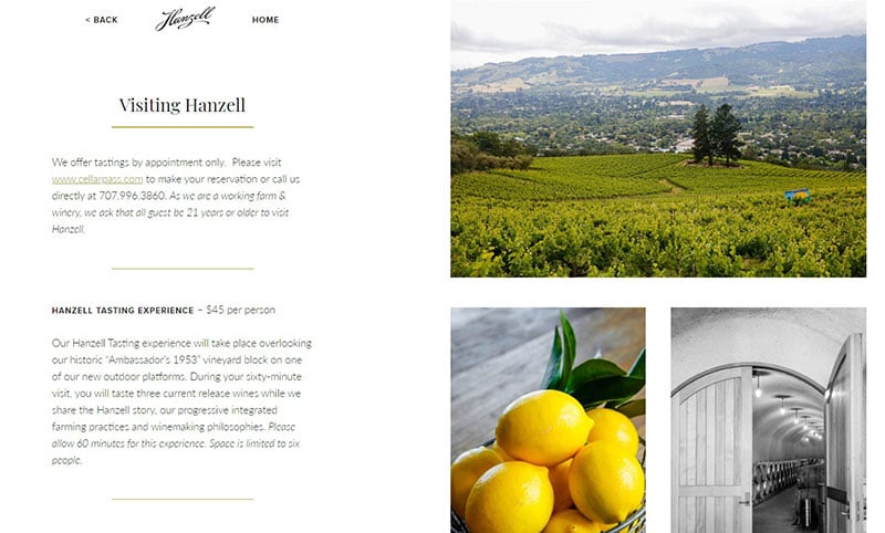
Another of the top cleanest website designs, Hanzell Vineyards opens to a split-screen. Half of it displays an image and the other half presents four navigational options.
PBSC
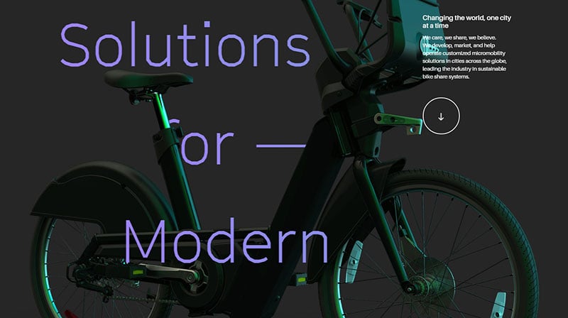
PBSC helps develop and operate bike-sharing systems across the globe. Its website utilizes big letters and parallax scrolling for a modern design.
Trent Walton
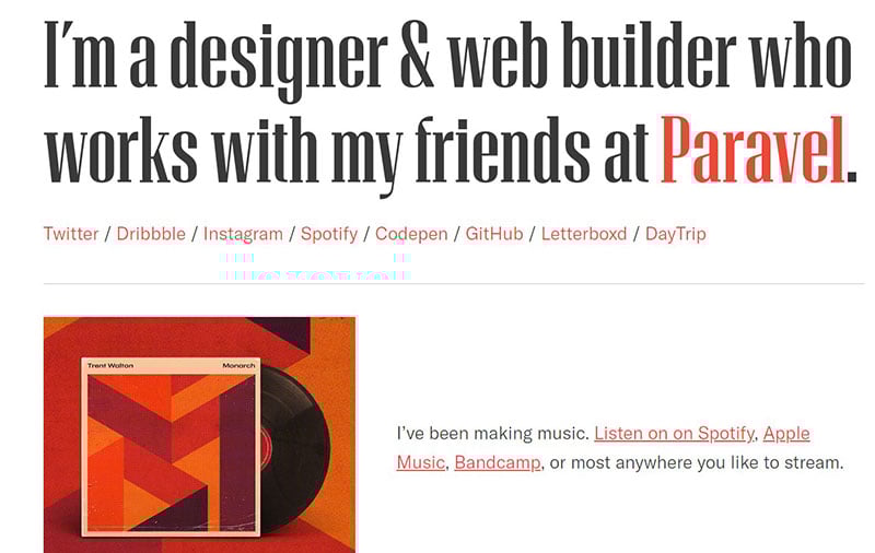
This webpage displays the portfolio of a designer and web builder. The whitespace and wide layout makes it organized and clean.
makemepulse
Makemepulse produces interactive technology. Their website showcases their creative talent with interactive effects.
a fork and a pencil
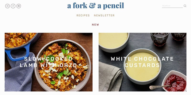
This white, clean website provides all your recipe needs. It is organized to easily locate recipe collections. Tasteful photos will get your mouth watering and motivate you to sign up for the newsletter.
Depositphotos
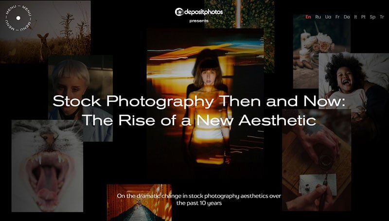
Using photos, Depositphotos demonstrates the evolution of stock photography from the 2000s to today.
Kylla & Mike
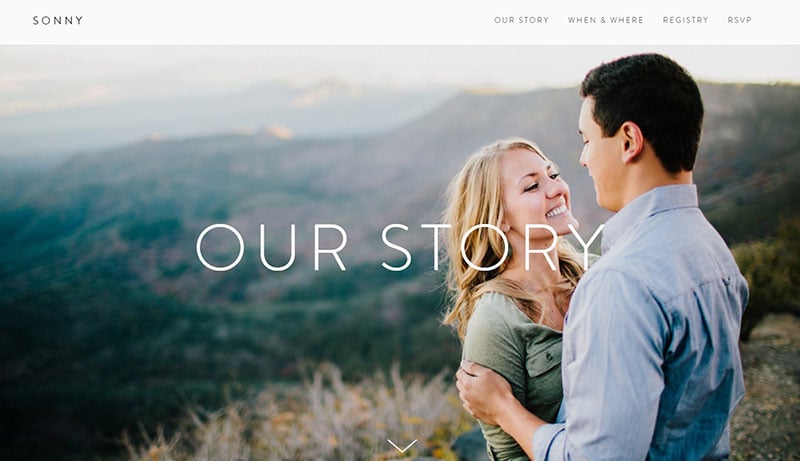
This is an excellent example of an elegant and sleek wedding website. The text is minimal and the layout draws attention to the photographs.
Marvin Schwaibold
Marvin Schwaibold is a German designer. His website showcases his projects with an organized layout and striking images.
Evolve Wealth
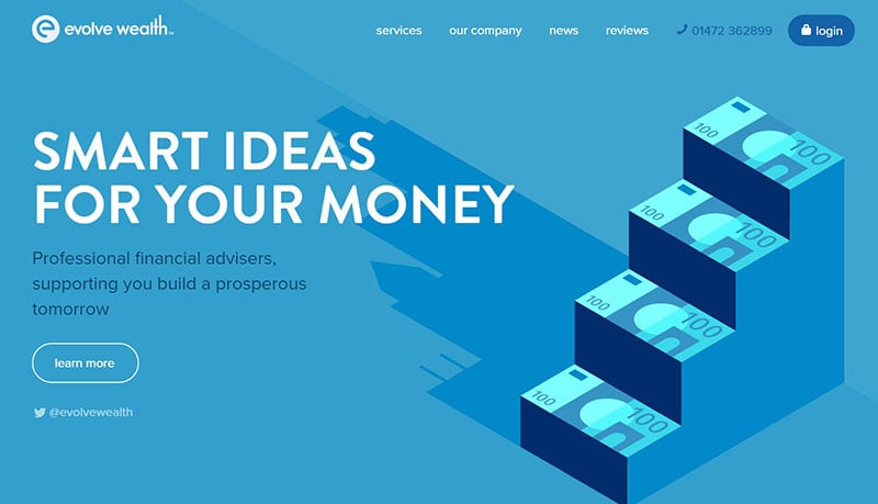
This website displays a bright blue background that features large white letters. The animation adds creativity to this clean website.
Everyday Experiments
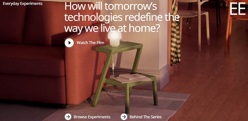
Everyday Experiments is a project by SPACE10 and Ikea. The website opens to a video with special effects playing in the background.
Frame Innenarchitektur
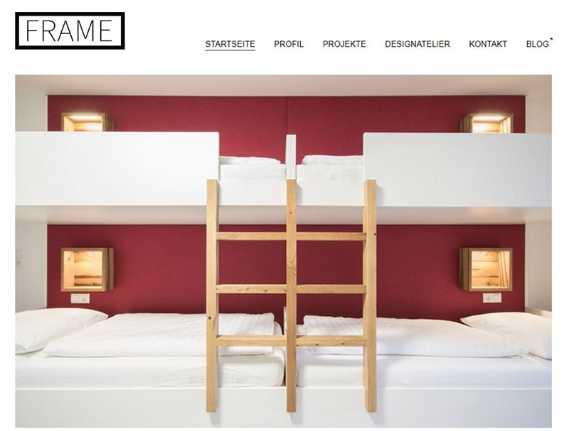
The Frame Innenarchitektur webpage is minimalism at its finest. It showcases a gallery of pictures and has a simple menu on the top of the page.
Canvas
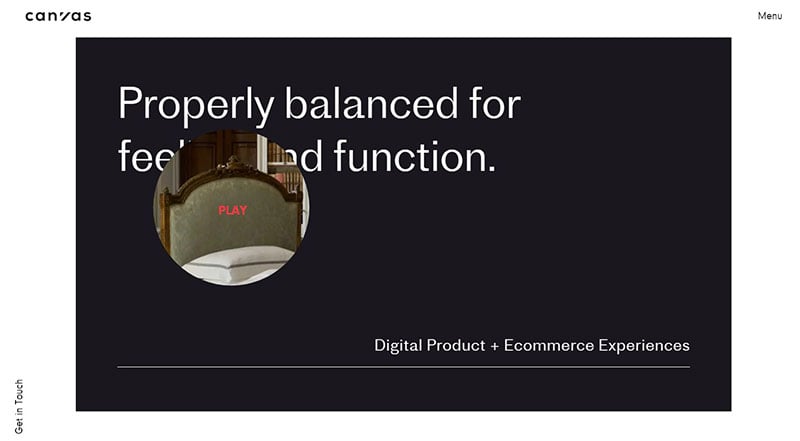
Canvas is a design studio. Plenty of whitespace and large text keeps the webpage uncluttered.
Baxter of California
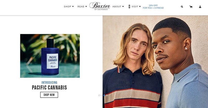
Large colorful photos paired with bold, distinct lettering gives Baxter of California a remarkably clean website design.
Masters 1987
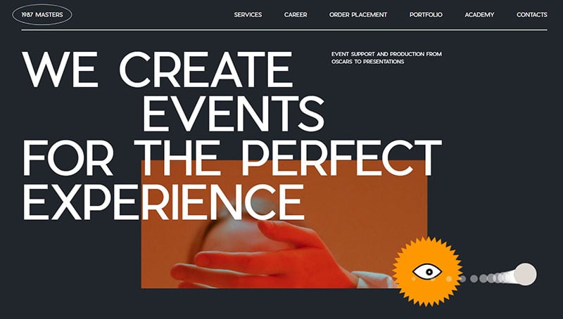
Masters 1987 is an event production company. Their website includes large white text with a yellow accent highlighting main ideas.
Luke Stephenson’s 99x99s Book Website
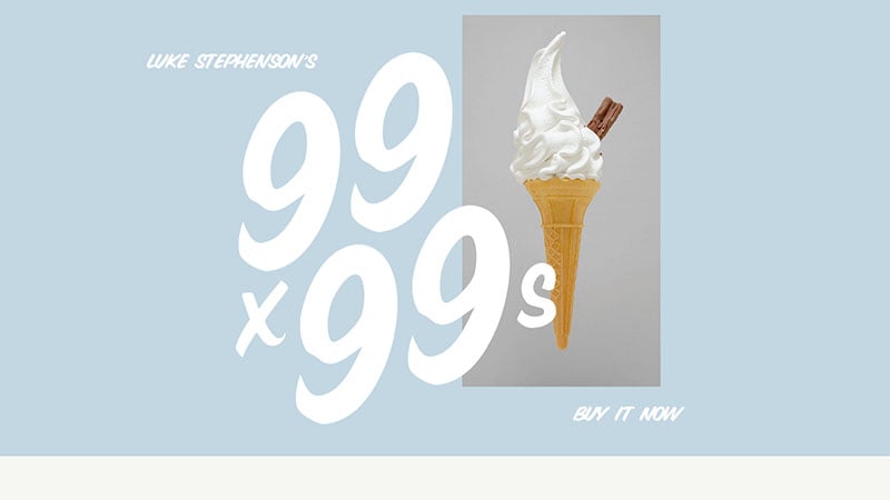
This website makes good use of whitespace. Soft colors, large letters, and photographs work together to make it appealing.
REKKI
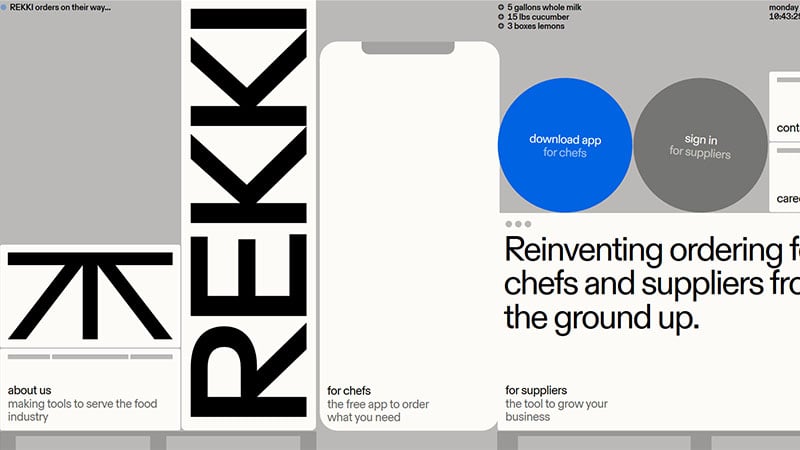
This website is a tool for chefs and suppliers. Rekki utilizes geometric shapes and accent colors to make a simple design.
Tembo Product Development
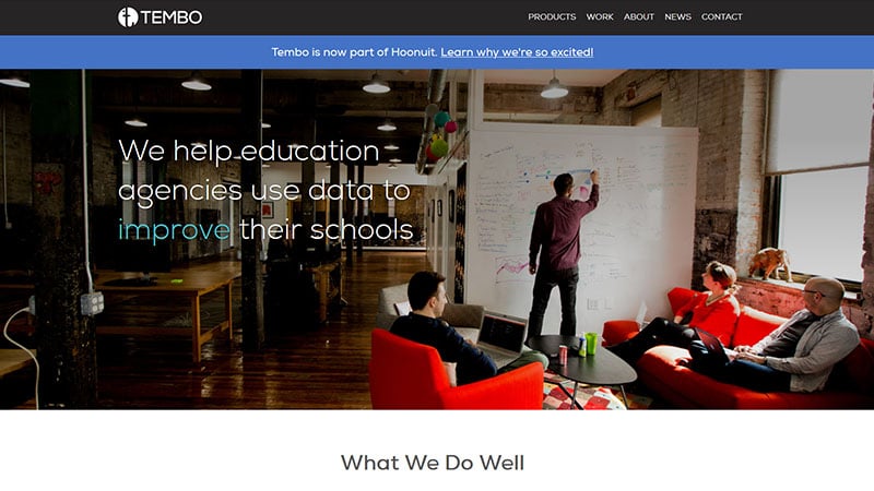
Another inspirational website for a clean design is Tembo Product Development. A large opening picture and animation graph create a clean and clear layout.
Khoa Lê
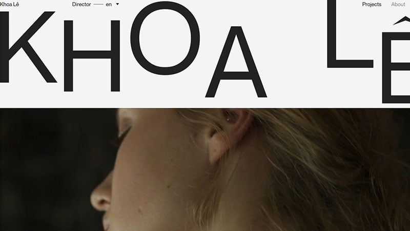
Khoa Lê is a director whose work has been shown in more than 20 countries. His clean website displays high-quality videos. It also uses mouseover effects and whitespace for an organized design.
H. Creative Group
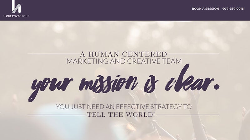
Creative fonts and shadows decorate this website. It also draws attention to its several CTA buttons.
Yuko Higuchi x Gucci
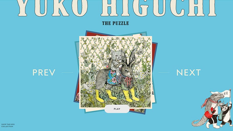
Yuko Higuchi x Gucci is a unique website. It contains a puzzle display featuring the illustrations of Yuko Higuchi.
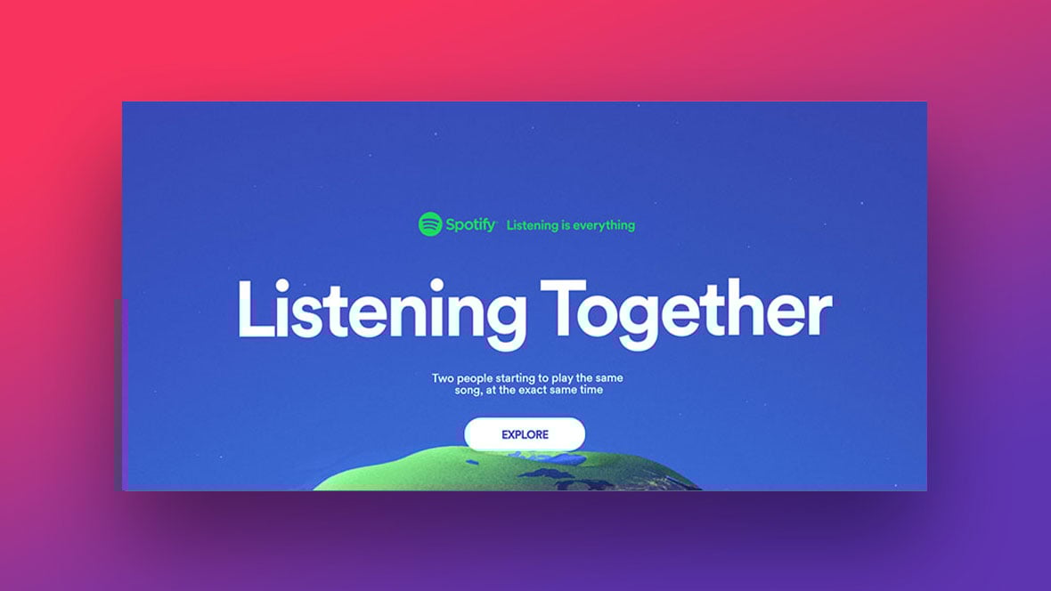
Listening Together
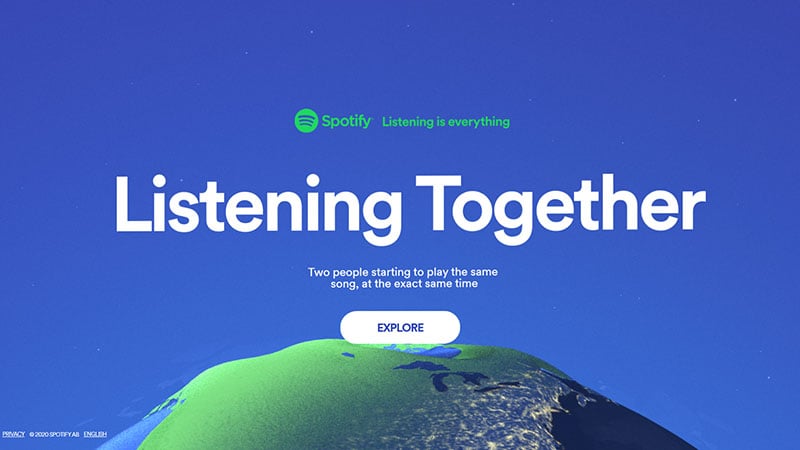
Every second, over 30,000 Spotify users play the same song. Listening Together presents visuals displaying that data.
Mags Yips Copywriting
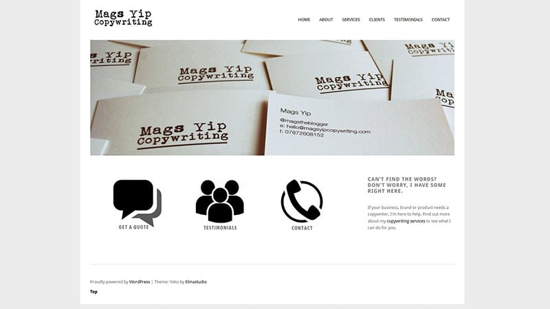
In an outstanding clean website design, Mags Yips Copywriting, displays a large image, minimum text, and bold icons.
Possible + Venmo
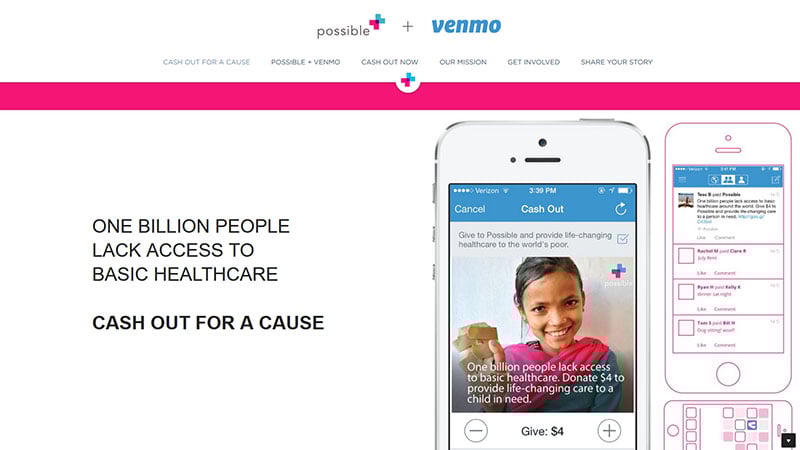
This website uses colorful imagery and accent colors to make the main ideas conspicuous.
Ivan Toma
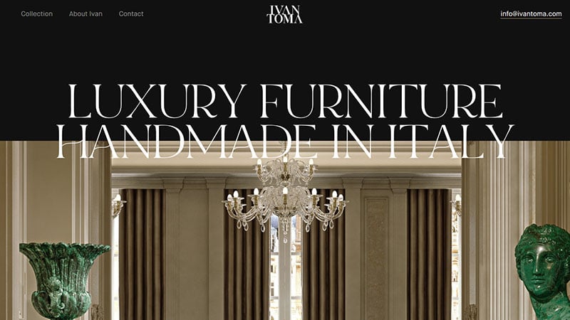
For this handmade Italian brand, high-quality images and a black background create an elegant website.
Summerlee Walter
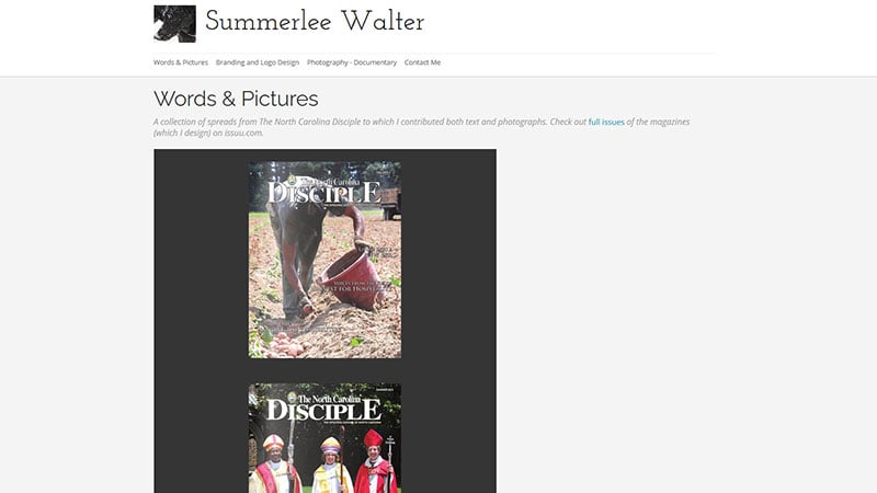
This clean website makes use of a grid view of images and minimal text.
Yannis Yannakopoulos
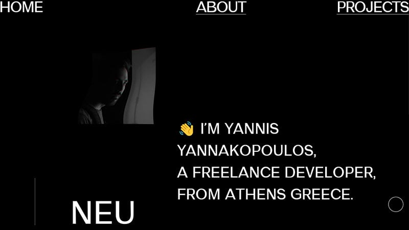
This is the website of Yannis Yannakopoulos, a freelance developer. A short homepage and white text on a black background make his website clean and crisp.
Bluehost
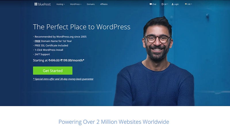
Bluehost combines white and blue to make a clean website. The color green highlights all the CTA buttons and animations add a creative feature.
Haerfest
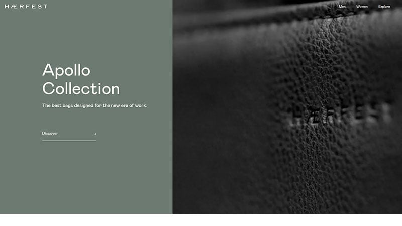
Haerfest captures attention with an opening video displaying their designer bags.
Apple
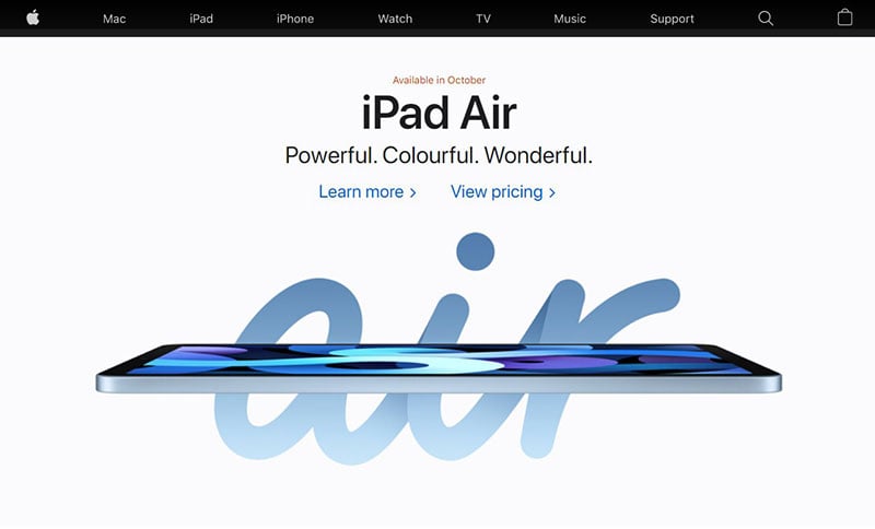
A black background displays white words when entering the homepage. A simple mouseover allows you to explore pictures of their products.
What I See
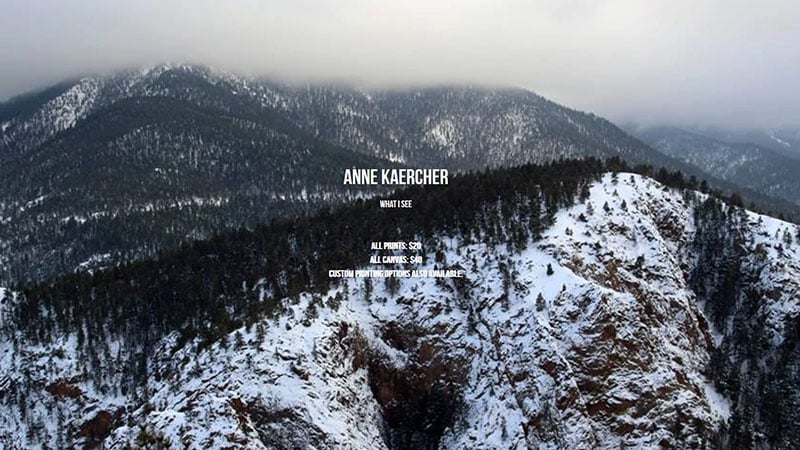
Here, a photo gallery by Anne Kaercher is displayed. Parallax scrolling expands each picture as you scroll by.
Junction
Junction combines creativity, media, and technology to build and improve brand solutions. Their website presents high-quality images and stylish font.
Shape Studio
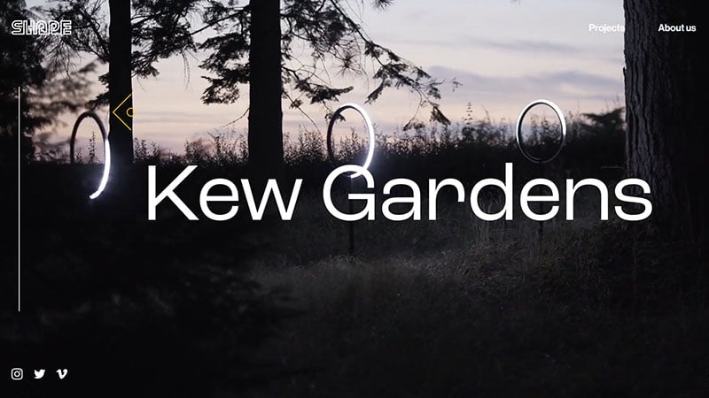
Shape is a specialist design and fabrication studio. Its homepage is simple, showing only a few menu options and a video.
Aayush Bucha
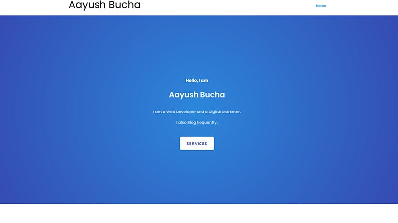
This website has a clean and effective design, making good use of whitespace and accent colors.
HENGE
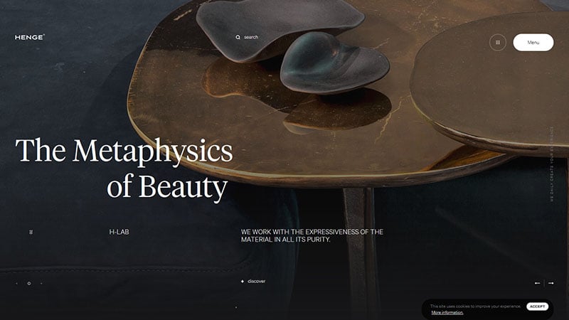
Henge opens to a slideshow of images. Its special effects and parallax scrolling make this a creative website. (https://store.spaceylon.com)
Spotify Pet Playlist
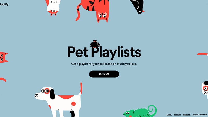
Spotify Pet Playlist was constructed to create playlists for pets, and its simple homepage qualifies it as a clean website.
Jiacheng Yang
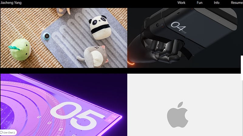
This digital designer’s website displays a clean, organized grid view of Jiacheng Yang’s work portfolio.
VanMoof: S3 & X3
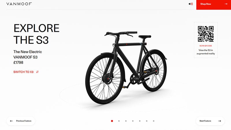
This website unveils e-bikes from VanMoof. You can explore the bike’s features in real-time 3D.
Sarah Caroline Müller
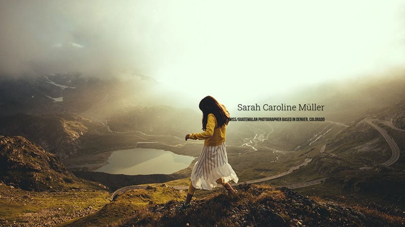
This website showcases the photos of photographer Sarah Caroline Müller with a grid view and white background.
&Tradition
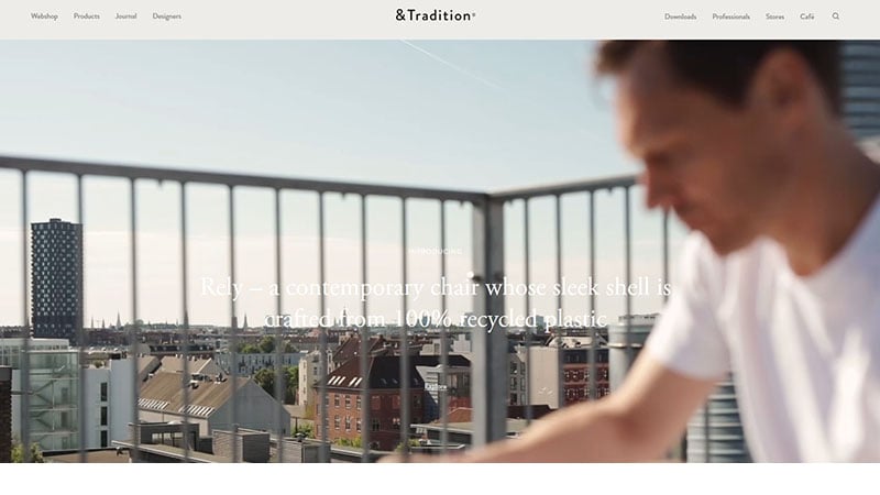
&Tradition creates furniture and other objects with timeless appeal. The website is also appealing, with stunning images and mouseover effects.
MTek Corporations

MTek Corporations’ website welcomes you with animated typography. It has a clean, organized layout and a balanced proportion of visuals and text.
Martine Rose
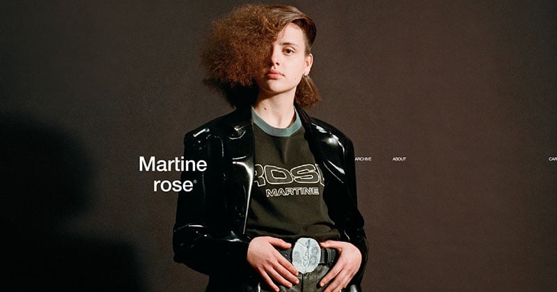
Martine Rose is a menswear designer who exhibits his designs on his website using a slider.
The Web Design Studio
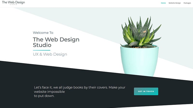
This website incorporates nice images with strong text for a creative and clean design.
Olivier Gillaizeau
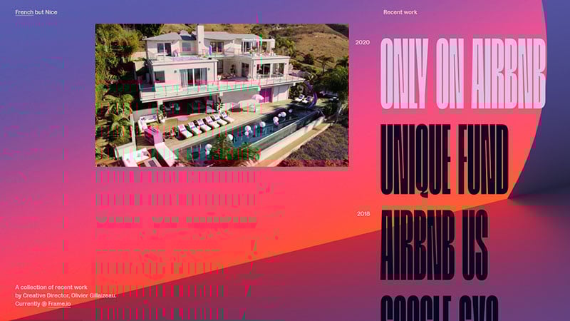
This website shows the portfolio of the designer Olivier Gillaizeau and is decorated with bright colors and large font.
WPDean
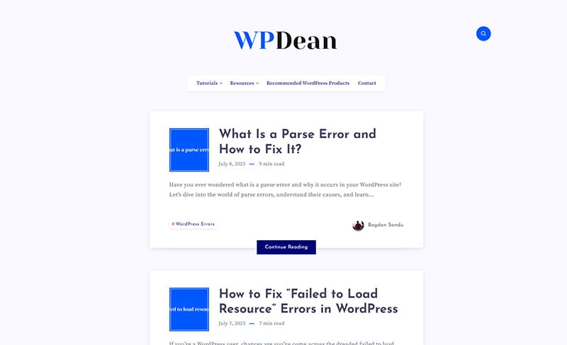
WPDean.com serves as a comprehensive resource for WordPress users of all levels, offering valuable insights, tips, tricks, and tutorials.
FAQs about clean website designs
1. What are the key features of a clean website design?
The hallmarks of a clean website design include minimalism, clarity, and simplicity. The design ought to include a lot of white space, a distinct hierarchy, and a small number of colors. Consistency, readability, and balance should all be considered while using typography. The navigation of a well-designed website should be simple, and the text and visual content should be well-balanced.
2.How does a clean website design differ from a cluttered one?
In contrast to a cluttered one, a clean website design is streamlined and concentrated on presenting the most crucial information. A busy website design, with too much text, too many graphics, and not enough whitespace, is frequently perplexing and overwhelming. User experience is prioritized through a simple website layout, making it simpler for visitors to explore and discover what they need.
3. What are some benefits of having a clean website design?
increased user experience, quicker load times, and increased search engine performance are just a few advantages of a clean website design. Additionally, it can improve a website’s visual appeal, professionalism, and usability. A simple website layout can boost user interaction and boost conversion rates.
4. Can a website have too much whitespace?
Yes, if it is not used properly, a website may have too much whitespace. Whitespace should be deliberately employed to divide sections, provide a visual hierarchy, and direct readers’ attention. An excessive amount of whitespace can make a website seem empty or incomplete, which lowers engagement. Whitespace and content must be balanced appropriately.
5. What is the role of typography in clean website design?
In order to have a clean website design, typography is essential. The website’s typeface should be readable and consistent throughout. To achieve a pleasing balance, the font’s size, spacing, and weight should all be carefully taken into account. Typography can be used to express the tone and personality of a website, establish a visual hierarchy, and direct users’ attention.
6. How can color be used in a clean website design?
In a simple website design, color can be used to convey emotions, highlight key information, and create contrast. Use a small number of colors, emphasizing accents in neutral tones. The meaning of each color should be considered, as well as how it relates to the theme and branding of the website.
7. Should images be used sparingly in a clean website design?
Images can be utilized in a simple website design, but they should only be used when necessary and with purpose. The user experience can be improved and the website can become more engaging by using high-quality photos that are pertinent to the text. A website’s load times can be slowed down and can appear cluttered if there are too many images on it.
8. How can navigation be optimized in a clean website design?
A simple website design must have clear navigation. It needs to be uncomplicated, intuitive, and straightforward to use. There should be a distinct menu and a navigation structure that reflects the hierarchy of the website. Links and buttons ought to be recognizable and consistent. It is important to test navigation to make sure it is efficient and user-friendly.
9. What are some common mistakes to avoid when designing a clean website?
Using too many fonts, failing to establish a visual hierarchy, overcrowding the website with information, and failing to optimize for mobile devices are some typical pitfalls to avoid while developing a clean website. Prioritizing the most crucial pieces of information and concentrating on the user experience is crucial.
10. How can user experience be improved with a clean website design?
By keeping things simple, establishing a clear hierarchy, making the site mobile-friendly, and making good use of whitespace, a clean website design can enhance user experience. The website should load quickly and have simple navigation.
The choice of typeface and color must be harmonious and pleasing to the eye. A straightforward call to action, such as buttons or links that urge viewers to do the required action, should also be included in a simple website design.
In the end, a simple website layout should make it simple for visitors to discover the information they require and direct them toward the website’s objective, which could be to make a purchase, complete a form, or simply gain more knowledge about a particular subject.
A simple website design can promote more engagement, more conversions, and ultimately a more successful website by putting a strong emphasis on the user experience.
Ending thoughts on the cleanest website designs
The clean websites on this list vary from businesses to portfolios and many other categories,s all completed with basic techniques. These include whitespace, bold typography, and vivid visuals. Colors can also be a powerful tool to create a clean website. It can be difficult to design a website that contains all the required information in a minimalist style. However, using these techniques and the above websites as inspiration, you can also create a beautiful and clean website.
If you liked this article about cleanest website designs, you should check out this article about website footers.
There are also similar articles discussing minimalist websites, parallax scrolling, website color schemes, and website animation.
And let’s not forget about articles on coming soon page design, modern website design, one page website, and creative websites.

