
If you want to tell a story that captivates readers, it needs to be active. The same goes for visual storytelling.
When you’re designing a website for a high-octane brand — like a sports organization, fitness center, or car company — the most effective way to do it is with an action shot. In this tutorial, we’re going to show you how to create a gravity-defying action shot for your hero image.
We’ll be borrowing the layout and special effects from the Gravity Design Hero template in order to create this hero image design.
Table of Contents:
- Step 1: Update the background
- Step 2: Delete layers you don’t need
- Step 3: Swap out the astronaut image for your own
- Step 4: Edit the title
- Step 5: Edit the call-to-action
- Step 6: Edit the featurette text
- Step 7: Add your special effect
How to create a hero image with an exciting action shot
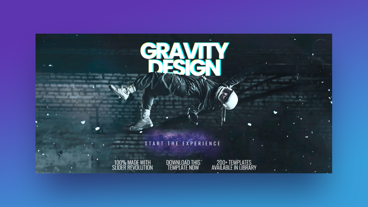
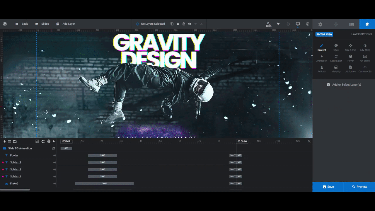
In the original version of this hero image template, we see someone in astronaut-like gear performing a gravity-defying stunt:
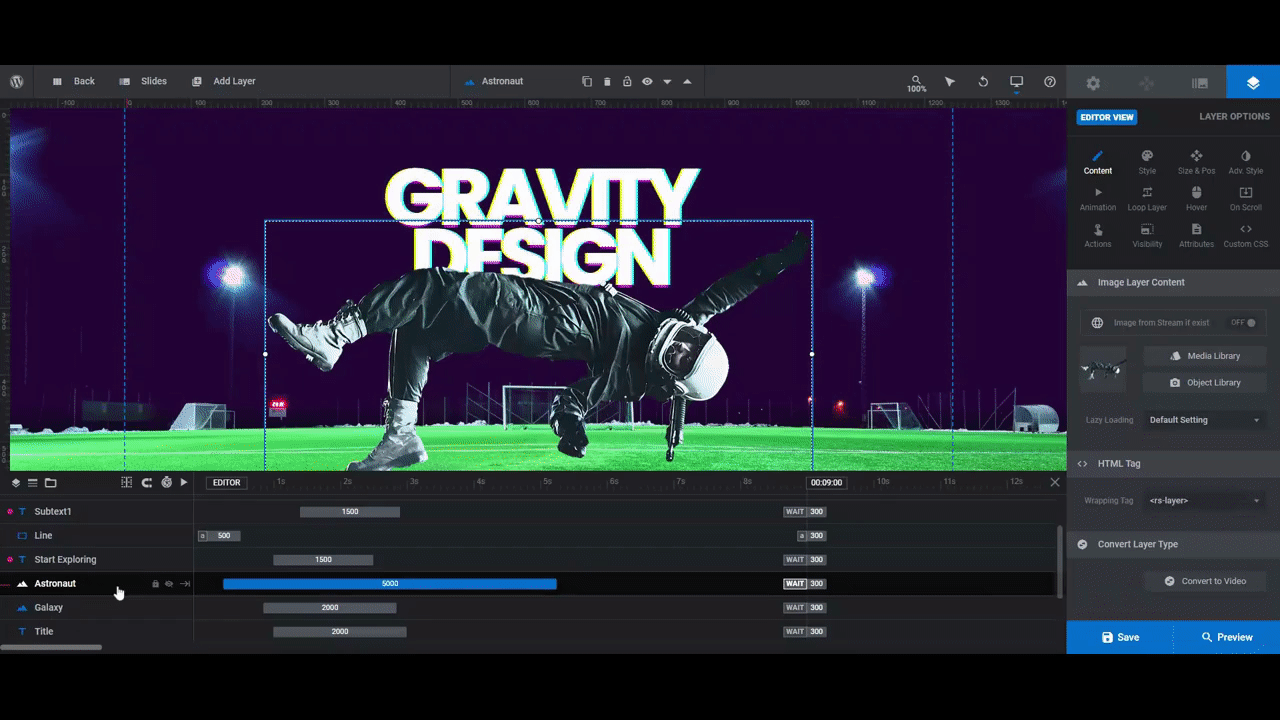
In the following tutorial, we’re going to show you to repurpose this design to make an athlete look just as powerful and agile as they do on the field:
Here are some get-started links to review if this is your first time using Slider Revolution:
Step 1: Update the background
There are three areas in Slider Revolution where you’ll need to update this hero image’s background:
The first is under “Module Options” and “Layout”. Scroll down to the section called “Module Background”, click on the BG Color color swatch, and then set a new color in the selection dialogue that appears:
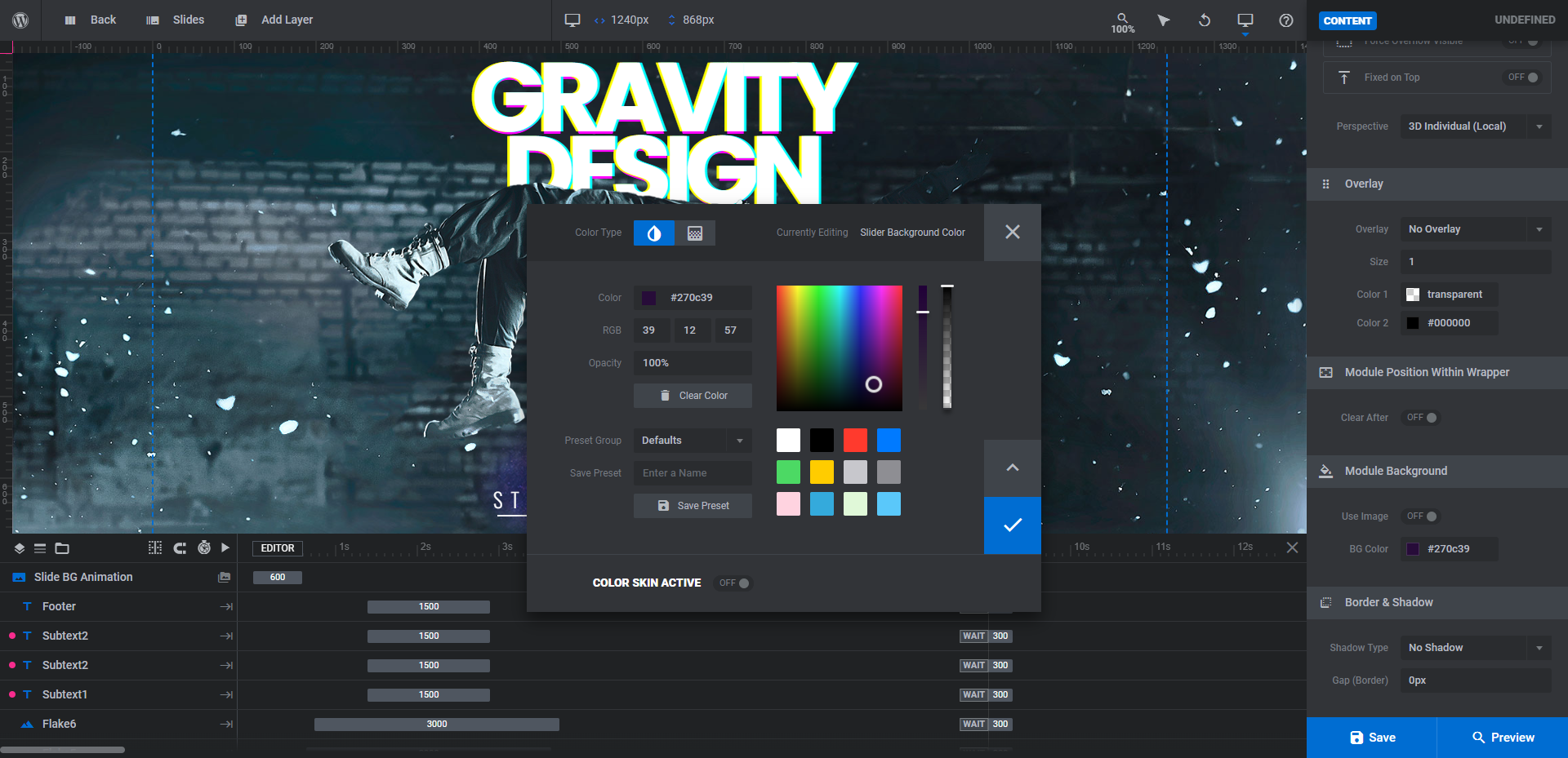
Next, go to “Slide Options” and “Background”. Change the BG Color to the same one you’re using as the module background
Pro tip: While you won’t see this color change reflected in the canvas, you’ll notice it when you preview and then publish this hero image to your website. That’s because it’s the color that appears just before the design loads. So choose a color that will blend well with the background image you’re about to insert into the slide.
The last part of the background to update is an image layer called Background. Locate it in the timeline editor. Then go to “Layer Options” and “Content” to upload a new background image:
When you’re done, save your changes.
Learn more:
Step 2: Delete layers you don’t need
There are seven layers we aren’t going to keep in our design.
One of them is called Footer. It’s the dark copyright line at the bottom of the hero image. You probably won’t need this either since this information typically goes in the footer of a website.
The other six layers are named Flake [number]. We won’t be keeping the particle effect in this design, so the flakes aren’t necessary for our purposes.
To simultaneously delete these layers, hold down the Ctrl or command button on your keyboard as you select them in the timeline editor. Then hit Backspace or delete to remove them from the design.
Learn more:
Step 3: Swap out the astronaut image for your own
The Astronaut graphic is 1025px x 500px. While it’s a good practice to replace Slider Revolution template images with similarly sized images, you have a bit more leeway in this design.
For instance, our replacement soccer player image is 845px x 1260px. It’s the opposite orientation and quite a bit bigger. However, thanks to the big space in the middle as well as the intuitive sizing tool, we’ll be able to make it fit.
To upload your new graphic, click on the Astronaut layer. Then go to “Layer Options” and “Content”. Open the Media Library and swap out the astronaut for your image:
If you need to resize and reposition your image as we do, go to the “Size & Pos” settings tab to do so:
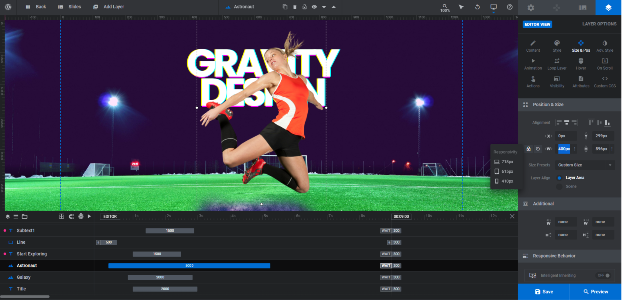
Use the following settings under Position & Size to adjust your image:
- X: Move the image horizontally (in pixels)
- Y: Move the image vertically (in pixels)
- W: Change the width of the image (in pixels or percentage)
- H: Change the height of the image (in pixels or percentage)
Note: Changing the size of the image in the default (i.e. desktop) view will proportionally change the size of the image as it appears on smaller devices. However, auto-resizing doesn’t always get it right.
To ensure that your new image looks good on all screens, open up the responsive view menu in the toolbar. Then, make adjustments to the image in each size variant:

Changes you make will not impact variants that are larger than the one you’re working on. In other words, size and position changes made to mobile won’t change what you already set up for desktop.
Learn more:
- Editing Images in Template Modules
- Desktop, Laptop, Tablet and Phone Size Variants
- Adjusting for Responsiveness
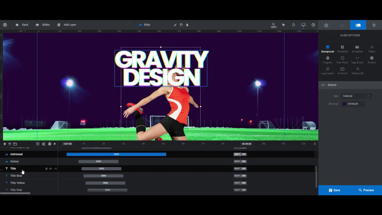
Step 4: Edit the title
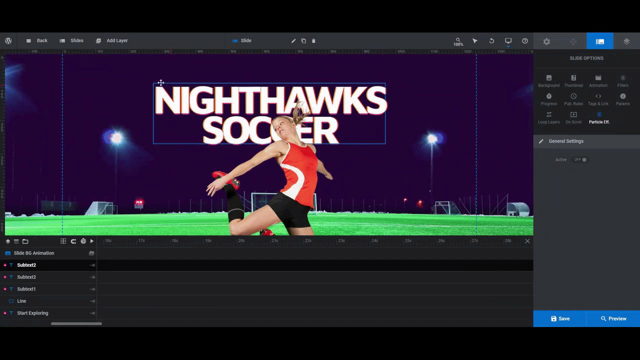
If you look in the timeline editor, you’re going to see 4 title layers:
- Title: The white text layer we see in front
- Title Blue: The neon blue color that sits behind the main text layer
- Title Yellow: The neon yellow color that sits behind the main text layer
- Title Pink: The neon pink color that sits behind the main text layer
Visitors will see these colors meld together when the slide first loads. They’ll also see them peek out from behind the main white text layer. If you want to keep this colorful silhouette effect, leave all the layers in the slide. Otherwise, delete all of them but Title.
As for editing the title layers, you’ll have to customize them one at a time.
Go to “Layer Options” and edit what the layer says under “Content” and the font, color, and other style settings under “Style”:
Pro tip: If you want to keep the colorful layers in place, pick colors that complement the subject of your image. Use ImageColorPicker.com to identify specific colors from your main image. Then use Canva Color Wheel to find bright colors that complement the one you pick.
Learn more:
Step 5: Edit the call-to-action
Next is the call-to-action. There are three layers that make up this part of the slide:
- Start Exploring: The call-to-action text that says “START THE EXPERIENCE”
- Line: The line that appears beneath the CTA when someone hovers over it
- Galaxy: The purple galaxy image fragment behind it
For our redesign, we’re going to delete the Galaxy layer. Then, edit the Start Exploring layer just as we did the title layers.
Tip: If your new text or font causes a misalignment between the length of the call-to-action text and the underline, edit the overall pixel size of the Start Exploring layer under “Style”.
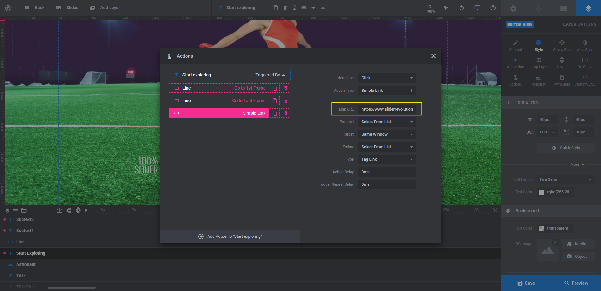
One other thing you’ll have to do in this step is edit the text link. To do this, click on Start Exploring and go to “Actions”. Select Simple Link and then enter the URL you want to direct visitors to:
Save your changes when you’re done.
Learn more:
Step 6: Edit the featurette text
There are three layers in this slide called Subtext[number]. These are the three side-by-side feature notes at the bottom of the design. If you feel like they add something to the hero image, keep them in. If not, feel free to delete them.
We’re going to keep them. To customize them, do the same thing you did to edit what the other text layers said and how they looked:

Pro tip: To create evenly sized subtext layers, use <br /> (or the return arrow icon above the text field) to force text to the next line. This way, the bottom portion of your design won’t feel off-balance if you have an uneven amount of text in the featurettes.
Learn more:
Step 7: Add your special effect
Particle effects are enabled in this template. We want to make our soccer field look realistic, so we’re going to disable them in our design.
Whether you want to disable this special effect or customize it, you’ll find it under “Slide Options” and “Particle Eff.”:
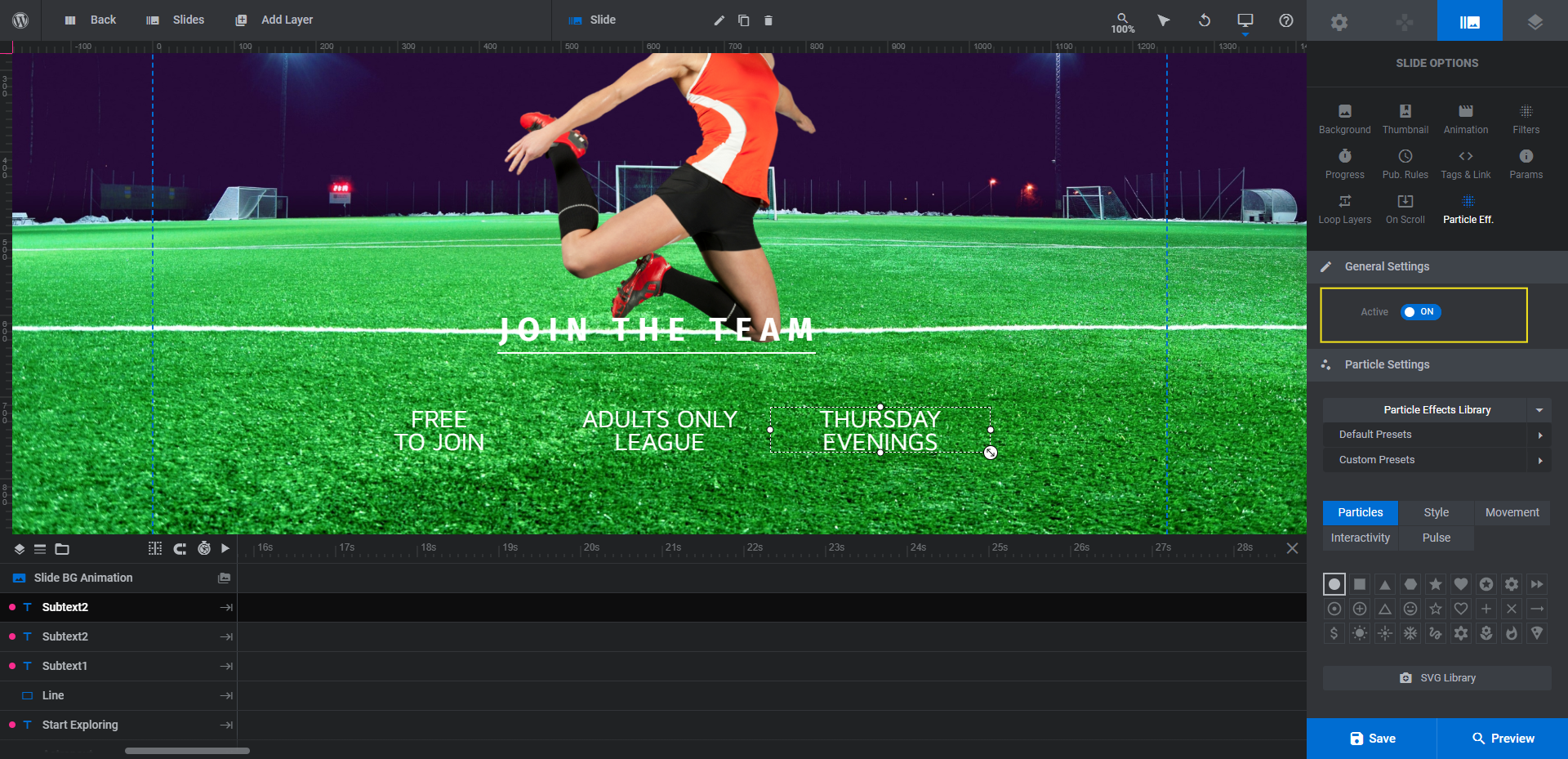
The toggle controls whether the effect is turned off or on.
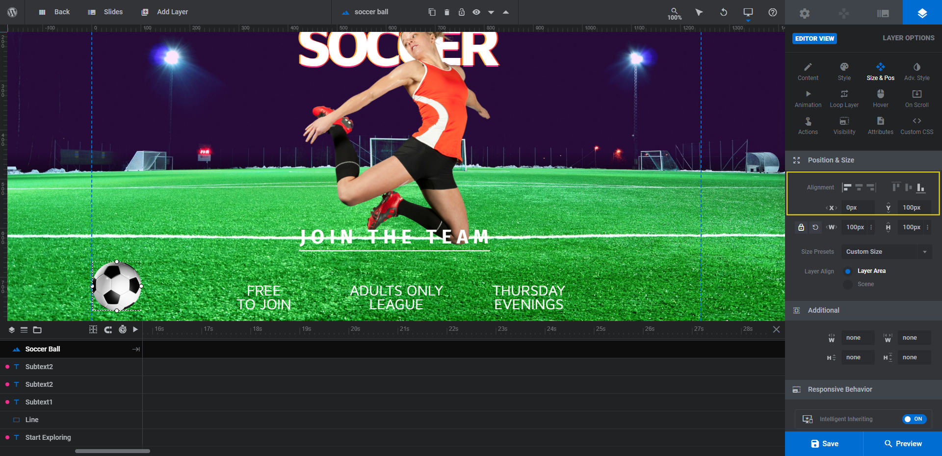
What we’re going to do instead is place a soccer ball on the field. If you want to do something similar, go up to the toolbar, hover over “Add Layer” and select “Image”. You can then upload your new image to the Media Library:
The next thing we’re going to do is move it. We want it to be closer to the bottom of the screen.
Under “Size & Pos”, we’ll left- and bottom-align the new soccer ball layer. We’ll then set the X value to 0px and the Y value to 100px:
Next, we’ll add a slow-rolling animation to it. Go to “Animation” and set the IN transition to Long Slide from Left.
Under Basics, change the Duration value to 3000 and the Start to 1000.
Under Advanced, set the rotation to 360deg.
It’s important to check the responsive variants once more to ensure that the new graphic appears in the right place on the screen and that it doesn’t intrude on your text. If it does, you might want to disabe the image on smaller screens (which you can do under “Visibility” settings).
Learn more:
Bring your hero image to life with action
Want to tell a visual story that gets visitors excited about your website and what it offers? Using images of action shots is one way to do it. Another option is to create a hero image that’s interactive and exciting to look at.
Take inspiration from the Gravity Design Hero template or use it as the foundation for your own action-packed hero image. Either way, your visitors are going to be impressed with the end result.

